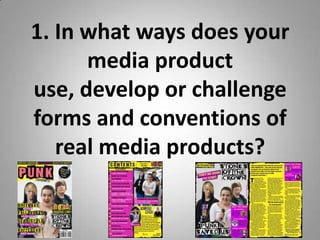
This magazine uses conventions of real magazines but also challenges some. It follows a typical layout with masthead, coverlines, and photo but uses an unconventional two-sided coverline placement. The writing aims to make readers feel like they belong while challenging norms with taboo language. Punk influences like font and safety pins establish the brand identity while sticking to conventions helps avoid disorienting readers. Overall it balances familiarity and uniqueness to attract attention while still feeling authentic to its genre.
![Overall
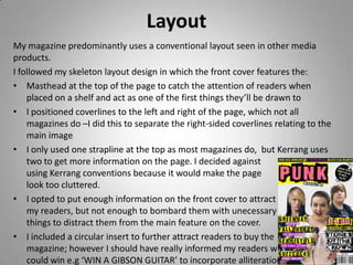
• I decided to predominantly stick to magazine genre conventions to not
disorientate readers from what they’re used to seeing on shelves; however I
wanted to make sure my new magazine would grab their attention, so made
use of my unique colour scheme to draw them in, as each cover would be
seen for one month at a time alongside all of the others.
• I wanted to use Maslow’s Hierarchy of Needs (1954) to make my readers feel
as though they belonged to an exclusive ‘group’ through the house style
continuity to set it apart from other magazine.
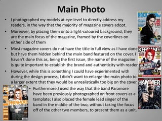
• I placed coverlines on the left-side of the page because McKay (2000) suggests
to put the emphasis there ‘as this is the part that will show when the
magazine is on the average newsagent’s shelf’ and made sure they were large
enough to be legible from 2-3 metres away to grab readers’ attention.
• McKay (2000) also argues to make strong links to the contents page as
‘readers are irritated if the fascinating story heralded on the cover is
impossible to find in the contents list [especially so] if it is given a different
title in the contents list. I could have possibly improved this if I had changed
the font of ‘Stones of the Crown’ to the same one used on the front cover and
double-page spread.](https://image.slidesharecdn.com/mediapowerpoint-yasmin-130411123307-phpapp01/85/Media-powerpoint-yasmin-6-320.jpg)


