this is question 2 and is part of my media evaluation.It explains how my ancillary and main products work together to grab the attention of my target audience.
Ecological Succession. ( ECOSYSTEM, B. Pharmacy, 1st Year, Sem-II, Environmen...
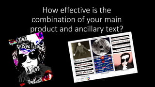
Q2
1. How effective is the
combination of your main
product and ancillary text?
2. • My main product and my ancillary texts work together to effectively
reach out to their target audience starting out from 18 year olds and
then still attracting the attention of people in their early 20s. This age
group are stereotyped to be loud ,care free and that they are classed
as rule breakers. My Digi pack has lots of connotations of recklessness
and breaks some codes of the lay out of a Digi pack but follows some
so it is still clear what the product is and what it is trying to promote.
In my poster I used news
paper style font to reflect
all the bad press that
young people get and by
distorting the lettering, I
am suggesting to my
audience that I do not
share this view point.
Making them feel like they
have someone on their
side, enticing them to by
my product.
3. • The photography I used in my ancillary texts is similar to the shots I
use in my video as I have used cutaway shots and then I have used
close up shots of peoples lips and eyes. Giving it a pop art punk feel
as these are not the normal conventions when taking a photograph as
you are not getting the whole subject in the framing also that the
loud colours of the manipulated images would attract the attention of
my target audience as they don’t like following the rules.
• As my main product is about drugs abuse I distorted one of the
images on the digipak to show that the character is being effected by
the drugs. This then further breaks the conventions of a digipak as the
photographs of the artists are usually edited to make them look
better.
4. My ancillary texts support my main product in terms of colour scheme as I have chosen black and
white with splashes of blues and reds mainly. These colours represent danger and love and reinforce
the negative content of the music video that is then filmed in low key lighting to reflect this back to
the audience.
The house style of both of my ancillary texts are messy and contain the overlapping of images these
have connotations of working class youth as they are scene by society as unorganised and cause
disruption. This house style will draw in the correct target audience as individuals will be able to
relate to the structure and format. This then goes on to relate to my music video as it contains lots
of sharp cuts and image overlaying within the content. This makes it is clear that I have created a
brand identity for my product.
On my digipack my cd is given the effect that it has been spray painted this is a crime commonly
associated with young people and so they are more likely going to take and interest in my products
as it is hinting rule breaking. The pattern around the cd also looks like the hypnotic effect I use un
my main product to show the effects of drugs again linking them together to become one package.
My house styles have been consistent and I think that they work well to create a product that is
suitable for 18-25 year olds if I was to do anything differently I would make my ancillary's more
informative as especially the poster is vague on giving information out.