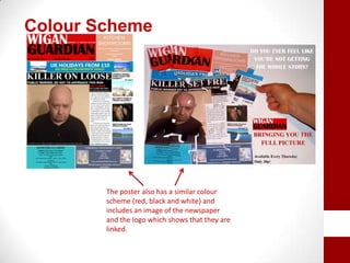
2. How effectiveis the combination of your main product
and ancillarytexts?
As all newspapers tend stick to the usual conventions such as
masthead, headlines, by-lines, smaller stories and adverts, my
newspaper also conformed to these conventions.
I also made sure that the layout and colour scheme wasn’t too
different from other local newspapers such as Wigan Observer
and Wigan Evening Post as I wanted my product to be as
authentic as possible. This meant that I also had to make sure
the poster also had this colour scheme as I wanted it to be
obvious that they went together.
The main link between my main product and my ancillary texts is
the slogan “BRINGING YOU THE FULL PICTURE”
The slogan is used on the
poster to advertise the
newspaper. I used the idea of
a jigsaw to fit in with this as
fits well with the slogan
Person 2 has wrong info,
bringing in the idea of
getting the full picture if
you buy the newspaper
The slogan is also said by
a voiceover at the end of
the radio advert
The name of the newspaper was included on the front
cover of the main product, the poster and in the radio
advert.
This made it clear to the audience that these three products were
linked. Using the same masthead on the newspaper and poster
gave consistency and made the products seem more authentic.
Colour Scheme
The poster also has a similar colour
scheme (red, black and white) and
includes an image of the newspaper
and the logo which shows that they are
linked.
The poster and newspaper also use the same fonts
which were Britannic Bold and Times New Roman.
Britannic Bold
Times New Roman
This gave another link between the newspaper and poster.
Because of these links, the combination of my main
product and ancillary texts work well together.
Small details such as the colour scheme, the slogan and
including the title Wigan Guardian on both the poster and
in the radio ad make it clear that the three products are
linked.

Q2

  • 1.
    2. How effectiveisthe combination of your main product and ancillarytexts?
  • 2.
    As all newspaperstend stick to the usual conventions such as masthead, headlines, by-lines, smaller stories and adverts, my newspaper also conformed to these conventions. I also made sure that the layout and colour scheme wasn’t too different from other local newspapers such as Wigan Observer and Wigan Evening Post as I wanted my product to be as authentic as possible. This meant that I also had to make sure the poster also had this colour scheme as I wanted it to be obvious that they went together.
  • 3.
    The main linkbetween my main product and my ancillary texts is the slogan “BRINGING YOU THE FULL PICTURE” The slogan is used on the poster to advertise the newspaper. I used the idea of a jigsaw to fit in with this as fits well with the slogan Person 2 has wrong info, bringing in the idea of getting the full picture if you buy the newspaper The slogan is also said by a voiceover at the end of the radio advert
  • 4.
    The name ofthe newspaper was included on the front cover of the main product, the poster and in the radio advert. This made it clear to the audience that these three products were linked. Using the same masthead on the newspaper and poster gave consistency and made the products seem more authentic.
  • 5.
    Colour Scheme The posteralso has a similar colour scheme (red, black and white) and includes an image of the newspaper and the logo which shows that they are linked.
  • 6.
    The poster andnewspaper also use the same fonts which were Britannic Bold and Times New Roman. Britannic Bold Times New Roman This gave another link between the newspaper and poster.
  • 7.
    Because of theselinks, the combination of my main product and ancillary texts work well together. Small details such as the colour scheme, the slogan and including the title Wigan Guardian on both the poster and in the radio ad make it clear that the three products are linked.