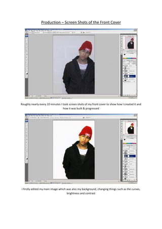
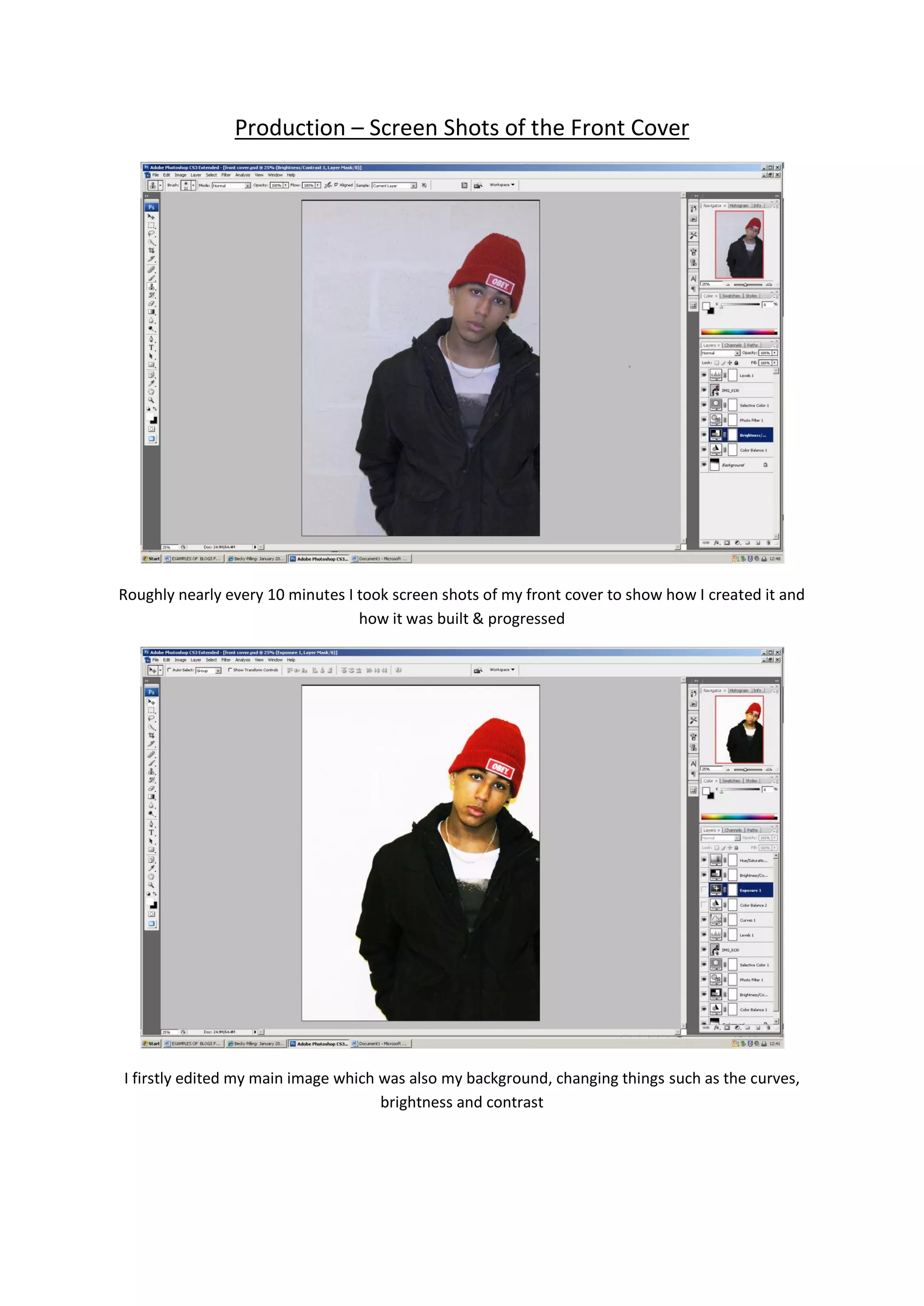
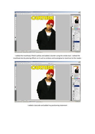
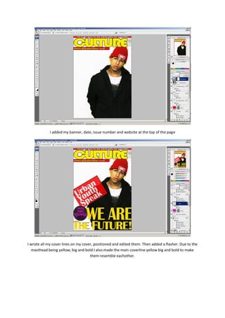
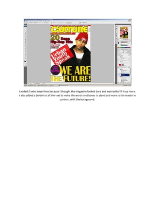
Production – Screen Shots of the Front Cover


Roughly nearly every 10 minutes I took screen shots of my front cover to show how I created it and
                                  how it was built & progressed


I firstly edited my main image which was also my background, changing things such as the curves,
                                     brightness and contrast
I added the masthead, filled it yellow and added a border using the stroke tool. I edited the
masthead also by placing effects on it such as emboss and outerglow to stand out to the reader.


                    I added a barcode and added my positioning statement
I added my banner, date, issue number and website at the top of the page


I wrote all my cover lines on my cover, positioned and edited them. Then added a flasher. Due to the
   masthead being yellow, big and bold I also made the main coverline yellow big and bold to make
                                     them resemble eachother.
I added 2 extra coverlines because I thought the magazine looked bare and wanted to fill it up more.
I also added a border to all the text to make the words and boxes to stand out more to the reader in
                                     contrast with the background.

Production front cover

  • 1.
    Production – ScreenShots of the Front Cover Roughly nearly every 10 minutes I took screen shots of my front cover to show how I created it and how it was built & progressed I firstly edited my main image which was also my background, changing things such as the curves, brightness and contrast
  • 2.
    I added themasthead, filled it yellow and added a border using the stroke tool. I edited the masthead also by placing effects on it such as emboss and outerglow to stand out to the reader. I added a barcode and added my positioning statement
  • 3.
    I added mybanner, date, issue number and website at the top of the page I wrote all my cover lines on my cover, positioned and edited them. Then added a flasher. Due to the masthead being yellow, big and bold I also made the main coverline yellow big and bold to make them resemble eachother.
  • 4.
    I added 2extra coverlines because I thought the magazine looked bare and wanted to fill it up more. I also added a border to all the text to make the words and boxes to stand out more to the reader in contrast with the background.