Annotations of school magazine
•Download as PPTX, PDF•
1 like•243 views

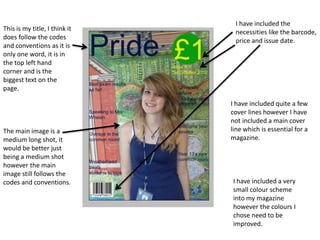
This document summarizes a magazine cover design project. It includes the title at the top left in the largest text, and includes necessities like the barcode and price. However, it is missing a main cover line. The main image follows conventions but could be cropped closer. While it includes a small color scheme and sections the contents page appropriately, the author notes improvements could be made to the colors and making the section headings stand out more.

Recommended
More Related Content
What's hot
What's hot (19)
Viewers also liked
Viewers also liked (18)
Similar to Annotations of school magazine
Similar to Annotations of school magazine (20)
More from Sarah Hanna
More from Sarah Hanna (20)
Annotations of school magazine
- 1. I have included the This is my title, I think it necessities like the barcode, does follow the codes price and issue date. and conventions as it is only one word, it is in the top left hand corner and is the biggest text on the page. I have included quite a few cover lines however I have not included a main cover The main image is a line which is essential for a medium long shot, it magazine. would be better just being a medium shot however the main image still follows the codes and conventions. I have included a very small colour scheme into my magazine however the colours I chose need to be improved.
- 2. I have included my title of my magazine onto my contents page as many magazines include this. I have sectioned my contents page into two headings, ‘Features’ and ‘Every Issue’. This is a code and I have included convention and I images that link to have followed it my articles however I well but in the do need to add more future I need to images onto my make these contents page to headings stand make it more out. interesting.