2. 2
Table of Contents
Introduction 3
Industry Ideation 4
What’s in a Name (And Mission Statement)? 4
Symbols, Symbols... and 98 More Symbols 5
More Than Just a Typeface 7
Refine, Refine, Refine 9
E(Merging) into an Identity 10
Creating a Stationary 11
Website...Times 3 14
Putting it all Together 16
Conclusion 17
3. 3
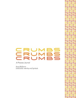
Project Overview
Over the course of the Fall 2017 semester, I developed and refined my own
brand. The purpose of this assignment, part of the Identity and Symbols course
at the University of Minnesota, was to create a brand from the beginning. As
a student, developing a brand was a new aspect of design that I had not yet
explored , and I found this opportunity to be exciting and a challenge I looked
forward to.
To begin the semester, ideation of a brand name and a mission statement took
place. From this exercise, I learned the importance of mission statements and
how to begin building a brand using a mission statement and objectives that I
want elements of my brand to achieve. With the name, Crumbs, and a mission
statement, ideation of symbols and logotypes began.
To find a symbol and logotype that matched my brand and embodied my mission,
ideation was integral to the semester. A major takeaway from ideation was learn-
ing to evaluate numerous ideas and think beyond the expected. Through ide-
ation, ideas were narrowed down to a final logotype and symbol, which could be
used to expand th e brand further.
For my own identity, I chose to work with only a logotype as I thought it solidified
my brand the best and allowed for the most exploration. After the choosing my
logotype, I expanded my brand to paper choice, color palettes, patterns, and
home pages for websites. With the addition of all these added elements, the
brand became an original identity that needed guidelines.
The final aspect of the assignment was to create a brand guideline book to describe
the brand in detail and display how the identity was to be used in the future. Overall,
this assignment expanded my appreciation as a designer for brand development,
and gave me a deeper sense of understanding for identity development.
5. 5
Concept Sketches
Symbols are important elements that can provide context to the mission of the
identity as well as the industry that the identity belongs to. For my exploration,
I wanted to try a variety of facets that a symbol could embody. For a cooking a
bake ware line, there were many directions that a symbol could go into. I ex-
plored kitchen symbols, animal symbols, food symbols, and other random ob-
jects I thought could evolve to embody my brand. In the process of ideation, 100
symbols were hand drawn, and eventually refined to ten symbols that could be
explored further.
Symbols, Symbols ...and 98
More Symbols
6. 6
Symbols, Symbols ...and 98
More Symbols
Refinements
Final 3 Concepts
Concept one
Concept two
Concept three
7. 7
More Than Just a Typeface
Concept Sketches
Developing a logotype could have taken many directions. To begin the process,
I could have either hand drawn my 50 sketches, used illustrator, or did a blended
variation. I chose to start with hand drawn sketches. I wanted to be able to build
my logotype and create an original logotype. Once I sketched, I narrowed my fa-
vorite down to ten ideas that could be refined and expanded upon. From the ten
ideas, I further narrowed down to three final concepts that were built in illustrator.
9. 9
Logotype Final Refinements
Symbol Final Refinements
Refine, Refine, Refine
Once I had a variety of symbols and logotypes, I refined each identity further. At
this point, all ideas were still separate identities and all could be taken in a dif-
ferent direction. The purpose of this was to maintain ideation and exploration of
our identities, and not create an identity without exploring options. After refining
heavily, three logotypes and three symbols were submitted. From there, these
ideas could be merged into one idea, or one logotype could be explored, or just
a symbol.
10. 10
E(Merging) into an Identity
After spending about half a semester ideating, creating, refining, and finalizing a
logotype and a symbol, the next phase of the assignment began. This phase was
the identity portion of the class, and the half in which I learned how the applica-
tion of an identity can dictate the successfulness of a brand.
This phase began with a choice. I could utilize both a logotype and symbol, one
or the other, or I could start from scratch. I initially wanted to use my structured
logotype as well as my pyramid symbol, but quickly realized that my brand would
be much more successful without a symbol and finding a strong, unique way to
utilize just my logotype was the best direction to move forward with.
After this decision came learning about important aspects to consider when fur-
ther developing a brand. These aspects included, but were not limited to: sta-
tionary, color palette, extended color palette, paper quality, web specifications,
pattern usage, and brand standards.
With the knowledge of how to proceed with creating an identity, the rest of the
semester was dedicated to actualizing an identity that embodied my goals and
mission statement from the beginning of the semester.
11. 11
Creating a Stationary
Concept Sketches
Once I decided to move forward with my logotype, developing a stationary sys-
tem became the next phase in the assignment. For this assignment, I was to
create an envelope, business card, and letterhead that emulated the brand and
identity I thought best matched my original mission statement. In this phase, like
previous ones, ideation and conceptualizing became important, as well as creat-
ing a mood that emulated the brand. From ideation came creation of stationary.
From ideas and mood boards, I was able to create a stationary set I believed to
be durable, versatile, and inviting.
13. 13
Creating a Stationary
Ideation and Revision
Final Stationary
Abbigail Brokaw
525 8th Avenue Southeast
Minneapolis, MN 55414
Dear Ms. Brokaw,
Lorem ipsum dolor sit amet, consectetuer adipiscing elit, sed
diam nonummy nibh euismod tincidunt ut laoreet dolore magna
aliquam erat volutpat. Ut wisi enim ad minim veniam, quis nos-
trud exerci tation ullamcorper suscipit lobortis nisl ut aliquip ex
ea commodo consequat. Duis autem vel eum iriure dolor in
hendrerit in vulputate velit esse molestie consequat, vel illum
dolore eu feugiat nulla facilisis at vero eros et accumsan et iusto
odio dignissim qui blandit praesent luptatum zzril delenit augue
duis dolore te feugait nulla facilisi.
Lorem ipsum dolor sit amet, cons ectetuer adipiscing elit, sed
diam nonummy nibh euismod tincidunt ut laoreet dolore magna
aliquam erat volutpat. Ut wisi enim ad minim veniam, quis nos-
trud exerci tation ullamcorper suscipit lobortis nisl ut aliquip ex
ea commodo consequat.
Lorem ipsum dolor sit amet, consectetuer adipiscing elit, sed
diam nonummy nibh euismod tincidunt ut laoreet dolore magna
aliquam erat volutpat. Ut wisi enim ad minim veniam, quis nos-
trud exerci tation ullamcorper suscipit lobortis nisl ut aliquip ex
ea commodo consequat. Duis autem vel eum iriure dolor in
hendrerit in vulputate velit esse molestie consequat, vel illum
dolore eu feugiat nulla facilisis at vero eros et accumsan et iusto
odio dignissim qui blandit praesent luptatum zzril delenit augue
duis dolore te feugait nulla facilisi.
Sincerely,
Anna McKenna
Anna McKenna
VP of Product Testing
612.634.7577
amckenna@crumbs.org
Anna McKenna
VP of Product Testing
612.634.7577
amckenna@crumbs.org
Anna McKenna
VP of Product Testing
612.634.7577
amckenna@crumbs.org
1122 University Ave.
Minneapolis, MN 55455
14. 14
Website...Times 3
As the CRUMBS identity developed further and elements of the brand emerged
implementing possible websites became another way to expand upon the brand.
The website was allowed to expand upon the established identity and utilize an
extended color palette, integrate images, and utilize new facets of the brand. For
my website, I wanted to create a space where imagery was the driving element of
the website. I wanted the website to be clean, inviting, and user-friendly exhibits
of my identity, while still maintaining the overall vibe of my brand.
Concept Sketches
15. 15
Website...Times 3
Image driven through a focal image
featuring a product. Navigation kept
simple to keep with a user-friendly
feeling with the design.
Focal image, utilizing human ap-
peal with a meal. Products featured
throughout the image to tie into the
brand. Color palette is used minimally,
and the brand is modernized the most
in this version.
Most interactive of the three versions.
This version integrates the most similar
elements found in the stationary, with
color usage, pattern usage, and logo-
type usage. Still image driven, but ex-
plores various aspects of the products
adding versatility to this version.
Version one
Version two
Version three
Final Iterations
16. 16
The final phase of the assignment was to create a brand standards guide that ef-
fectively explained all of the aspects of the brand that I had developed. This was
the culmination of the identity portion of the class. Layout was an important as-
pect to consider while designing this brand guide, while also including aspects of
my brand that were important to include when applying the brand in the future.
For my guide, I kept a simple layout, utilizing my color palette and a simple two
panel grid. For my guidelines, I included the following: the construction and
usage of the logotype, the typeface system, color palette, pattern usage, paper
choice, and imagery usage.
The brand manual was the hardest part of this assignment. The manual was a
piece of culmination for the assignment, meaning there had to be a finality to
the assignment which was very hard to have as a realization after working on it
for an entire semester.
Putting it all together: A Brand
Manual
Sample Page Cover Page
17. 17
Conclusion
The transformation of my brand, CRUMBS, from the beginning of the semester
to the end of the semester has been quite a process. I have gained a lot of under-
standing of all the elements that are necessary to build an identity, and gained
a greater sense of respect for all the work that goes into building a cohesive,
unique brand.
In design, as always, the outcome I create is never truly finished. I am pleased
with the progress I have made over the course of the semester and the final
product I created. I have learned a lot about my style as a designer and elements
that I find aesthetically pleasing, but I also learned that there is always room for
improvement and further ex