Report
Share

Recommended
Poster powerpoint
This document discusses the design process for a promotional poster for a new artist's album. The initial photo was selected to highlight the artist's sophisticated style. A red bar was added to draw the eye and make space for other elements. The iconic logo was positioned in the middle to identify the artist. Then, the album title was placed under the logo in a different color with lines on either side. Finally, additional photos, website links, a magazine quote and rating were included to complete the poster.
Printscreen Powerpoint
The document discusses the design process for a magazine cover. The creator used a "Cut Out" filter on the main image to make it look like a painting and convey that the model is passionate about soul music. Gold was chosen as the main color scheme to represent wealth and maturity. Additional elements like the masthead, cover line, cell lines for artist interviews, and issue details were added and their colors, fonts, and effects were adjusted to make sure each element stood out clearly against the image without clashing. The final design uses a black, white, and yellow color scheme.
Series of photo shoot images for ancillary tasks
The document contains a series of photo-shoot images intended for ancillary tasks. The images were taken as part of a photo-shoot and seem to be outtakes or behind-the-scenes pictures rather than the main promotional photos. In summary, the document holds supplementary photo images from a photo-shoot not meant for primary promotional use.
Printscreen Powerpoint 2
1) The document describes the process of designing a contents page for a magazine, beginning with creating a yellow rectangle as a masthead.
2) An editor's invoice is added in the corner in a small font.
3) The author considers adding a "Regulars box" but decides against it to make room for more pictures.
4) A large main image is centered on the page but then moved to the right side, though this created alignment issues, so it was moved back to the center.
Media Technologies
The document summarizes the tools and software the author used to create a magazine as part of a course. It describes using a blog to upload pictures, audio, and video and learning how to embed these media types. It also discusses using Adobe Audition to edit audio recordings, Adobe Photoshop to edit photos and design pages, Microsoft Word to write articles, Microsoft PowerPoint for presentations, Microsoft Excel to create charts, and the author's mobile phone to take and edit photos when Photoshop was unavailable. The author gained experience with these tools over the course of the magazine production.
Question 2
The magazine represents an indie audience that enjoys trendy but rough fashion, attending live music gigs, and socializing. Photographs in the magazine feature models that fit this target audience and their generally subdued facial expressions. The text uses slang terms indie fans would recognize to engage them, and photos include props like guitars that are fashion statements within indie culture and represent the music genre central to the audience.
Portfolio Presentation
The document summarizes the author's skills including web design using Adobe Dreamweaver, video editing with Adobe Premiere Pro, image manipulation with Adobe Photoshop and Adobe Illustrator, music production using Mixcraft5, photography, artworks from years 11-12 of school, video editing since year 10, and drumming. Links are provided to examples of anime music videos edited by the author on YouTube.
Final cd ancillary tasks
This document discusses the design process for a CD cover and inserts. Several logo and image designs were rejected before finalizing the cover, which features the artist framed by Tower Bridge in grayscale with color only on the artist. The back cover similarly features the artist in color on a black and white background. The inserts include lyrics and dedications pages that continue featuring the artist alone in various poses to maintain consistency and sex appeal across the release.
Production diary
John Okello kept a production diary documenting his work on an advanced production course project over several months. He worked in a group to research music videos, develop a questionnaire, film interviews, storyboard and film scenes, edit footage, and complete a music video by adding visual effects and rendering the final cut. They faced challenges like performers cancelling and technical issues, but completed shooting and editing to finish the project by presenting the final video.
Question 4
The document describes the various new media technologies used at different stages of developing a music video. Adobe Premiere Pro was the main software used for editing video clips, adding transitions, color correction, and titles. Adobe Photoshop was used to edit photos and create logos. Websites like Unsigned.com and MySpace were used in the planning stage to find an artist, and YouTube to upload videos. Microsoft Word and Excel were used to create questionnaires and analyze results. PowerPoint and SlideShare were used to organize and present work. A camera, tripod, and green screen equipment were used to film footage.
Question2
The document discusses how effectively the main music video product and accompanying ancillary texts of a poster and CD cover were designed to promote an artist. Key points made include:
- Costume, props, and locations were kept consistent between the products to clearly link them and position the artist as a mainstream city musician.
- Font, logo, and color scheme choices were made to represent the artist as their own recognizable brand across all products.
- Locations in and around London were used to portray the artist as both emotionally deep but also modern and urban.
- Color, especially red, was used consistently to imply themes of passion and strength within the artist's relationship and music.
Question2
The document discusses how consistency across ancillary products like posters and CD covers can help promote a music artist. It analyzes how the group created consistency in the costume, typography/logo, representation of the artist, use of colors, and locations featured between the music video and ancillary materials for their artist. This consistency helped convey the artist as an introspective yet masculine R&B star and make all the products easy for audiences to associate with one another and the artist's brand.
Music videoscreenshots
This document provides descriptions of scenes and techniques used in editing a music video. It explains how split screens were used to show closeness between characters, and how green screen footage of dancers was edited to make it appear like there were backup dancers through duplication and opacity adjustments. It also describes how color isolation was used to make a character in red stand out at a mock night club scene, and how overlaying two video clips at different opacities highlighted the closeness of the characters. Backgrounds were designed in Illustrator and various camera shots and locations were used to tell the story and relationship between the main characters.
Poster powerpoint
This document discusses the design process for a promotional poster for a new artist's album. The initial photo was selected to highlight the artist's sophisticated style. A red bar was added to draw the eye and make space for other elements. The iconic logo was positioned in the middle to identify the artist. Finally, additional photos, text, and ratings were included to provide more information and make the poster appealing to its target audience.
Untitled Presentation
The document outlines costumes and equipment for an R&B music video. It describes casual mens clothing for the male performers and a red dress for the main female performer to signify love and lust. A video camera will be used to record footage and mounted on a tripod to keep shots steady. When not in the red dress, the female is to wear casual clothing like the males, but incorporating the color red to maintain her character.
Mediapowerpoint
The document discusses the results of a survey conducted to help determine preferences for a music video. Responses were collected from 40 people ranging in age from 17 to older. The survey found that most people preferred if a music video included a mixture of different styles to appeal to a wide audience. Social media sites like YouTube and Facebook were considered the best places to broadcast a music video to allow other users to share it. The most popular music genres identified were R&B and hip hop.
Lyric analysis for singnature
The document analyzes the lyrics of the song "Rite on Time" by Singnature. It describes the guy in the song being struck by a beautiful woman and wanting to know her. He promises to always be there for her and wants to show her how he feels deep inside. Throughout the song, he tries to convince her to come home with him by telling her how he can please her and give her everything she needs. He pleads for a chance to be with her and promises to never make her sad. The overall concept is a guy trying to woo a girl and ask her out by emphasizing how much he cares for her.
Representation
This document discusses representing different audiences in magazine photography. It first talks about representing young people by featuring young artists in casual clothing doing typical youth activities like hanging out in parks. It then discusses representing musicians by showing them fully immersed in their music without looking at the camera. The third part addresses representing a mature audience by using formal language without slang in articles and keeping the page simple with one picture and text for older audiences who want straight information.
Progression
The document summarizes the progress made on different elements of a magazine from preliminary to final versions. It describes improvements made to the front page, contents page, and main article in terms of design, layout, use of images and text, and overall communication to the intended audience. The conclusion recognizes skills developed in attracting the target readership through effective use of typography, images, and magazine conventions learned through genre analysis.
Printscreen Powerpoint 3
1) The document describes the process of designing a contents page for a magazine, beginning with creating a yellow rectangle as a masthead.
2) An editor's invoice is added in the corner in a small font.
3) The author considers adding a "Regulars box" but decides against it to make room for more pictures.
4) A large main image is centered on the page to promote the featured artist, but is later moved to the right side for layout reasons.
Printscreen Powerpoint 2
1) The document describes the process of designing a contents page for a magazine, beginning with creating a yellow rectangle as a masthead.
2) An editor's invoice is added in the corner in a small font.
3) The author considers adding a "Regulars box" but decides against it to make room for more pictures.
4) A large main image is centered on the page but then moved to the right side, though this looks unbalanced, so it is moved back to center with a grey margin added.
Printscreen Powerpoint 2
1) The document describes the process of designing a contents page for a magazine, beginning with creating a yellow rectangle as a masthead.
2) An editor's invoice is added in the corner in a small font.
3) The author considers adding a "Regulars box" but decides against it to make room for more pictures.
4) A large main image is centered on the page to promote the featured artist, but is later moved to the right side for better layout.
Printscreen Powerpoint 2
1) The document describes the process of designing a contents page for a magazine, beginning with creating a yellow rectangle as a masthead.
2) An editor's invoice is added in the corner in a small font.
3) The author considers adding a "Regulars box" but decides against it to make room for more pictures.
4) A large main image is centered on the page but then moved to the right side, though this looks unbalanced, so it is moved back to center with a grey margin added.
Printscreen Powerpoint 2
1) The document describes the process of designing a contents page for a magazine.
2) A yellow rectangle was used as a masthead, and images and text were positioned and repositioned to create balance and parallel layout.
3) Additional elements like regular features boxes and banners were considered but ultimately removed for space reasons.
Printscreen Powerpoint 2
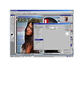
By adjusting the Colour Picker to yellow, the document creator used the rectangle tool to make a box shape as the contents page masthead. This masthead would be big, eye-catching and stylish, similar to another magazine's masthead. The creator kept the masthead font black to stay consistent with the colour scheme and added the date in a lighter colour for clarity.
The creator then added an Editor's Invoice in a small corner font. An image of the main artist focus was added and initially positioned on the left, but issues arose so it was moved to the right instead, though problems remained. Positioning it back to the left left wasted space, so a grey banner was added to make elements more
More Related Content
More from Kero00
Production diary
John Okello kept a production diary documenting his work on an advanced production course project over several months. He worked in a group to research music videos, develop a questionnaire, film interviews, storyboard and film scenes, edit footage, and complete a music video by adding visual effects and rendering the final cut. They faced challenges like performers cancelling and technical issues, but completed shooting and editing to finish the project by presenting the final video.
Question 4
The document describes the various new media technologies used at different stages of developing a music video. Adobe Premiere Pro was the main software used for editing video clips, adding transitions, color correction, and titles. Adobe Photoshop was used to edit photos and create logos. Websites like Unsigned.com and MySpace were used in the planning stage to find an artist, and YouTube to upload videos. Microsoft Word and Excel were used to create questionnaires and analyze results. PowerPoint and SlideShare were used to organize and present work. A camera, tripod, and green screen equipment were used to film footage.
Question2
The document discusses how effectively the main music video product and accompanying ancillary texts of a poster and CD cover were designed to promote an artist. Key points made include:
- Costume, props, and locations were kept consistent between the products to clearly link them and position the artist as a mainstream city musician.
- Font, logo, and color scheme choices were made to represent the artist as their own recognizable brand across all products.
- Locations in and around London were used to portray the artist as both emotionally deep but also modern and urban.
- Color, especially red, was used consistently to imply themes of passion and strength within the artist's relationship and music.
Question2
The document discusses how consistency across ancillary products like posters and CD covers can help promote a music artist. It analyzes how the group created consistency in the costume, typography/logo, representation of the artist, use of colors, and locations featured between the music video and ancillary materials for their artist. This consistency helped convey the artist as an introspective yet masculine R&B star and make all the products easy for audiences to associate with one another and the artist's brand.
Music videoscreenshots
This document provides descriptions of scenes and techniques used in editing a music video. It explains how split screens were used to show closeness between characters, and how green screen footage of dancers was edited to make it appear like there were backup dancers through duplication and opacity adjustments. It also describes how color isolation was used to make a character in red stand out at a mock night club scene, and how overlaying two video clips at different opacities highlighted the closeness of the characters. Backgrounds were designed in Illustrator and various camera shots and locations were used to tell the story and relationship between the main characters.
Poster powerpoint
This document discusses the design process for a promotional poster for a new artist's album. The initial photo was selected to highlight the artist's sophisticated style. A red bar was added to draw the eye and make space for other elements. The iconic logo was positioned in the middle to identify the artist. Finally, additional photos, text, and ratings were included to provide more information and make the poster appealing to its target audience.
Untitled Presentation
The document outlines costumes and equipment for an R&B music video. It describes casual mens clothing for the male performers and a red dress for the main female performer to signify love and lust. A video camera will be used to record footage and mounted on a tripod to keep shots steady. When not in the red dress, the female is to wear casual clothing like the males, but incorporating the color red to maintain her character.
Mediapowerpoint
The document discusses the results of a survey conducted to help determine preferences for a music video. Responses were collected from 40 people ranging in age from 17 to older. The survey found that most people preferred if a music video included a mixture of different styles to appeal to a wide audience. Social media sites like YouTube and Facebook were considered the best places to broadcast a music video to allow other users to share it. The most popular music genres identified were R&B and hip hop.
Lyric analysis for singnature
The document analyzes the lyrics of the song "Rite on Time" by Singnature. It describes the guy in the song being struck by a beautiful woman and wanting to know her. He promises to always be there for her and wants to show her how he feels deep inside. Throughout the song, he tries to convince her to come home with him by telling her how he can please her and give her everything she needs. He pleads for a chance to be with her and promises to never make her sad. The overall concept is a guy trying to woo a girl and ask her out by emphasizing how much he cares for her.
Representation
This document discusses representing different audiences in magazine photography. It first talks about representing young people by featuring young artists in casual clothing doing typical youth activities like hanging out in parks. It then discusses representing musicians by showing them fully immersed in their music without looking at the camera. The third part addresses representing a mature audience by using formal language without slang in articles and keeping the page simple with one picture and text for older audiences who want straight information.
Progression
The document summarizes the progress made on different elements of a magazine from preliminary to final versions. It describes improvements made to the front page, contents page, and main article in terms of design, layout, use of images and text, and overall communication to the intended audience. The conclusion recognizes skills developed in attracting the target readership through effective use of typography, images, and magazine conventions learned through genre analysis.
Printscreen Powerpoint 3
1) The document describes the process of designing a contents page for a magazine, beginning with creating a yellow rectangle as a masthead.
2) An editor's invoice is added in the corner in a small font.
3) The author considers adding a "Regulars box" but decides against it to make room for more pictures.
4) A large main image is centered on the page to promote the featured artist, but is later moved to the right side for layout reasons.
Printscreen Powerpoint 2
1) The document describes the process of designing a contents page for a magazine, beginning with creating a yellow rectangle as a masthead.
2) An editor's invoice is added in the corner in a small font.
3) The author considers adding a "Regulars box" but decides against it to make room for more pictures.
4) A large main image is centered on the page but then moved to the right side, though this looks unbalanced, so it is moved back to center with a grey margin added.
Printscreen Powerpoint 2
1) The document describes the process of designing a contents page for a magazine, beginning with creating a yellow rectangle as a masthead.
2) An editor's invoice is added in the corner in a small font.
3) The author considers adding a "Regulars box" but decides against it to make room for more pictures.
4) A large main image is centered on the page to promote the featured artist, but is later moved to the right side for better layout.
Printscreen Powerpoint 2
1) The document describes the process of designing a contents page for a magazine, beginning with creating a yellow rectangle as a masthead.
2) An editor's invoice is added in the corner in a small font.
3) The author considers adding a "Regulars box" but decides against it to make room for more pictures.
4) A large main image is centered on the page to promote the featured artist, but is later moved to the right side for better layout.
Printscreen Powerpoint 2
1) The document describes the process of designing a contents page for a magazine, beginning with creating a yellow rectangle as a masthead.
2) An editor's invoice is added in the corner in a small font.
3) The author considers adding a "Regulars box" but decides against it to make room for more pictures.
4) A large main image is centered on the page but then moved to the right side, though this looks unbalanced, so it is moved back to center with a grey margin added.
Printscreen Powerpoint 2
1) The document describes the process of designing a contents page for a magazine.
2) A yellow rectangle was used as a masthead, and images and text were positioned and repositioned to create balance and parallel layout.
3) Additional elements like regular features boxes and banners were considered but ultimately removed for space reasons.
Printscreen Powerpoint 2
By adjusting the Colour Picker to yellow, the document creator used the rectangle tool to make a box shape as the contents page masthead. This masthead would be big, eye-catching and stylish, similar to another magazine's masthead. The creator kept the masthead font black to stay consistent with the colour scheme and added the date in a lighter colour for clarity.
The creator then added an Editor's Invoice in a small corner font. An image of the main artist focus was added and initially positioned on the left, but issues arose so it was moved to the right instead, though problems remained. Positioning it back to the left left wasted space, so a grey banner was added to make elements more