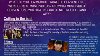
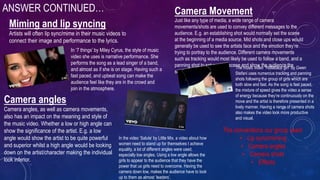
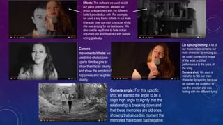
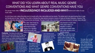
1. IN WHAT WAYS DOES YOUR MEDIA
PRODUCT USE, DEVELOP OR
CHALLENGE FORMS AND
CONVENTIONS OF REAL MEDIA
PRODUCTS?
2. Cutting to the beat
Music videos tend to be edited so that each clip changes at the time of the beat of the song. A ‘cut’ transition is
generally used to make sure it matches the beat, and the technique can create a visually pleasing music video as a
rhythm for the cuts would be established.
WHAT DID YOU LEARN ABOUT WHAT THE CONVENTIONS
WERE OF REAL MUSIC VIDEOS? AND WHAT MUSIC VIDEO
CONVENTIONS YOU HAVE INCLUDED / NOT INCLUDED AND
WHY?
‘Wings’ by little mix is a perfect example of this convention, as the video
cuts to the beat of the song the majority of the time, as well as including
all 4 girls in every shot.
Effects
Having visual effects adds more of a narrative story and creates more of
an exciting feel for the video. The audience would be generally interested
in the technology behind the effects however mainly it keeps the
audience interested in the video. Due to music videos having the freedom
of expression, they often been the basis of experimenting with new visual
effects, especially in the early days of CGI.
‘We made it’ by Eminem uses many visual
effects e.g. a green screen when Eminem
is singing through fire. He also uses effects
represented by the Star Trek reference he
was trying to convey. Effects keeps the
audience intrigued and wanting more so
they continue watching the video, and
maybe more of his videos so see if he uses
effects in them too.
3. ANSWER CONTINUED…
Miming and lip syncing
Artists will often lip sync/mime in their music videos to
connect their image and performance to the lyrics.
In ‘7 things’ by Miley Cyrus, the style of music
video she uses is narrative performance. She
performs the song as a lead singer of a band,
and almost as if she is on stage. Having such a
fast paced, and upbeat song can make the
audience feel like they are in the crowd and
join in the atmosphere.
Camera Movement
Just like any type of media, a wide range of camera
movements/shots are used to convey different messages to the
audience. E.g. an establishing shot would normally set the scene
at the beginning of a media source. Mid shots and close ups would
generally be used to see the artists face and the emotion they’re
trying to portray to the audience. Different camera movements
such as tracking would most likely be used to follow a band, and a
panning shot to set another scene and show the audience the
surroundings.
The music video “Hollaback girl” by Gwen
Stefani uses numerous tracking and panning
shots following the group of girls which are
both slow and fast. As the song is fast paced,
the mixture of speed gives the video a sense
of energy because they’re continuously on the
move and the artist is therefore presented in a
lively manner. Having a range of camera shots
also makes the video look more productive
and visual.
Camera angles
Camera angles, as well as camera movements,
also has an impact on the meaning and style of
the music video. Whether a low or high angle can
show the significance of the artist. E.g. a low
angle would show the artist to be quite powerful
and superior whilst a high angle would be looking
down on the artist/character making the individual
look inferior.
In the video ‘Salute’ by Little Mix, a video about how
women need to stand up for themselves t achieve
equality, a lot of different angles were used,
especially low angles. Using a low angle allows the
girls to appear to the audience that they have the
power that us girls need to overcome. Having the
camera down low, makes the audience have to look
up to them as almost ‘leaders’.
The conventions our group used:
• Lip sync/miming
• Camera angles
• Camera shots
• Effects
4. Effects: The software we used to edit
our piece, premier pro, allowed our
group to experiment with the different
tools it provided us with. For example,
we used a key frame to fade in our male
character over our main character whilst
she was singing for our last scene. We
also used a key frame to fade out an
argument clip and replace it with Natalie
crying gradually.
Camera
movements/shots: we
used mid-shots/close-
ups to film the girls to
show their faces clearly
and show the emotion of
happiness and laughter
clearly.
Lip syncing/miming: A lot of
our music video contains our
main character lip syncing so
we could connect the image
of the artist and their
performance to the lyrics of
the song.
Camera shot: We used a
mid-shot to film our main
character lip syncing because
we wanted the audience to
see the emotion she was
feeling with the different lyrics.Camera angle: For this specific
shot we wanted the angle to be a
slight high angle to signify that the
relationship is breaking down and
that these memories are old ones,
showing that since this moment the
memories have been bad/negative.
5. Our groups music video ‘If I Were A Boy’ by Beyonce is a pop music video, so I looked specifically into the conventions and codes of a pop
music video.
In a lot of pop music videos the artists tend to be girls with a few male artists and boy bands. The artists tend to be good-looking from a male
and female point of view. Typically, if the artist is a female the video tends to include a mixture of male and female characters, however if the
artist is male then stereotypically the performers are female. The type if music video (narrative, performance based or concept video) will also
affect the kind of performers used.The video ‘Dark Horse’ by
Katy Perry consists of a
performance by Katy
singing. It’s a narrative
performance with both
males and females included.
One direction’s music video
‘that’s what makes you
beautiful’ is mainly a
performance based video
with a little narrative when
females appear.
WHAT DID YOU LEARN ABOUT REAL MUSIC GENRE
CONVENTIONS AND WHAT GENRE CONVENTIONS HAVE YOU
INCLUDED/NOT INCLUDED AND WHY?
Costume: The clothes the artist wears
depends on their personality and the image they
want to present. The typical clothes tend to be
vibrant colours and maybe something unique e.g.
Lady Gaga and Michael Jackson. Fashion is
important to pop stars to promote their image.Michael Jackson is wearing
a vibrant red outfit in his
music video thriller, this
makes him stand out in his
video. He is an artist that
defines himself through his
clothes and uses them to
express how he feels.
Nicki Minaj is very
extravagance when it
comes to her style.
She wears very vibrant
clothes to represent
her upbeat personality.
Justin Timberlake almost
subverts the conventions of a
typical pop artist, wearing
suits and jackets. He is well
presented and defines
himself through his smart
clothing.
Lighting: The lighting is usually
the same within each music video
whether male or female; high key
natural and un-natural lighting. This
lighting is used to present a positive
vibe and encourage the audience to
buy the music.
The video ‘Burn’ by Ellie
Goulding uses a lot of
high key lighting. In the
video natural lighting is
used throughout but has
been enhanced by tools
to make it more
dynamic.
6. ANDREW GOODWIN'S
THEORYAndrew Goodwin explains his theory by six
conventions:
• A relationship between the lyrics and visuals
• Thought beats
• Genre related style and iconography present
• Close ups
• Voyeurism
• Intertextual references to other media texts
Copy of Andrew Goodwin's Music Video Theory
A relationship between the lyrics and
visuals
This convention demonstrates how Goodwin noticed a music
videos visuals either had a similarity or direct contrast to the lyrics
of the song.
In Price Tag by Jessie J, the
visuals do not match the lyrics of
the song. In the song it goes “its
not about the money” however
Jessie J is stood in front of a tree
with money, and her fashion
sense/accessories suggests
money is not a problem for her.
This shows that the visuals and
lyrics contrast in this section.
Adele's song ‘someone like
you’ relates the visuals and
lyrics together as when Adele
sings “for me, it isn’t over” she
is seen looking very emotional.
This provokes a empathetic
response from the audience.
Thought beats – the
relationship between the
music and the visuals
Goodwin proposed that the
visuals within a music video are
related to the lyrics/change in
pace of the song.An example of a music video that edited the clips in time to the pace/beat of
the song is Bounce by Calvin Harris.
Genre-related style and
iconography present
Goodwin noticed that most artists have a trend of
repeating certain actions within their music
videos as their ‘trademark’. This helps make the
songs recognisable due to its reoccurrence. The
‘trademark’ action represents the artist and is a
marketing strategy so the audience remember it.
Jason Derulo is an
example of this as he
normally has the
same/similar
choreography in his
upbeat songs so when
people think of him
they will also be
reminded of his
dancing style too.
Close up
A common feature for record labels is to use close
ups of the artists to show the artist throughout the
video. Normally with female artists they are
promoted in provocative angles to sexualise the
artist following the Laura Mulvey’s male gaze.
7. WHAT DID YOU LEARN ABOUT REAL DIGIPAK CONVENTIONS
AND WHAT DIGIPAK CONVENTIONS HAVE YOU
INCLUDED/NOT INCLUDED AND WHY?
Front: The image presented on the font usually
takes up the whole surface area to catch the
audiences eye. It is normally familiar to the
audience, either being from their music video or
an image with relevance to the song/artist.
Typically the front cover will have the artists
name and the title of the album on it. The titles
would most likely be in big, bold writing similar
to the colours of the themes and so they stand
out when on the shelves in stores. It will include
aspects of what the theme of the album is and
the genre. If the digipak is a single release then
there would normally be a track listing of the
song on the front to promote it with numerous
remixes/versions which attracts the audience to
Inside panels: The inside panels of the
digipak tends to link with the themes from the
front of the digipak so it is continuous
throughout the album. Sometimes there will
be a written piece from the artist which can
thank/greet the audience for buying the
album. It can also be featured in the hand out
booklet which can include the lyrics for people
to read. The booklet not only includes the
lyrics but can include numerous photographs
relating to the theme of the album.
Back: The back almost always includes the track list of the songs that are
being featured on the album. The list is usually placed on top of another
photo which links to the theme of the album again. The barcode will normally
be placed on the back of the digipak which allows customers to buy it.,
Another convention could be links to Facebook/Twitter/Instagram that could
help the albums promotions further.
The CD disc: The cd will either be designed very basically with one block colour still
following the theme of the album or feature an image/pattern that represents the
artist or album. It normally include the artist name and album to create fluency
throughout the product. The same font and colours would be used in order to keep
the style throughout.
On the front cover of my digipak I used
a picture of my main character that
took up the whole surface. I included
the artists and albums name to inform
the audiences with the details they
need. I made the theme of my digipak
black and white and followed this
theme with the titles as I used white
writing on quite a dark background to
contrast the two. I included the track
lists on the back of my digipak which is
placed on top of another photo of the
artist however I chose to leave this one
in colour so it made it more eye-
catching in contrast to the theme of
black and white. I didn’t include a
written piece from the artist in my
inside panels but I did have two photos
that were related to my theme. For my
CD disc I completed diverted from my
theme by using a photo of a sunset. I
didn’t use one block colour because I
didn’t want it to be too plain and
wanted to add a little bit of colour. It
features the artists name but not the
album as I wanted to keep it simple
and not full of information that I had
already placed on the front cover.
8. WHAT DID YOU LEARN ABOUT REALADVERT CONVENTIONS
AND WHAT ADVERT CONVENTIONS HAVE YOU
INCLUDED/NOT INCLUDED AND WHY?
Name of artist
The name of the artist is one of the main features
needed on an advert so the audience knows who's
album is being advertised and to buy. Normally it is
the main text that stands out on the poster with the
title of the album being next. I made the name of the
artist stick out the most on the advert to catch the
eye of the audience. If they liked this artist and saw
her name on the poster they would pay a lot of
attention to it. I made the writing big in a simple font
to make it easy to read if passing by.
Album single/name
Normally the title of the album would be the next
piece of text to catch the audiences eye. I
purposely put the album name underneath the
artists name because it would be the next thing
the audience would be looking at and wanting to
know. I advertised the no.1 single to notify the
audience that if they liked that song then there's
more to come in the album which might make
them more eager to buy it.
Release date
If the album isn’t released yet then usually you'll find a date on the
advert to notify the audience when they can buy the album
however if its already been released you will see ‘out now’. It also
gives a personal touch that encourages the fans to go listen to it. I
thought putting the release day the opposite side of the main
information so people don’t over look it and miss it. I feel like
putting it in the bottom right corner where there isn’t much
information would draw more attention to it after they’ve finished
looking elsewhere.
Review/Rating
Reviews are common when it comes to
adverts as they influence the audience to
purchase the album if it is highly rated.
With the advert I created I specifically
wanted to add a rating to encourage the
audience more to buy the album. with the
rating I also added a one word review to
contribute to the positivity about it.
Where to buy
Normally the advert will inform the audience where they
can buy the album. If the album is available for
download then it will be tell where it can be downloaded
e.g. itunes/spotify. I feel like I should've followed the
convention of telling the audience where they could buy
it because it would make it more easier and accessible
for the audience to get it. If they struggled to find it then
they might have not bothered to buy it after the hassle.
Websites
A website for the artist/label would be positioned
somewhere subtle on the poster for the audience to
visit if they’re interested. I didn’t want the website to
take up a lot of the poster because I feel like it wasn’t
such a necessity on the poster and want it to take too
much of the audiences attention away from the picture
and more important information surrounding it.