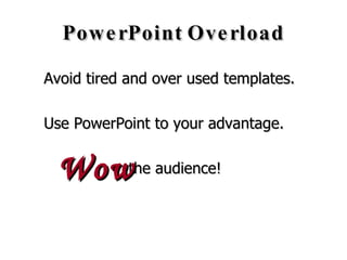
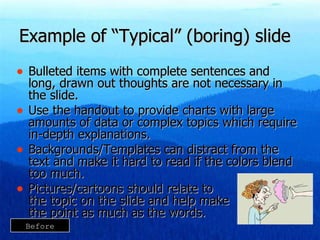
becci cantrell Presentation Skills
PowerPoint Overload Avoid tired and over used templates. Use PowerPoint to your advantage.  the audience! Wow
Example of “Typical” (boring) slide Bulleted items with complete sentences and long, drawn out thoughts are not necessary in the slide. Use the handout to provide charts with large amounts of data or complex topics which require in-depth explanations. Backgrounds/Templates can distract from the text and make it hard to read if the colors blend too much. Pictures/cartoons should relate to  the topic on the slide and help make  the point as much as the words. Before
Giving you the  pieces  of a  GREAT PRESENTATION!
Use pictures that blen d   with the slide design.
Before & After
Read the warning signs Using a script type font makes the presentation difficult to read from a distance. Many people feel using the same color background on every slide is important. There are also people who choose to use cartoon graphics and insist on putting one on every slide, whether it is needed or not! Before
Use an easy to read font.  Most common:  44 pt. for header  35 pt. for body Read the  warning signs After
Background color  relates to the image & message.  Color scheme is not required. Read the  warning signs After
Give your presentation a professional edge. Read the  warning signs After
Welcome to TOG We are glad you are here. We will help you be the best client representative possible. Before
Welcome to  TOG After
Always ask for payment in full (PIF)! Asking for payment in full will help you reach your bonus. The best way to reach resolution goals is to ask for PIF every time! Always follow the script and ask for PIF before you offer payment plan options. Before
_________________ Payment In Full! (PIF) Maximum  BONUS + Maximum  RESOLUTION After
Look for graphics that are unique.  Then, use them in unique ways. Before
Look for graphics that are unique.  Then use them  in unique ways. After
 
Make it   extraordinary!

Presentation Skills

  • 1.
  • 2.
    PowerPoint Overload Avoidtired and over used templates. Use PowerPoint to your advantage. the audience! Wow
  • 3.
    Example of “Typical”(boring) slide Bulleted items with complete sentences and long, drawn out thoughts are not necessary in the slide. Use the handout to provide charts with large amounts of data or complex topics which require in-depth explanations. Backgrounds/Templates can distract from the text and make it hard to read if the colors blend too much. Pictures/cartoons should relate to the topic on the slide and help make the point as much as the words. Before
  • 4.
    Giving you the pieces of a GREAT PRESENTATION!
  • 5.
    Use pictures thatblen d with the slide design.
  • 6.
  • 7.
    Read the warningsigns Using a script type font makes the presentation difficult to read from a distance. Many people feel using the same color background on every slide is important. There are also people who choose to use cartoon graphics and insist on putting one on every slide, whether it is needed or not! Before
  • 8.
    Use an easyto read font. Most common: 44 pt. for header 35 pt. for body Read the warning signs After
  • 9.
    Background color relates to the image & message. Color scheme is not required. Read the warning signs After
  • 10.
    Give your presentationa professional edge. Read the warning signs After
  • 11.
    Welcome to TOGWe are glad you are here. We will help you be the best client representative possible. Before
  • 12.
    Welcome to TOG After
  • 13.
    Always ask forpayment in full (PIF)! Asking for payment in full will help you reach your bonus. The best way to reach resolution goals is to ask for PIF every time! Always follow the script and ask for PIF before you offer payment plan options. Before
  • 14.
    _________________ Payment InFull! (PIF) Maximum BONUS + Maximum RESOLUTION After
  • 15.
    Look for graphicsthat are unique. Then, use them in unique ways. Before
  • 16.
    Look for graphicsthat are unique. Then use them in unique ways. After
  • 17.
  • 18.
    Make it extraordinary!

Editor's Notes

  • #3 The use of PowerPoint has become so prevalent that some organizations require outside presenters to use it during their presentation. Our audience is going into PowerPoint overload! The use of PowerPoint has become expected…but you don’t have to use the same tired, redundant templates that are everywhere. Even though it has become expected…but you don’t have to use the same tired, redundant templates that are everywhere. Use PowerPoint to add to your message, get the audience’s attention and add an element of entertainment to your presentation.
  • #4 Bulleted items with complete sentences and long, drawn out thoughts are not necessary in the slide. Use the handout to provide charts with large amounts of data or complex topics which require in-depth explanations. Backgrounds/Templates can distract from the text and make it hard to read if the colors blend too much. Pictures/cartoons should relate to the topic on the slide and help make the point as much as the words.
  • #6 Use pictures that will blend with the slide design, background and topic. Bullets are only used as needed. Be brief on slides.
  • #7 On the following slides you will see a slide design including background colors, fonts and clip arts commonly found in tired, old powerpoints across the US. Then, I will show you an example of an attention grabbing, professional slide with the same message…new and improved!
  • #8 Using a script type font makes the presentation difficult to read from a distance. Many people feel using the same color background on every slide is very important. There are also people who choose to use cartoon graphics and insist on putting one on every slide, whether it is needed or not! Make sure any graphics are kept in the proper proportions. Here the sign is shorter and wider than it is meant to be.
  • #9 Use a clear, easy to read font that is large enough to read from anywhere in the room. Most common: 44 pt. for header 35 pt. for body
  • #10 Use a background color that relates to the image & message. The slides do not all have to have the same color scheme.
  • #11 Choosing a photograph or realistic image gives the presentation a professional edge. Don’t be afraid of empty space on the slide.
  • #12 This certainly gets across the point of “Welcome to TOG” but the cartoon clip art make it seem basic and unprofessional. The sentences used in the bullets are not really appropriate for bullets.
  • #13 This slide also gets across the same message but it is much simpler. Using the photographs instead of cartoons and the people dressed in business suits makes the message much more professional while keeping it simple. Suggestions for finding pictures and templates that are unique: Use pictures you or your friends/family have taken. Take pictures in your office. Website suggestions: www.Presentationpro.com – free powerpoint templates, icons and pictures www.office.microsoft.com – clip art, pictures, sounds www.bigfoto.com - pictures www.bigstockphoto.com/download-free-photos.html - free pictures
  • #14 The point of this slide is to emphasize the importance of asking for PIF, however it’s message gets lost in all of the text. There is a lot to read, but not a lot to look at. The bullets are complete sentences which really don’t require bullets. And the background color makes the font at the top difficult to read. Bullets: Asking for payment in full will help you reach your bonus. The best way to reach resolution goals is to ask for PIF every time! Always follow the script and ask for PIF before you offer payment plan options.
  • #16 There is nothing unique about this cartoon man. The background color is just bad! It is so bright that it is hard to look at and it does not compliment the message of this slide.
  • #17 Taking the time to find unique graphics, like this one, will really pay off. While a picture of an apple could be boring, this version with the reflection and also the contrasting green leaf attached provides energy to the slide.
  • #18 This is the Birmingham Center Director, Stan Sims. His slogan, C5+PFU = Success has become the culture of the Birmingham office. Our office had a Pie-A-Leader fund raiser in November. The proceeds were used to purchase food baskets for needy families in our community.
  • #19 Make your presentation the one they will remember!