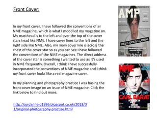
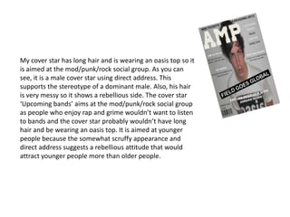
Jordan Field
Media Evaluation
G321
Question 1
In what ways does your media
product use, develop or
challenge forms and conventions
of real media products?
Front Cover:
In my front cover, I have followed the conventions of an
NME magazine, which is what I modelled my magazine on.
My masthead is to the left and over the top of the cover
stars head like NME. I have cover lines to the left and the
right side like NME. Also, my main cover line is across the
chest of the cover star so as you can see I have followed
the conventions of the NME magazines. The direct address
of the cover star is something I wanted to use as It’s used
in NME frequently. Overall, I think I have successfully
incorporated the conventions of NME magazine and I think
my front cover looks like a real magazine cover.
In my planning and photography practice I was basing the
front cover image on an issue of NME magazine. Click the
link below to find out more.
http://jordanfield1996.blogspot.co.uk/2013/0
1/original-photography-practise.html
Contents Page:
In my contents page, I haven’t followed the conventions of an
NME contents page. I have only included two pictures
whereas usual NME contents pages include 4 – 7 pictures. I
have done this so there is more space on the page and
doesn’t look as busy, hopefully then the reader would be
more attracted to read it all. If I could do it again I would
probably include 1 or 2 more pictures so it has more colour
and information. I like the way I have separated the different
information with lines so it looks more professional and
organised. I have included a YouTube channel and a URL for
the ‘AMP’ website, that is a convention I have followed
because it is something that would make the reader want to
investigate further into the magazine and find further
information.
DPS:
In my double page spread, I have followed some
conventions of a double page spread. The picture is on
the left hand side and the text is on the right. I have done
this because it is often used in magazines so my
magazine looks realistic. A section of the text is bigger
than the rest to highlight it and draw the reader in my
magazine, like it is used in the double page spread
underneath mine. I have done this so my magazine looks
real. Also, I have followed the convention that the first
letter is bigger than the rest of the text, again I have done
this so my magazine looks real.
Question 2
How does your media product
represent particular social groups?
My cover star has long hair and is wearing an oasis top so it
is aimed at the mod/punk/rock social group. As you can
see, it is a male cover star using direct address. This
supports the stereotype of a dominant male. Also, his hair
is very messy so it shows a rebellious side. The cover star
‘Upcoming bands’ aims at the mod/punk/rock social group
as people who enjoy rap and grime wouldn’t want to listen
to bands and the cover star probably wouldn’t have long
hair and be wearing an oasis top. It is aimed at younger
people because the somewhat scruffy appearance and
direct address suggests a rebellious attitude that would
attract younger people more than older people.
Question 3
What kind of media institution
might distribute your media
product and why?
http://www.bauermedia.co.uk/
My magazine would be distributed by a
company like Bauer media as it is a major
distributing company that publish
magazines such as ‘NME’ and ‘Q’ which my
magazine is relatively similar to.
Question 4
Who would your audience be for
your media product?
http://jordanfield1996.blogspot.co.uk/2012/1
1/target-audience-questionnaire.html
My target audience would be 15 – 25 year olds who enjoy
rock/indie/mod/punk music. It wouldn’t appeal to older people
because there is a rebellious attitude to the magazine and most of the
bands featured in my magazine are young and upcoming. NME
magazine is similar to mine and they appeal to the same audience, but
they occasionally have older artists in NME, I would use that in another
issue of my magazine if could carry the magazine on.
Question 5
How did you attract/address
your audience?
The grey and dull background colour makes
the reader focus on the cover star more and
gives an atmosphere of tension and trouble.
This helps to give off the rebellious attitude
I was going for. I also used the direct address
of the reader and the scruffiness to give off
a rebellious attitude that would attract
younger people. The exclusive would draw
the reader in so they can see what’s so
interesting about the interview. The
masthead ‘AMP’ appeals to my target
audience because bands use amps at their
gigs.
Question 6
What have you learnt about
technologies from the process of
constructing the product?
Blogger.com was a
simple process and it
was very easy to use.
The only problem was
that you can’t upload
something from word. I
liked using it because it
was an easy way to see
how your work is and
it’s an easy way to
regular upload your
work.
Blogger: Paint.net:
I didn’t use paint.net
because I found it really
difficult to use and I
couldn’t master it.
Using all of the
different layers at the
same time was too hard
for me and I couldn’t
use it.
Publisher:
I used publisher for
everything in the
magazine. It’s simple
and easy to use, there
are limitations to it
but my images didn’t
need much work done
to them so publisher
was a good piece of
software to use.
Question 7
Looking back to your preliminary
task, what do you feel that you have
learnt in the progression from it to
the full product?
As you can see I have come a long way from my preliminary
task. I have learnt how to put a masthead over the image
which makes it look a lot better. The cover lines are very basic
in the preliminary task and the main cover line colour doesn’t
look suitable. The barcode on my main task is a lot better than
the barcode in my preliminary task I learned how to make the
background of it transparent.
How successful do you feel your
end product is in fulfilling the
task? How well does it fit the
brief?
I think my product is successful in fulfilling the task. I think my front
cover looks like a real magazine front cover and my double page
spread looks like a real magazine double page spread. If I could do it
again I would work harder on my contents page and try and put 1 or
2 more pictures in to make it more colourful but other than that I
am happy.
After giving my first proof, I changed my contents page drastically
and I think it looks a lot better now because of it.
http://jordanfield1996.blogspot.co.uk/2013/02/first-proof.html

Presentation media

  • 1.
  • 2.
    Question 1 In whatways does your media product use, develop or challenge forms and conventions of real media products?
  • 3.
    Front Cover: In myfront cover, I have followed the conventions of an NME magazine, which is what I modelled my magazine on. My masthead is to the left and over the top of the cover stars head like NME. I have cover lines to the left and the right side like NME. Also, my main cover line is across the chest of the cover star so as you can see I have followed the conventions of the NME magazines. The direct address of the cover star is something I wanted to use as It’s used in NME frequently. Overall, I think I have successfully incorporated the conventions of NME magazine and I think my front cover looks like a real magazine cover. In my planning and photography practice I was basing the front cover image on an issue of NME magazine. Click the link below to find out more. http://jordanfield1996.blogspot.co.uk/2013/0 1/original-photography-practise.html
  • 4.
    Contents Page: In mycontents page, I haven’t followed the conventions of an NME contents page. I have only included two pictures whereas usual NME contents pages include 4 – 7 pictures. I have done this so there is more space on the page and doesn’t look as busy, hopefully then the reader would be more attracted to read it all. If I could do it again I would probably include 1 or 2 more pictures so it has more colour and information. I like the way I have separated the different information with lines so it looks more professional and organised. I have included a YouTube channel and a URL for the ‘AMP’ website, that is a convention I have followed because it is something that would make the reader want to investigate further into the magazine and find further information.
  • 5.
    DPS: In my doublepage spread, I have followed some conventions of a double page spread. The picture is on the left hand side and the text is on the right. I have done this because it is often used in magazines so my magazine looks realistic. A section of the text is bigger than the rest to highlight it and draw the reader in my magazine, like it is used in the double page spread underneath mine. I have done this so my magazine looks real. Also, I have followed the convention that the first letter is bigger than the rest of the text, again I have done this so my magazine looks real.
  • 6.
    Question 2 How doesyour media product represent particular social groups?
  • 7.
    My cover starhas long hair and is wearing an oasis top so it is aimed at the mod/punk/rock social group. As you can see, it is a male cover star using direct address. This supports the stereotype of a dominant male. Also, his hair is very messy so it shows a rebellious side. The cover star ‘Upcoming bands’ aims at the mod/punk/rock social group as people who enjoy rap and grime wouldn’t want to listen to bands and the cover star probably wouldn’t have long hair and be wearing an oasis top. It is aimed at younger people because the somewhat scruffy appearance and direct address suggests a rebellious attitude that would attract younger people more than older people.
  • 8.
    Question 3 What kindof media institution might distribute your media product and why?
  • 9.
    http://www.bauermedia.co.uk/ My magazine wouldbe distributed by a company like Bauer media as it is a major distributing company that publish magazines such as ‘NME’ and ‘Q’ which my magazine is relatively similar to.
  • 10.
    Question 4 Who wouldyour audience be for your media product?
  • 11.
    http://jordanfield1996.blogspot.co.uk/2012/1 1/target-audience-questionnaire.html My target audiencewould be 15 – 25 year olds who enjoy rock/indie/mod/punk music. It wouldn’t appeal to older people because there is a rebellious attitude to the magazine and most of the bands featured in my magazine are young and upcoming. NME magazine is similar to mine and they appeal to the same audience, but they occasionally have older artists in NME, I would use that in another issue of my magazine if could carry the magazine on.
  • 12.
    Question 5 How didyou attract/address your audience?
  • 13.
    The grey anddull background colour makes the reader focus on the cover star more and gives an atmosphere of tension and trouble. This helps to give off the rebellious attitude I was going for. I also used the direct address of the reader and the scruffiness to give off a rebellious attitude that would attract younger people. The exclusive would draw the reader in so they can see what’s so interesting about the interview. The masthead ‘AMP’ appeals to my target audience because bands use amps at their gigs.
  • 14.
    Question 6 What haveyou learnt about technologies from the process of constructing the product?
  • 15.
    Blogger.com was a simpleprocess and it was very easy to use. The only problem was that you can’t upload something from word. I liked using it because it was an easy way to see how your work is and it’s an easy way to regular upload your work. Blogger: Paint.net: I didn’t use paint.net because I found it really difficult to use and I couldn’t master it. Using all of the different layers at the same time was too hard for me and I couldn’t use it. Publisher: I used publisher for everything in the magazine. It’s simple and easy to use, there are limitations to it but my images didn’t need much work done to them so publisher was a good piece of software to use.
  • 16.
    Question 7 Looking backto your preliminary task, what do you feel that you have learnt in the progression from it to the full product?
  • 17.
    As you cansee I have come a long way from my preliminary task. I have learnt how to put a masthead over the image which makes it look a lot better. The cover lines are very basic in the preliminary task and the main cover line colour doesn’t look suitable. The barcode on my main task is a lot better than the barcode in my preliminary task I learned how to make the background of it transparent.
  • 18.
    How successful doyou feel your end product is in fulfilling the task? How well does it fit the brief?
  • 19.
    I think myproduct is successful in fulfilling the task. I think my front cover looks like a real magazine front cover and my double page spread looks like a real magazine double page spread. If I could do it again I would work harder on my contents page and try and put 1 or 2 more pictures in to make it more colourful but other than that I am happy. After giving my first proof, I changed my contents page drastically and I think it looks a lot better now because of it. http://jordanfield1996.blogspot.co.uk/2013/02/first-proof.html