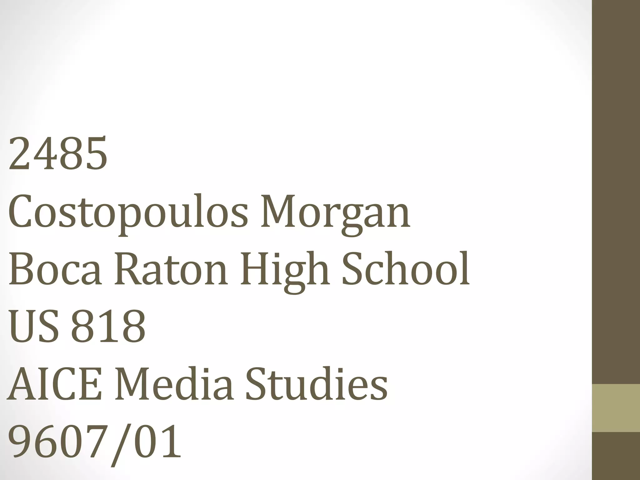
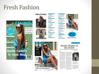
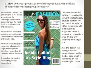
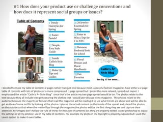
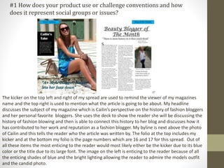
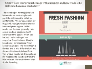
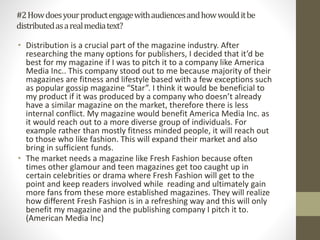
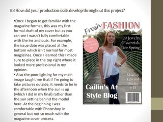
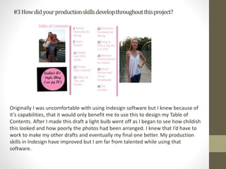
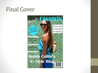
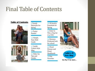
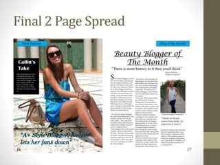
2485
Costopoulos Morgan
Boca Raton High School
US 818
AICE Media Studies
9607/01
Fresh Fashion
House Style
My masthead follows the
conventions as it’s placed
at the top of the
challenges the standard
conventions as the word
Fresh is a different font
and is diagonal.
My coverlines follow the
standard conventions as
they either on the left side
or the right side.
My main coverline follows
conventions because its
larger than my other
coverlines suggesting it’s
the main part of this issue.
The puff on the top left
follows the general
conventions.
The coverline on the
right isn't breaking the
conventions technically
because its standard
for coverlines to be on
either the right or left
third but in my
magazines sense it
breaks the conventions
since it’s the only
coverline on the right
side.
Also the date at the
top right follows
conventions as well as
the bar code which is
standardly on the
bottom right corner.
#1 How does your product use or challenge conventions and how
does it represent social groups or issues?
I decided to make my table of contents 2 pages rather than just one because most successful fashion magazines have either a 2 page
table of contents with lots of photos or a more compressed 1 page spread but I prefer the more relaxed, spread out layout. I
emphasized the article “Cailin’s A+ Style Blog” since that’s the article my two page spread would be on. The photos relate to the
text because they all include teen girls wearing the clothes that I would later discuss in my magazine. The photos relate to the
audience because the majority of females that read this magazine will be reading it to see what trends are about and will be able to
get an idea of some outfits by looking at the photos. I placed the actual content on the inside of the spread and placed the photos
on the outside so that when the reader flips through the magazine the photos will be the first thing they see and capture their
attention. My images don’t follow the rule of thirds for my table of contents but they are properly edited. I used photoshop to adjust
the settings of all my photos I use in my table of contents. For example my photo in the top right is properly exposed but I used the
Levels option to make it even better.
#1 How does your product use or challenge conventions and
how does it represent social groups or issues?
The kicker on the top left and right of my spread are used to remind the viewer of my magazines
name and the top right is used to mention what the article is going to be about. My headline
discusses the subject of my magazine which is Cailin’s perspective on the history of fashion bloggers
and her personal favorite bloggers. She uses the deck to show the reader she will be discussing the
history of fashion blowing and then is able to connect this history to her blog and discusses how it
has contributed to her work and reputation as a fashion blogger. My byline is next above the photo
of Cailin and this tells the reader who the article was written by. The folio at the top includes my
kicker and at the bottom my folio is the page numbers which are 16 and 17 for this spread. Out of
all these items the most enticing to the reader would most likely either be the kicker due to its blue
color or the title due to its large font. The image on the left is enticing to the reader because of all
the enticing shades of blue and the bright lighting allowing the reader to admire the models outfit
and the candid photo.
#1 How does your product use or challenge conventions and how
does it represent social groups or issues?
#2 How does your product engage with audiences and how would it be
distributed as a real media text?
The branding of my magazine can
be seen in my House Style and I
used the colors on the pallet to
reinforce the “fresh” concept of my
magazine. Using natural colors like
blue and green appeal to the
readers as they are generally calm
colors (and are associated with
nature and the ocean) which ties
back to the branding of my
magazine Fresh Fashion. Also the
branding of my masthead Fresh
Fashion is unique. The word Fresh is
slanted and is in a different font and
the word Fashion is in bold font.
This unique masthead design allows
my magazine to stand out from the
rest because there is no other with
similar branding.
#2Howdoesyourproductengagewithaudiencesandhowwoulditbe
distributedasarealmediatext?
• Distribution is a crucial part of the magazine industry. After
researching the many options for publishers, I decided that it’d be
best for my magazine if I was to pitch it to a company like America
Media Inc.. This company stood out to me because majority of their
magazines are fitness and lifestyle based with a few exceptions such
as popular gossip magazine “Star”. I think it would be beneficial to
my product if it was produced by a company who doesn’t already
have a similar magazine on the market, therefore there is less
internal conflict. My magazine would benefit America Media Inc. as
it would reach out to a more diverse group of individuals. For
example rather than mostly fitness minded people, it will reach out
to those who like fashion. This will expand their market and also
bring in sufficient funds.
• The market needs a magazine like Fresh Fashion because often
times other glamour and teen magazines get too caught up in
certain celebrities or drama where Fresh Fashion will get to the
point and keep readers involved while reading and ultimately gain
more fans from these more established magazines. They will realize
how different Fresh Fashion is in a refreshing way and this will only
benefit my magazine and the publishing company I pitch it to.
(American Media Inc)
#3Howdidyourproductionskillsdevelopthroughoutthisproject?
•Once I began to get familiar with the
magazine format, this was my first
formal draft of my cover but as you
can see I wasn’t fully comfortable
with the ins and outs. For example,
the issue date was placed at the
bottom which isn't normal for most
magazines. Once I learned this I made
sure to place in the top right where it
looked more professional in my
opinion.
• Also the poor lighting for my main
image taught me that if I’m going to
take pictures outside, it needs to be in
the afternoon when the sun is up
(which I did in my final) rather than
the sun setting behind the model
here. At the beginning I was
comfortable with Photoshop in
general but not so much with the
magazine cover process.
#3Howdidyourproductionskillsdevelopthroughoutthisproject?
Originally I was uncomfortable with using Indesign software but I knew because of
it’s capabilities, that it would only benefit me to use this to design my Table of
Contents. After I made this draft a light bulb went off as I began to see how childish
this looked and how poorly the photos had been arranged. I knew that I’d have to
work to make my other drafts and eventually my final one better. My production
skills in Indesign have improved but I am far from talented while using that
software.
#3Howdidyourproductionskillsdevelopthroughoutthisproject?
•I also used Indesign for my 2 page spread due to its symmetry and
organizational software. I knew when producing this draft, my images
needed some major improvements first of all. I admired the pink color
scheme of this draft and the text placement I kept the same for the most
part in my final draft.
•Major changes just needed to be made in my photography and
placement of the quote on the left page as well as the kicker needed to be
moved. Also the page numbers on the bottom would need to be changed
as those are the pages for the table of contents.
#4Howdidyouintegratetechnologies–software,hardwareandonline–in
thisproject?
• At school and at my home I used Dell computers, which I tend to be
the most familiar with working on so that was beneficial to my
success in class. Software wise I used a lot of Photoshop and tools
such as the dropper tool to select certain colors and the lasso tool to
crop certain parts of the images. Also a major part of my photo
editing was through the Levels selection on Photoshop which would
allow me to lighten my underexposed pictures and dark my
overexposed photos.
• In Indesign I used the grids and symmetry tools to my advantage and
made sure my work was symmetrical and looked professional at all
times. The internet was another valuable technological resource as
it encourage and allowed me to research all different aspects of this
project and led me to inspiration for my magazine.
• In class, we were also encouraged to post blog posts regularly about
our progress on our assignment. Microsoft word allowed me to type
out my article and later transfer it to my Indesign file, as well as
Microsoft word let me put this whole assignment together.
Final Cover
Final Table of Contents
Final 2 Page Spread
The End

2485criticalreflection

  • 1.
    2485 Costopoulos Morgan Boca RatonHigh School US 818 AICE Media Studies 9607/01
  • 2.
  • 3.
  • 4.
    My masthead followsthe conventions as it’s placed at the top of the challenges the standard conventions as the word Fresh is a different font and is diagonal. My coverlines follow the standard conventions as they either on the left side or the right side. My main coverline follows conventions because its larger than my other coverlines suggesting it’s the main part of this issue. The puff on the top left follows the general conventions. The coverline on the right isn't breaking the conventions technically because its standard for coverlines to be on either the right or left third but in my magazines sense it breaks the conventions since it’s the only coverline on the right side. Also the date at the top right follows conventions as well as the bar code which is standardly on the bottom right corner. #1 How does your product use or challenge conventions and how does it represent social groups or issues?
  • 5.
    I decided tomake my table of contents 2 pages rather than just one because most successful fashion magazines have either a 2 page table of contents with lots of photos or a more compressed 1 page spread but I prefer the more relaxed, spread out layout. I emphasized the article “Cailin’s A+ Style Blog” since that’s the article my two page spread would be on. The photos relate to the text because they all include teen girls wearing the clothes that I would later discuss in my magazine. The photos relate to the audience because the majority of females that read this magazine will be reading it to see what trends are about and will be able to get an idea of some outfits by looking at the photos. I placed the actual content on the inside of the spread and placed the photos on the outside so that when the reader flips through the magazine the photos will be the first thing they see and capture their attention. My images don’t follow the rule of thirds for my table of contents but they are properly edited. I used photoshop to adjust the settings of all my photos I use in my table of contents. For example my photo in the top right is properly exposed but I used the Levels option to make it even better. #1 How does your product use or challenge conventions and how does it represent social groups or issues?
  • 6.
    The kicker onthe top left and right of my spread are used to remind the viewer of my magazines name and the top right is used to mention what the article is going to be about. My headline discusses the subject of my magazine which is Cailin’s perspective on the history of fashion bloggers and her personal favorite bloggers. She uses the deck to show the reader she will be discussing the history of fashion blowing and then is able to connect this history to her blog and discusses how it has contributed to her work and reputation as a fashion blogger. My byline is next above the photo of Cailin and this tells the reader who the article was written by. The folio at the top includes my kicker and at the bottom my folio is the page numbers which are 16 and 17 for this spread. Out of all these items the most enticing to the reader would most likely either be the kicker due to its blue color or the title due to its large font. The image on the left is enticing to the reader because of all the enticing shades of blue and the bright lighting allowing the reader to admire the models outfit and the candid photo. #1 How does your product use or challenge conventions and how does it represent social groups or issues?
  • 7.
    #2 How doesyour product engage with audiences and how would it be distributed as a real media text? The branding of my magazine can be seen in my House Style and I used the colors on the pallet to reinforce the “fresh” concept of my magazine. Using natural colors like blue and green appeal to the readers as they are generally calm colors (and are associated with nature and the ocean) which ties back to the branding of my magazine Fresh Fashion. Also the branding of my masthead Fresh Fashion is unique. The word Fresh is slanted and is in a different font and the word Fashion is in bold font. This unique masthead design allows my magazine to stand out from the rest because there is no other with similar branding.
  • 8.
    #2Howdoesyourproductengagewithaudiencesandhowwoulditbe distributedasarealmediatext? • Distribution isa crucial part of the magazine industry. After researching the many options for publishers, I decided that it’d be best for my magazine if I was to pitch it to a company like America Media Inc.. This company stood out to me because majority of their magazines are fitness and lifestyle based with a few exceptions such as popular gossip magazine “Star”. I think it would be beneficial to my product if it was produced by a company who doesn’t already have a similar magazine on the market, therefore there is less internal conflict. My magazine would benefit America Media Inc. as it would reach out to a more diverse group of individuals. For example rather than mostly fitness minded people, it will reach out to those who like fashion. This will expand their market and also bring in sufficient funds. • The market needs a magazine like Fresh Fashion because often times other glamour and teen magazines get too caught up in certain celebrities or drama where Fresh Fashion will get to the point and keep readers involved while reading and ultimately gain more fans from these more established magazines. They will realize how different Fresh Fashion is in a refreshing way and this will only benefit my magazine and the publishing company I pitch it to. (American Media Inc)
  • 9.
    #3Howdidyourproductionskillsdevelopthroughoutthisproject? •Once I beganto get familiar with the magazine format, this was my first formal draft of my cover but as you can see I wasn’t fully comfortable with the ins and outs. For example, the issue date was placed at the bottom which isn't normal for most magazines. Once I learned this I made sure to place in the top right where it looked more professional in my opinion. • Also the poor lighting for my main image taught me that if I’m going to take pictures outside, it needs to be in the afternoon when the sun is up (which I did in my final) rather than the sun setting behind the model here. At the beginning I was comfortable with Photoshop in general but not so much with the magazine cover process.
  • 10.
    #3Howdidyourproductionskillsdevelopthroughoutthisproject? Originally I wasuncomfortable with using Indesign software but I knew because of it’s capabilities, that it would only benefit me to use this to design my Table of Contents. After I made this draft a light bulb went off as I began to see how childish this looked and how poorly the photos had been arranged. I knew that I’d have to work to make my other drafts and eventually my final one better. My production skills in Indesign have improved but I am far from talented while using that software.
  • 11.
    #3Howdidyourproductionskillsdevelopthroughoutthisproject? •I also usedIndesign for my 2 page spread due to its symmetry and organizational software. I knew when producing this draft, my images needed some major improvements first of all. I admired the pink color scheme of this draft and the text placement I kept the same for the most part in my final draft. •Major changes just needed to be made in my photography and placement of the quote on the left page as well as the kicker needed to be moved. Also the page numbers on the bottom would need to be changed as those are the pages for the table of contents.
  • 12.
    #4Howdidyouintegratetechnologies–software,hardwareandonline–in thisproject? • At schooland at my home I used Dell computers, which I tend to be the most familiar with working on so that was beneficial to my success in class. Software wise I used a lot of Photoshop and tools such as the dropper tool to select certain colors and the lasso tool to crop certain parts of the images. Also a major part of my photo editing was through the Levels selection on Photoshop which would allow me to lighten my underexposed pictures and dark my overexposed photos. • In Indesign I used the grids and symmetry tools to my advantage and made sure my work was symmetrical and looked professional at all times. The internet was another valuable technological resource as it encourage and allowed me to research all different aspects of this project and led me to inspiration for my magazine. • In class, we were also encouraged to post blog posts regularly about our progress on our assignment. Microsoft word allowed me to type out my article and later transfer it to my Indesign file, as well as Microsoft word let me put this whole assignment together.
  • 13.
  • 14.
  • 15.
  • 16.