Kolkata Call Girl Bagbazar 👉 8250192130 ❣️💯 Available With Room 24×7
Presentation 2
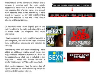
1. The font I use for the banner was ‘Stencil’ this is
because it matches with the main article
appearance. My banner is similar to most hip
hop magazine (list of artists names or a second
main headline onto of the masthead). I have
linked my banner to HIP HOP CONNECTION
magazine because it has the same colour
scheme and layout as mine.
On my front cover I have aligned part of the
main headline to the right and rotated the rest
to make make the magazine look more
interesting.
I have compared my main headline layout to a
VIBE magazine, because I have used the same
font, justification alignments and rotation to
the copy.
To make my cover look more interesting I have
added an additional heading which makes the
magazine look ‘PREETY BOYZ EDITION’, this is so
the readers know what else is included in the
magazine. I added this feature because a
similar heading was on Vibe and it stood out.
Most music magazines have the same style of
layout, because it’s a way of enticing people to
be interested in certain interest.