Responsive Web Design: The
 View of the World Depends
    on the Glasses I Wear
Frédéric Harper
Developer Evangelist @ Microsoft Canada
@fharper | outofcomfortzone.net
How we viewed the web…
• The Desktop Browser
How we view the web today…
•   The Desktop Browser
•   Mobile Browsers
•   Tablet form-factors
•   Televisions
•   Game Consoles
•   More…
•   So what’s the problem?
The Anti-Pattern
Responsive Web Design
• Thinking of the user’s needs instead of ours.
• Adapt to various device capabilities instead of
  configurations.
• Help future-proof our sites.
Responsive Web Designs
Elements of Responsive Web Design
•   A flexible, grid-based layout,
•   Flexible images and media, and
•   Media queries.
•   Something else.
Flexible, Grid-based Layout
Ok, so what’s the problem?
•   Non-responsive sites are no fun.
•   Fixed-width sites are not the best experiences.
•   Design tools tend to use pixels.
•   Sometimes a pixel does not equal a pixel.
•   So how do we turn pixels to their em
    counterparts?
Pixels to Ems Algorithm


                  𝒏                                      ∞
𝚫𝒚            𝟏           −𝒃 ±   𝒃 𝟐 − 𝟒𝒂𝒄                             𝒏𝝅𝒙           𝒏𝝅𝒙
   ≈ 𝐥𝐢𝐦   𝟏+         ×                    ± 𝒇 𝒙 = 𝒂𝟎+         𝒂 𝒏 𝐜𝐨𝐬     + 𝒃 𝒏 𝐬𝐢𝐧
𝚫𝒙   𝒏→∞      𝒏                  𝟐𝒂                                     𝑳             𝑳
                                                         𝒏=𝟏
Responsive Web Design READ MORE >>

     h1 {                                                  h1 {
em     font-size: 24px;              24 / 16 = 1.5           font-size: 1.5em;
     }                                                     }

     h1 a {                     11 / 24 = 0.458333333+     h1 a {
%      font-size: 11px;                                      font: 0.458333333+;
     }                                                     }
                  1                        2                           3
And the Grid?
Flexible Images and Media
A Simple Solution


 Works on images, as well as other media like <video>.
Another Possibility
  Filament Group –
 depends on cookies
    and JavaScript
Media Queries
Not so long ago…
•   We could define media types: screen and print.
•   But not easily respond to the user’s display.
•   Lots of grunt work.
•   Didn’t spend much time thinking about mobile
    devices.
CSS3 Media Queries
• The CSS3 Media Queries Module specifies
  methods to enable web developers to scope a
  style sheet to a set of precise device capabilities.
Simple Example
@media screen and (max-width: 600px) {
   body {
      font-size: 80%;
   }
}
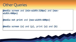
Other Queries
@media screen and (min-width:320px) and (max-
width:480px)

@media not print and (max-width:600px)

@media screen (x) and (y), print (a) and (b)
Can be declared…
In the Stylesheet
Import Rule
   @import url(mq.css) only screen and (max-
   width:600px)
link Element
   <link rel=“stylesheet” media=“only screen and
   (max-width:800px)” href=“mq.css”>
Supported Media Properties
•   min/max-width    •   device-aspect-ratio
•   min/max-height   •   color
•   device-width     •   color-index
•   device-height    •   monochrome
•   orientation      •   resolution
•   aspect-ratio
Little Pea Bakery
What About Devices?
• viewport meta tag
  • <meta name=“viewport”
    content=“width=device-width”>
• device-width vs. width
• maximum-zoom
What about non-supportive browsers?
• css3-mediaqueries-js by Wouter van der Graaf
• Just include the script in your pages
• Parses the CSS and applies style for positive media
  tests
Hey, what was that 4th thing?
Design
Hey, what was that 4th thing?
Design
• Do we start with mobile-first?
Hey, what was that 4th thing?
Design
• Do we start with mobile-first?
• Is it best that all sites are responsive?
Hey, what was that 4th thing?
Design
• Do we start with mobile-first?
• Is it best that all sites are responsive?
• Do we need or want to do visual comps for every device?
Hey, what was that 4th thing?
Design
• Do we start with mobile-first?
• Is it best that all sites are responsive?
• Do we need or want to do visual comps for every device?
• Don’t dismiss mobile as walking and looking something up.
Hey, what was that 4th thing?
Design
• Do we start with mobile-first?
• Is it best that all sites are responsive?
• Do we need or want to do visual comps for every device?
• Don’t dismiss mobile as walking and looking something up.
• We are at the beginning, that’s what makes this interesting!
Resources
• http://www.alistapart.com/articles/responsive-web-design/
• http://filamentgroup.com/examples/responsive-images/
• http://code.google.com/p/css3-mediaqueries-js/
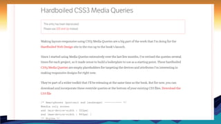
• http://stuffandnonsense.co.uk/blog/about/hardboiled_css3_media_queries
• http://www.stunningcss3.com/index.php
• http://www.abookapart.com/products/responsive-web-design
• http://www.smashingmagazine.com/2011/07/22/responsive-web-design-techniques-tools-
  and-design-strategies/
• http://mediaqueri.es/
• http://www.w3.org/TR/css3-mediaqueries/
Questions?
Frédéric Harper

Developer Evangelist @ Microsoft
fredh@microsoft.com
@fharper
http://webnotwar.ca
http://outofcomfortzone.net

Prairie Dev Con West - 2012-03-15 - Responsive Web Design

  • 1.
    Responsive Web Design:The View of the World Depends on the Glasses I Wear Frédéric Harper Developer Evangelist @ Microsoft Canada @fharper | outofcomfortzone.net
  • 2.
    How we viewedthe web… • The Desktop Browser
  • 3.
    How we viewthe web today… • The Desktop Browser • Mobile Browsers • Tablet form-factors • Televisions • Game Consoles • More… • So what’s the problem?
  • 4.
  • 6.
    Responsive Web Design •Thinking of the user’s needs instead of ours. • Adapt to various device capabilities instead of configurations. • Help future-proof our sites.
  • 7.
  • 8.
    Elements of ResponsiveWeb Design • A flexible, grid-based layout, • Flexible images and media, and • Media queries. • Something else.
  • 9.
  • 10.
    Ok, so what’sthe problem? • Non-responsive sites are no fun. • Fixed-width sites are not the best experiences. • Design tools tend to use pixels. • Sometimes a pixel does not equal a pixel. • So how do we turn pixels to their em counterparts?
  • 11.
    Pixels to EmsAlgorithm 𝒏 ∞ 𝚫𝒚 𝟏 −𝒃 ± 𝒃 𝟐 − 𝟒𝒂𝒄 𝒏𝝅𝒙 𝒏𝝅𝒙 ≈ 𝐥𝐢𝐦 𝟏+ × ± 𝒇 𝒙 = 𝒂𝟎+ 𝒂 𝒏 𝐜𝐨𝐬 + 𝒃 𝒏 𝐬𝐢𝐧 𝚫𝒙 𝒏→∞ 𝒏 𝟐𝒂 𝑳 𝑳 𝒏=𝟏
  • 13.
    Responsive Web DesignREAD MORE >> h1 { h1 { em font-size: 24px; 24 / 16 = 1.5 font-size: 1.5em; } } h1 a { 11 / 24 = 0.458333333+ h1 a { % font-size: 11px; font: 0.458333333+; } } 1 2 3
  • 14.
  • 15.
  • 16.
    A Simple Solution Works on images, as well as other media like <video>.
  • 17.
    Another Possibility Filament Group – depends on cookies and JavaScript
  • 18.
  • 19.
    Not so longago… • We could define media types: screen and print. • But not easily respond to the user’s display. • Lots of grunt work. • Didn’t spend much time thinking about mobile devices.
  • 20.
    CSS3 Media Queries •The CSS3 Media Queries Module specifies methods to enable web developers to scope a style sheet to a set of precise device capabilities.
  • 21.
    Simple Example @media screenand (max-width: 600px) { body { font-size: 80%; } }
  • 22.
    Other Queries @media screenand (min-width:320px) and (max- width:480px) @media not print and (max-width:600px) @media screen (x) and (y), print (a) and (b)
  • 23.
    Can be declared… Inthe Stylesheet Import Rule @import url(mq.css) only screen and (max- width:600px) link Element <link rel=“stylesheet” media=“only screen and (max-width:800px)” href=“mq.css”>
  • 24.
    Supported Media Properties • min/max-width • device-aspect-ratio • min/max-height • color • device-width • color-index • device-height • monochrome • orientation • resolution • aspect-ratio
  • 25.
  • 26.
    What About Devices? •viewport meta tag • <meta name=“viewport” content=“width=device-width”> • device-width vs. width • maximum-zoom
  • 27.
    What about non-supportivebrowsers? • css3-mediaqueries-js by Wouter van der Graaf • Just include the script in your pages • Parses the CSS and applies style for positive media tests
  • 34.
    Hey, what wasthat 4th thing?
  • 35.
    Hey, what wasthat 4th thing? Design
  • 36.
    Hey, what wasthat 4th thing? Design • Do we start with mobile-first?
  • 37.
    Hey, what wasthat 4th thing? Design • Do we start with mobile-first? • Is it best that all sites are responsive?
  • 38.
    Hey, what wasthat 4th thing? Design • Do we start with mobile-first? • Is it best that all sites are responsive? • Do we need or want to do visual comps for every device?
  • 39.
    Hey, what wasthat 4th thing? Design • Do we start with mobile-first? • Is it best that all sites are responsive? • Do we need or want to do visual comps for every device? • Don’t dismiss mobile as walking and looking something up.
  • 40.
    Hey, what wasthat 4th thing? Design • Do we start with mobile-first? • Is it best that all sites are responsive? • Do we need or want to do visual comps for every device? • Don’t dismiss mobile as walking and looking something up. • We are at the beginning, that’s what makes this interesting!
  • 41.
    Resources • http://www.alistapart.com/articles/responsive-web-design/ • http://filamentgroup.com/examples/responsive-images/ •http://code.google.com/p/css3-mediaqueries-js/ • http://stuffandnonsense.co.uk/blog/about/hardboiled_css3_media_queries • http://www.stunningcss3.com/index.php • http://www.abookapart.com/products/responsive-web-design • http://www.smashingmagazine.com/2011/07/22/responsive-web-design-techniques-tools- and-design-strategies/ • http://mediaqueri.es/ • http://www.w3.org/TR/css3-mediaqueries/
  • 42.
    Questions? Frédéric Harper Developer Evangelist@ Microsoft fredh@microsoft.com @fharper http://webnotwar.ca http://outofcomfortzone.net