By: Jimmy Cobb
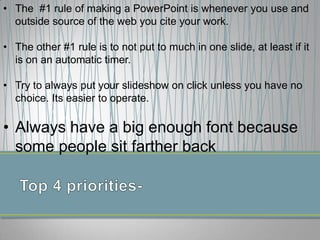
• The #1 rule of making a PowerPoint is whenever you use and
outside source of the web you cite your work.
• The other #1 rule is to not put to much in one slide, at least if it
is on an automatic timer.

• Try to always put your slideshow on click unless you have no
choice. Its easier to operate.

• Always have a big enough font because
some people sit farther back
• Bullets
• When you use bullets
more organized.
• It is easier to read.
• It can be easier to
understand.

No Bullets
Its hard to understand and
its not easier to read. It
looks scrabbled. The facts
can be unorganized. And
when there is to much in a
slide it is harder to time.
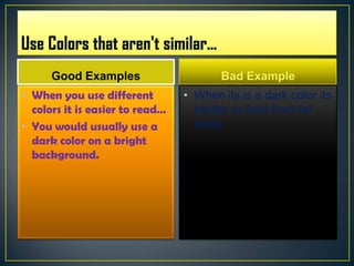
Good Examples

Bad Example

• When you use different
colors it is easier to read…
• You would usually use a
dark color on a bright
background.

• When its is a dark color its
harder to read from far
away.
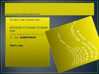
• Or don’t use a fancy font…
• Because it is hard to read
and
sldsfdoadfladsddfdddrudddd
bd also… kjhsfdakjf
• That’s why

Powerpoint powerpoint

  • 1.
  • 2.
    • The #1rule of making a PowerPoint is whenever you use and outside source of the web you cite your work. • The other #1 rule is to not put to much in one slide, at least if it is on an automatic timer. • Try to always put your slideshow on click unless you have no choice. Its easier to operate. • Always have a big enough font because some people sit farther back
  • 3.
    • Bullets • Whenyou use bullets more organized. • It is easier to read. • It can be easier to understand. No Bullets Its hard to understand and its not easier to read. It looks scrabbled. The facts can be unorganized. And when there is to much in a slide it is harder to time.
  • 4.
    Good Examples Bad Example •When you use different colors it is easier to read… • You would usually use a dark color on a bright background. • When its is a dark color its harder to read from far away.
  • 5.
    • Or don’tuse a fancy font… • Because it is hard to read and sldsfdoadfladsddfdddrudddd bd also… kjhsfdakjf • That’s why