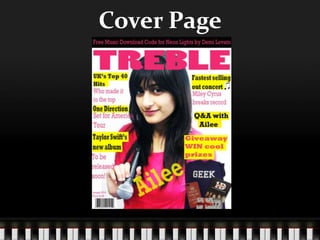
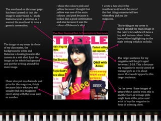
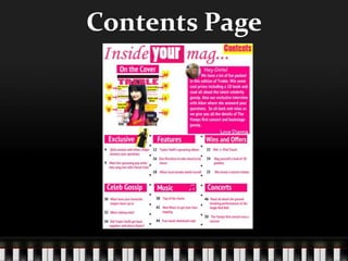
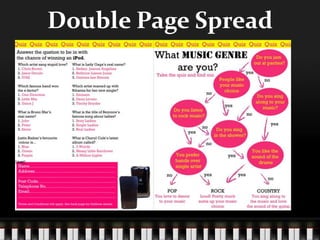
Music Magazine
Evaluation
Ansa Khan
Cover Page
The masthead on the cover page
has been layered so that the
image is underneath it. I made
Haleema wear a pink top as I
wanted the masthead to have a
generic convention.
I wrote a lure above the
masthead so it would be one of
the first thing someone will see
when they pick up the
magazine.
I chose the colours pink and
yellow because I thought that
yellow was one of the main
colours and pink because it
looked like a good combination
and also because it was the
colour of Haleema’s shirt
The image on my cover is of one
of my classmates, the
background is white and
Haleema is looking towards the
camera in a mid shot. I put the
image as the whole background
and put the writing around the
main image.
The writing on my cover is
based around the main image in
the centre for each text I have a
top and bottom colour. I also
have yellow highlighting on the
main writing which is on bold.
On the cover I have images of
prizes which can be won, this is
another lure as teenage girls
might look at the prices and
wish to buy the magazine in
hope of winning them.
I have also put on a barcode and
price for the magazine, this is
because this is what you will
usually find on a magazine
cover along with the issue date
or number.
The target audience for my
magazine will be girls aged
between 12-18. This is because
my magazine is mostly aimed at
teenage girls as it is about
music that would appeal to this
target audience.
Contents Page
I put the image of the Magazine
cover on the contents page and
then put the page numbers of
the articles which I mentioned
on the cover. This is because if
people wanted to go directly to
those pages then they would
not have to find it in the
contents area. This is a generic
convention because it can be
found on many magazines.
I wrote the word ‘contents’ on
the side so people would know
what this page was. I did this
because the masthead on my
page does not include this
word.
I chose the colours pink and yellow
because those are the colours which
I used on the cover of my magazine.
I used the same colours in order to
match the cover with the contents
and stick to a certain colour theme
throughout the magazine.
I have not used many images on
my contents page though there
is a small one to show the
reader of the magazine where
they will find the main article
that is being advertised on the
cover of the magazine.
I included an editor’s note on
my contents page because from
the research I did I found that
many magazines had editor’s
notes which welcomed people
to the magazine. I also used this
to introduce some of the topics
that could be found in the
contents.
I have arranged all the contents
into different sections e.g.
Features, Exclusives and Music.
This is so that when you look at
the contents you can quickly
figure out which page you want
to go to.
The headings of each topic are in
white and have a pink shape
under them to make them stand
out from the rest of the writing. I
have also put the page numbers
in different colours and made the
font for them bigger so they can
also stand out.
The target audience for my
magazine will be girls aged
between 12-18 so I had to add
in topics which would appeal to
them, in order to do so I had to
think about the latest music and
artist.
Double Page Spread
On the top of my double page
article I have put a border going
across both the pages and have
the word ‘Quiz’ repeating. This
is a design idea to let the reader
of the magazine know that this
is the quiz page.
There is a quiz which can be done and I have
used big bold writing to tell the reader what
the quiz is about. I though of doing this
because from my research I have seen that
many magazines aimed at teenage girls have
quiz pages like this one.
I chose the colours pink and
yellow and black for the double
page because these are the
colours that I have been using
for the cover and contents page.
It is a generic convention to use
the same colour theme
throughout a magazine.
The questions on
the page all have the
same layout. The
question s are in
black and so are the
numberings for the
answers but the
answer options are
in pink.
The layout of this quiz
page takes up the whole
right hand page, it leads
from one question to
another till the reader gets
to the bottom of the page
where they will see their
answer.
I also used oval shapes to make the questions
on the page stand out, this is so the reader
knows what they have to answer. It also makes
it easier to link the questions through arrows.
I have also used a
box at the bottom for
the reader to fill in
their details and
send the information
off in order to be in
with the chance of
winning the prizes.
The arrows on this page
are of the internet as
they were not available
on Photoshop. I was
able to drag them on
and resize and position
them as I wished to.
I also took a picture of an iPod and put
it on the quiz page to show the prize
to the reader. This could be used as a
lure for the reader to try and enter.

Music Magazine Evaluation

  • 1.
  • 2.
  • 3.
    The masthead onthe cover page has been layered so that the image is underneath it. I made Haleema wear a pink top as I wanted the masthead to have a generic convention. I wrote a lure above the masthead so it would be one of the first thing someone will see when they pick up the magazine. I chose the colours pink and yellow because I thought that yellow was one of the main colours and pink because it looked like a good combination and also because it was the colour of Haleema’s shirt The image on my cover is of one of my classmates, the background is white and Haleema is looking towards the camera in a mid shot. I put the image as the whole background and put the writing around the main image. The writing on my cover is based around the main image in the centre for each text I have a top and bottom colour. I also have yellow highlighting on the main writing which is on bold. On the cover I have images of prizes which can be won, this is another lure as teenage girls might look at the prices and wish to buy the magazine in hope of winning them. I have also put on a barcode and price for the magazine, this is because this is what you will usually find on a magazine cover along with the issue date or number. The target audience for my magazine will be girls aged between 12-18. This is because my magazine is mostly aimed at teenage girls as it is about music that would appeal to this target audience.
  • 4.
  • 5.
    I put theimage of the Magazine cover on the contents page and then put the page numbers of the articles which I mentioned on the cover. This is because if people wanted to go directly to those pages then they would not have to find it in the contents area. This is a generic convention because it can be found on many magazines. I wrote the word ‘contents’ on the side so people would know what this page was. I did this because the masthead on my page does not include this word. I chose the colours pink and yellow because those are the colours which I used on the cover of my magazine. I used the same colours in order to match the cover with the contents and stick to a certain colour theme throughout the magazine. I have not used many images on my contents page though there is a small one to show the reader of the magazine where they will find the main article that is being advertised on the cover of the magazine. I included an editor’s note on my contents page because from the research I did I found that many magazines had editor’s notes which welcomed people to the magazine. I also used this to introduce some of the topics that could be found in the contents. I have arranged all the contents into different sections e.g. Features, Exclusives and Music. This is so that when you look at the contents you can quickly figure out which page you want to go to. The headings of each topic are in white and have a pink shape under them to make them stand out from the rest of the writing. I have also put the page numbers in different colours and made the font for them bigger so they can also stand out. The target audience for my magazine will be girls aged between 12-18 so I had to add in topics which would appeal to them, in order to do so I had to think about the latest music and artist.
  • 6.
  • 7.
    On the topof my double page article I have put a border going across both the pages and have the word ‘Quiz’ repeating. This is a design idea to let the reader of the magazine know that this is the quiz page. There is a quiz which can be done and I have used big bold writing to tell the reader what the quiz is about. I though of doing this because from my research I have seen that many magazines aimed at teenage girls have quiz pages like this one. I chose the colours pink and yellow and black for the double page because these are the colours that I have been using for the cover and contents page. It is a generic convention to use the same colour theme throughout a magazine. The questions on the page all have the same layout. The question s are in black and so are the numberings for the answers but the answer options are in pink. The layout of this quiz page takes up the whole right hand page, it leads from one question to another till the reader gets to the bottom of the page where they will see their answer. I also used oval shapes to make the questions on the page stand out, this is so the reader knows what they have to answer. It also makes it easier to link the questions through arrows. I have also used a box at the bottom for the reader to fill in their details and send the information off in order to be in with the chance of winning the prizes. The arrows on this page are of the internet as they were not available on Photoshop. I was able to drag them on and resize and position them as I wished to. I also took a picture of an iPod and put it on the quiz page to show the prize to the reader. This could be used as a lure for the reader to try and enter.