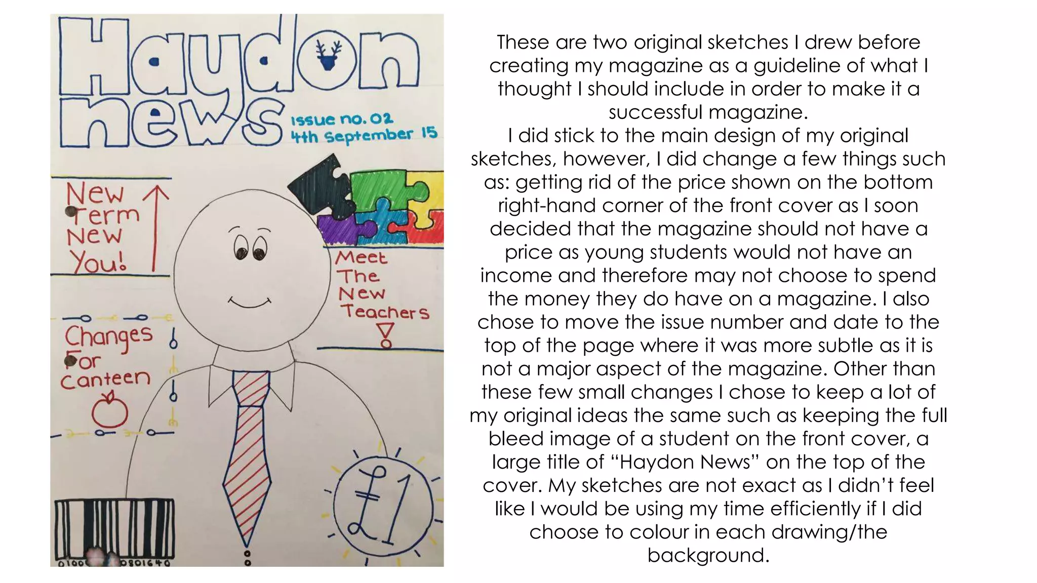
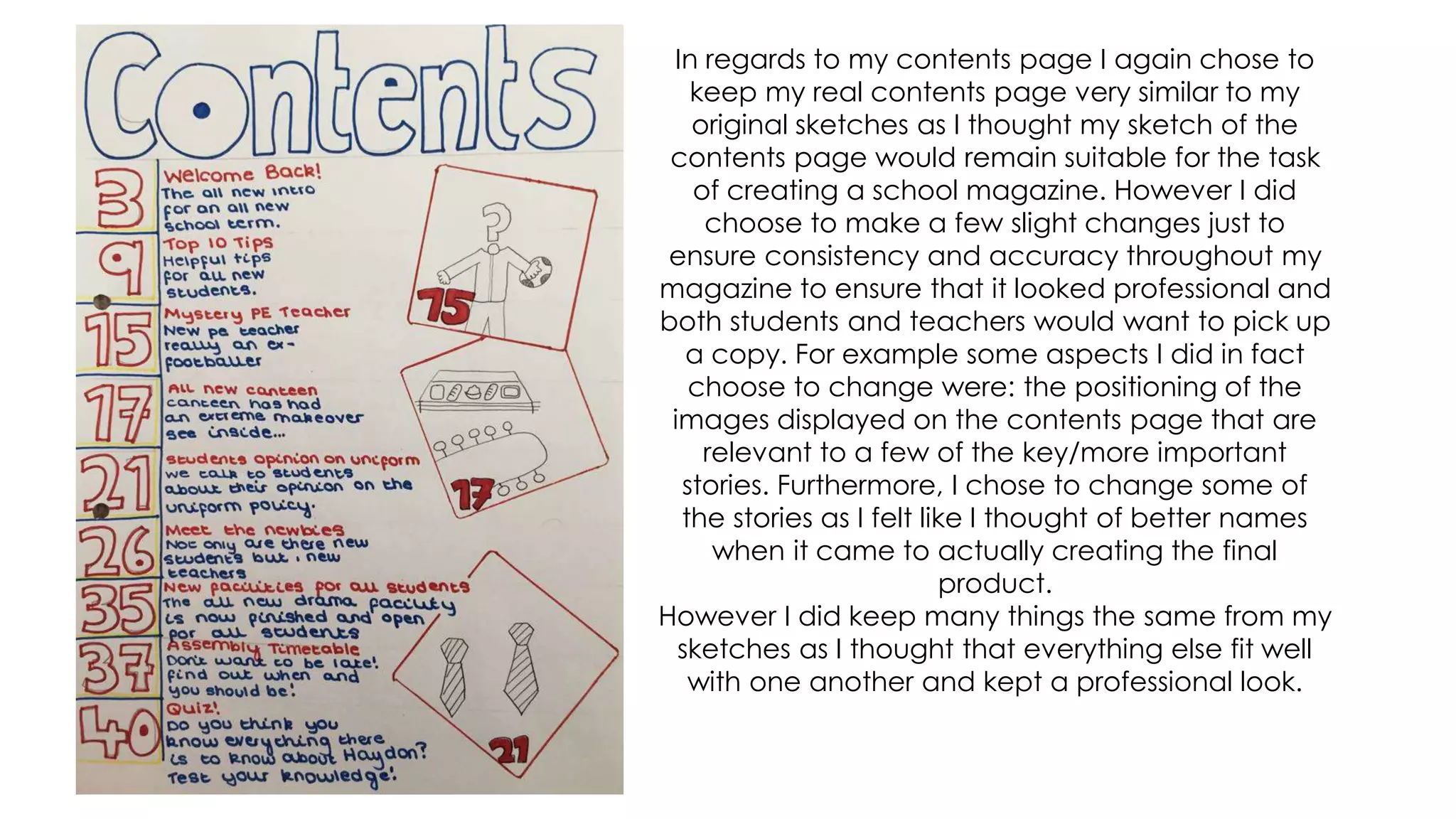
The document summarizes the author's process for completing a preliminary task to create a magazine for their secondary school. Some key points:
- The author used InDesign and Photoshop software to design the magazine based on their previous media studies experience.
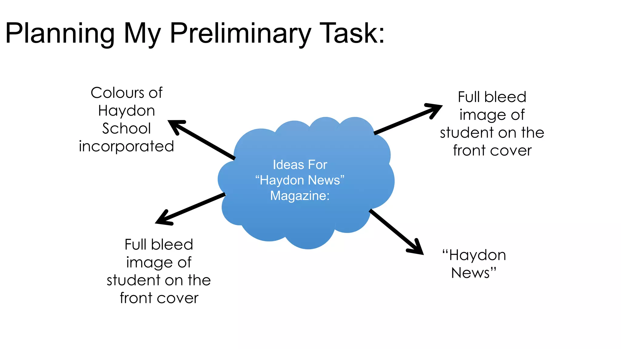
- They titled the magazine "Haydon News" to represent the school and chose bold colors like blue, yellow, black and white that aligned with the school logo.
- On the cover, they included a full-bleed photo of a smiling student to represent the happy school environment and intrigue readers.
- They created sketches before designing the actual magazine to plan layouts like the cover and contents page. The final magazine mostly followed these original sketches