
Download to read offline


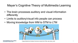


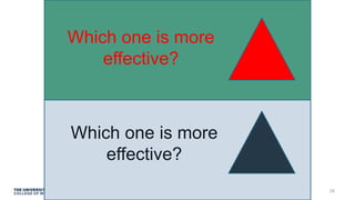


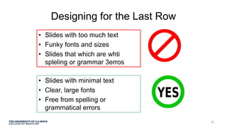


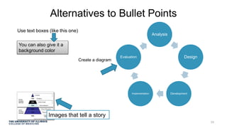


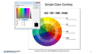


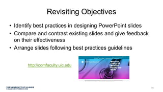

This presentation discusses best practices for designing effective PowerPoint slides. It covers topics like Mayer's cognitive theory of multimedia learning, limiting text on slides, using images and videos appropriately, designing for visibility from the back of the room, and employing effective use of color, fonts, and animations. The objectives are to learn how to design slides following guidelines like reducing extraneous details, using clear contrasts and formatting, and avoiding overuse of bullet points. Examples are provided of both effective and ineffective slide designs.


