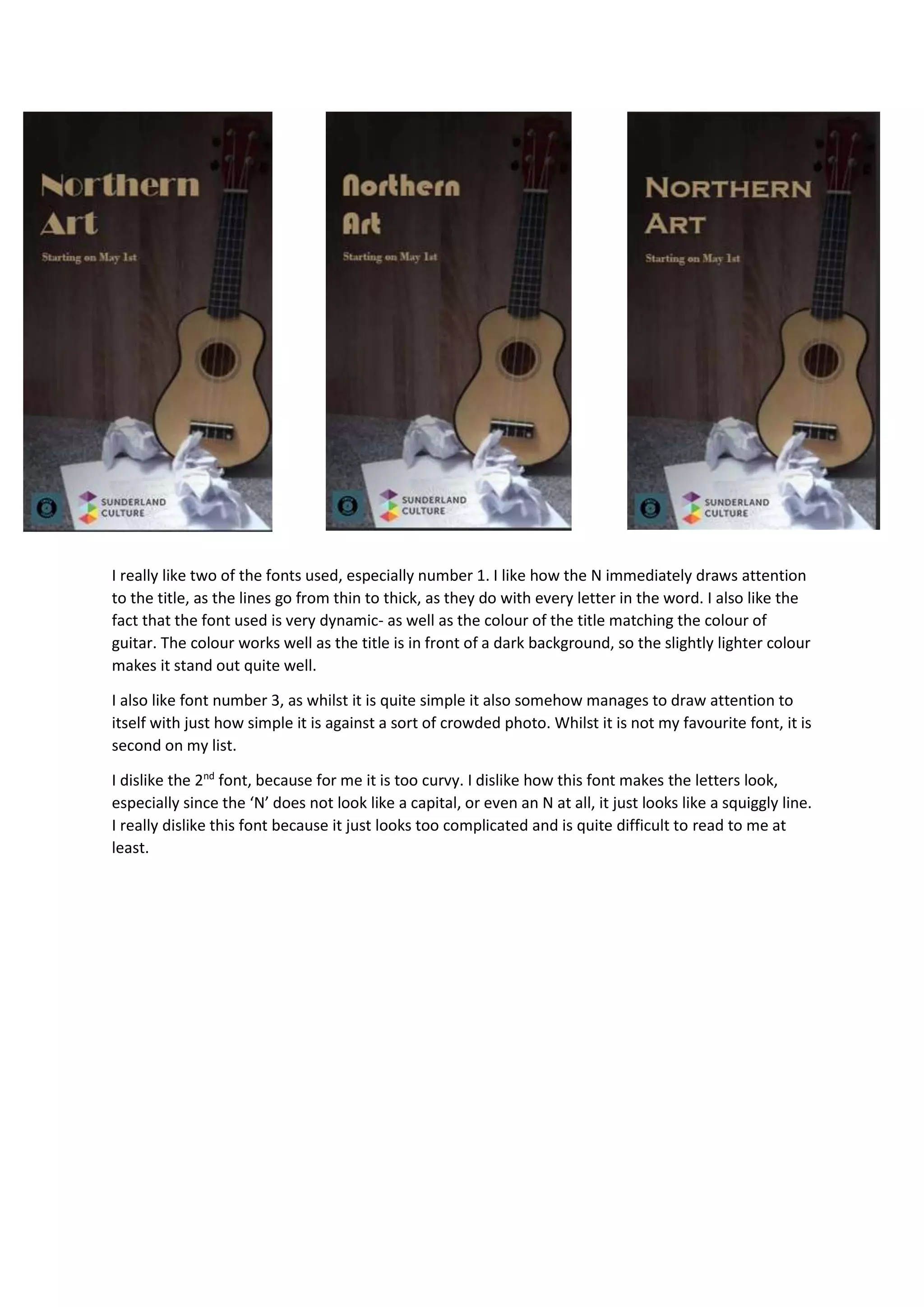
Font 1 draws attention to the title with lines that vary in thickness and a color that matches the guitar in the photo. Font 3 is simple yet draws attention due to its simplicity against a busy background. Font 2 is disliked as its letters, especially the N, are too curvy and complicated, making it difficult to read.