VIP College Call Girls Gorakhpur Bhavna 8250192130 Independent Escort Service...
Pop genre magazine conventions
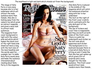
1. The masthead is light and dark which stands out from the background. The image of Katy Perry is very sexy because she is in her underwear which will attract the male audience more than female. Also she is looking away from the camera too which gives an indirect response and gives a sexy look to attract male audiences. The magazine front cover background is light with the colour pink and white which makes the black text of the right hand side stand out more a long with the text size of the main headline and the words used for example ‘sex’ to make Katy Perry sound sexy and make the audience interested about reading about Katy Perry in the magazine. Also Katy Perry is placed in the middle of the magazine which will catch the audiences attention along with her in her underwear. The text on the right of the front cover is white which contrasts with the only dark part of the background. The use of kickers and cover lines is responsible and they are both on both sides of the front cover. There is a pink line underneath each kicker on the left side which separates each kicker. The background is in a bedroom because there is a bed which Katy Perry is sitting on and it looks like that she has just woken up which gives a bit of surprise and a sexy thought for the male audience. This front cover would attract male readers more than female.
2. The image of lady Gaga is very sexy and attractive for the male audience. The outfit Lady Gaga is wearing suits her style of fashion and her hair looks like it has been blowing in the wind and she hasn’t brushed it. The text is different because ‘Lady’ is underneath the picture of Lady Gaga and is smaller than the text ‘GAGA’ which is half under the image and the other half is over the image which suits Lady Gaga because she is an usual artist. Her black trousers and gloves contrast with the whiteness of her hair. There is a variety of kickers and cover lines on the left and right side of the front cover. The background is a plain grey colour but it makes the white, black and red text stand out. The number ‘100’ is big which will attract the audience’s attention. The cover line text is small.