
More Related Content
What's hot
What's hot (19)
Viewers also liked
Viewers also liked (15)
Similar to Pitch presentation
Similar to Pitch presentation (20)
Pitch presentation
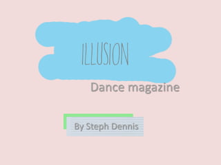
- 1. ILLUSION Dance magazine By Steph Dennis
- 2. MY CLIENT THE NORTHERN ECHO My magazine will fit a gap in the market because the genre mixes dance and fashion and there is no magazine on the market like this.
- 3. Audience Research Age – 16-24 Gender - Female Tribe – Trendies and Sports Junkies Location – North East Socioeconomic status – A-C2 Target audience – Freestyle/disco dancers
- 5. Why I chose this genre.. I am passionate about this style of dance No magazine on the market like this I have a lot of knowledge I can present about it It is for a niche audience so I can focus on specific sections It brings two different genre’s together
- 6. Contents Articles “Dance it, live it!” “Take it on” “Top ten productions” “Stand out from the crowd” “Keep your cool” “Stay away from stress” “It’s all about the costume” “Stay in shape!” “What’s your look?”
- 7. My genre Sell lines Masthead INSPIRATION Main sell line The layout of my magazine is going to be mainly influenced by company magazine and the content will be inspired by Dance Spirit magazine. INFLUENCE
- 8. Layout and colour influence Fonts WINDSOR HAND TREBUCHET MS PRESTIGE ELITE STD
- 9. Design of product High selling price because it is unique Influenced by Company magazine Use a feminine colour scheme Range of topics, not just dance Local magazine so it is relevant Articles and content on areas of interest Name of magazine comes from dance term Language in the articles 2nd and 3rd person narrative voice Relatable language Colloquial language Short paragraph length and fast paced Specialised dance terms Text to image ratio 50/50
- 10. Mock up one
- 11. MOCK UP TWO2
- 12. FEEDBACK Could have Like the title made the as it is page look a relatable lot busier Liked the pastel colours Good text to image ratio Like the step by step Good layout Change the and fonts presented because they well are too similar Lots of different elements Images to the relatable for layout the target audience Article good, interesting Good article and topic and it is enjoyable to Could have featured more pictures of dancers made read personal
- 13. FEEDBACK Second Colours are a person bit to dark, makes it looks to personal serious Title relates to the article Good use of colour Well presented page Good layout They like the and way in which presented it involves well the audience Images Prefer how relatable for the article is the target more of a audience shock story Good article They like the topic and it is shock made imagery personal Could have included breakout boxes to break up text
- 14. Expenses Photographers Journalists Insurance Photographers Models Sub editors Researchers Lighting assistants Make up assistant Studio space rental Flash lighting Camera Insurance Travel Props Studio space rental
- 15. Commercial viability Total expenditure comes to £4780.60 Most of the income after editorial comes from personnel, equipment advertising and that Total income after costs and the cost to comes to a total of giving the distributors print and produce the £8986. and retailers 25% each magazine comes to £2102.70 If the total sales estimate Printing costs were to be 4,000 copies and the sales income would be £10,000 I would get a total income of £18,986.
- 16. Distribution My magazine will need to be distributed in places that the target audience of the magazine would be likely to go too. Dance college/university Dance studio’s Fashion stores Independent shops Hair and Beauty shops
- 17. Front cover Flat Plans Bold title featured at the top Use of 3 colours Sell lines and teasers Most attention on main image Sell lines etc featured around the outside of the image Colour scheme would change with every issue like Company magazine Only a few fonts featured Important sections made bold
- 18. Contents page Magazine name featured down the side Same colour scheme as front cover Imagery of articles that will feature inside
- 19. Double page spread 1
- 20. Double page spread 2
- 21. Double page spread 3
- 22. Conclusion0 The unique selling point of this magazine is the fact that it is a magazine on freestyle dance and there is no magazine on the market like this. Varied topics • e.g. make up articles to getting fit for the perfect body article so it is relatable to more people and gains a wider audience.
- 23. THANKYOU!