Download to read offline


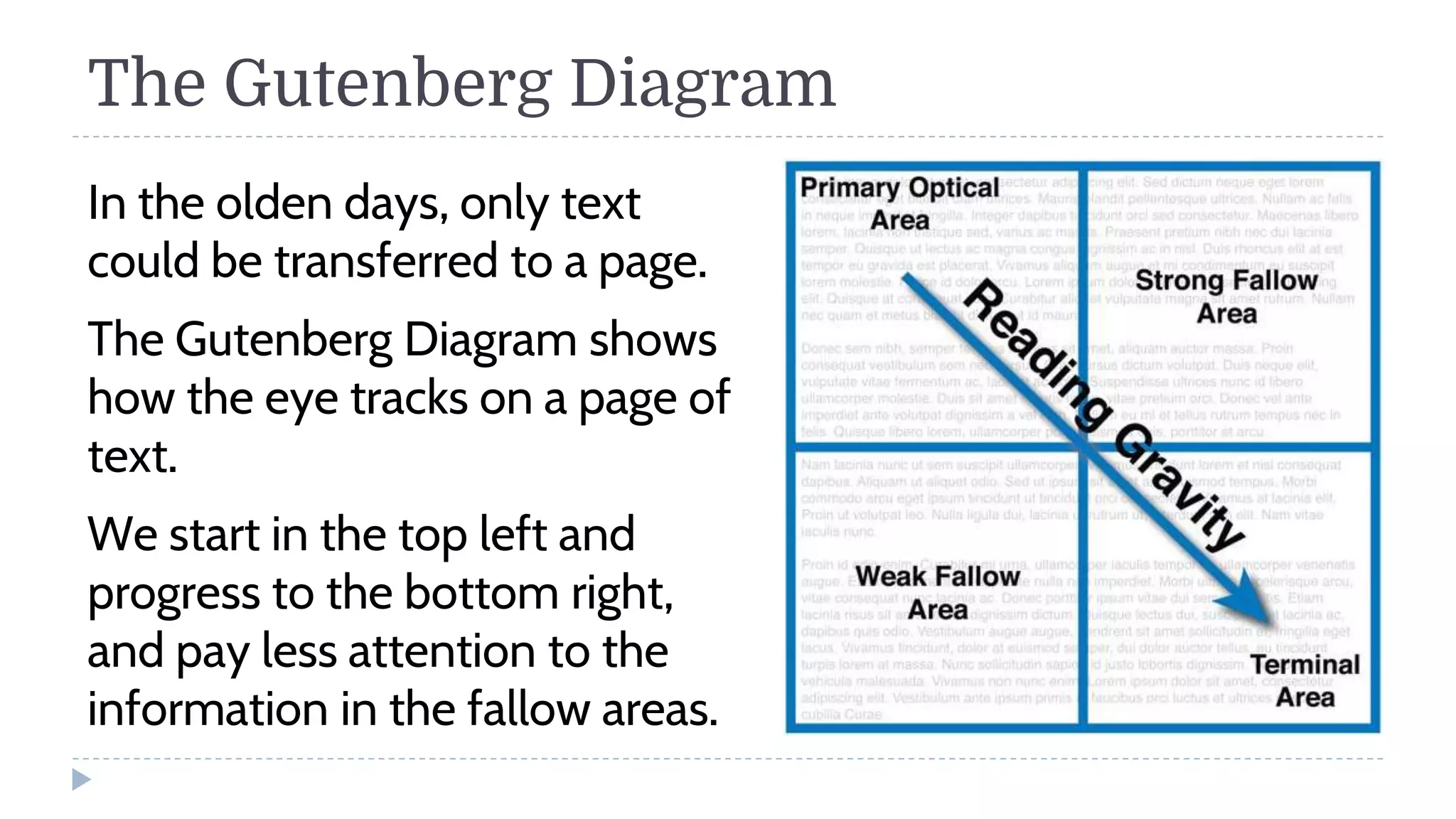


The document discusses various page layout techniques including the Gutenberg diagram, F-layout, Z-layout, rule of thirds, golden ratio, visual hierarchy, grid systems, and designing book covers. It provides details on how layout guides the eye across a page and organizing content through alignment, proximity and repetition. Templates and style sheets are mentioned as tools to create pre-designed pages. Book cover dimensions and design tips are also outlined.


