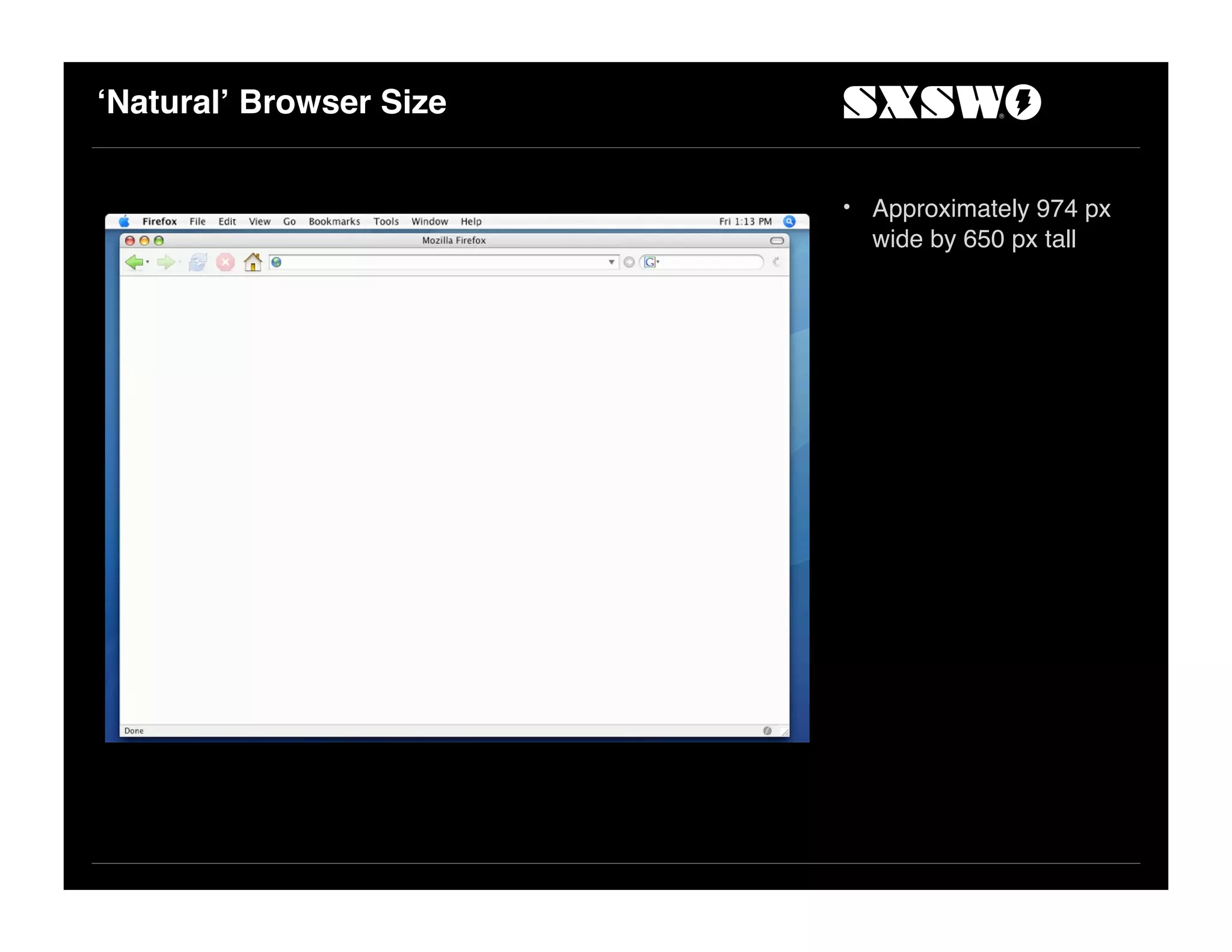
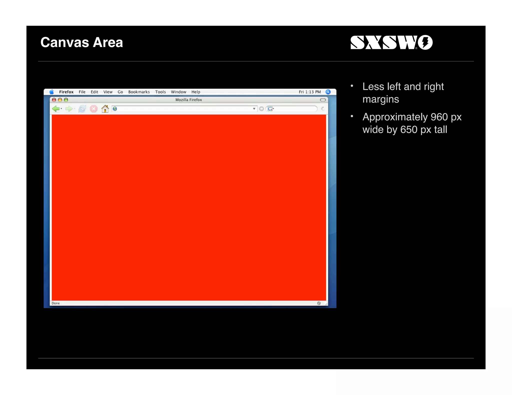
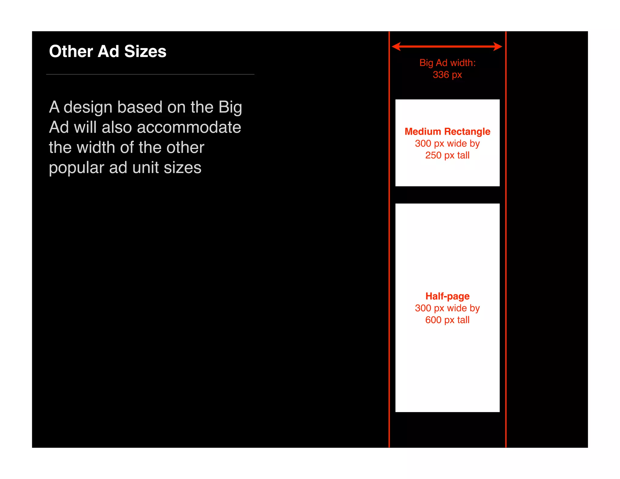
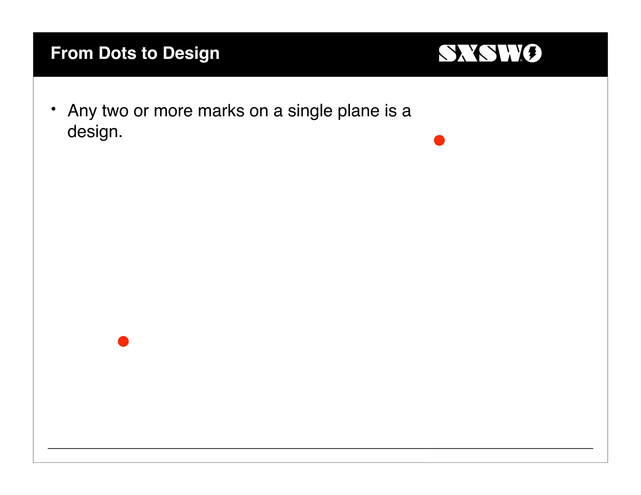
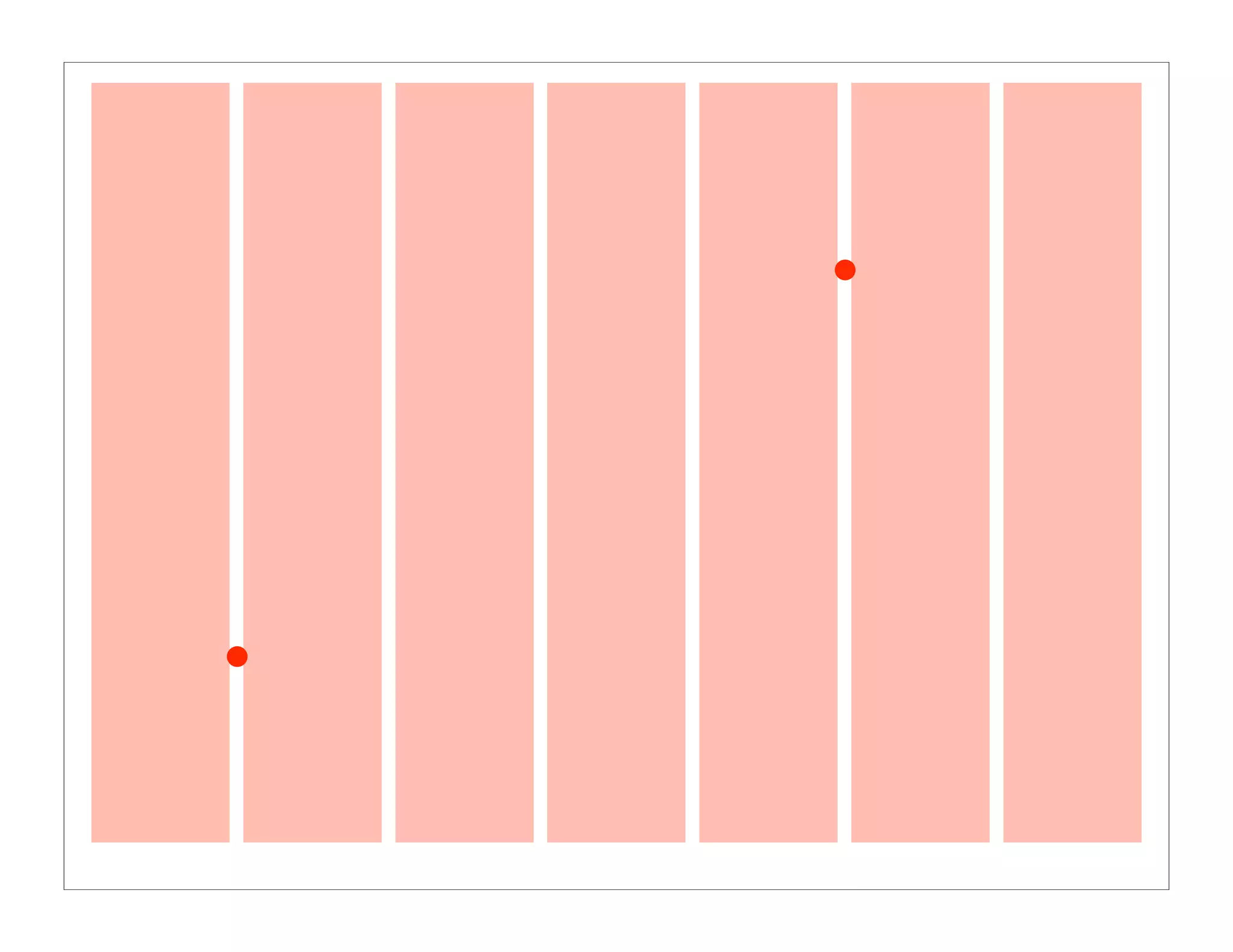
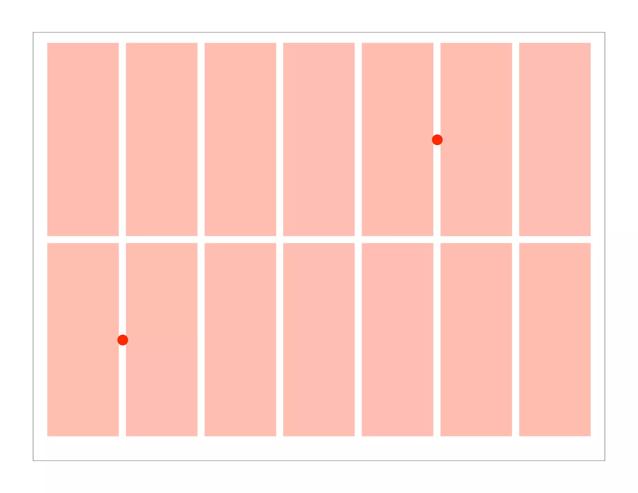
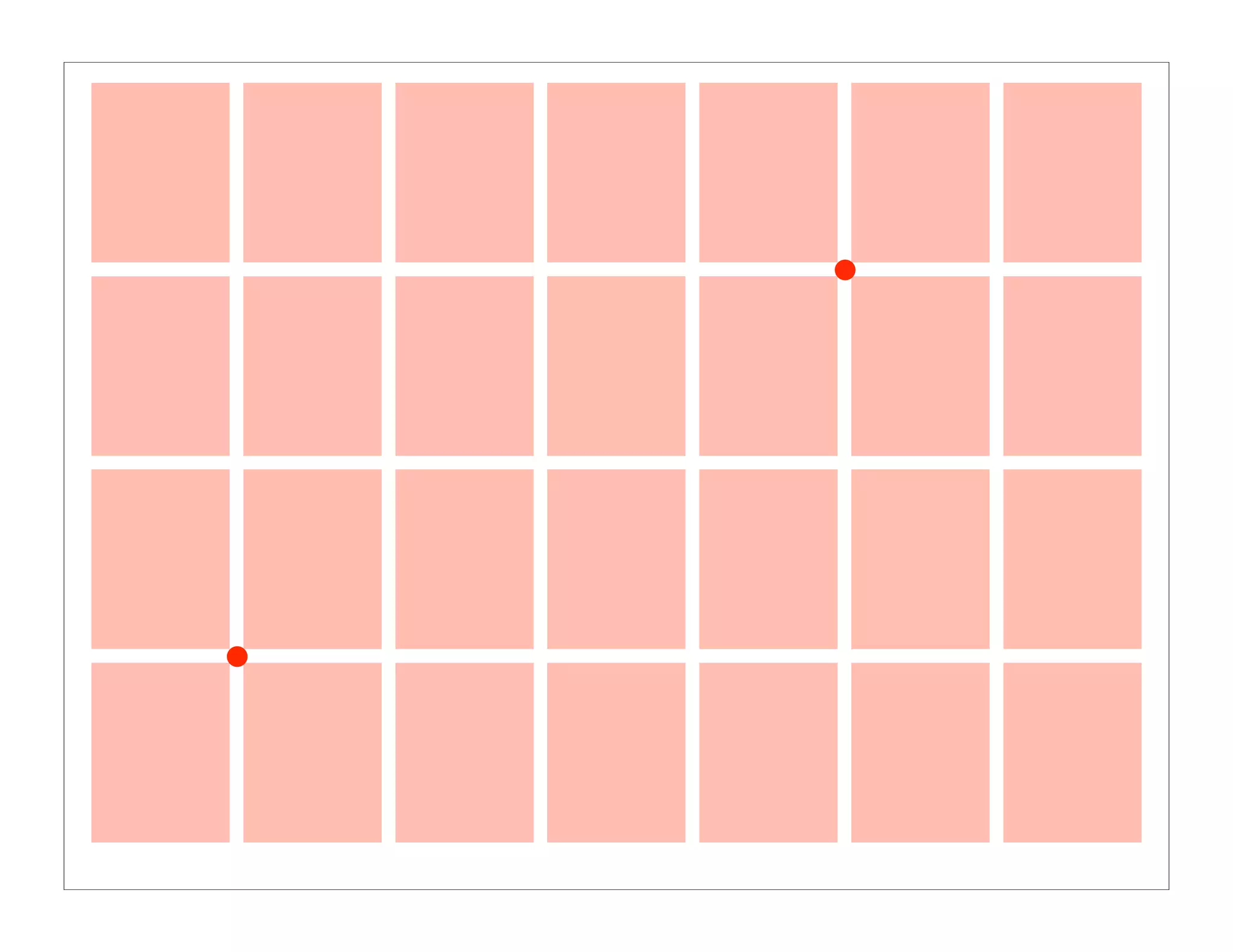
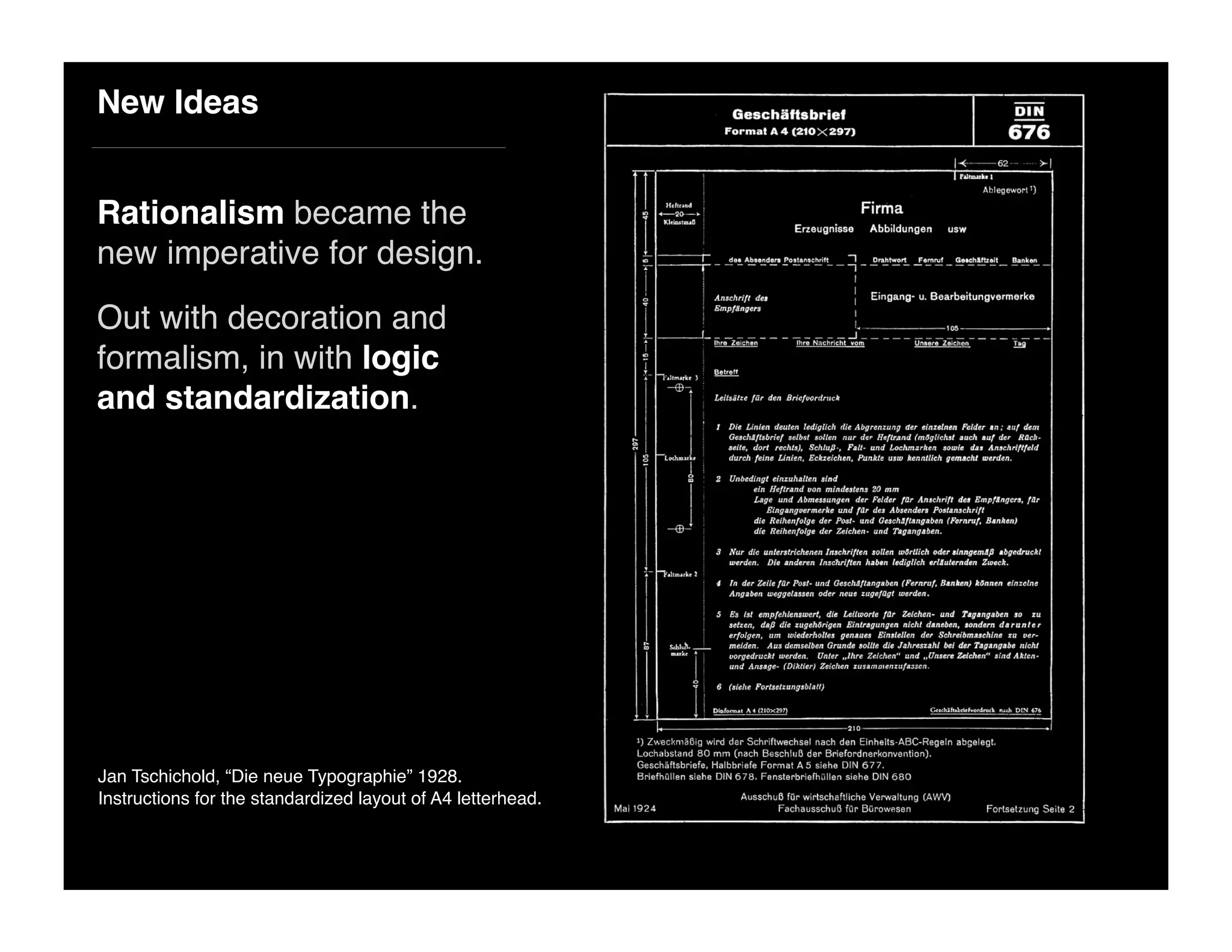
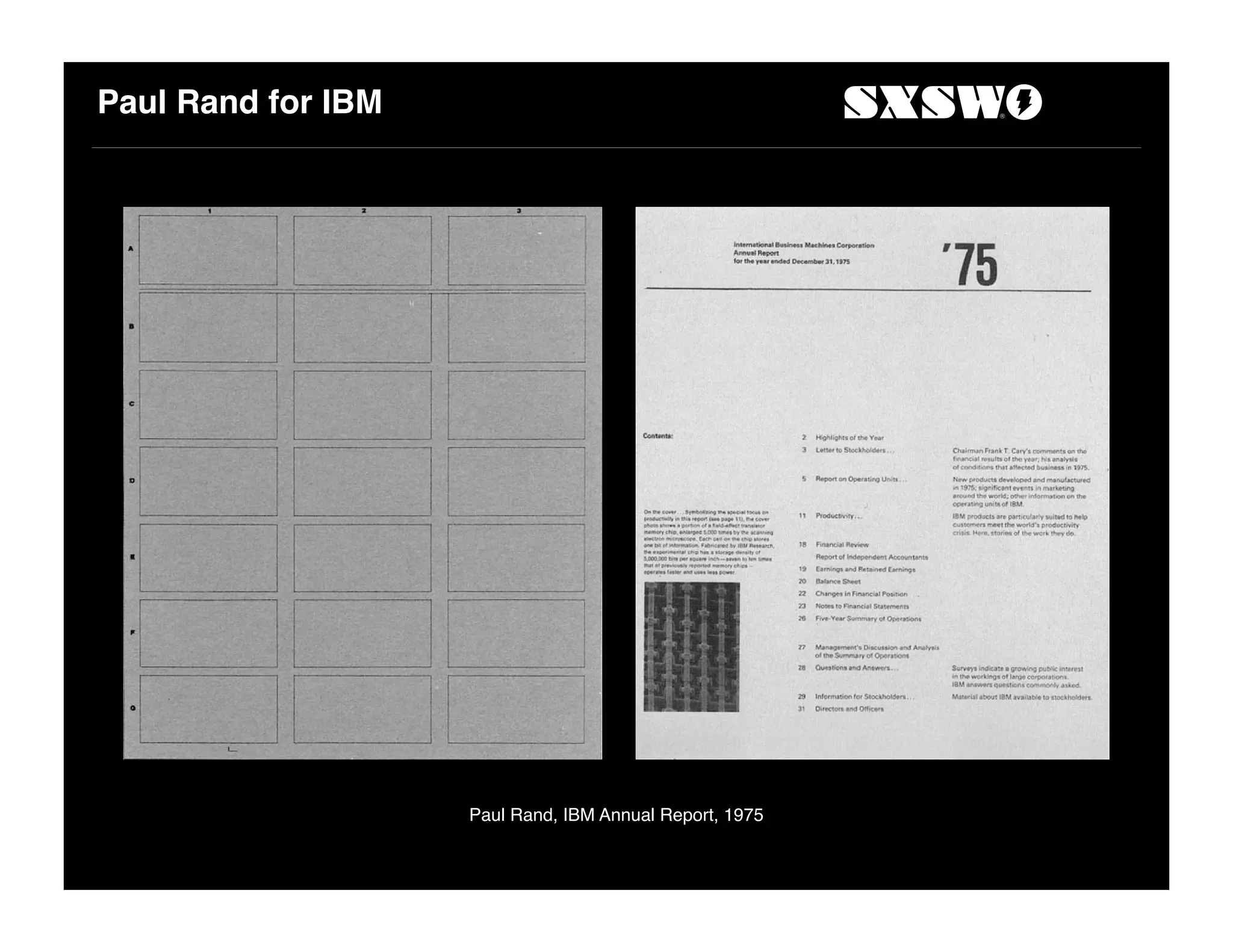
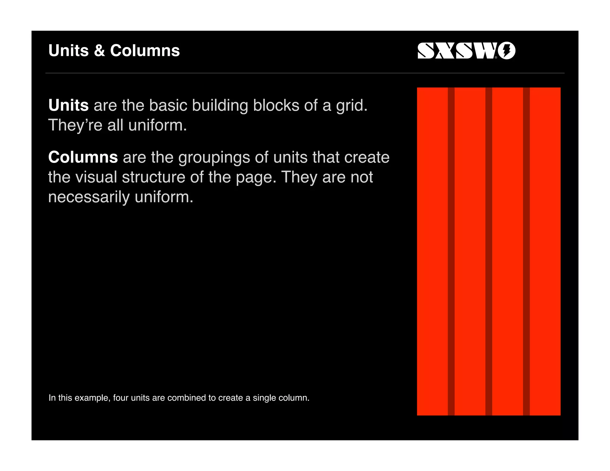
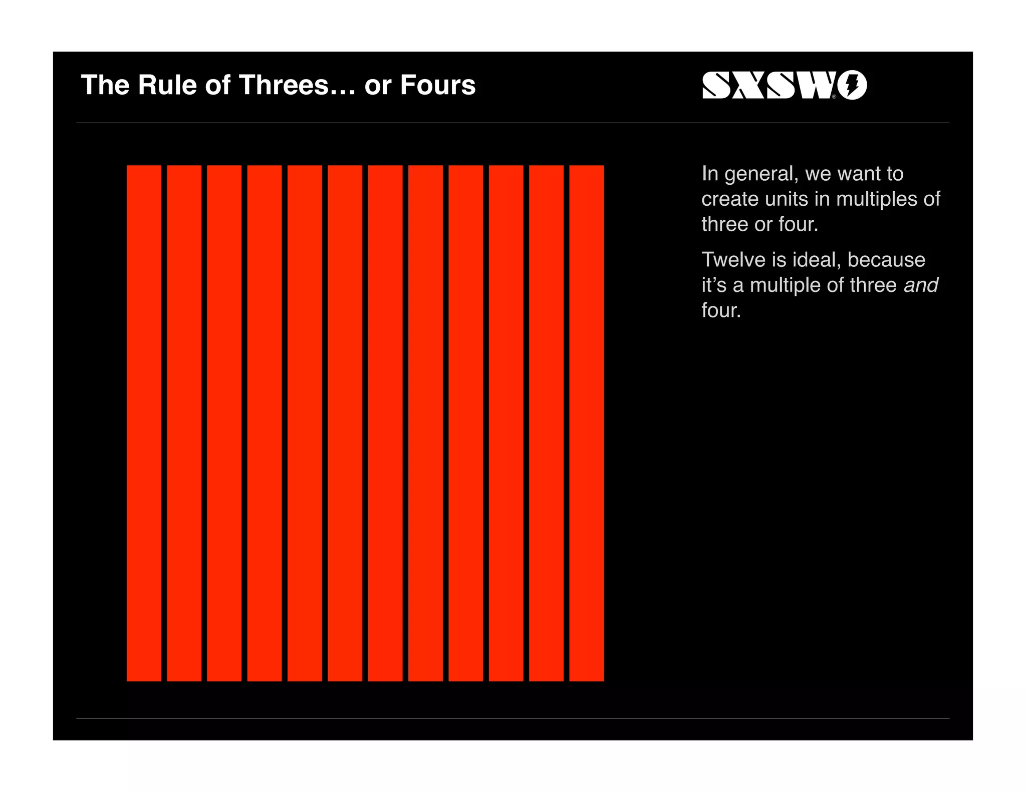
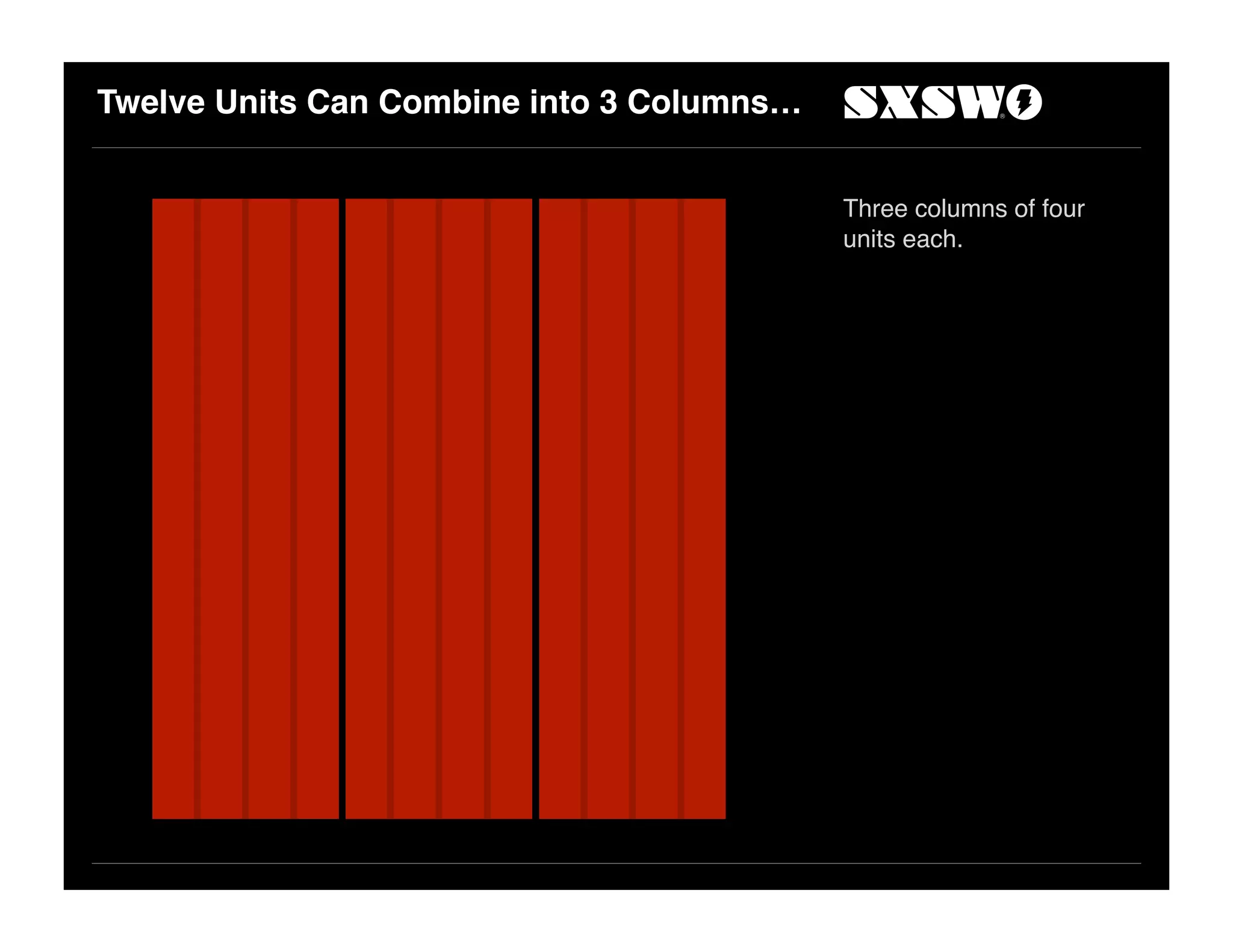
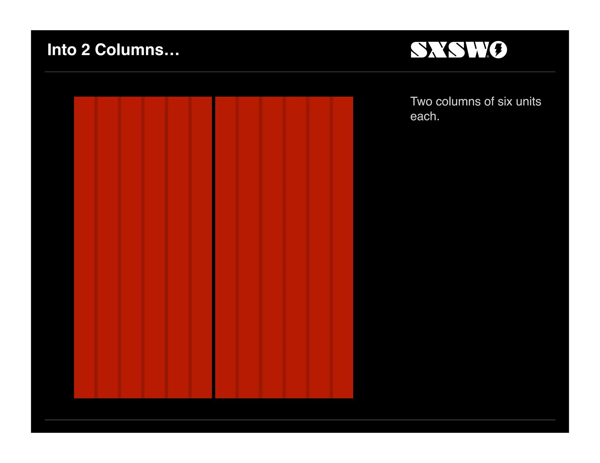
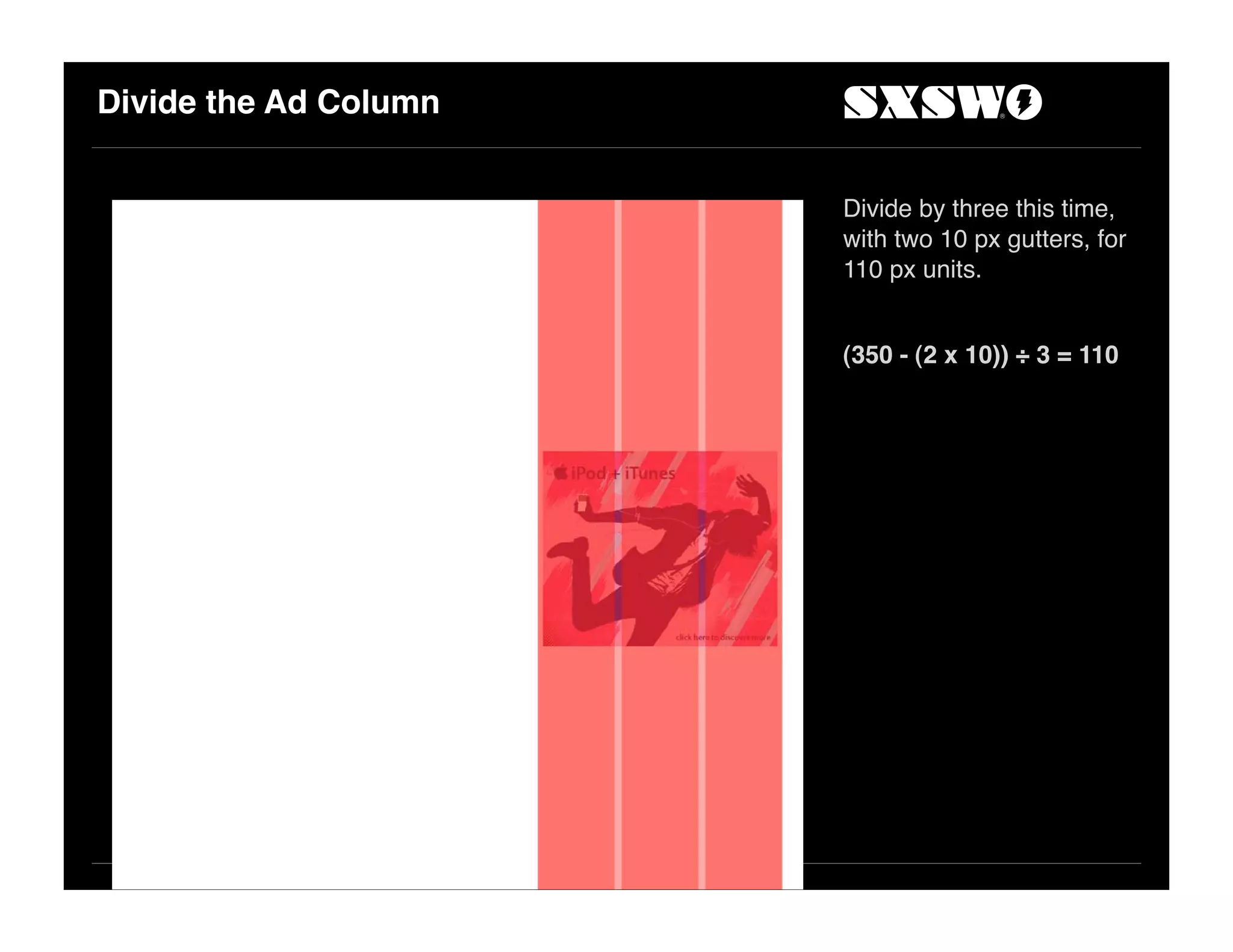
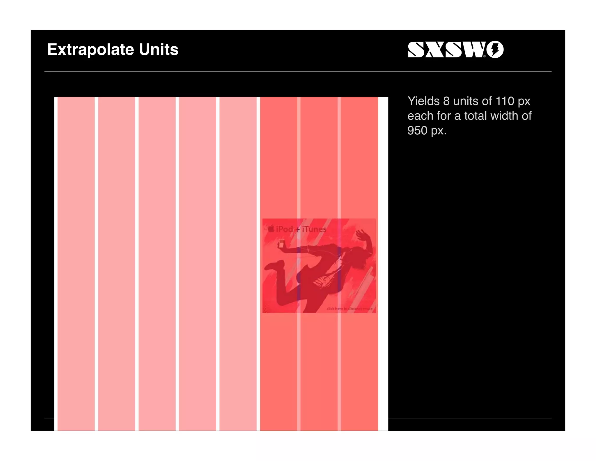
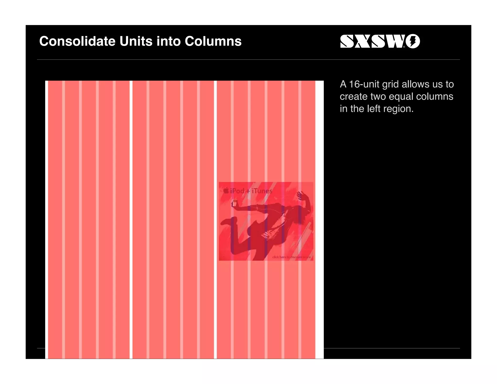
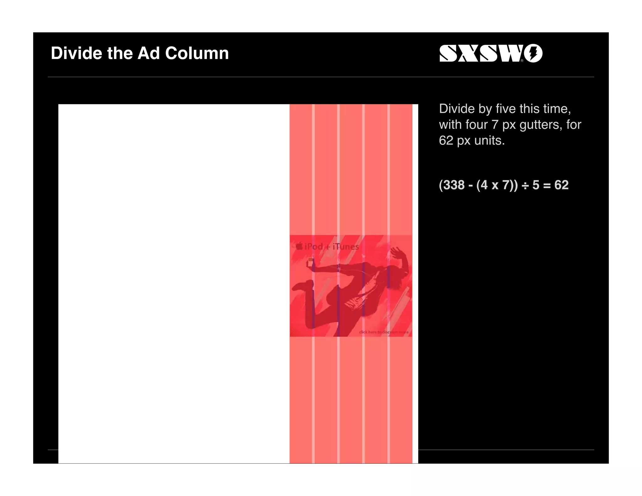
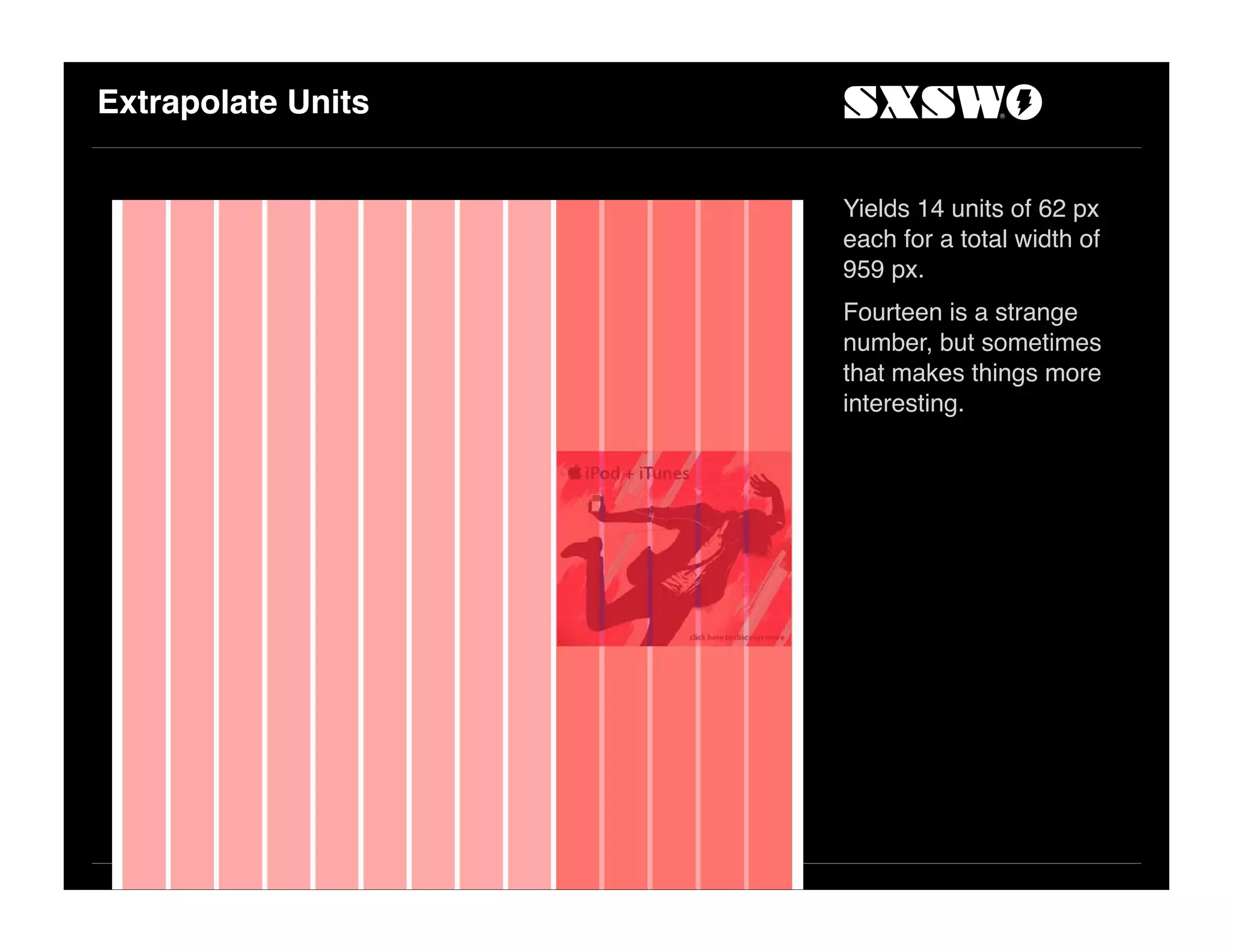
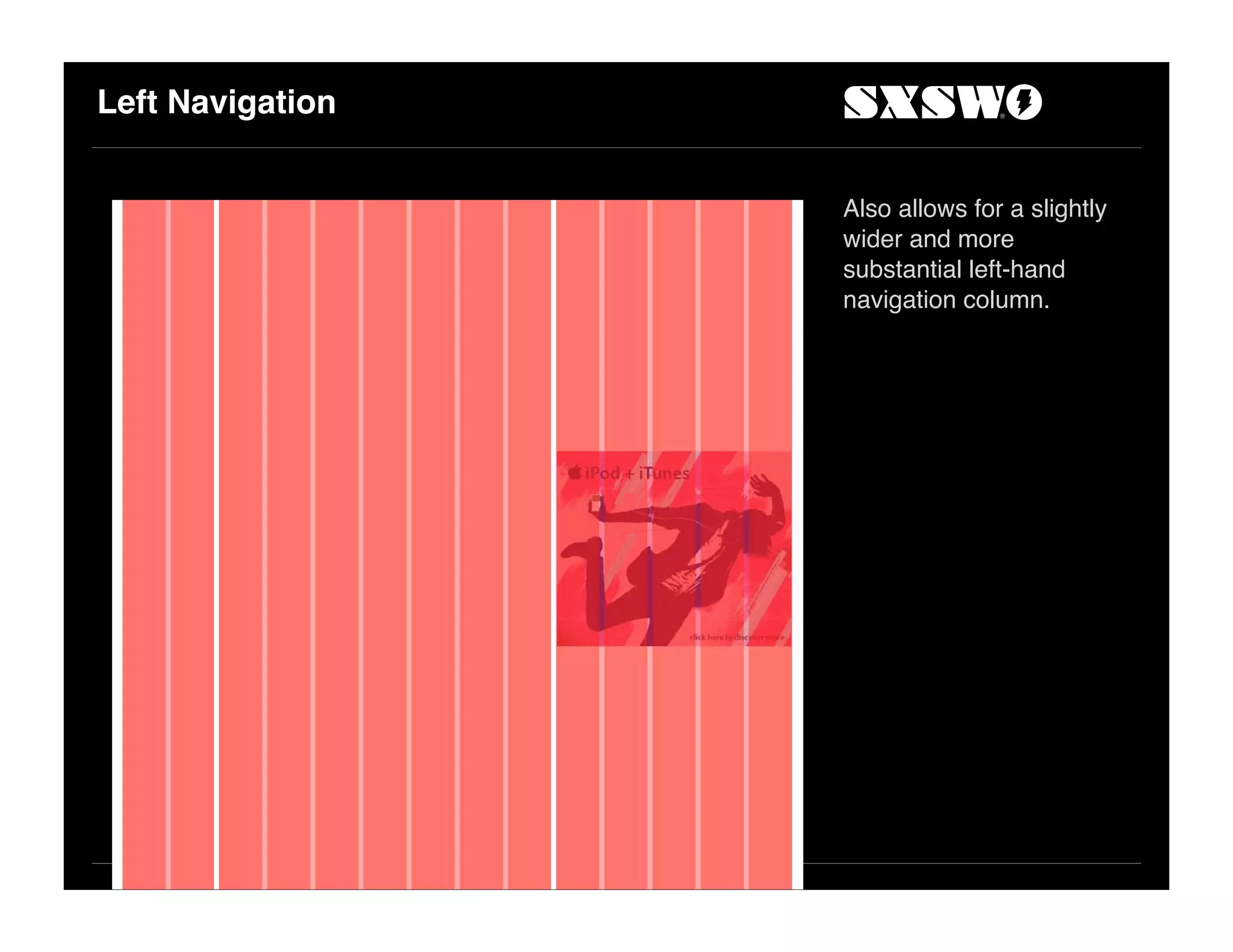
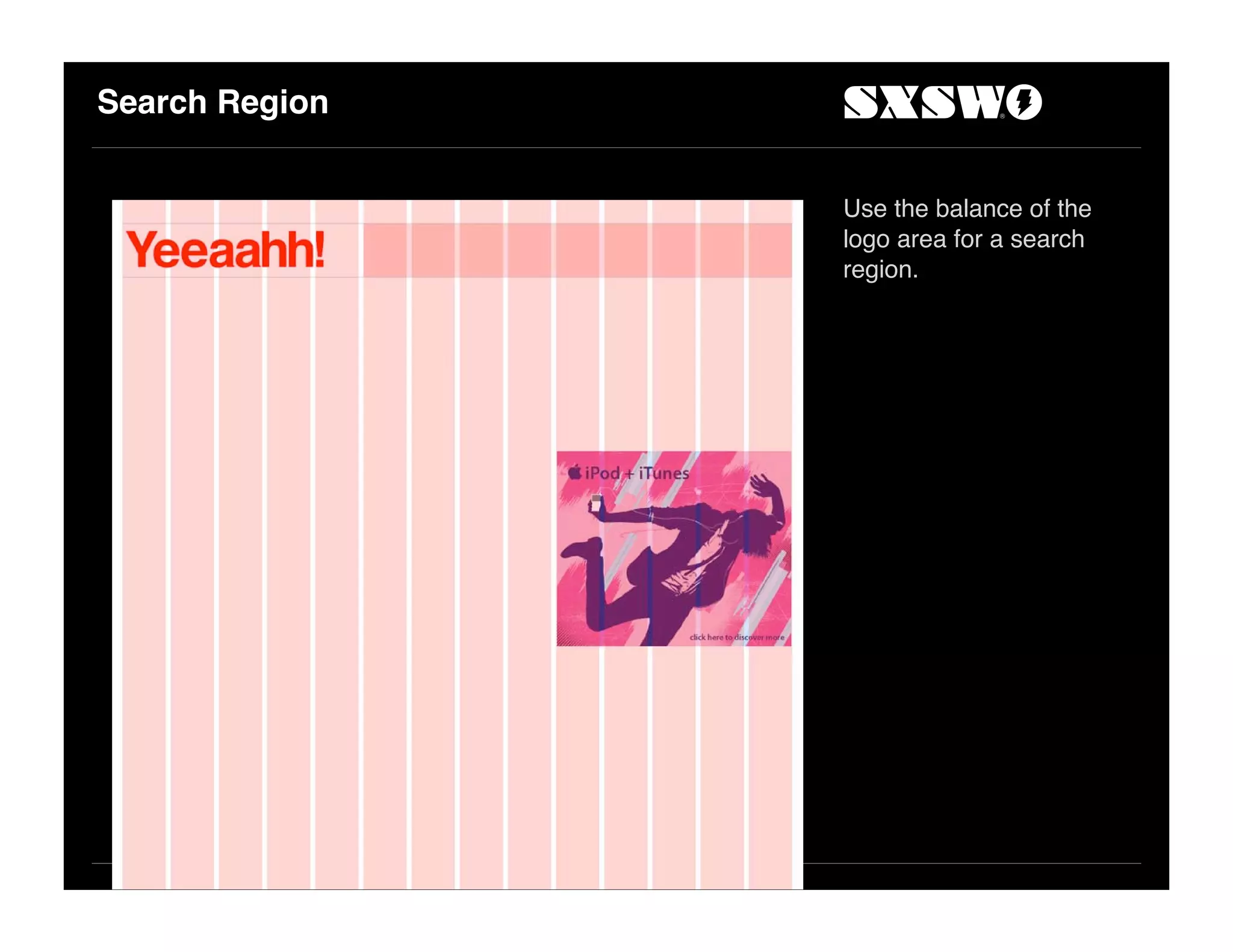
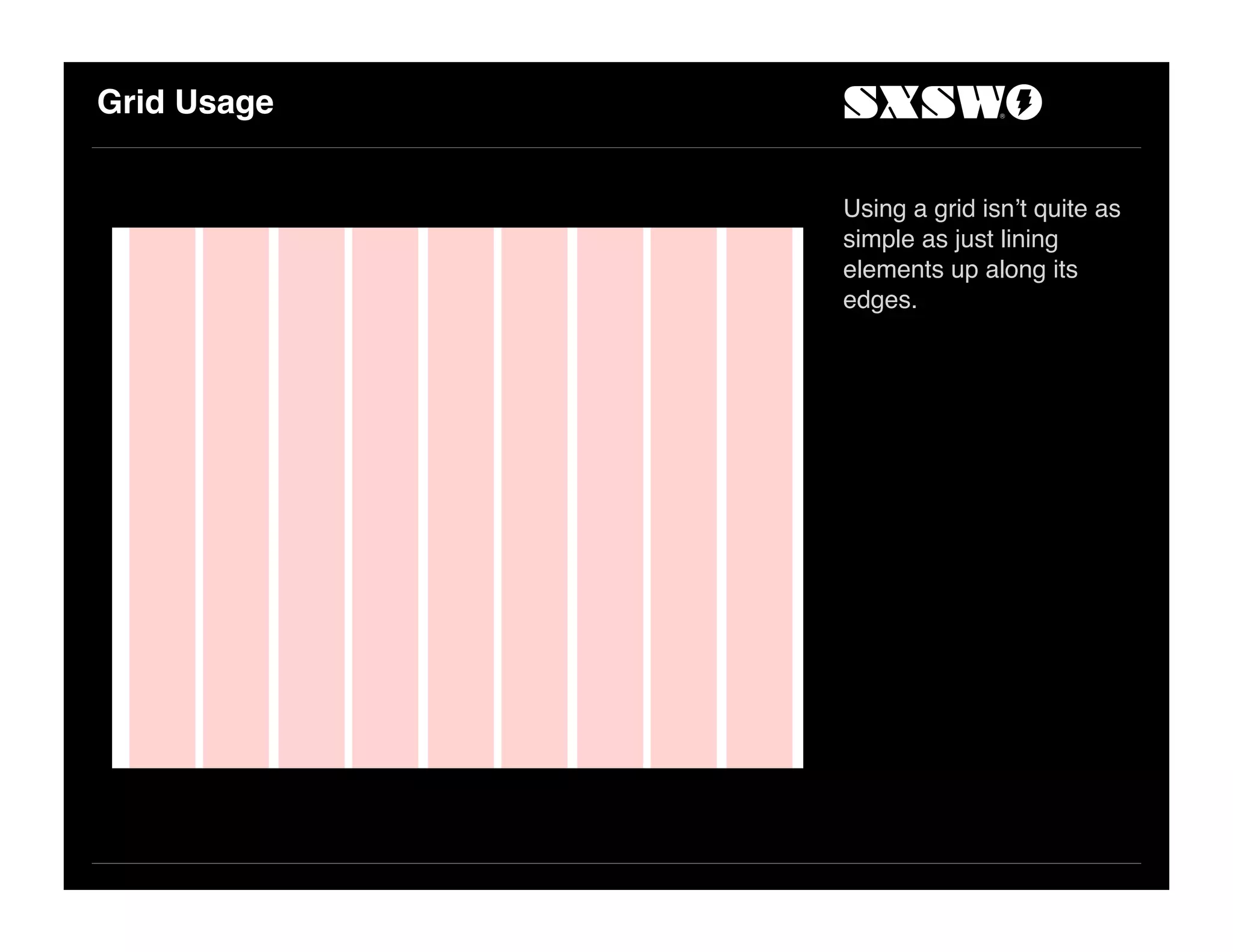
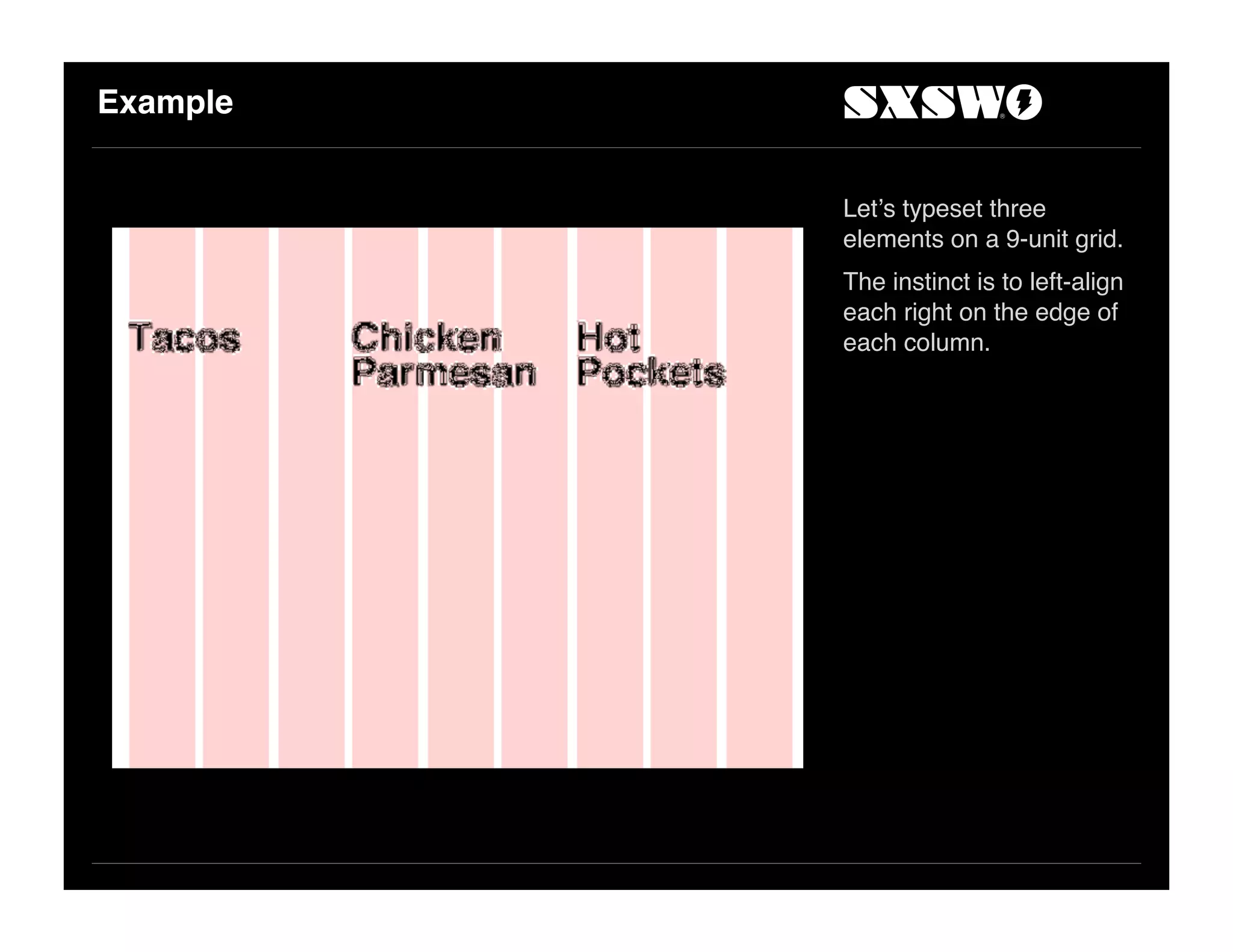
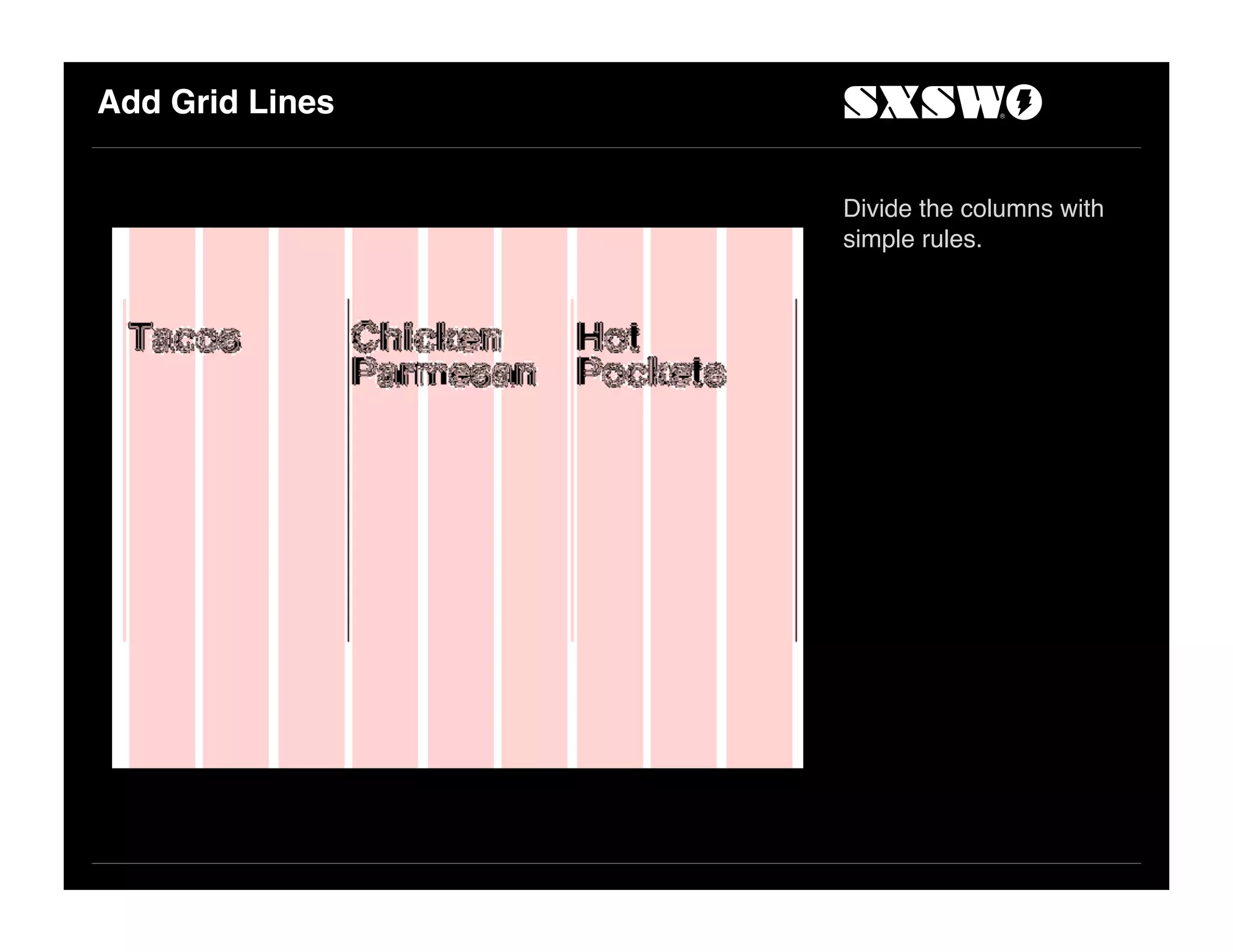
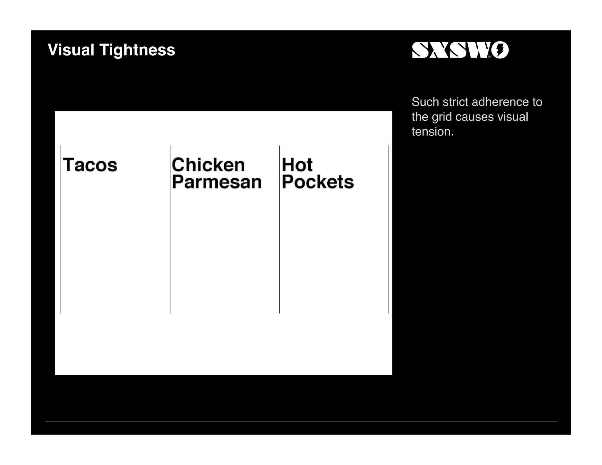
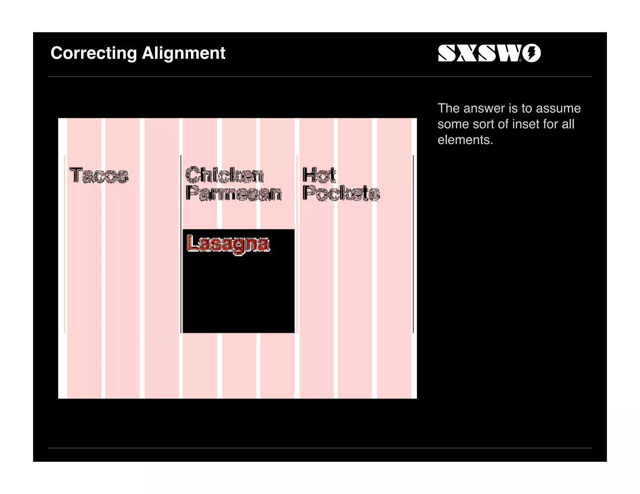
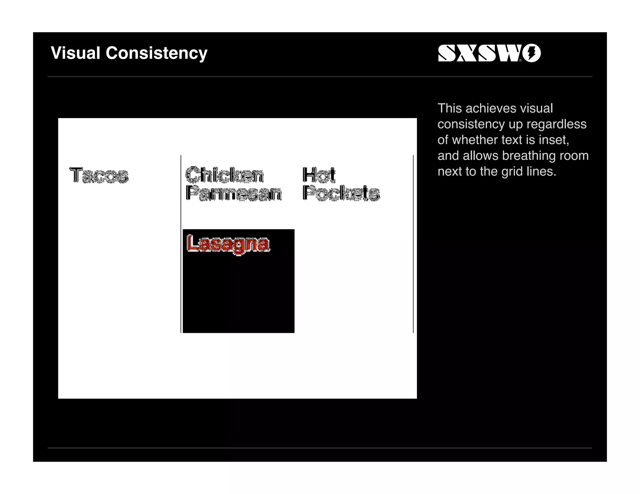
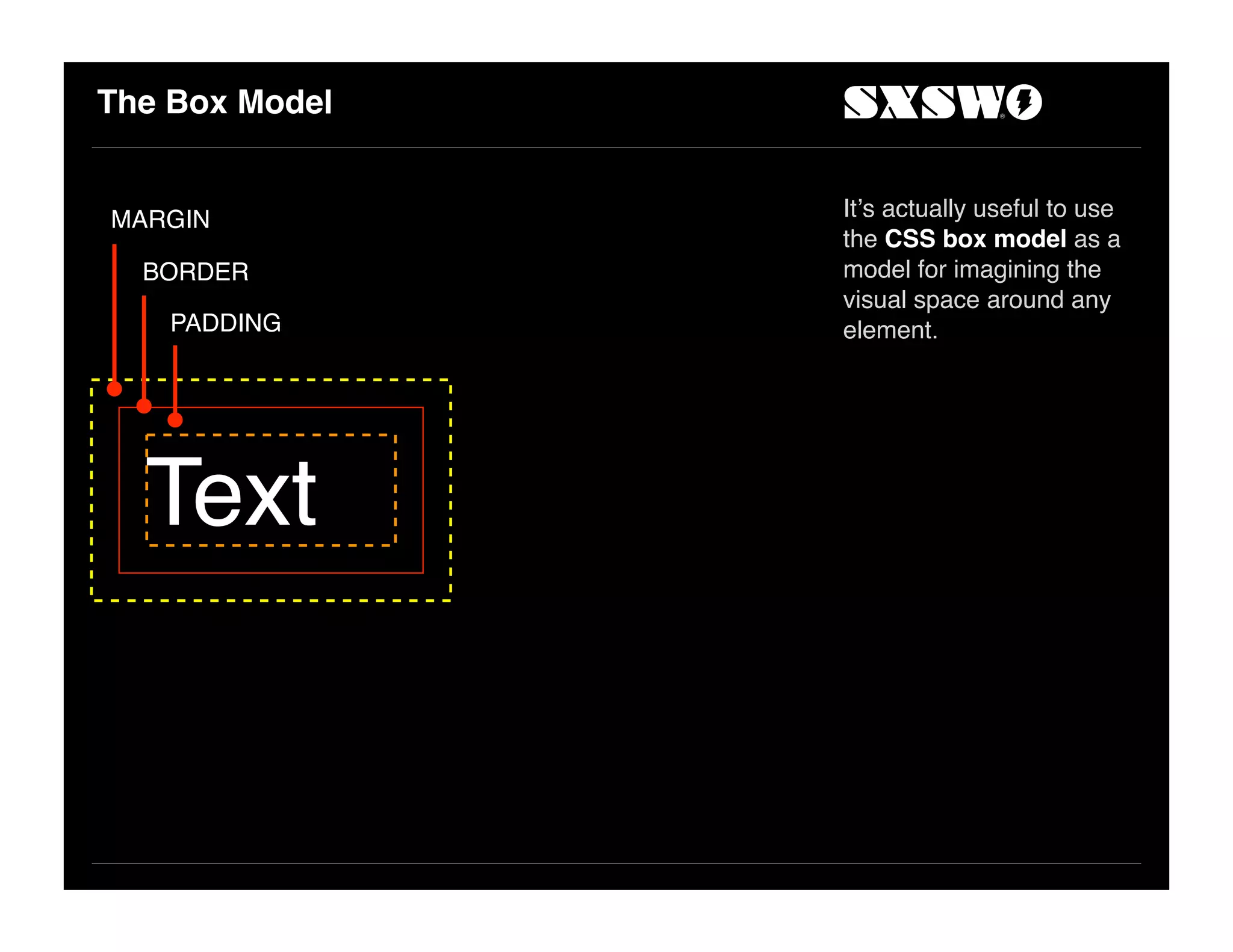
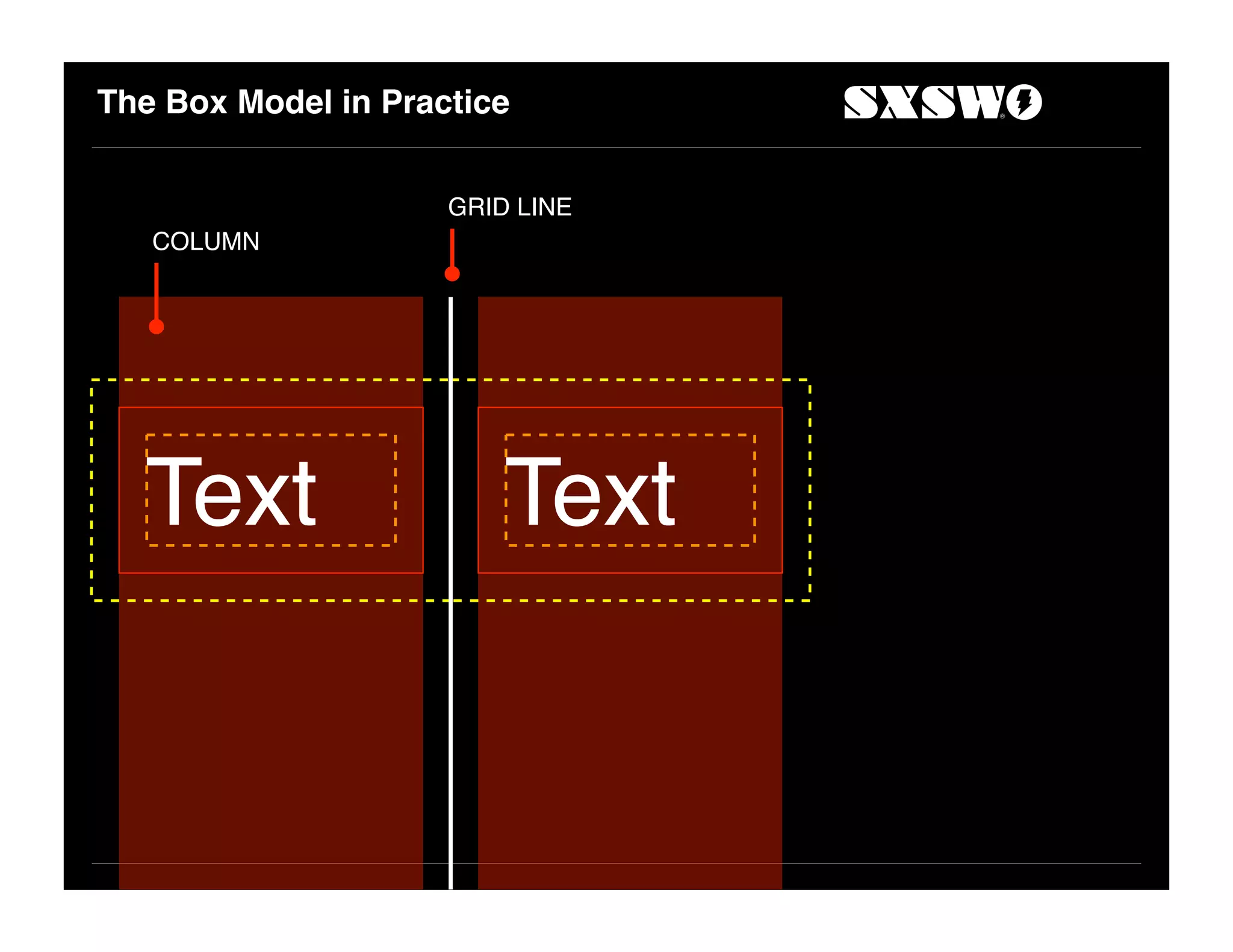
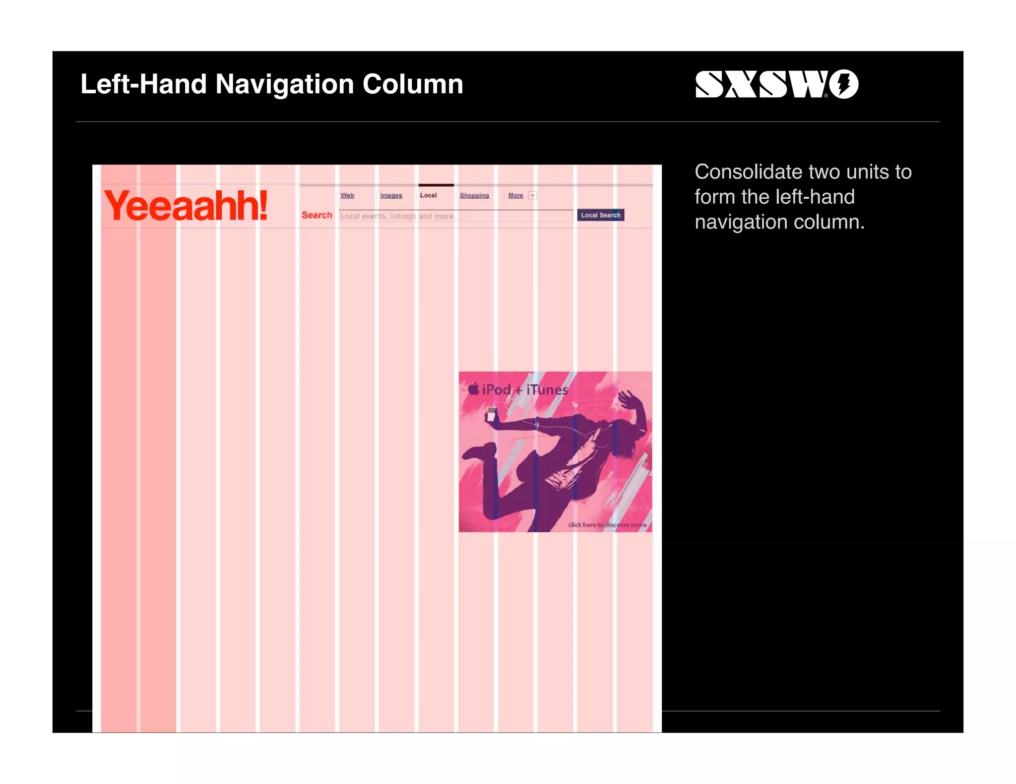
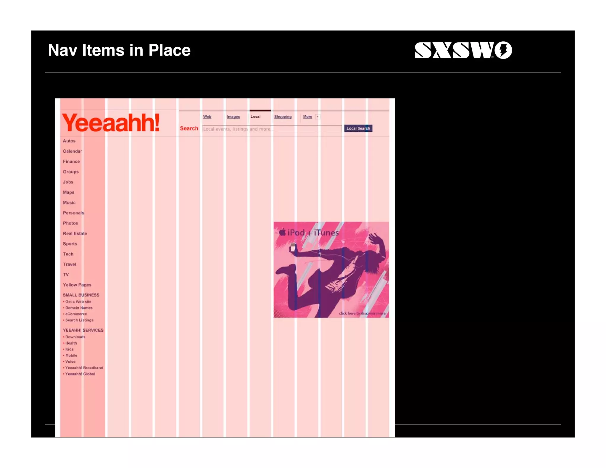
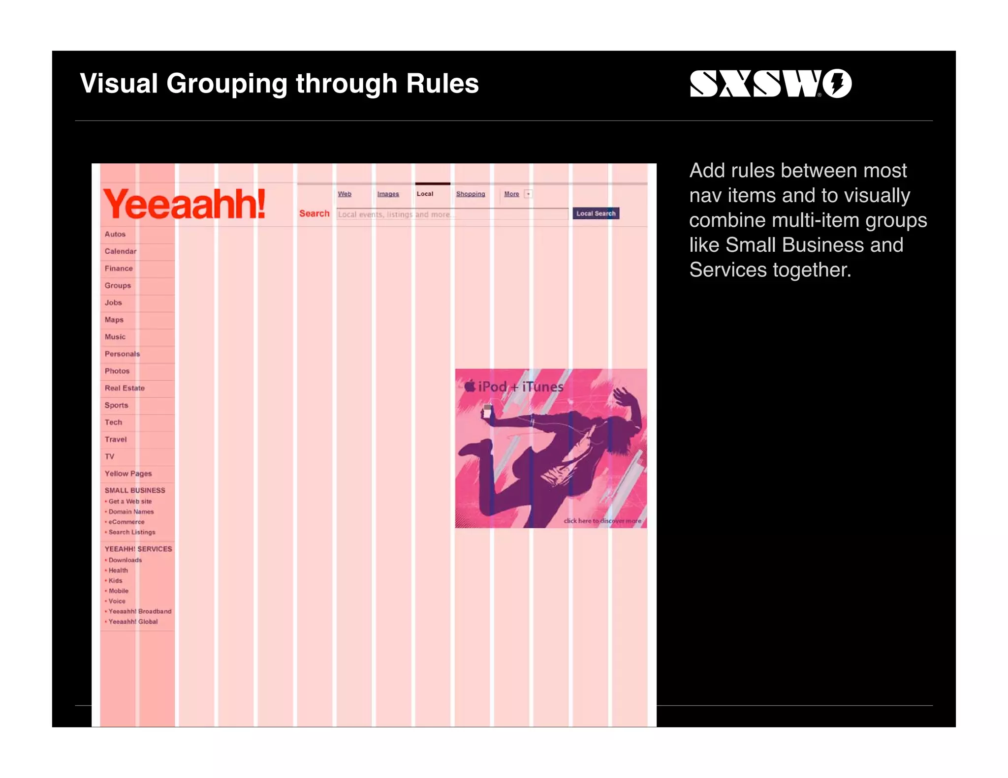
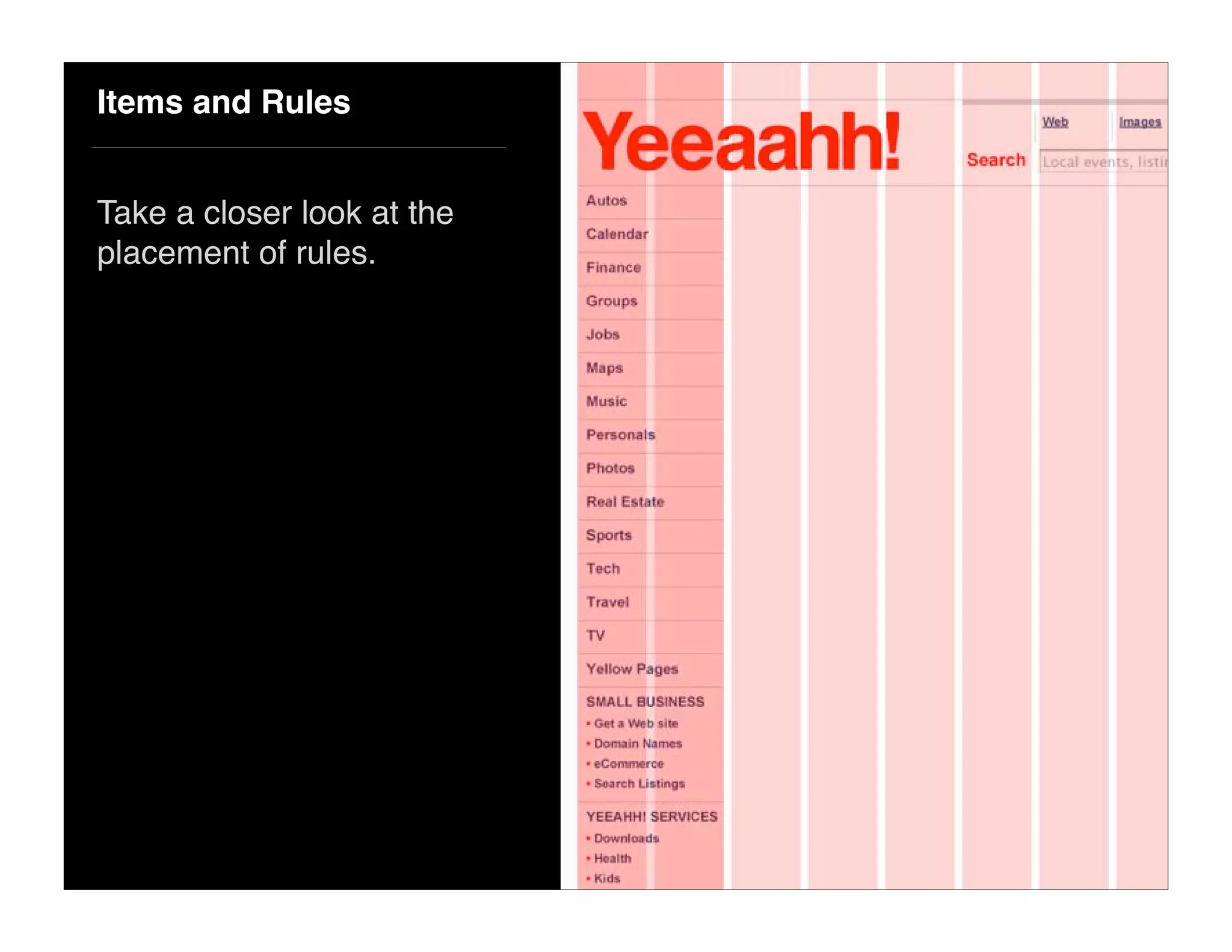
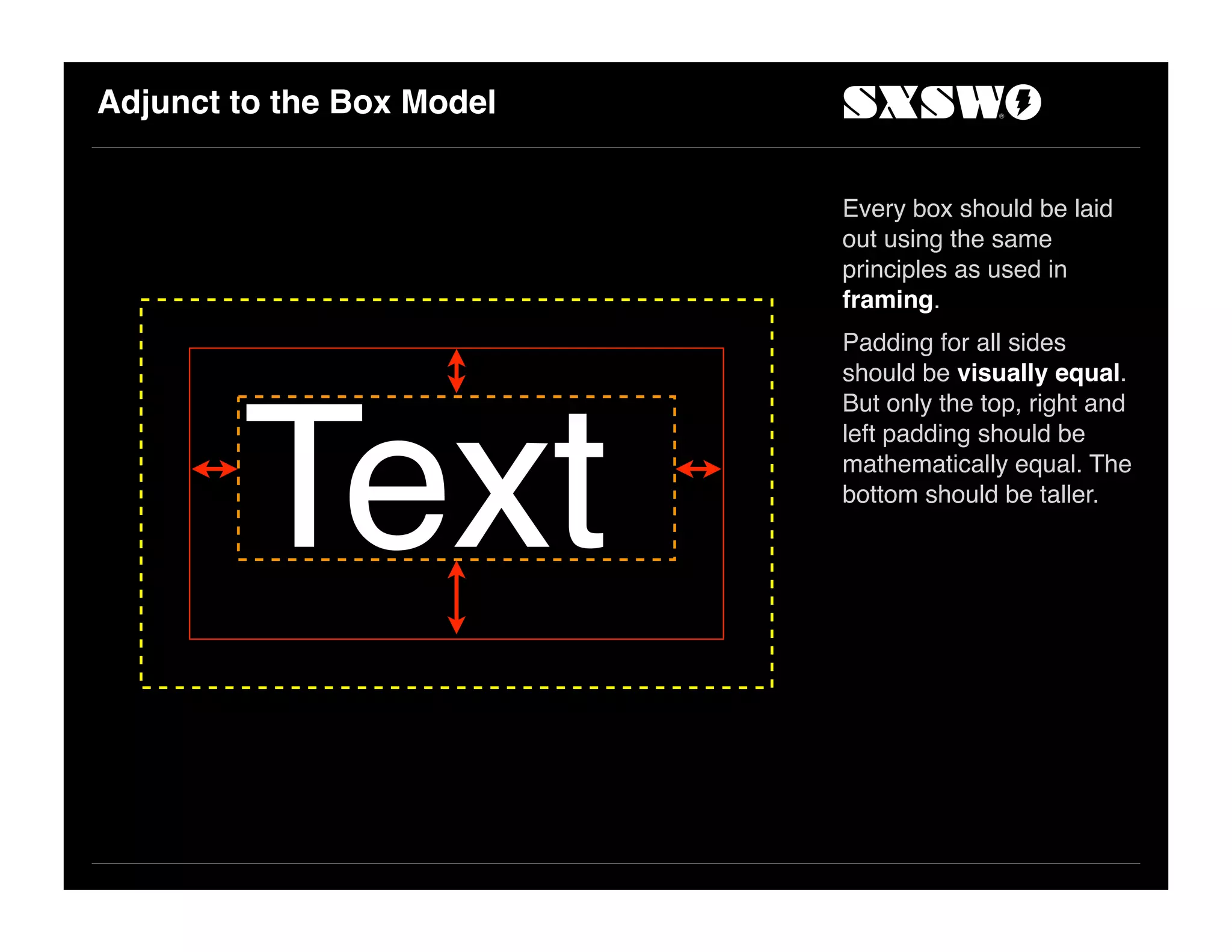
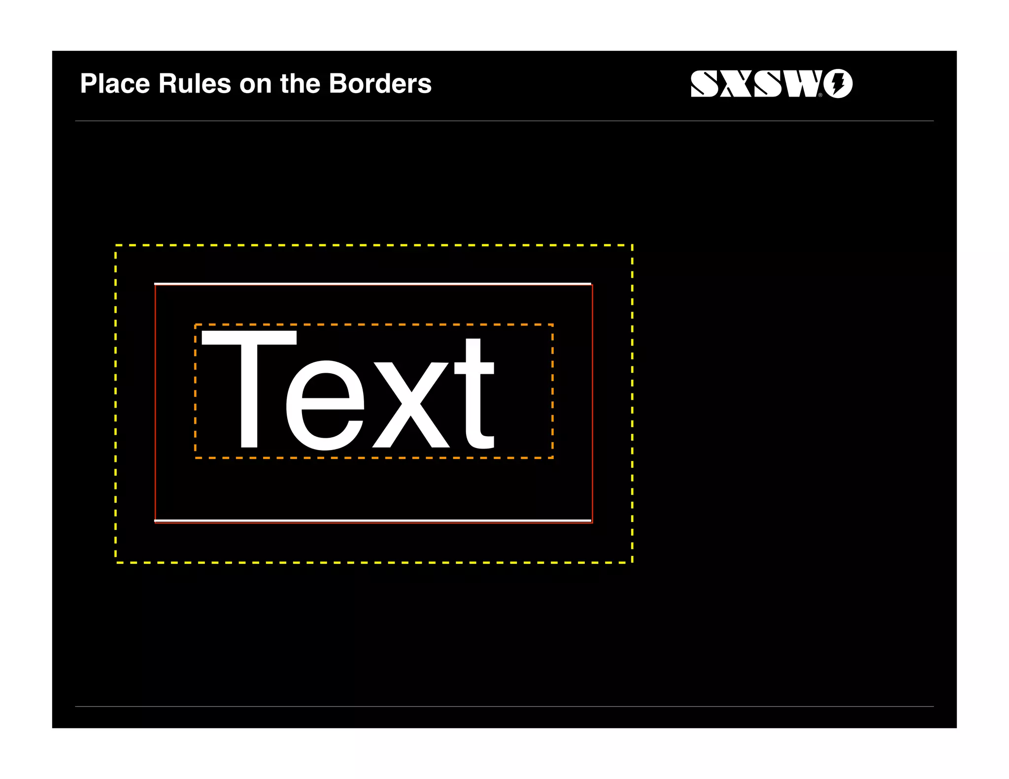
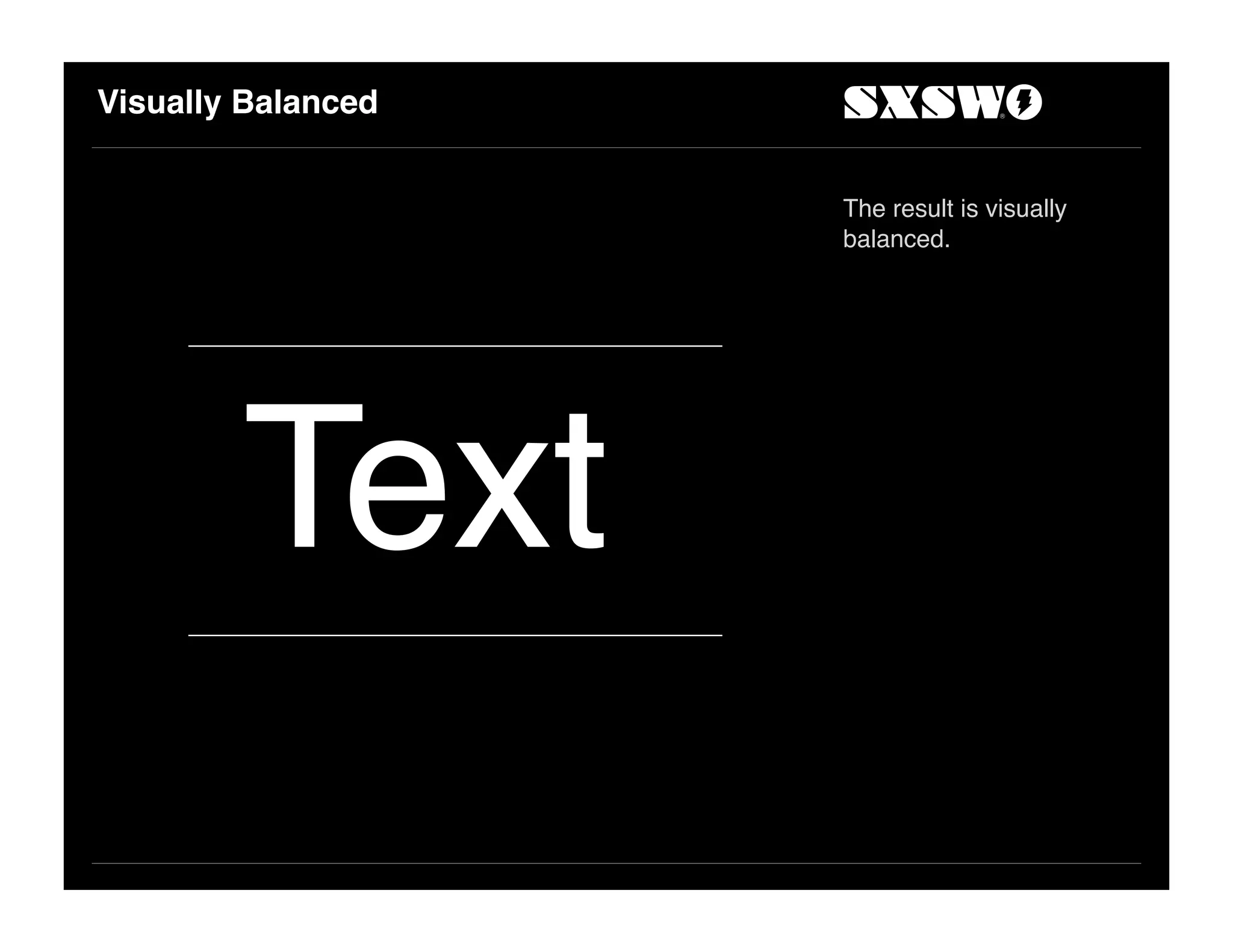
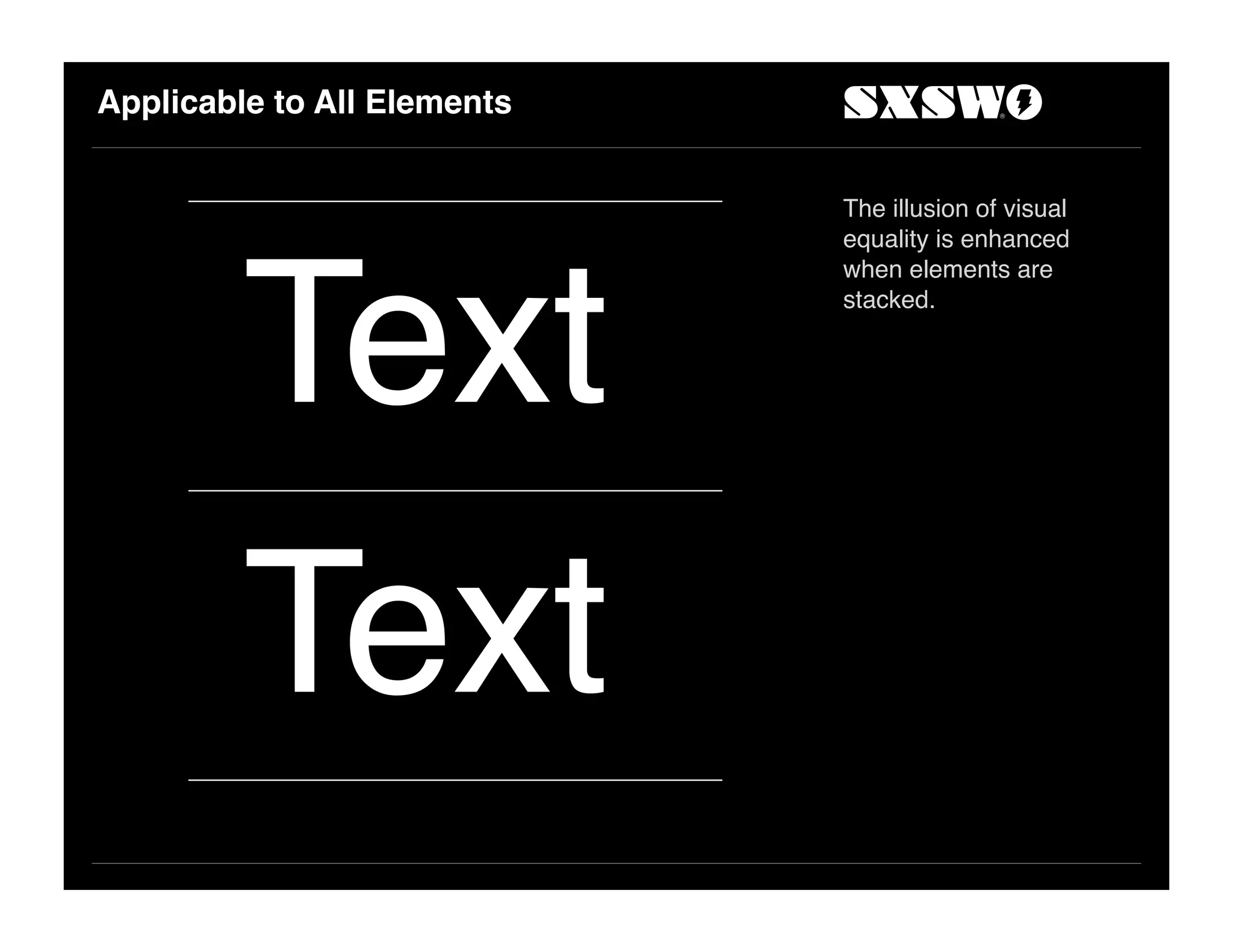
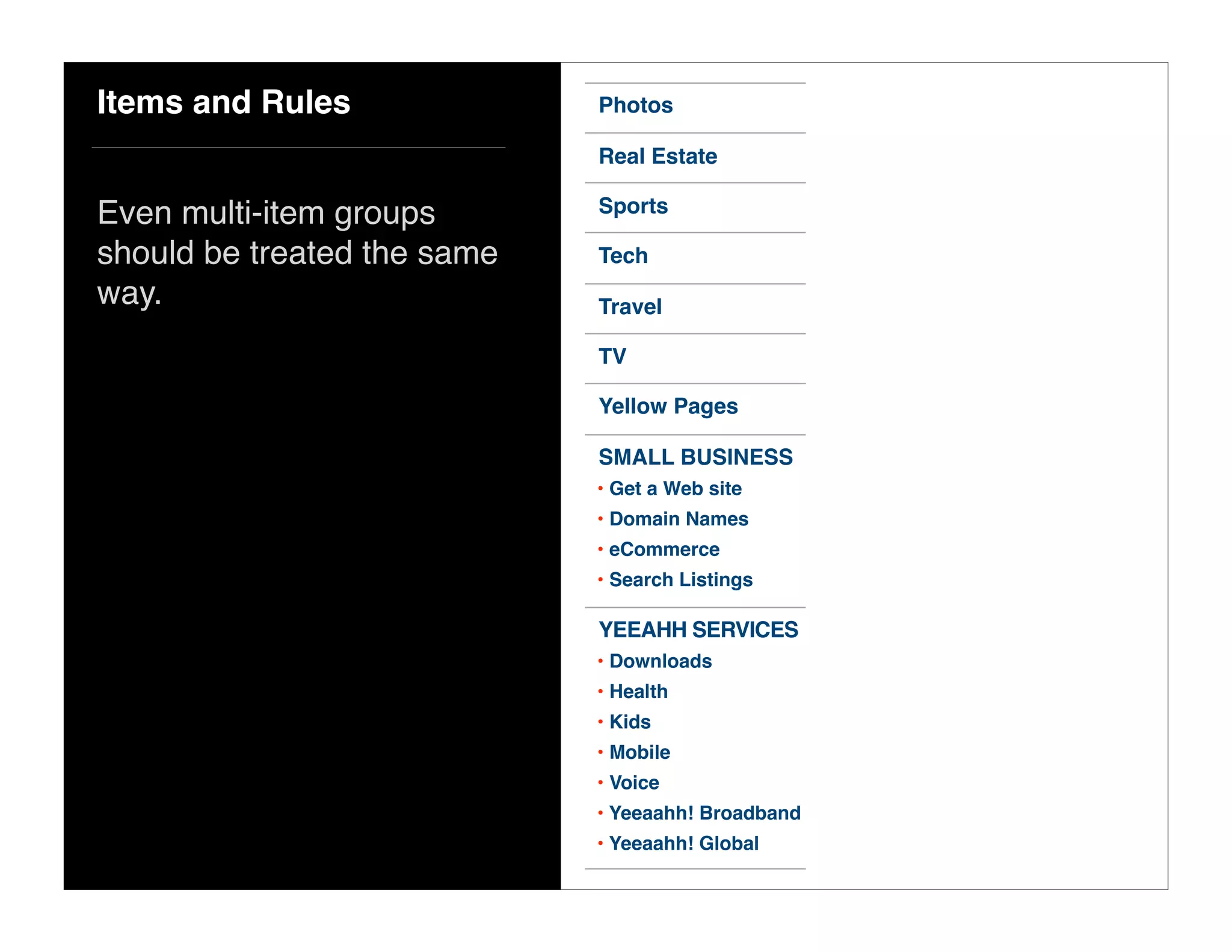
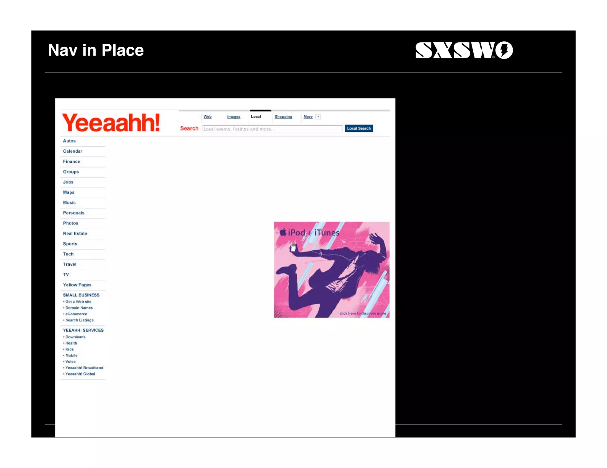
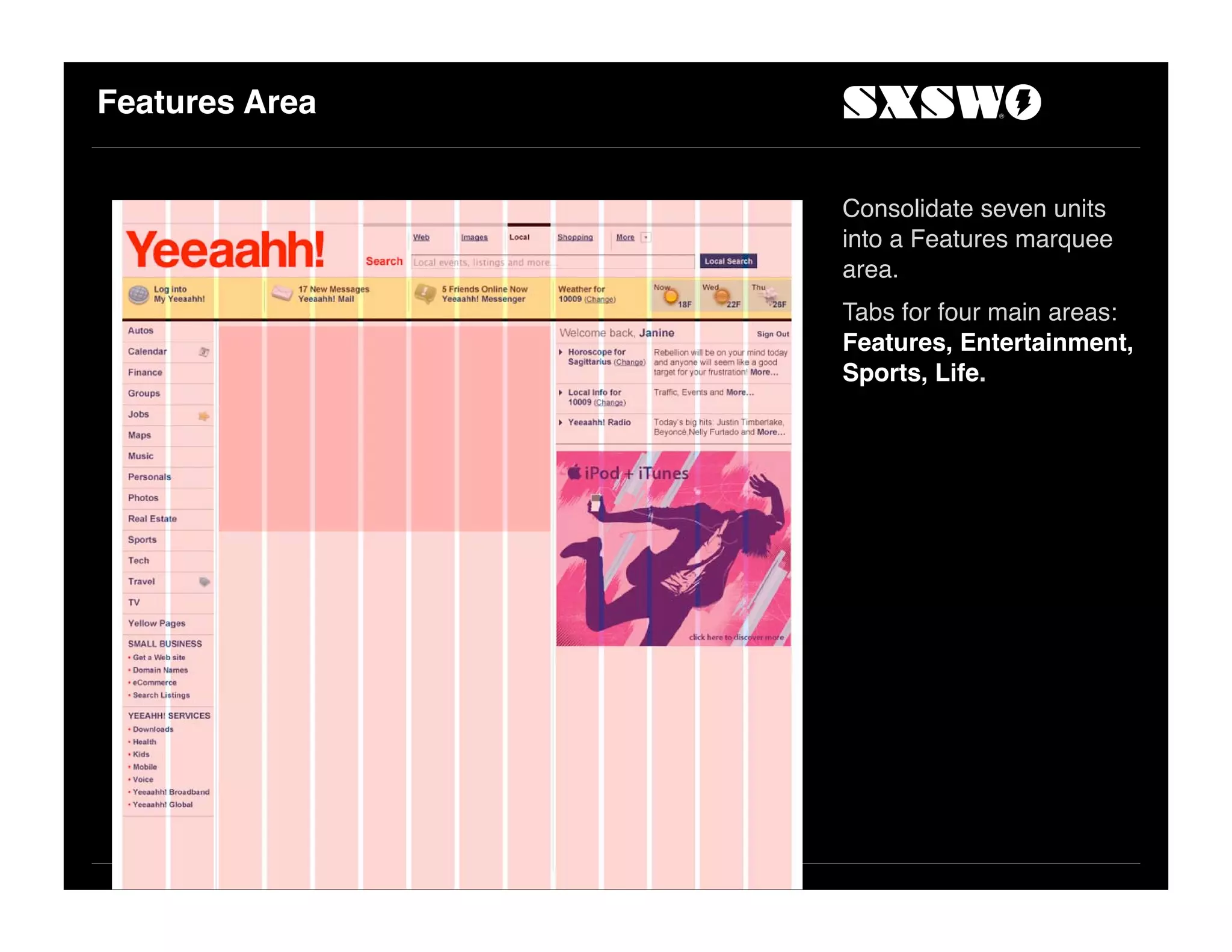
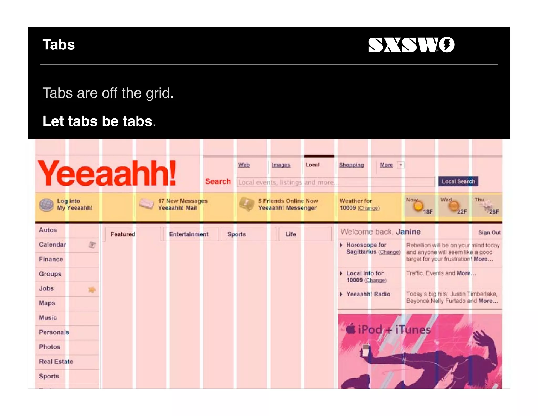
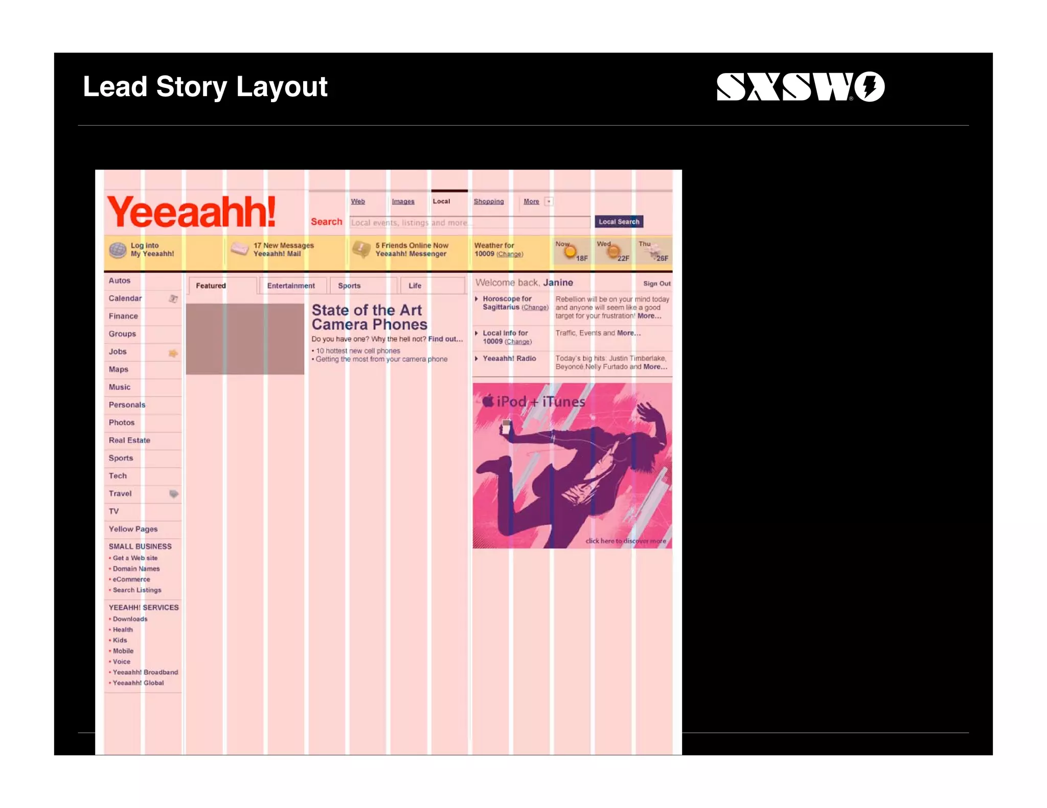
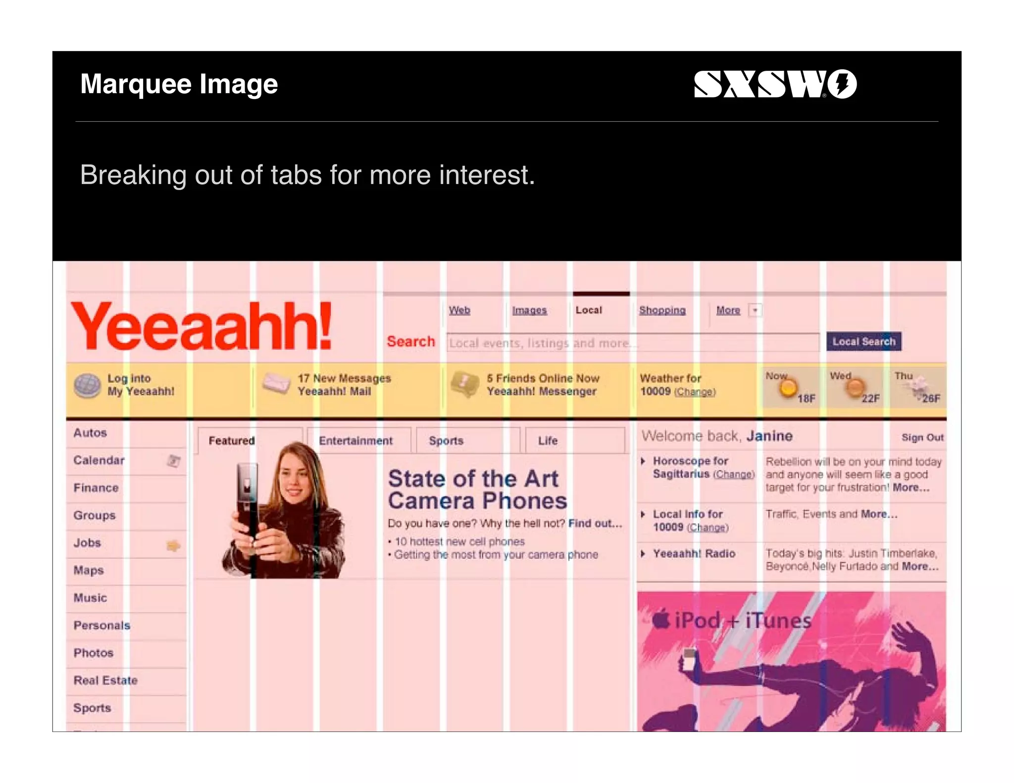
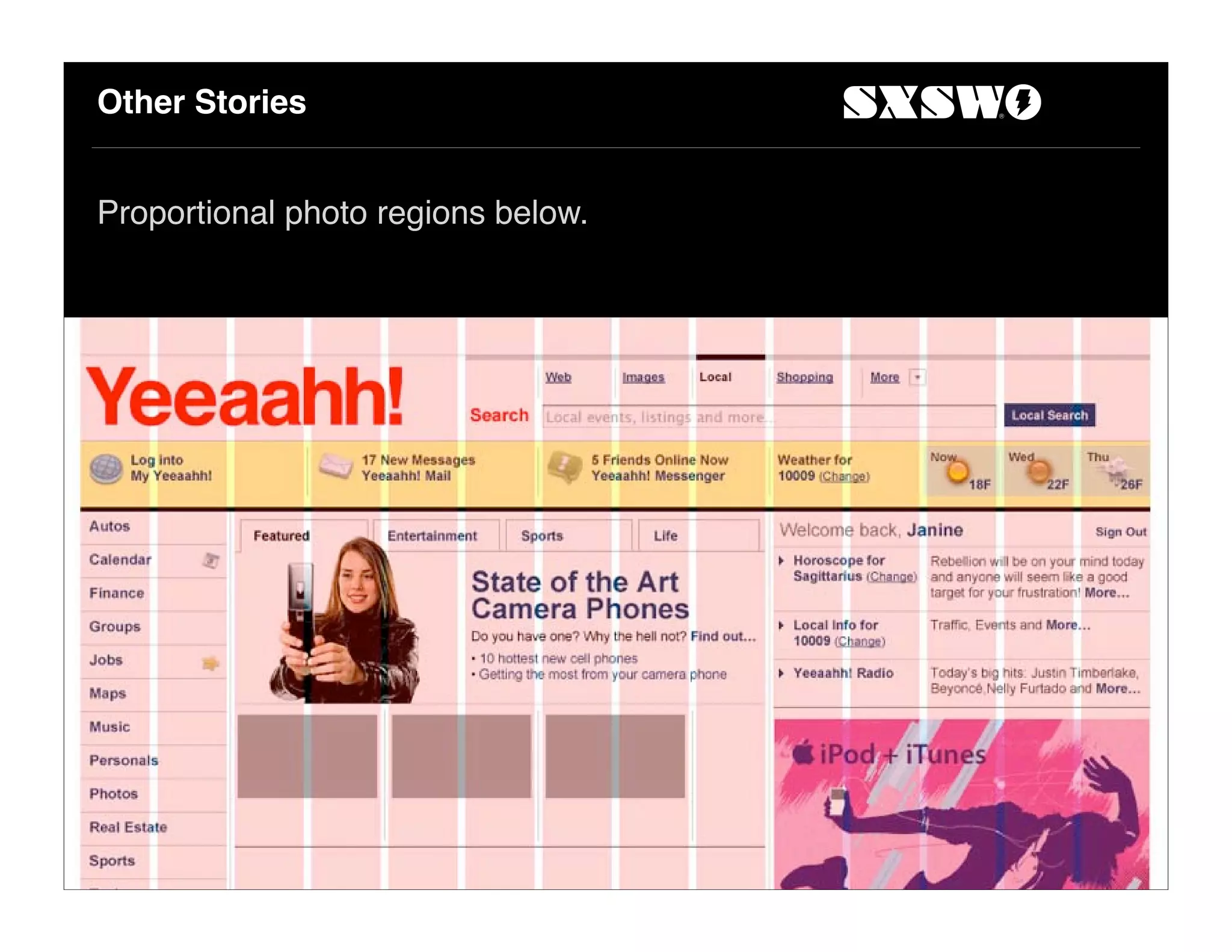
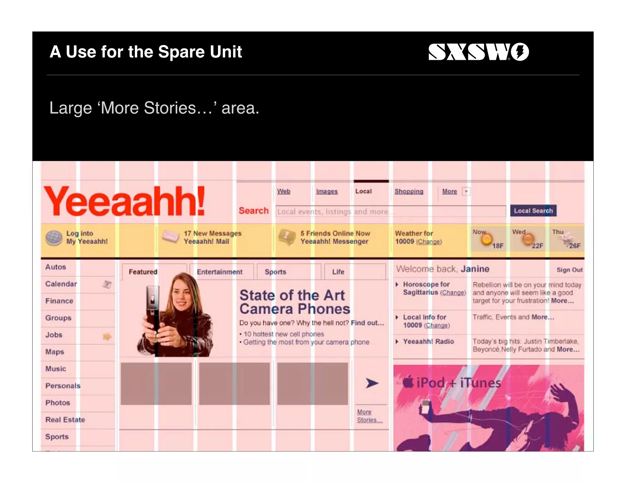
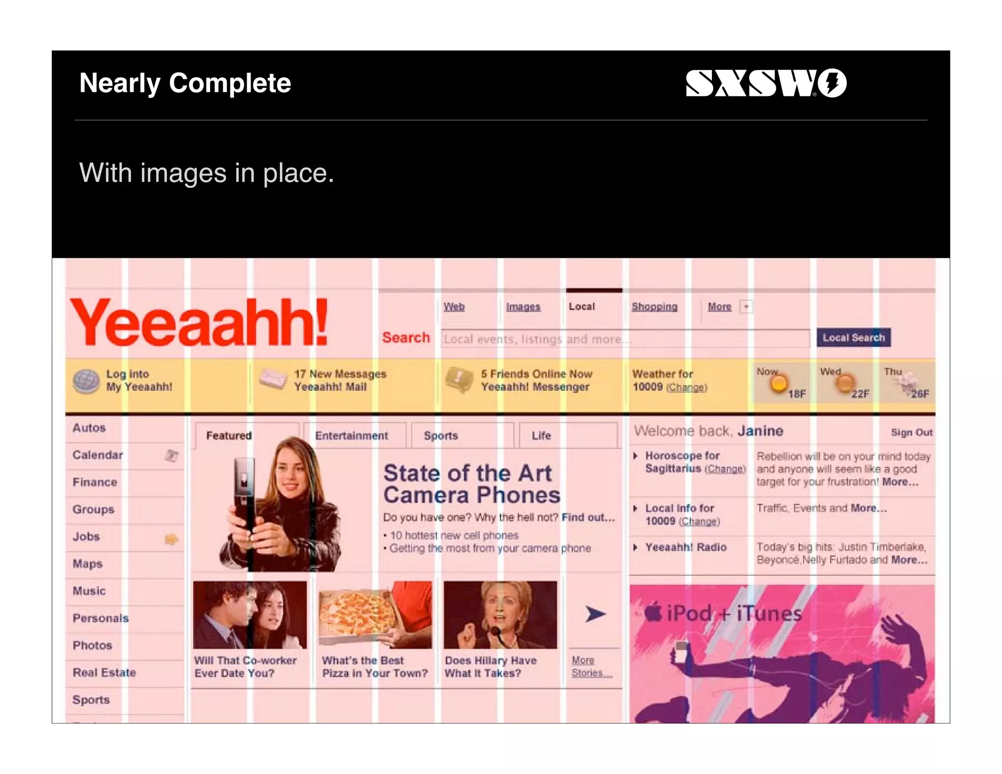
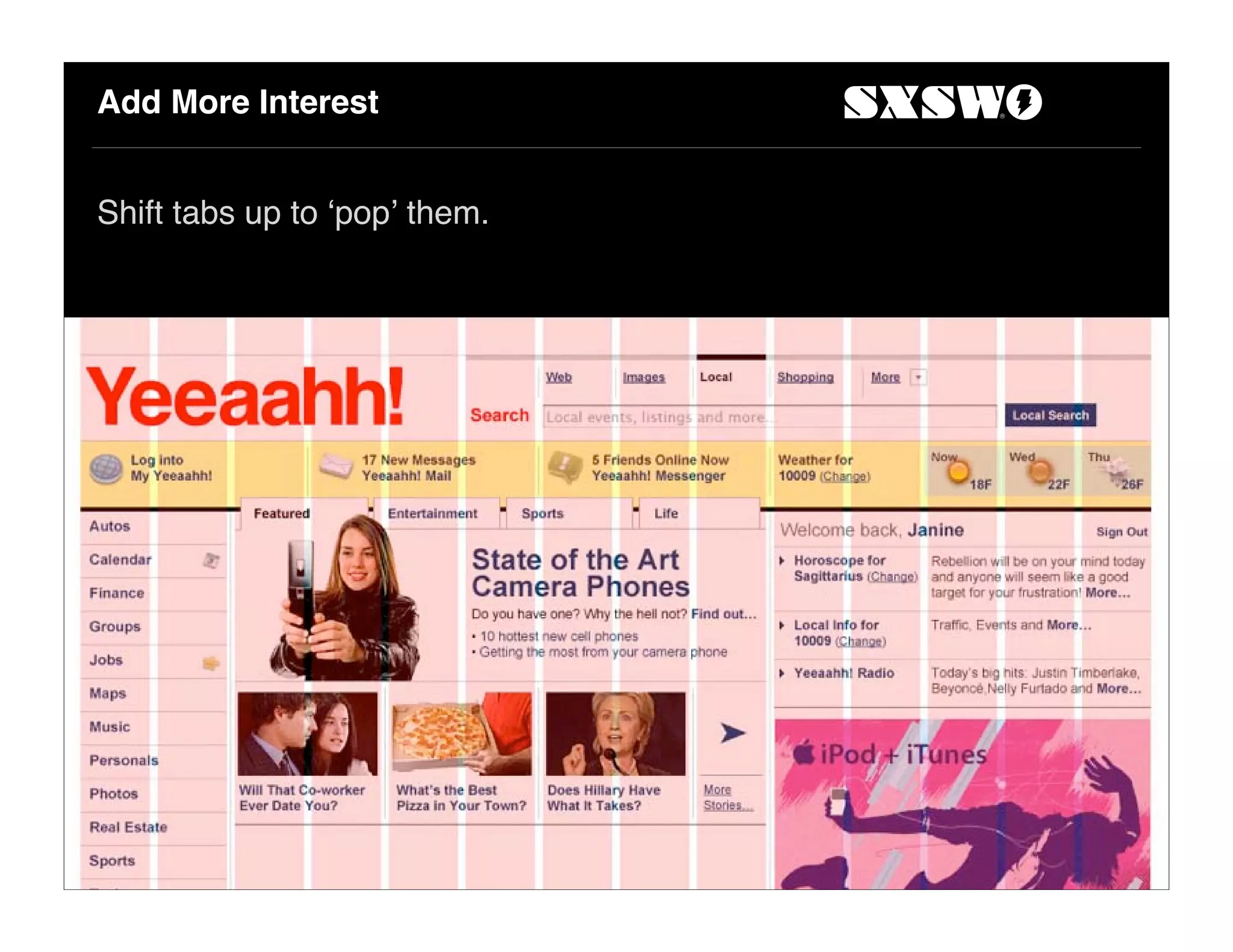
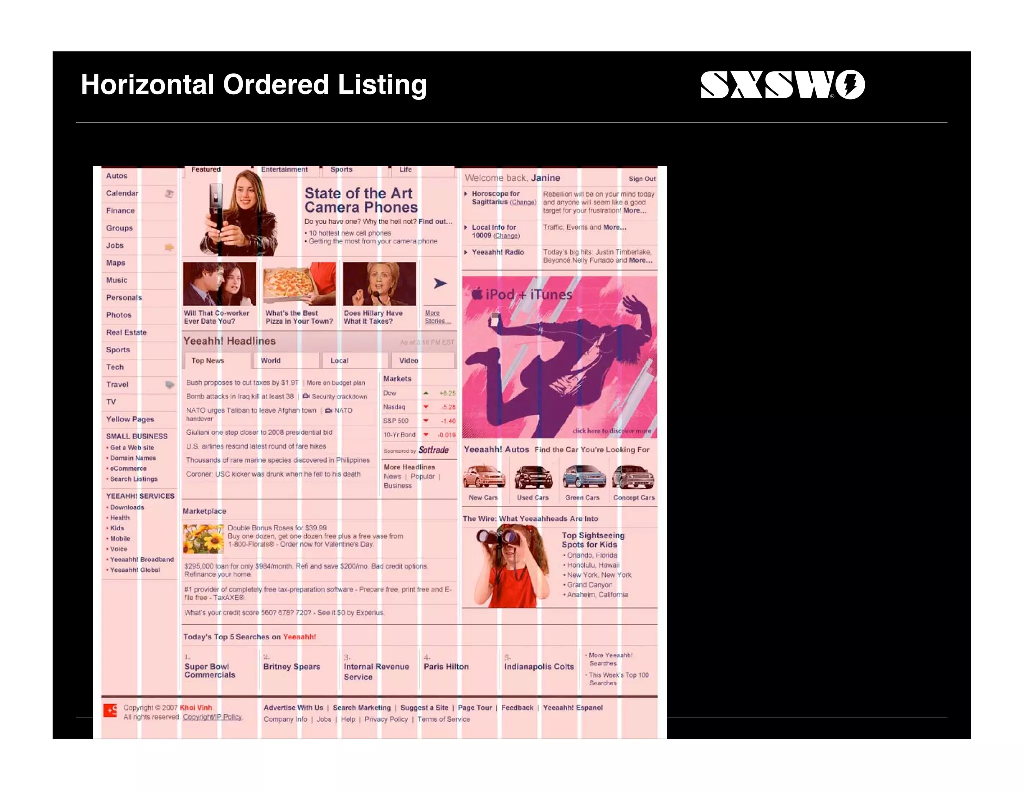
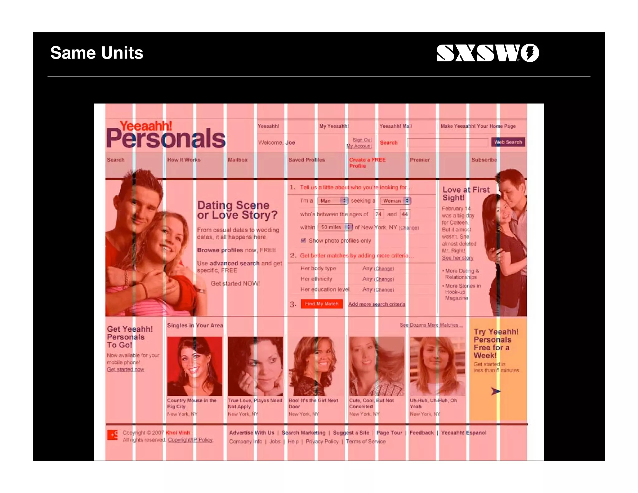
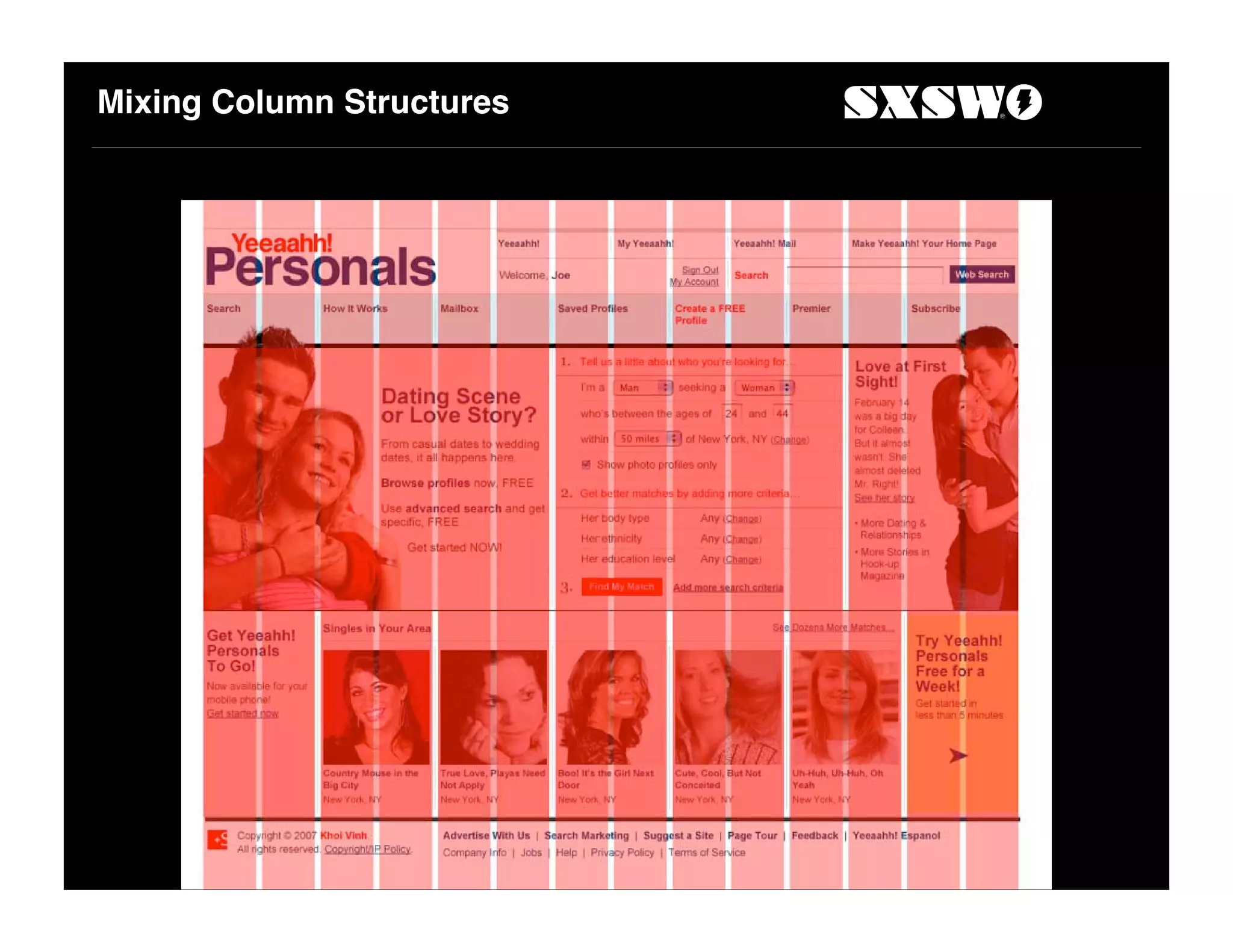
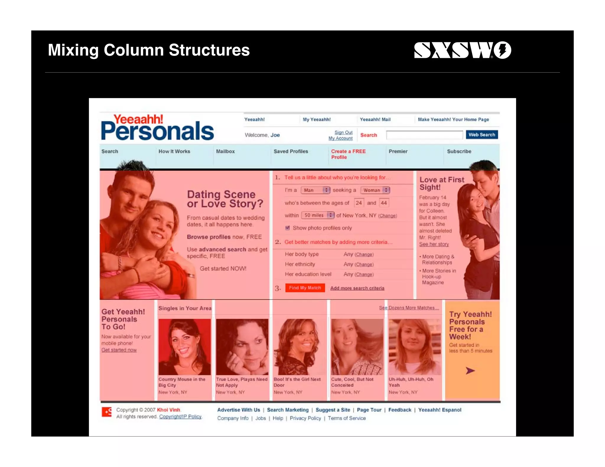
This document summarizes a presentation about using grids in web design. It discusses the history of grids in graphic design and their continued relevance today. The presentation walks through designing a grid for a sample website, considering screen size, ad placements, column structure, and unit sizes. Elements like navigation, search, and content areas are designed within the grid framework. The document suggests treating all elements similarly according to the box model for visual consistency. Overall it promotes the use of grids to bring order and standardization to web design.
Making IT Process Automation Work for Youelliando dias
The document discusses how IT process automation can help organizations reduce costs and improve efficiency. It outlines the benefits of automation, such as improved business agility, reduced risk, and lower operational expenses. The document also discusses how IT process automation is becoming a key initiative to successfully drive down costs. It provides an example of how one company was able to significantly improve their virtual image to staff ratios and achieve rapid ROI through automation.
This document provides an introduction to CakePHP, an open source PHP framework that follows the model-view-controller (MVC) pattern and convention over configuration approach. It outlines key CakePHP concepts like models, views, controllers, associations, and extensions. The document also shares information about the presenter and provides additional resources for learning more about CakePHP.
The document discusses the growing market for location-based apps and services. It notes that location-based mobile apps could generate over $12.5 billion by 2014. While the technology is becoming more affordable and ubiquitous, issues around user experience and privacy still need to be addressed before location is fully adopted. The document promotes Geoloqi's solution which aims to reduce uncertainty in meeting times and eliminate redundant messages through proximity notifications and automatic check-ins based on location.
This document provides an overview of common web application vulnerabilities and how to prevent them when developing Java web applications. It begins with examples of recent security breaches involving web apps and why web app security is important. It then discusses the typical architecture of web apps and principles of secure programming. The bulk of the document outlines the top 9 most common web vulnerabilities, providing examples of vulnerable code and solutions to prevent each type of vulnerability. It focuses on input validation, access controls, session management, and cross-site scripting vulnerabilities. The goal is to help developers learn how to build secure Java web apps.
This document outlines six principles of good web design: consistency, convenience, readability, speed, accessibility, and testing. It provides guidelines for each principle, such as keeping a consistent layout, fonts, and color palette; including navigational links on every page; using readable text colors and white space; minimizing images to improve download speed; designing for common screen resolutions; and testing pages across different browsers and computers. The information comes from a powerpoint presentation based on a book about web design for art teachers.
The document discusses the history and use of grids in design. It begins with an overview of grids and their purpose in bringing order and standardization to design. The document then provides examples of historical grid usage from the modernist era. It discusses how grids are still used today for similar reasons as in the past. The bulk of the document focuses on designing a grid for a specific website, including determining constraints, unit sizes, column configurations, and layout techniques. It emphasizes starting with the design problem and establishing constraints to guide grid creation.
The document discusses the history and use of grids in design. It begins with an overview of grids and their purpose in bringing order and standardization to design. It then provides examples of grids used historically from the 1400s to modern times. The document goes on to describe how to build a grid for a specific website, including determining constraints, establishing units and columns, and using the grid to layout page elements while allowing for behavior of elements. It emphasizes using grids not just for alignment but for visual consistency and tightness.
The document discusses the history and use of grids in design. It begins by outlining the constraints of the design problem, including a screen resolution of 1024x768 and incorporating common ad unit sizes like the Big Ad. Various grid options are explored and a 12-unit grid with units of 62px is selected. Elements like headers, navigation, and content areas are placed on the grid. The document shows how following box model principles and allowing padding around elements achieves visual consistency. Overall the document provides an example of thoughtfully designing a grid structure based on constraints and using the grid to lay out page elements.
This document summarizes the key points in a presentation about using grids in web design. It discusses how grids can provide order and structure, traces the historical use and rationale for grids, and provides examples of applying grids to layout web pages. Specific tips are given, such as using a multiple of 3 or 4 units, allowing for padding in element boxes, and treating rules between elements similarly to borders. The document demonstrates creating a grid structure and dividing a page into regions like headers, navigation, content areas, and sidebars.
The document discusses the use of grids in design. It provides a brief history of grids from early ornamental designs to modern rational designs influenced by machines and standardization. The document then discusses how to build a grid for a specific design problem involving a 1024x768 screen size and big advertisement units. It demonstrates going through multiple attempts to define an appropriate grid, including rounding advertisement column widths, extrapolating unit sizes, and consolidating units into columns. The optimal solution presented uses a 14-unit grid with 62 pixel units to allow for flexible layout of content while accommodating advertisements.
The document provides an overview of web design concepts including the evolution of web design, common grid layouts, typography best practices, and use of color. It discusses the progression of web design from early text-based pages to modern CSS-based and responsive designs. Key grid layouts like 960 grid, golden ratio, and common layouts like three box, five boxes and full screen photo are examined. Guidelines for typography include using sufficient contrast, appropriate font sizes scaled by distance, font hierarchy using Fibonacci sequences, and proper spacing. Color theory concepts like color wheel, analogous and complementary schemes, and cultural meanings of colors are also summarized.
Goodbye Nightmare : Tops and Tricks for creating LayoutsLuc Bors
Luc Bors gave a presentation on creating complex layouts with Oracle ADF Faces. He discussed various layout containers like PanelFormLayout, PanelStretchLayout, PanelSplitter, panelAccordion, and PanelTabbedLayout. He emphasized the importance of using fewer layout containers, reducing the number of components that need to stretch, and working with colors to understand layout behavior. The presentation included tips on resources and best practices like using quick start layouts, avoiding nested scrolling, and benefiting from the PanelGridLayout component.
Luc Bors presented tips and tricks for creating complex layouts with Oracle ADF Faces at ODTUG KScope 2013 in New Orleans. He discussed using various layout containers like the panelFormLayout, panelStretchLayout, panelSplitter, panelAccordion, and panelTabbedLayout. He emphasized the importance of using colors to understand layout behavior and reducing the number of layout containers. The panelGridLayout was highlighted as an effective way to create grid-based layouts without needing spacers or separators. Examples were provided for creating common application layouts like an Outlook-style interface using these techniques.
Covers frameworks, navigation patterns, preprocessors, responsive images, responsive data tables, polyfills. Presentation at the Cleveland Web Standards Association, October 30, 2012.
This presentation introduces responsive web design which allows websites to automatically adapt their layout to different screen sizes. It discusses using a flexible grid system, flexible images and media, and media queries to create a single adaptive design. The strategy is to use a linear mobile-first approach and progressively enhance the design for larger screens using media queries. This allows the site to work on any device while providing the best experience for each form factor.
YOU CAN EASILY UNDERSTAND THIS TOPIC BY USING THIS PPT. AFTER GOING THROUGH THIS PPT ANYONE CAN MAKE DIAGRAM USING THIS SOFTWARE. AFTER PRACTICE YOU WILL BE ABLE TO CREATE LAYOUT OF ANY INDUSTRY IN 2D.
THANKS
The document provides an overview of web design and typography. It discusses the evolution of web design from the early 1990s to present day. It covers common web design layouts like the 960 grid, applying the golden ratio, and examples like three box, five boxes, and full screen photo layouts. It also summarizes guidelines for typography on the web, including using sufficient contrast, appropriate font sizes scaled by distance, hierarchical sizing using the Fibonacci sequence, and allowing proper spacing between elements. The document is intended to educate about design elements and best practices for the surface design of websites.
This document provides tips for creating effective visualizations in Tableau, focusing on techniques for making visualizations useful, beautiful, and interactive. It discusses best practices such as asking a question to define the purpose of a visualization, choosing appropriate visual types, using dashboards to show multiple perspectives, and formatting visualizations for clarity and readability. Interactive features like filters, actions, and hyperlinks are also covered to help users understand and explore the data.
Re-Coding for Responsive Design: Tips, Tricks, and TrapsAliciaVirtue
An overview of ways to answer the challenge of re-coding to add responsive design behavior to a website while operating under organizational design restrictions to maintain a standard, unmobile-friendly look.
Graphic design for social media by canva for slideshareSoraya Elsayed
Graphic Design for Social Media discusses key principles for designing visual content. It introduces Canva, an online graphic design tool. The document covers:
1. Basic composition rules like the rule of thirds, golden triangle, and golden spiral to create visually appealing designs.
2. Design principles such as emphasis, contrast, balance, and proximity that draw a viewer's eye through an image.
3. An activity where readers use Canva and composition rules to design an Instagram post, applying principles of emphasis and proportion.
Graphic Design for Social Media discusses principles of effective graphic design for sharing on platforms like Facebook and Instagram. It emphasizes that images help people retain information better than text alone. The document covers composition rules like the rule of thirds, golden triangle, and golden spiral to create visually pleasing designs. It also explains basic design principles such as emphasis, contrast, balance, proportion, pattern, movement, proximity, and unity. Readers are guided to apply these principles and rules through exercises like creating social media graphics with grids for layouts in Canva.
This document provides an overview and analysis of various web layout patterns, including cards, grids, magazine-style layouts, split screens, single-page apps, F patterns, Z patterns, and symmetrical layouts. It discusses the problems each layout addresses, how the layout works as a solution, and tips for implementing each style successfully. The document is from a book on web UI design patterns and focuses on layout, content, data, scrolling, and multimedia patterns.
This document provides information about a training institute that offers courses in professional embroidery, digitizing, and multidecoration. It details a new course batch starting in August 2013 with morning, afternoon, and evening class times. The document also discusses the Wilcom and DecoStudio software solutions used in classes, various course topics covered, class schedules, goals and community expectations, admission criteria, instructor experience and background, and contact information for the school.
This document introduces the concept of responsive web design. It notes that the number of mobile devices now exceeds desktop computers and the mobile web will surpass the desktop internet by 2015. It then discusses responsive design, which involves creating websites that automatically adjust their layout depending on device and screen size using fluid grids, flexible images and media queries. Examples of responsive sites and resources for learning more are provided.
The document discusses several key factors in visual interface design including screen organization, language used, distinctiveness of components, and aesthetics. Common problems are discussed such as visual inconsistency, overuse of design elements, and poor typography. The document also outlines what users want from interfaces including orderliness, obvious indications of elements, expected locations of information, plain language, and clear indications of actions. Design goals are outlined as reducing visual, intellectual, memory, and motor work. Tests for good design focus on ability to identify elements without text labels. Principles of organizing screen elements, consistency, ordering, navigation, flow, balance, symmetry, regularity, predictability, sequentiality, economy, unity, groupings, simplicity,
This document provides guidance on laying out presentation boards for architectural projects. It discusses organizing content with a grid, using visual hierarchy through scale and proportion, establishing rhythm, choosing fonts, aligning related drawings, leaving white space, and includes examples of competition boards. Key recommendations include using a basic grid, arranging elements by importance, limiting fonts and sizes, and aligning plans and sections at the same scale.
ClojureScript allows developers to use the Clojure programming language to build applications that compile to JavaScript. This enables Clojure code to run in environments where JavaScript is supported, like web browsers and mobile apps. ClojureScript leverages the Google Closure compiler and library to provide whole program optimization of Clojure code compiling to JavaScript.
Why you should be excited about ClojureScriptelliando dias
ClojureScript allows Clojure code to compile to JavaScript. Created by Rich Hickey and friends, it provides optimizations for performance while maintaining readability and abstraction. As a Lisp for JavaScript, ClojureScript controls complexity on the web and benefits from JavaScript's status as a compilation target for many languages.
Functional Programming with Immutable Data Structureselliando dias
1. The document discusses the advantages of functional programming with immutable data structures for multi-threaded environments. It argues that shared mutable data and variables are fundamentally flawed concepts that can lead to bugs, while immutable data avoids these issues.
2. It presents Clojure as a functional programming language that uses immutable persistent data structures and software transactional memory to allow for safe, lock-free concurrency. This approach allows readers and writers to operate concurrently without blocking each other.
3. The document makes the case that Lisp parentheses in function calls uniquely define the tree structure of computations and enable powerful macro systems, homoiconicity, and structural editing of code.
O documento lista e descreve as principais partes de um contêiner de carga seco, incluindo o painel frontal, laterais, traseira, teto, piso e estrutura inferior. Muitos componentes como painéis laterais, travessas do teto e fundo são numerados de acordo com sua localização. As portas traseiras contêm quadros, painéis, dobradiças e barras de fechamento.
O documento discute a história da geometria projetiva, desde Euclides até seu uso em computação gráfica. Aborda figuras-chave como Pascal, que foi pioneiro na área, e como a perspectiva foi aplicada nas artes ao longo dos séculos.
Polyglot and Poly-paradigm Programming for Better Agilityelliando dias
This document discusses the benefits of polyglot and poly-paradigm programming approaches for building more agile applications. It describes how using multiple languages and programming paradigms can optimize both performance and developer productivity. Specifically, it suggests that statically-typed compiled languages be used for core application components while dynamically-typed scripting languages connect and customize these components. This approach allows optimizing areas that require speed/efficiency separately from those requiring flexibility. The document also advocates aspects and functional programming to address cross-cutting concerns and concurrency challenges that arise in modern applications.
This document discusses JavaScript libraries and frameworks. It provides an overview of some popular options like jQuery, Prototype, Dojo, MooTools, and YUI. It explains why developers use libraries, such as for faster development, cross-browser compatibility, and animation capabilities. The document also discusses how libraries resemble CSS and use selector syntax. Basic examples are provided to demonstrate common tasks like hover effects and row striping. Factors for choosing a library are outlined like maturity, documentation, community, and licensing. The document concludes by explaining how to obtain library code from project websites or Google's AJAX Libraries API.
How to Make an Eight Bit Computer and Save the World!elliando dias
This document summarizes a talk given to introduce an open source 8-bit computer project called the Humane Reader. The talk outlines the goals of providing a cheap e-book reader and computing platform using open source tools. It describes the hardware design which uses an AVR microcontroller and interfaces like video output, SD card, and USB. The talk also covers using open source tools for development and sourcing low-cost fabrication and assembly. The overall goals are to create an inexpensive device that can provide educational resources in developing areas.
Ragel is a parser generator that compiles to various host languages including Ruby. It is useful for parsing protocols and data formats and provides faster parsing than regular expressions or full LALR parsers. Several Ruby projects like Mongrel and Hpricot use Ragel for tasks like HTTP request parsing and HTML parsing. When using Ragel with Ruby, it can be compiled to Ruby code directly, which is slow, or a C extension can be written for better performance. The C extension extracts the parsed data from Ragel and makes it available to Ruby.
A Practical Guide to Connecting Hardware to the Webelliando dias
This document provides an overview of connecting hardware devices to the web using the Arduino platform. It discusses trends in electronics and computing that make this easier, describes the Arduino hardware and software, and covers various connection methods including directly to a computer, via wireless modems, Ethernet shields, and services like Pachube that allow sharing sensor data over the internet. The document aims to demonstrate how Arduinos can communicate with other devices and be used to build interactive systems.
O documento introduz o Arduino, uma plataforma de desenvolvimento open-source. Discute as características e componentes do Arduino, incluindo microcontroladores, software e exemplos de código. Também fornece instruções básicas sobre como programar o Arduino usando linguagem C.
O documento apresenta um mini-curso introdutório sobre Arduino, abordando o que é a plataforma Arduino, como é estruturado seu hardware, como programá-lo, exemplos básicos de código e aplicações possíveis como controle residencial e robótica.
The document discusses various functions for working with datasets in the Incanter library for Clojure. It describes how to create, read, save, select rows and columns from, and sort datasets. Functions are presented for building datasets from sequences, reading datasets from files and URLs, saving datasets to files and databases, selecting single or multiple columns, and filtering rows based on conditions. The document also provides an overview of the Incanter library and its various namespaces for statistics, charts, and other functionality.
Rango is a lightweight Ruby web framework built on Rack that aims to be more robust than Sinatra but smaller than Rails or Merb. It is inspired by Django and Merb, uses Ruby 1.9, and supports features like code reloading, Bundler, routing, rendering, and HTTP error handling. The documentation provides examples and details on using Rango.
Fab.in.a.box - Fab Academy: Machine Designelliando dias
This document describes the design of a multifab machine called MTM. It includes descriptions of the XY stage and Z axis drive mechanisms, as well as the tool heads and network used to control the machine. Key aspects of the design addressed include the stepper motor selection, drive electronics, motion control firmware, and use of a virtual machine environment and circular buffer to enable distributed control of the machine. Strengths of the design include low inertia enabling high acceleration, while weaknesses include low basic resolution and stiffness unsuitable for heavy milling.
The Digital Revolution: Machines that makeselliando dias
The document discusses the results of a study on the effects of a new drug on memory and cognitive function in older adults. The double-blind study involved giving either the new drug or a placebo to 100 volunteers aged 65-80 over a 6 month period. Testing showed those receiving the drug experienced statistically significant improvements in short-term memory retention and processing speed compared to the placebo group.
The document discusses using Clojure for Hadoop programming. Clojure is a dynamic functional programming language that runs on the Java Virtual Machine. The document provides an overview of Clojure and how its features like immutability and concurrency make it well-suited for Hadoop. It then shows examples of implementing Hadoop MapReduce jobs using Clojure by defining mapper and reducer functions.
This document provides an overview of Hadoop, including:
1) Hadoop solves the problems of analyzing massively large datasets by distributing data storage and analysis across multiple machines to tolerate node failure.
2) Hadoop uses HDFS for distributed data storage, which shards massive files across data nodes with replication for fault tolerance, and MapReduce for distributed data analysis by sending code to the data.
3) The document demonstrates MapReduce concepts like map, reduce, and their composition with an example job.
Hadoop and Hive Development at Facebookelliando dias
Facebook generates large amounts of user data daily from activities like status updates, photo uploads, and shared content. This data is stored in Hadoop using Hive for analytics. Some key facts:
- Facebook adds 4TB of new compressed data daily to its Hadoop cluster.
- The cluster has 4800 cores and 5.5PB of storage across 12TB nodes.
- Hive is used for over 7500 jobs daily and by around 200 engineers/analysts monthly.
- Performance improvements to Hive include lazy deserialization, map-side aggregation, and joins.
Multi-core Parallelization in Clojure - a Case Studyelliando dias
The document describes a case study on using Clojure for multi-core parallelization of the K-means clustering algorithm. It provides background on parallel programming concepts, an introduction to Clojure, and details on how the authors implemented a parallel K-means algorithm in Clojure using agents and software transactional memory. They present results showing speedups from parallelization and accuracy comparable to R's implementation on both synthetic and real-world datasets.
"What does it really mean for your system to be available, or how to define w...Fwdays
We will talk about system monitoring from a few different angles. We will start by covering the basics, then discuss SLOs, how to define them, and why understanding the business well is crucial for success in this exercise.
[OReilly Superstream] Occupy the Space: A grassroots guide to engineering (an...Jason Yip
The typical problem in product engineering is not bad strategy, so much as “no strategy”. This leads to confusion, lack of motivation, and incoherent action. The next time you look for a strategy and find an empty space, instead of waiting for it to be filled, I will show you how to fill it in yourself. If you’re wrong, it forces a correction. If you’re right, it helps create focus. I’ll share how I’ve approached this in the past, both what works and lessons for what didn’t work so well.
Introduction of Cybersecurity with OSS at Code Europe 2024Hiroshi SHIBATA
I develop the Ruby programming language, RubyGems, and Bundler, which are package managers for Ruby. Today, I will introduce how to enhance the security of your application using open-source software (OSS) examples from Ruby and RubyGems.
The first topic is CVE (Common Vulnerabilities and Exposures). I have published CVEs many times. But what exactly is a CVE? I'll provide a basic understanding of CVEs and explain how to detect and handle vulnerabilities in OSS.
Next, let's discuss package managers. Package managers play a critical role in the OSS ecosystem. I'll explain how to manage library dependencies in your application.
I'll share insights into how the Ruby and RubyGems core team works to keep our ecosystem safe. By the end of this talk, you'll have a better understanding of how to safeguard your code.
zkStudyClub - LatticeFold: A Lattice-based Folding Scheme and its Application...Alex Pruden
Folding is a recent technique for building efficient recursive SNARKs. Several elegant folding protocols have been proposed, such as Nova, Supernova, Hypernova, Protostar, and others. However, all of them rely on an additively homomorphic commitment scheme based on discrete log, and are therefore not post-quantum secure. In this work we present LatticeFold, the first lattice-based folding protocol based on the Module SIS problem. This folding protocol naturally leads to an efficient recursive lattice-based SNARK and an efficient PCD scheme. LatticeFold supports folding low-degree relations, such as R1CS, as well as high-degree relations, such as CCS. The key challenge is to construct a secure folding protocol that works with the Ajtai commitment scheme. The difficulty, is ensuring that extracted witnesses are low norm through many rounds of folding. We present a novel technique using the sumcheck protocol to ensure that extracted witnesses are always low norm no matter how many rounds of folding are used. Our evaluation of the final proof system suggests that it is as performant as Hypernova, while providing post-quantum security.
Paper Link: https://eprint.iacr.org/2024/257
"Scaling RAG Applications to serve millions of users", Kevin GoedeckeFwdays
How we managed to grow and scale a RAG application from zero to thousands of users in 7 months. Lessons from technical challenges around managing high load for LLMs, RAGs and Vector databases.
From Natural Language to Structured Solr Queries using LLMsSease
This talk draws on experimentation to enable AI applications with Solr. One important use case is to use AI for better accessibility and discoverability of the data: while User eXperience techniques, lexical search improvements, and data harmonization can take organizations to a good level of accessibility, a structural (or “cognitive” gap) remains between the data user needs and the data producer constraints.
That is where AI – and most importantly, Natural Language Processing and Large Language Model techniques – could make a difference. This natural language, conversational engine could facilitate access and usage of the data leveraging the semantics of any data source.
The objective of the presentation is to propose a technical approach and a way forward to achieve this goal.
The key concept is to enable users to express their search queries in natural language, which the LLM then enriches, interprets, and translates into structured queries based on the Solr index’s metadata.
This approach leverages the LLM’s ability to understand the nuances of natural language and the structure of documents within Apache Solr.
The LLM acts as an intermediary agent, offering a transparent experience to users automatically and potentially uncovering relevant documents that conventional search methods might overlook. The presentation will include the results of this experimental work, lessons learned, best practices, and the scope of future work that should improve the approach and make it production-ready.
inQuba Webinar Mastering Customer Journey Management with Dr Graham HillLizaNolte
HERE IS YOUR WEBINAR CONTENT! 'Mastering Customer Journey Management with Dr. Graham Hill'. We hope you find the webinar recording both insightful and enjoyable.
In this webinar, we explored essential aspects of Customer Journey Management and personalization. Here’s a summary of the key insights and topics discussed:
Key Takeaways:
Understanding the Customer Journey: Dr. Hill emphasized the importance of mapping and understanding the complete customer journey to identify touchpoints and opportunities for improvement.
Personalization Strategies: We discussed how to leverage data and insights to create personalized experiences that resonate with customers.
Technology Integration: Insights were shared on how inQuba’s advanced technology can streamline customer interactions and drive operational efficiency.
Session 1 - Intro to Robotic Process Automation.pdfUiPathCommunity
👉 Check out our full 'Africa Series - Automation Student Developers (EN)' page to register for the full program:
https://bit.ly/Automation_Student_Kickstart
In this session, we shall introduce you to the world of automation, the UiPath Platform, and guide you on how to install and setup UiPath Studio on your Windows PC.
📕 Detailed agenda:
What is RPA? Benefits of RPA?
RPA Applications
The UiPath End-to-End Automation Platform
UiPath Studio CE Installation and Setup
💻 Extra training through UiPath Academy:
Introduction to Automation
UiPath Business Automation Platform
Explore automation development with UiPath Studio
👉 Register here for our upcoming Session 2 on June 20: Introduction to UiPath Studio Fundamentals: https://community.uipath.com/events/details/uipath-lagos-presents-session-2-introduction-to-uipath-studio-fundamentals/
LF Energy Webinar: Carbon Data Specifications: Mechanisms to Improve Data Acc...DanBrown980551
This LF Energy webinar took place June 20, 2024. It featured:
-Alex Thornton, LF Energy
-Hallie Cramer, Google
-Daniel Roesler, UtilityAPI
-Henry Richardson, WattTime
In response to the urgency and scale required to effectively address climate change, open source solutions offer significant potential for driving innovation and progress. Currently, there is a growing demand for standardization and interoperability in energy data and modeling. Open source standards and specifications within the energy sector can also alleviate challenges associated with data fragmentation, transparency, and accessibility. At the same time, it is crucial to consider privacy and security concerns throughout the development of open source platforms.
This webinar will delve into the motivations behind establishing LF Energy’s Carbon Data Specification Consortium. It will provide an overview of the draft specifications and the ongoing progress made by the respective working groups.
Three primary specifications will be discussed:
-Discovery and client registration, emphasizing transparent processes and secure and private access
-Customer data, centering around customer tariffs, bills, energy usage, and full consumption disclosure
-Power systems data, focusing on grid data, inclusive of transmission and distribution networks, generation, intergrid power flows, and market settlement data
Conversational agents, or chatbots, are increasingly used to access all sorts of services using natural language. While open-domain chatbots - like ChatGPT - can converse on any topic, task-oriented chatbots - the focus of this paper - are designed for specific tasks, like booking a flight, obtaining customer support, or setting an appointment. Like any other software, task-oriented chatbots need to be properly tested, usually by defining and executing test scenarios (i.e., sequences of user-chatbot interactions). However, there is currently a lack of methods to quantify the completeness and strength of such test scenarios, which can lead to low-quality tests, and hence to buggy chatbots.
To fill this gap, we propose adapting mutation testing (MuT) for task-oriented chatbots. To this end, we introduce a set of mutation operators that emulate faults in chatbot designs, an architecture that enables MuT on chatbots built using heterogeneous technologies, and a practical realisation as an Eclipse plugin. Moreover, we evaluate the applicability, effectiveness and efficiency of our approach on open-source chatbots, with promising results.
Dandelion Hashtable: beyond billion requests per second on a commodity serverAntonios Katsarakis
This slide deck presents DLHT, a concurrent in-memory hashtable. Despite efforts to optimize hashtables, that go as far as sacrificing core functionality, state-of-the-art designs still incur multiple memory accesses per request and block request processing in three cases. First, most hashtables block while waiting for data to be retrieved from memory. Second, open-addressing designs, which represent the current state-of-the-art, either cannot free index slots on deletes or must block all requests to do so. Third, index resizes block every request until all objects are copied to the new index. Defying folklore wisdom, DLHT forgoes open-addressing and adopts a fully-featured and memory-aware closed-addressing design based on bounded cache-line-chaining. This design offers lock-free index operations and deletes that free slots instantly, (2) completes most requests with a single memory access, (3) utilizes software prefetching to hide memory latencies, and (4) employs a novel non-blocking and parallel resizing. In a commodity server and a memory-resident workload, DLHT surpasses 1.6B requests per second and provides 3.5x (12x) the throughput of the state-of-the-art closed-addressing (open-addressing) resizable hashtable on Gets (Deletes).
"Choosing proper type of scaling", Olena SyrotaFwdays
Imagine an IoT processing system that is already quite mature and production-ready and for which client coverage is growing and scaling and performance aspects are life and death questions. The system has Redis, MongoDB, and stream processing based on ksqldb. In this talk, firstly, we will analyze scaling approaches and then select the proper ones for our system.
What is an RPA CoE? Session 1 – CoE VisionDianaGray10
In the first session, we will review the organization's vision and how this has an impact on the COE Structure.
Topics covered:
• The role of a steering committee
• How do the organization’s priorities determine CoE Structure?
Speaker:
Chris Bolin, Senior Intelligent Automation Architect Anika Systems
QA or the Highway - Component Testing: Bridging the gap between frontend appl...zjhamm304
These are the slides for the presentation, "Component Testing: Bridging the gap between frontend applications" that was presented at QA or the Highway 2024 in Columbus, OH by Zachary Hamm.
"$10 thousand per minute of downtime: architecture, queues, streaming and fin...Fwdays
Direct losses from downtime in 1 minute = $5-$10 thousand dollars. Reputation is priceless.
As part of the talk, we will consider the architectural strategies necessary for the development of highly loaded fintech solutions. We will focus on using queues and streaming to efficiently work and manage large amounts of data in real-time and to minimize latency.
We will focus special attention on the architectural patterns used in the design of the fintech system, microservices and event-driven architecture, which ensure scalability, fault tolerance, and consistency of the entire system.
Essentials of Automations: Exploring Attributes & Automation ParametersSafe Software
Building automations in FME Flow can save time, money, and help businesses scale by eliminating data silos and providing data to stakeholders in real-time. One essential component to orchestrating complex automations is the use of attributes & automation parameters (both formerly known as “keys”). In fact, it’s unlikely you’ll ever build an Automation without using these components, but what exactly are they?
Attributes & automation parameters enable the automation author to pass data values from one automation component to the next. During this webinar, our FME Flow Specialists will cover leveraging the three types of these output attributes & parameters in FME Flow: Event, Custom, and Automation. As a bonus, they’ll also be making use of the Split-Merge Block functionality.
You’ll leave this webinar with a better understanding of how to maximize the potential of automations by making use of attributes & automation parameters, with the ultimate goal of setting your enterprise integration workflows up on autopilot.
1. Grids Are Good
(Right?)
March 10, 2007
SXSW Interactive
Austin, TX
Khoi Vinh
Subtraction.com
Mark Boulton
MarkBoulton.co.uk
2. About Khoi
I!m the Design Director for The New York
Times Online.
I!m the author of Subtraction.com, a personal
weblog where I write about design, technology
and other subjects.
nytimes.com
subtraction.com
4. About Mark
I!m the Founder of a tiny design consultancy
Mark Boulton Design.
I also write about design and whatever else
takes my fancy at markboulton.co.uk
markboultondesign.com
markboulton.co.uk
18. New Ideas
Rationalism became the
new imperative for design.
Out with decoration and
formalism, in with logic
and standardization.
Jan Tschichold, “Die neue Typographie” 1928.
Instructions for the standardized layout of A4 letterhead.
19. The More Things Change…
Modernists looked to build a new aesthetic by
• Deriving beauty from the innate qualities of
the machine
• Championing standardization
Sound familiar?
20. …The More They Stay the Same
There is a strong overlap between what
motivated grid usage nearly a century ago and
what motivates grid usage today.
• Deriving beauty from the innate qualities of
the browser
• Championing standardization
21. Paul Rand for IBM
Paul Rand, IBM Annual Report, 1975
41. Canvas Area
• Less left and right
margins
• Approximately 960 px
wide by 650 px tall
42. The Big Ad
The most useful ad unit to design for is the Big
Ad.
336 px wide by 280 px tall as established by the
Internet Advertising Bureau.
43. Big Ad width:
336 px
Other Ad Sizes
A design based on the Big
Ad will also accommodate
the width of the other
popular ad unit sizes
Medium Rectangle
300 px wide by
250 px tall
Half-page
300 px wide by
600 px tall
44. The Utility of Constraints
Ad units complicate things, but they!re actually
very helpful because they serve as fixed
constraints.
Constraints are the mother of design
invention.
46. Units & Columns
Units are the basic building blocks of a grid.
They!re all uniform.
Columns are the groupings of units that create
the visual structure of the page. They are not
necessarily uniform.
In this example, four units are combined to create a single column.
47. The Rule of Threes… or Fours
In general, we want to
create units in multiples of
three or four.
Twelve is ideal, because
it!s a multiple of three and
four.
48. Twelve Units Can Combine into 3 Columns…
Three columns of four
units each.
54. Formula
Canvas - ((Total Units -1) x Gutter) ÷ Total Units = Unit
950 - ((16 -1) x 10) ÷ 16 = Unit
(Don!t worry about doing it this way.)
55. Round-up the Ad Column
Round up the ad unit
column to an even 340 px
width.
56. Divide the Ad Column
Divide the ad column into
two units of 165 px each,
with a 10 pixel gutter.
(340 - 10) ÷ 2 = 165
57. Extrapolate Units
Yields 5 units of 165 px
each for a total width of
just 865 px.
These could be
subdivided into 10 units
but a 10 unit grid is
difficult to work with.
62. Subdivide the Units
Eight units is a good
number, but we can
subdivide it even further
into a 16-unit grid for
added flexibility.
These units are 50 px
wide
63. Consolidate Units into Columns
A 16-unit grid allows us to
create two equal columns
in the left region.
67. Round-up the Ad Column
For a tighter look, we can
round up the ad unit to
338 px.
68. Divide the Ad Column
Divide by five this time,
with four 7 px gutters, for
62 px units.
(338 - (4 x 7)) ÷ 5 = 62
69. Extrapolate Units
Yields 14 units of 62 px
each for a total width of
959 px.
Fourteen is a strange
number, but sometimes
that makes things more
interesting.
70. Consolidate Units into Columns
Allows the left region to be
consolidated into 3
columns.
83. Accounting for Behavior
In digital media, those
boxes are often behavior.
That is, they may or may
not appear persistently.
When they!re not there, it
can cause visual
misalignment.
87. The Box Model
It!s actually useful to use
the CSS box model as a
model for imagining the
visual space around any
element.
Text
MARGIN
BORDER
PADDING
88. The Box Model in Practice
Text Text
COLUMN
GRID LINE
98. Visual Grouping through Rules
Add rules between most
nav items and to visually
combine multi-item groups
like Small Business and
Services together.
100. Adjunct to the Box Model
Every box should be laid
out using the same
principles as used in
framing.
Padding for all sides
should be visually equal.
But only the top, right and
left padding should be
mathematically equal. The
bottom should be taller.
Text
103. Applicable to All Elements
The illusion of visual
equality is enhanced
when elements are
stacked.
Text
Text
104. Items and Rules
Even multi-item groups
should be treated the same
way.
Yellow Pages
TV
Travel
Tech
Sports
Real Estate
Photos
SMALL BUSINESS
• Get a Web site
• Domain Names
• eCommerce
• Search Listings
YEEAHH SERVICES
• Downloads
• Health
• Kids
• Mobile
• Voice
• Yeeaahh! Broadband
• Yeeaahh! Global