
Recommended
More Related Content
What's hot
What's hot (19)
Similar to Different music genres
Similar to Different music genres (20)
More from jordanricemedia
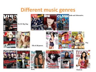
Different music genres
- 2. Rock Rock- as you can see these magazines involve rock bands and singers on the front cover. The expressions of the artists are all moody and they are dressed in casual clothing with their tattoos on show, coming across as controversial. This is typical for a rock star to behave in this way and the magazine is stereotyping the artists so that the readers know what genre they are reading. The front cover looked very busy, however the colours are kept in a simple scheme so that it doesn’t look tacky. I believe that people who read this genre of magazines are people who enjoy listening to rock and heavy metal and dress in a rock style. The age of these readers can vary from teenagers to middle aged people, I think that more men enjoy reading these magazines.
- 3. Mix of genres Mix of Genres- These magazines all look very simple, the editors have done this because they don’t want to look like they are appealing to a specific genre. The music which will be discussed in these magazines will be chart music and only the biggest stars will be included. I believe that young adults and teenagers will enjoy reading these magazines. A mix of gender will read this magazine and because there is such a range of different people who read this magazine I can not stereotype how they would look.
- 4. Pop Pop- These magazines look very pink and busy and consist of teen sensations on the front of them. These magazines look very happy and cheerful and the people on the front cover are smiling and are dressed in casual but cool clothing. I believe that the people who read this magazine are young girls who enjoy listening to pop and main stream music. I think that they will dress in pink, girly clothing from places like H&M.
- 5. Classical Classical- this magazine looks very simple. The font is not too bold and vibrant and the image is very simple. I believe that classical music magazines do this to create a serious approach. The person on the front cover is dressed in respectful and smart clothing to emphasise the style of music. I think that people who read this magazine are from the older generation and are slightly wealthy.
- 6. Indie and alternative Indie and Alternative- These magazines look very simple and bland. The people on the front cover look miserable, similar to the people on the rock magazine however their hard core style is toned down slightly. I believe that the editors have shown the artists looking like this to emphasise the moody tone in their music. The people that read these magazines will vary from an age of teenagers to middle class people, the gender is likely to be male.
- 7. RNB/ Hip Hop RNB/Hip Hop- These magazines look cool and edgy, similar to the rock magazines however in a slightly different way. Instead of the emphasise being on tattoos ect it deals more with sex appeal and objectifying people. This is effective because a lot of the lyrics in Hip hop and RNB are very provocative and sex related. The structure is laid out very simply with a simple colour scheme. I believe that people who read these magazines are between the ages of 16-28 and they enjoy dancing and booty shaking !