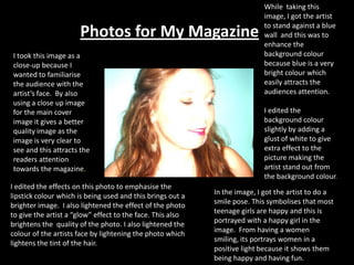
1. While taking this image, I got the artist to stand against a blue wall and this was to enhance the background colour because blue is a very bright colour which easily attracts the audiences attention. I edited the background colour slightly by adding a glust of white to give extra effect to the picture making the artist stand out from the background colour. Photos for My Magazine: I took this image as a close-up because I wanted to familiarise the audience with the artist’s face. By also using a close up image for the main cover image it gives a better quality image as the image is very clear to see and this attracts the readers attention towards the magazine. Iedited the effects on this photo to emphasise the lipstick colour which is being used and this brings out a brighter image. I also lightened the effect of the photo to give the artist a “glow” effect to the face. This also brightens the quality of the photo. I also lightened the colour of the artists face by lightening the photo which lightens the tint of the hair. In the image, I got the artist to do a smile pose. This symbolises that most teenage girls are happy and this is portrayed with a happy girl in the image. From having a women smiling, its portrays women in a positive light because it shows them being happy and having fun.
2. This is an image which I will be using in my contents page. While taking this photo I did not know what angle to take the image at, however After considering all angle, I decided to take this image as a Mid-shot. I chose to take this image as a Mid-shot to get a better angle of artist while they were sitting down. By also doing a mid shot photo, the audience are at a better understanding of the artists body language. I also edited this photo to add edginess to this photo. I firstly darkened this photo to give a black and white effect to this photo. I then lightened the image to lighten the artists face so that it was Cleary visible to the audience. For this angle shot, I wanted to have a black background to go with the effect of the photo which was black and white. By having a dark background also attracts all the audience attraction to the artist in the photo. Therefore in this picture the background is not over powering the main image. In this image, I edited the photo for many different reasons. I firstly edited the photo for it to have a white glow. The white glow effect symbolises purity of women and this effect is Cleary portrayed in this image. This photo also breaks many stereotypes of teenagers. In this image the teenage girl is looking away and this effects gives to the audience that she is very shy and nervous. This breaks stereotypes because the older generation believe that the younger generation are loud and over confident and I believe this image breaks that stereotype.
3. This image is also of a close up of the artist. The image also have servial different effects which makes up the contrast of this photo. I firstly cropped this photo down because the background of the photo was not needed for this image. I also cropped this background out because I just wanted the audience to be attracted to the main image of the photo. Once the photo was cropped I then edited the photo by lightening the effects by adding a glowing effect to the image. I then added a “sepia” effect to the image and then lightened the image again to give an orange glow to this photo. This photo will most likely be used on my context page because I feel that this is image does not attract the audience as much as what the first photo does. However I like this photo effects because it adds edgiest to the photo because it has a different contrast colour which attracts the readers attention. This image portrays a young girl having fun by doing a fun pose. I think this portrays teenage girls in a positive way because the teenage girl is having fun without breaking the law or committing a crime with the older generation believing that the younger generation see crime as a fun lifestyle therefore this image portrays that the younger generation can have fun without breaking any laws.
4. This is one of my mid-shot photos. The angle that I took this image at was an “over the head” angle where the camera was above the artist in the image. For this photo, I did not edit the photo however the adjustment that was made to the photo was that the image was slightly cropped to crop out what additional things in the background which are not needed for the shot. However this was the only image which has a colourful background because this photo was not edited. The background of the photo contains of white wall tiles with added patterns. I used this as a background because I did not want all shots to have a plan background, I also took this image as a close up shot as I believe that a main image should be close up so that the audience can get a better feel for the magazine. To get this image I had to edit the photo several times . I firstly cropped the photo down to get a closer image of the face. I then darkened the photo for a black and white effect. Once the photo was darken I then slightly lightened them image so that the image has a slight glow and this was the final outcome from the editing.