Downloaded 96 times


![Thank you David Humphreys [email_address] @peakusability @davemonkey http:// www.volkside.com/go/ozia /](https://image.slidesharecdn.com/ozia2009uiaspresented-091002191355-phpapp02/75/Navigation-Models-Efficiency-versus-user-preference-32-2048.jpg)

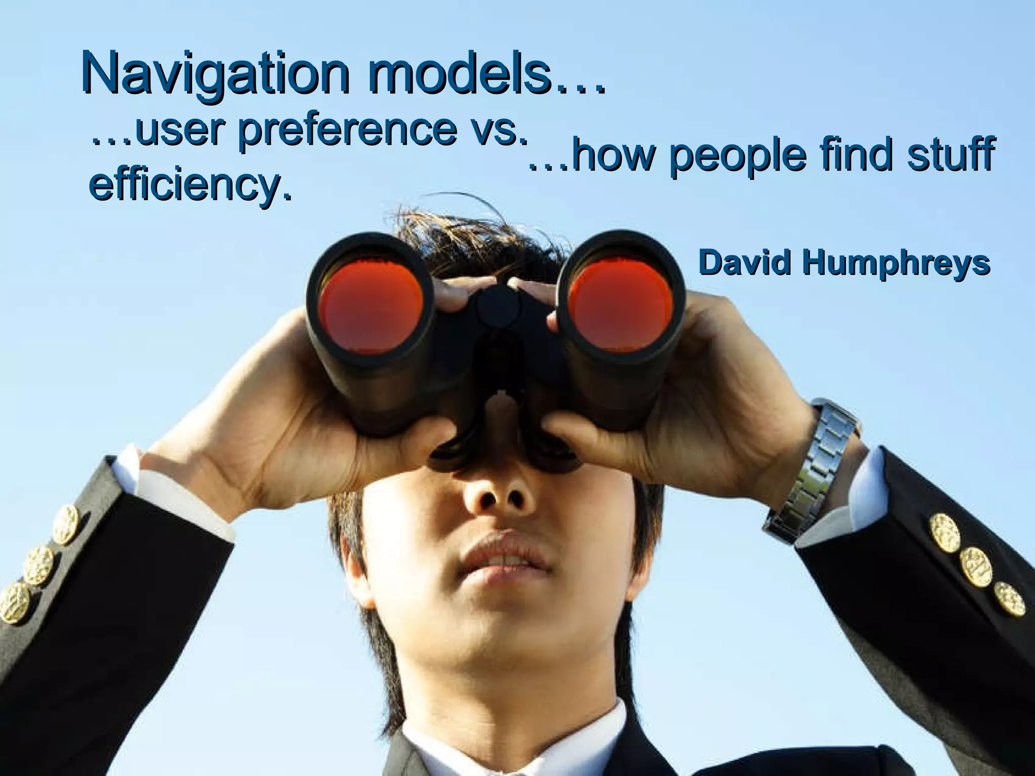
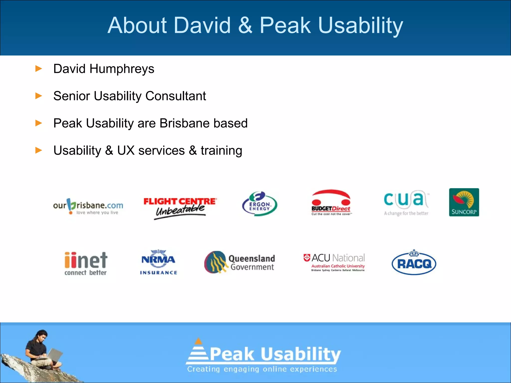
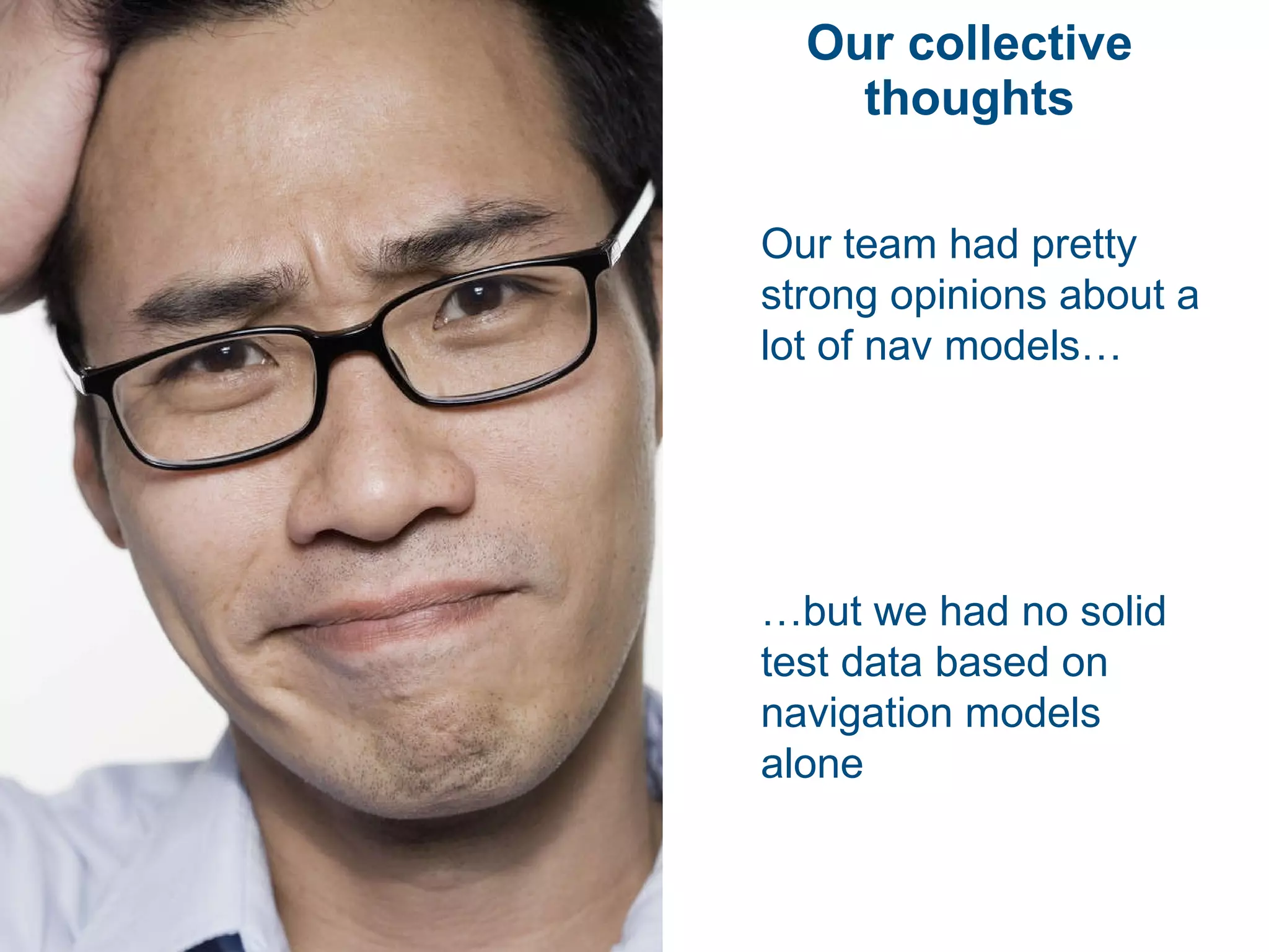
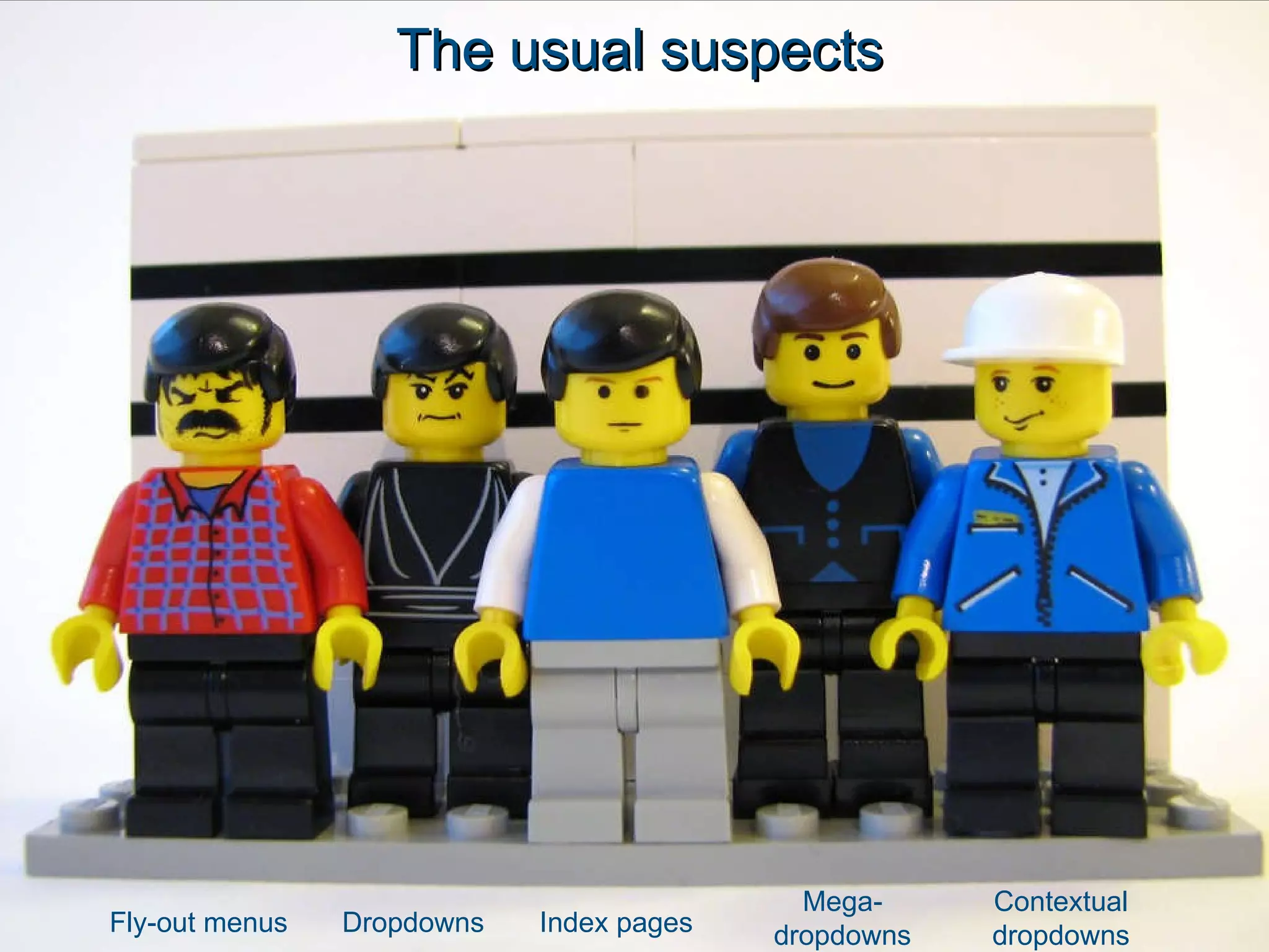
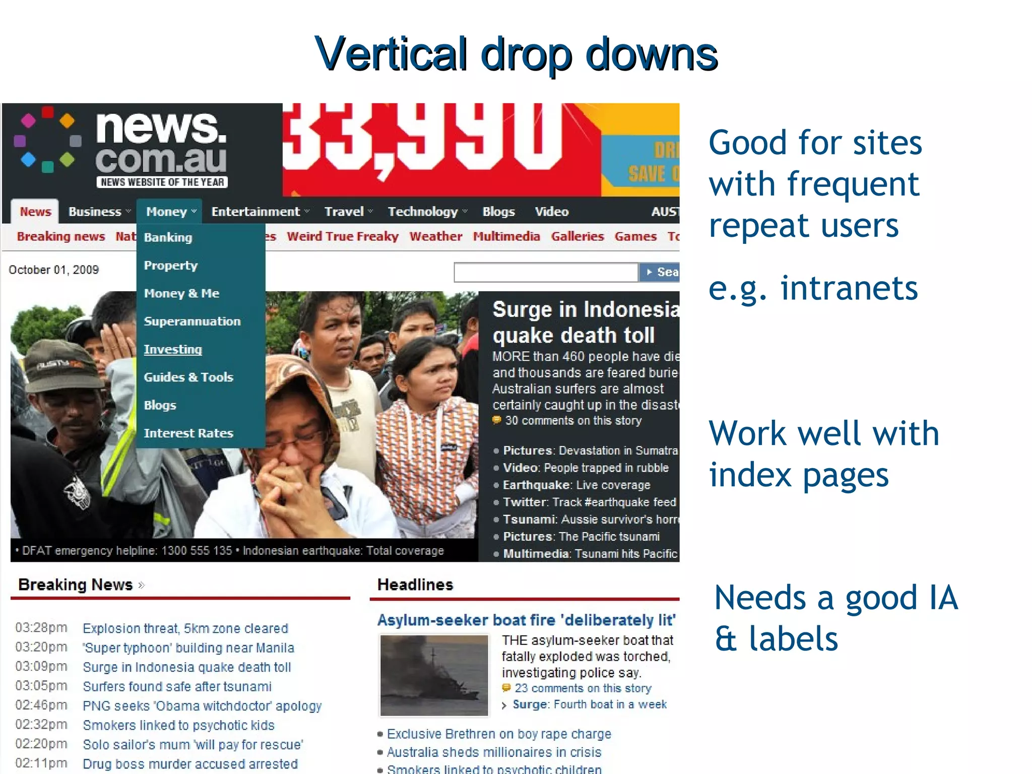
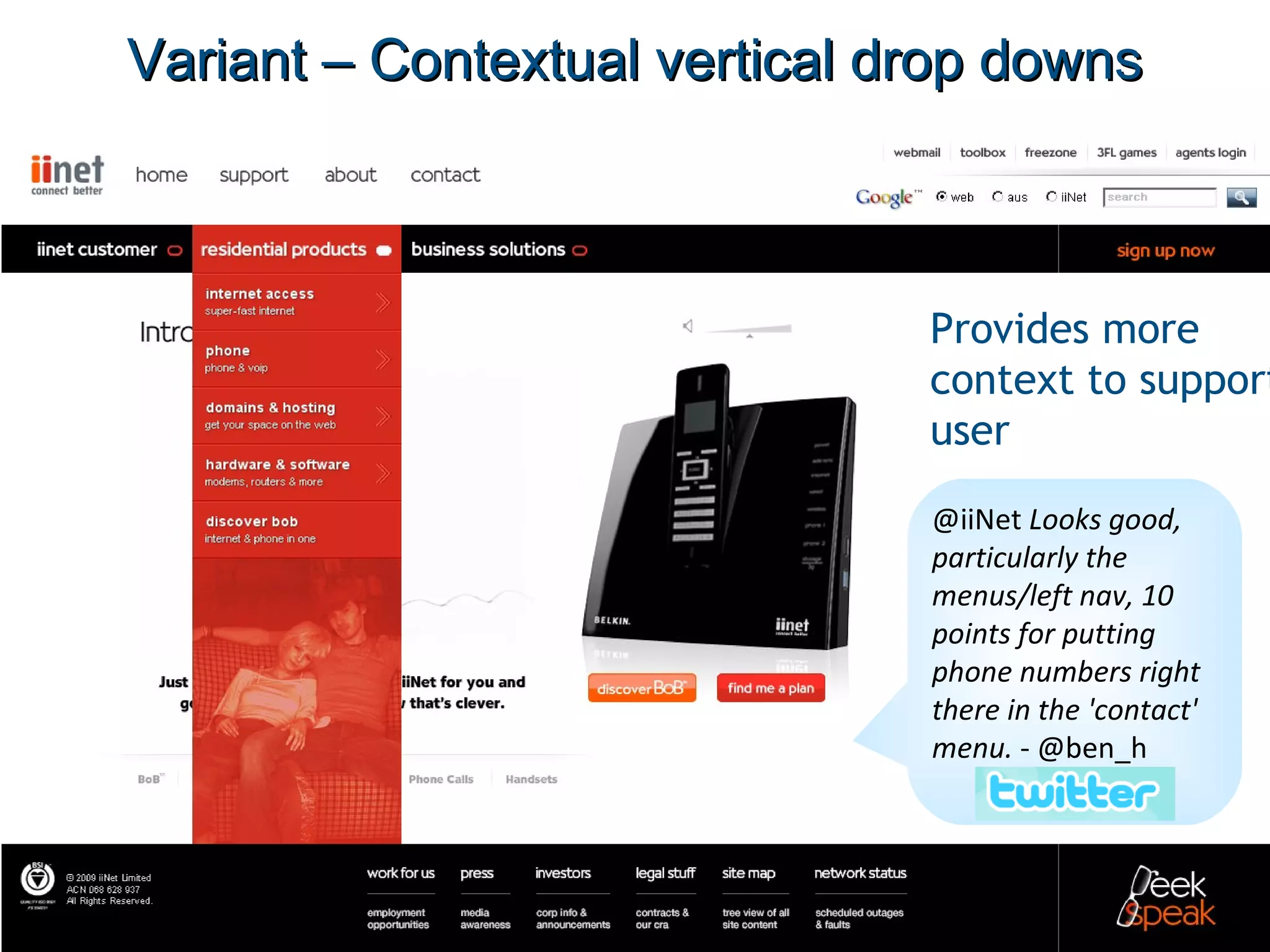
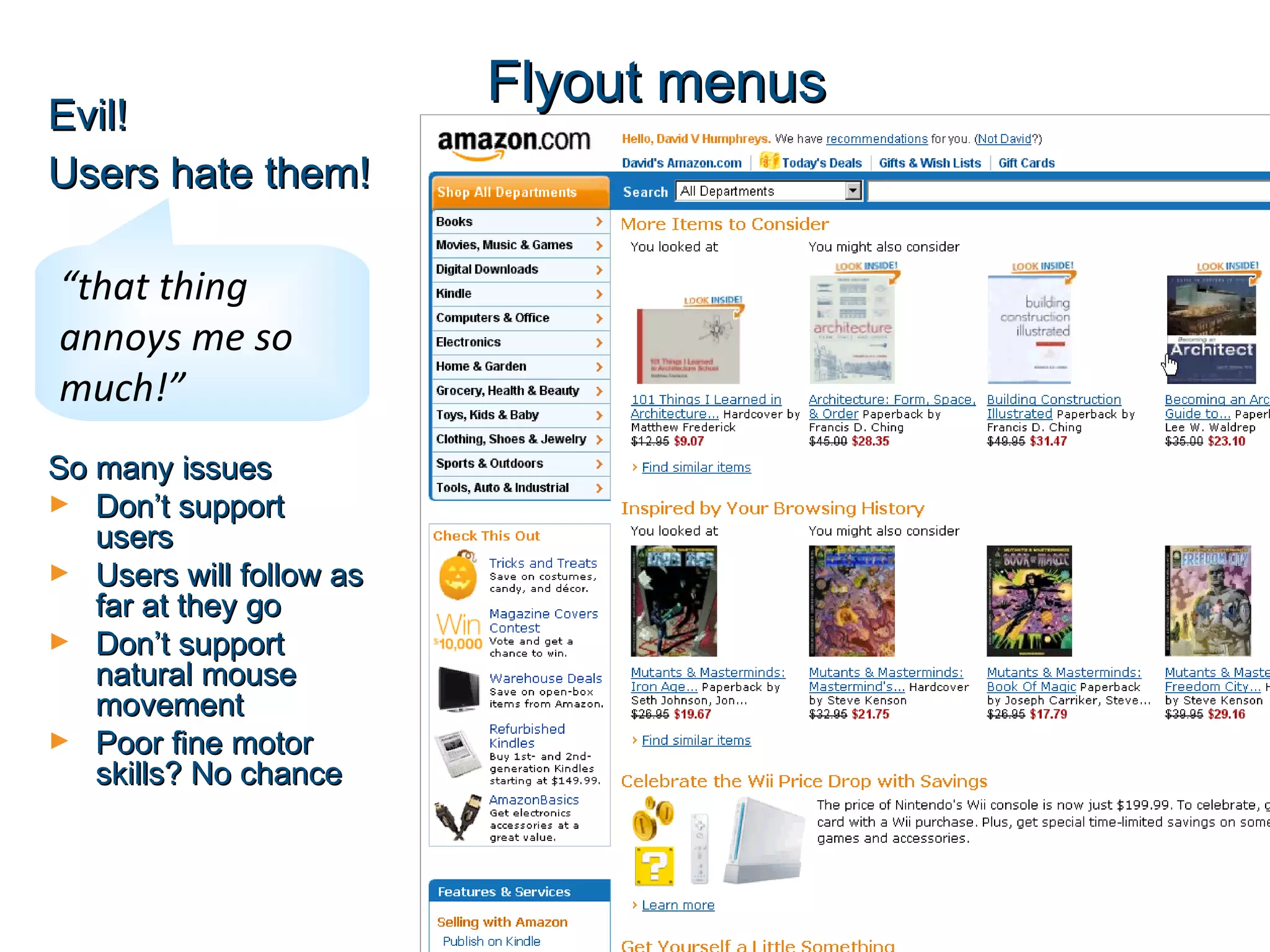
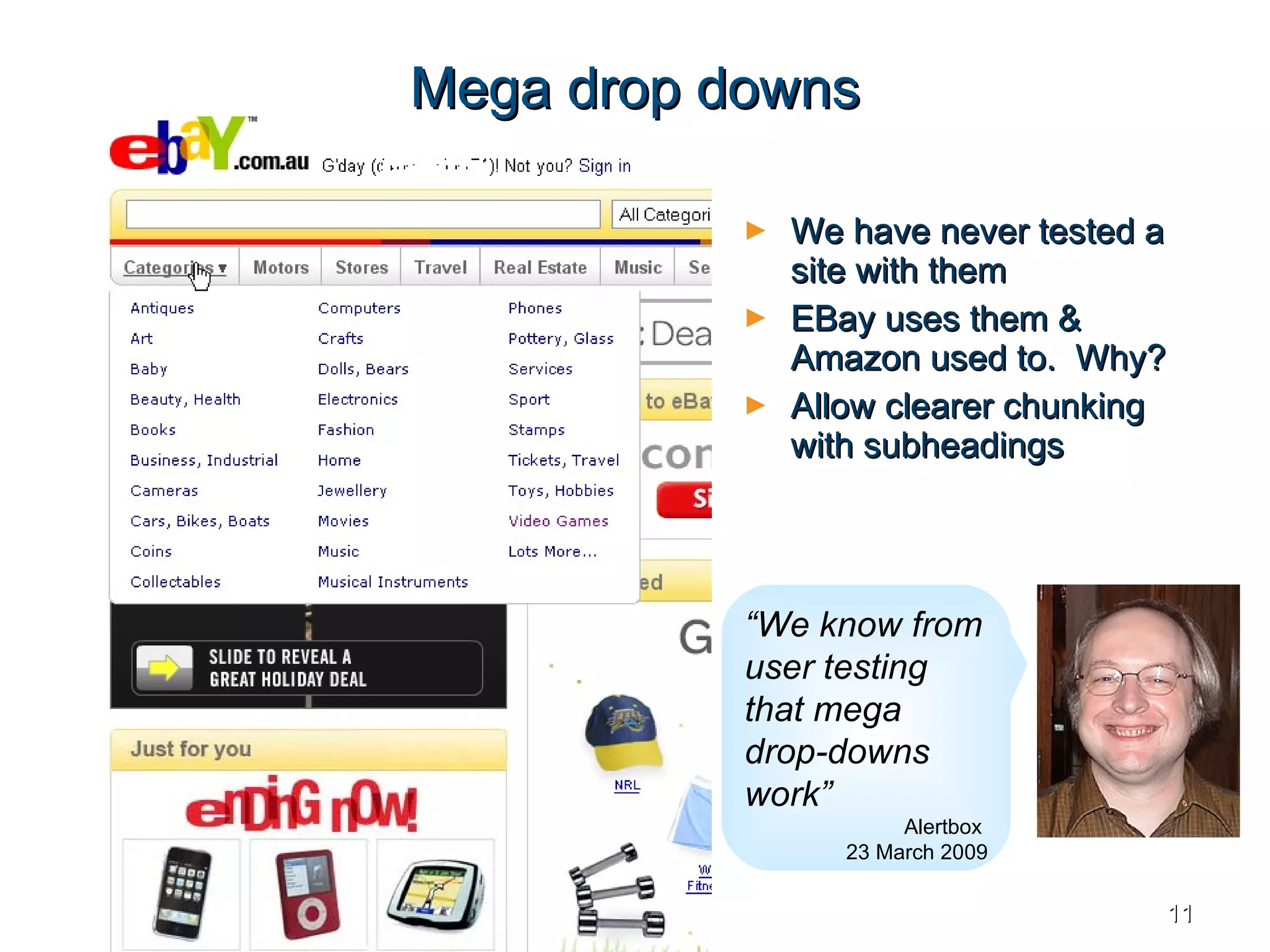
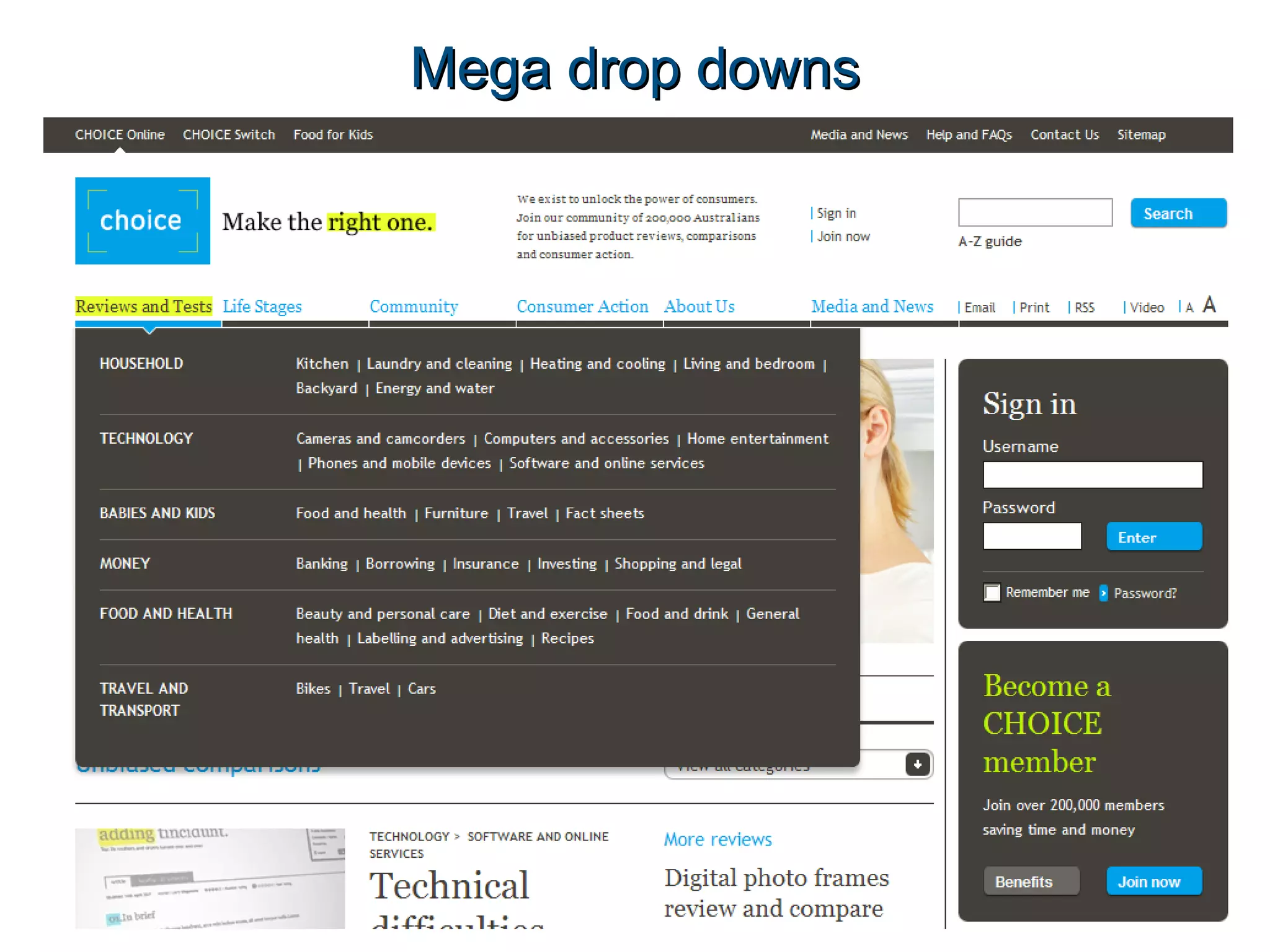
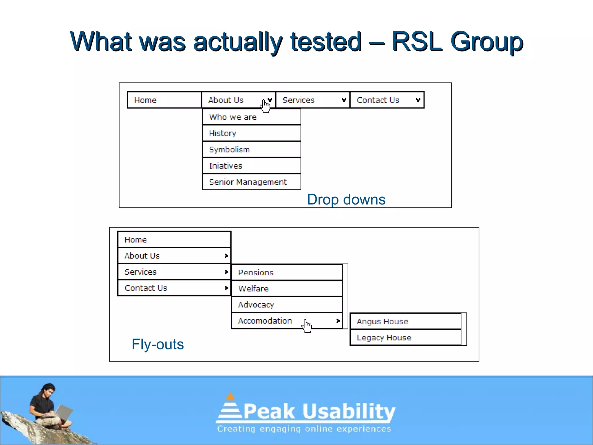
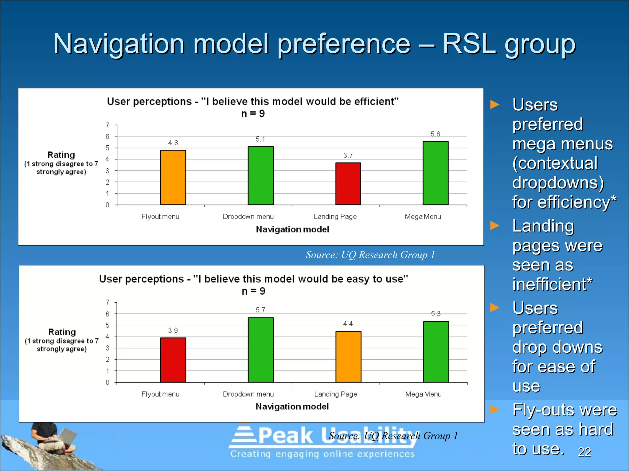
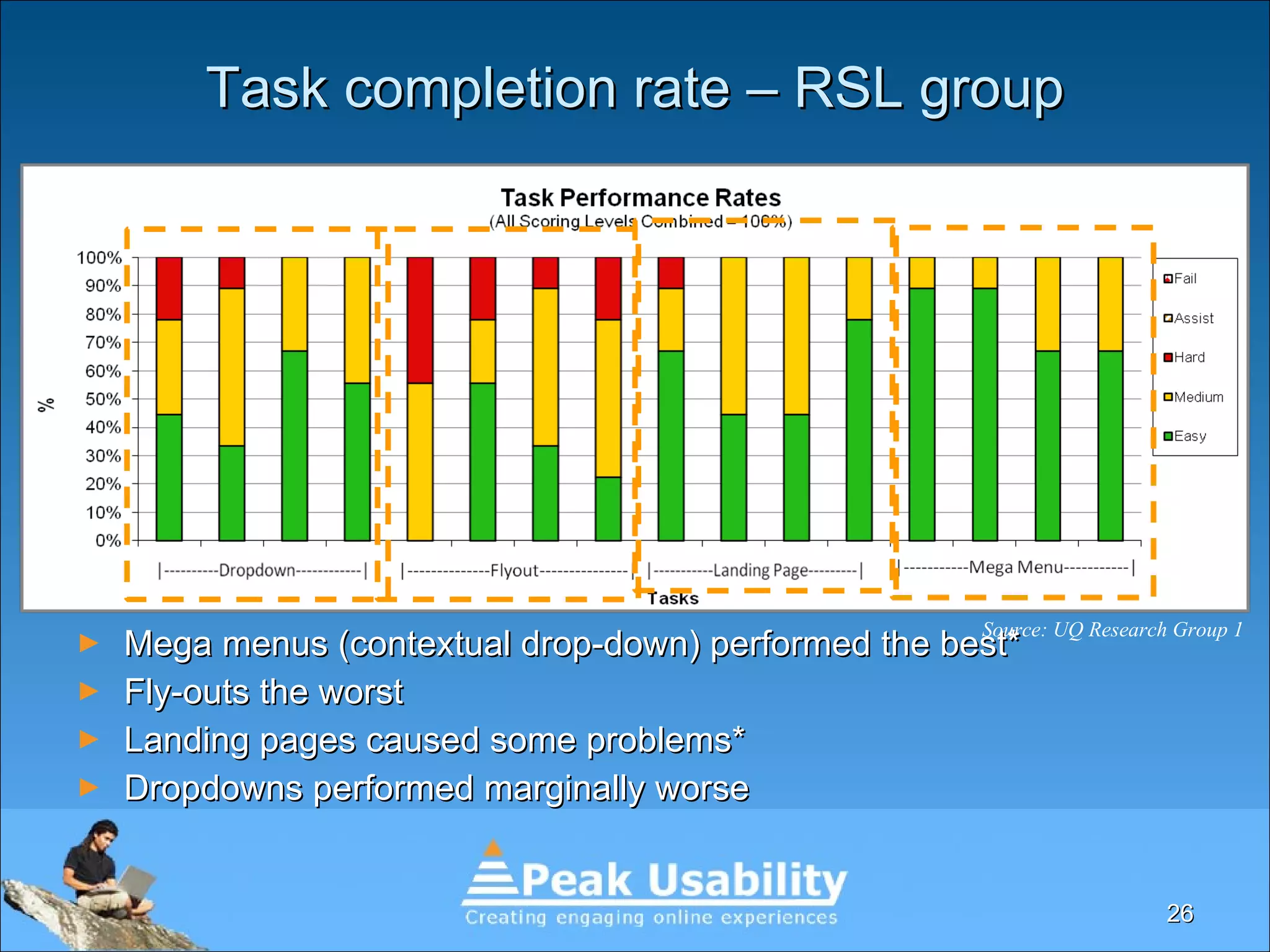
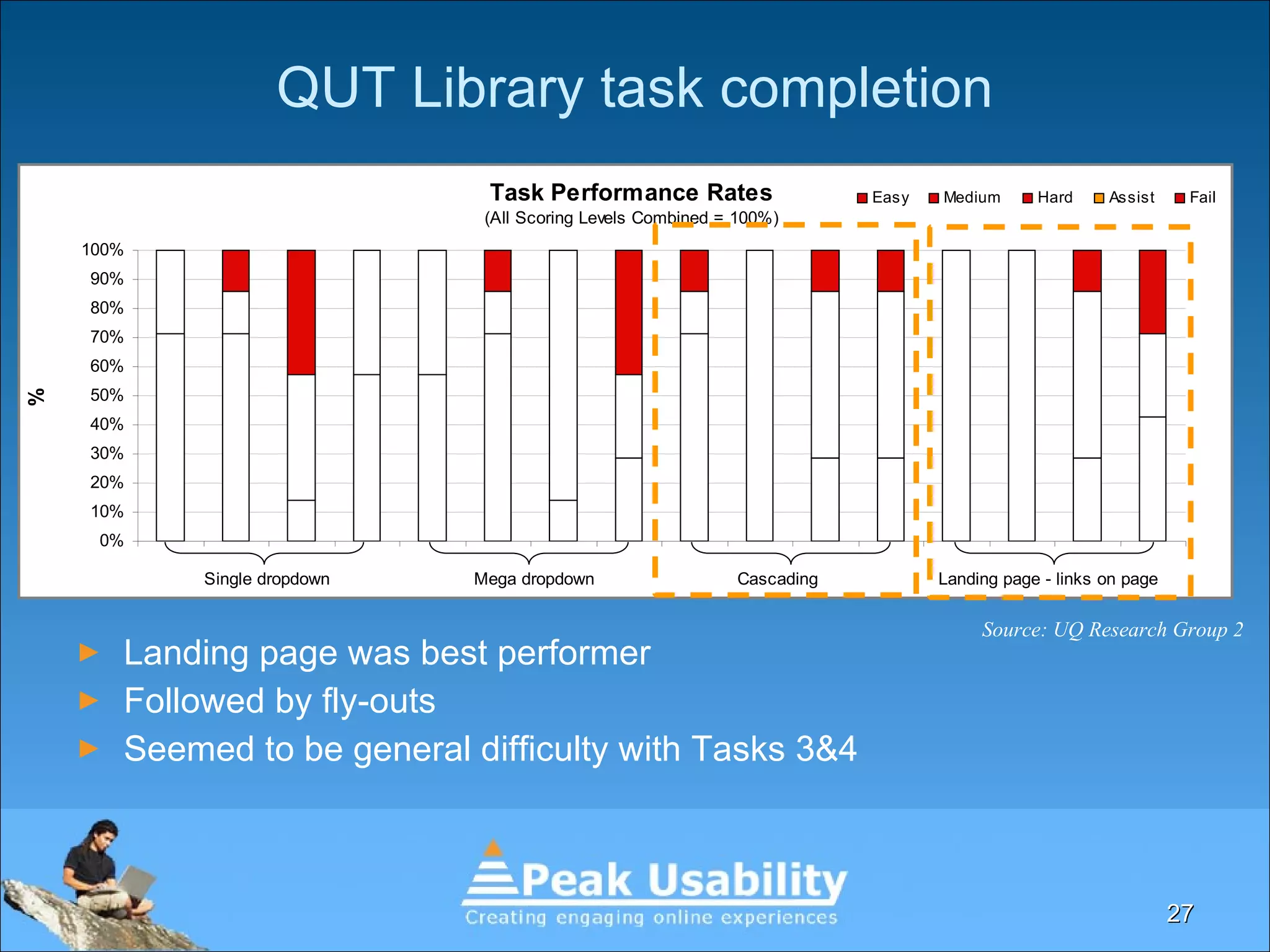
This document discusses a research project led by David Humphreys on user navigation models to determine preferred and efficient options for users. The study, involving two user groups, revealed that mega menus (contextual drop-downs) were preferred for efficiency, while fly-out menus were generally disliked. The research highlights the need for further investigation into navigation models and user preferences.


![[UX Series] 5 - Navigation](https://cdn.slidesharecdn.com/ss_thumbnails/navigation-150911112601-lva1-app6891-thumbnail.jpg?width=640&height=640&fit=bounds)


![Coded Agents – with UiPath SDK + LangGraph [Virtual Hands-on Workshop]](https://cdn.slidesharecdn.com/ss_thumbnails/codedagentsdeck-251215155422-5497c599-thumbnail.jpg?width=640&height=640&fit=bounds)


