Presentation notes | What I learned about NAVIGATION DESIGN in 2010
Navigation design | www.cazazz.com page 1
Slide 1
What I learned about
in 2010
NAVIGATION
DESIGN
www.cazazz.com
A month or so I was archiving some
old design work, and came across
some website layouts from the 1990s
that seemed to me quite different to
most of today’s websites. And for
good reason! Anyway, that’s what
prompted me to do this
presentation…
Slide 2
What I didn’t know about
in 1997
NAVIGATION
DESIGN
They say to understand the present
you have to know where you’ve been,
so here we go…
Slide 3
Let’s check out
the early days of
web navigation
A little nip back through time is in
order. Btw I know the 50s/60s theme
isn’t right for the 90’s, but I have just
been designing a 50s theme website,
and had a few 50s style fonts and
graphics handy, so I figured it would
be a shame to waste the opportunity!
Slide 4
Back in 1997…
www.honda.co.uk
a simple corporate website
This is a screenshot of a website
designed for Honda Motor Europe
(site launched in early 1997).
Slide 5
Back in 1997…
www.honda.co.uk
basic
menu
matrix
exploring
brand
values
brand
message
guidance
The site was based around a matrix of
brand values – individuality, pleasure,
etc. The user dips in to explore the
site. Remember, this was done in the
days when commercialism was still a
relatively dirty word on the Internet,
so websites weren’t overtly selling
products and services.
Presentation notes | What I learned about NAVIGATION DESIGN in 2010
Navigation design | www.cazazz.com page 2
Slide 6
Enigmatic navigation
www.honda.co.uk
Indicators
show
where
you are
Back to
matrix
Very basic
menu
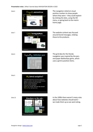
The navigation relied on visual
position markers to show people
where they were – they could explore
by clicking the dots, using the RH
menu, or going back to the matrix
home page.
Slide 7
Lateral EXPLORATION
www.honda.co.uk
Brand values drive content and navigation
The website content was focused
around brand messages, relating
these to the products.
Slide 8
Inspired by… Battleships game
1 2 3 4 5 6 7 8 9 10
A B B B B S
B
C C D
D C D
E C
F D D D
G S D
H S
I S
J C C C
The grid idea for the Honda
navigation was inspired by the pen-
and-paper Battleships game, which
uses a grid to position items.
Slide 9
Why lateral navigation?
• Encourage exploration and brand engagement
• Appeal to women, who make purchase decisions
• Refresh a brand perceived to be stuffy
• Reach a younger demographic
• Stand out from competitors
• Support the message “first man then machine”
• Why not? Few rules back then…
Slide 10
Elsewhere on the web…
Find more via the “Wayback machine” http://web.archive.org
1996
1998
1998
1995-7
In the 1990s there weren’t many rules
about how websites should work –
we made them up as we went along.
Presentation notes | What I learned about NAVIGATION DESIGN in 2010
Navigation design | www.cazazz.com page 3
Slide 11
Meanwhile, back in 2010...
So, back to the present…
Slide 12
The same site in 2010
http://www.honda.co.uk/cars
Action
menu
Product
menu
Topical
features
Feature
buttons
Footer links
Service
menu
The Honda site is a typical corporate
site, designed to promote products. It
uses standard navigation menus,
including deep footer links to help
users find detailed content and boost
SEO performance.
Slide 13
So what’s changed?
• Usability (research, best practice, awareness)
• Accessibility (legal & ethical need for accessible websites)
• Technology (Browsers, Javascript, Ajax, Mobile/Touch devices, etc)
• Commercialism (need for measurable results, SEO performance)
• Audience (numbers, demographics, sophistication, expectations)
• Conventions (nav bars, tabs, breadcrumbs, links, standards)
• Tools (CMS templates, menu systems, SEO analysis)
Slide 14
What’s the role of
website navigation?
Q.
Slide 15
What’s the role of
website navigation?
Q.
Help people find their
way around.
A.
Website navigation isn’t really about
helping people find there way around.
Who really wants to spend time
exploring a website (apart from web
designers)? It’s more about helping
people find what they want –
information, products, services, etc –
as effectively as possible.
Presentation notes | What I learned about NAVIGATION DESIGN in 2010
Navigation design | www.cazazz.com page 4
Slide 16
Role of navigation…
1. Find stuff they want
2. Get an overview of
what’s on offer
3. See where they are
4. See where they
can go
For users…
Slide 17
Role of navigation…
1. Find stuff they want
2. Get an overview of
what’s on offer
3. See where they are
4. See where they
can go
For users…
1. Drive people to
action points
2. Cross-sell services
3. Show what is/isn’t
available
4. Be found on Google
For site owners…
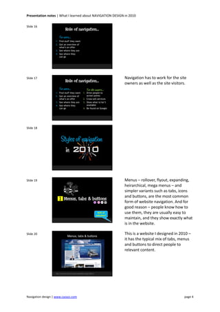
Navigation has to work for the site
owners as well as the site visitors.
Slide 18
Styles of navigation
in 2010
Slide 19
Menus, tabs & buttons
90% of
websites?
1
Menus – rollover, flyout, expanding,
heirarchical, mega menus – and
simpler variants such as tabs, icons
and buttons, are the most common
form of website navigation. And for
good reason – people know how to
use them, they are usually easy to
maintain, and they show exactly what
is in the website.
Slide 20
Menus, tabs & buttons
http://www.ford.com/microsites/sustainability-report-2009-10
This is a website I designed in 2010 –
it has the typical mix of tabs, menus
and buttons to direct people to
relevant content.
Presentation notes | What I learned about NAVIGATION DESIGN in 2010
Navigation design | www.cazazz.com page 5
Slide 21
More menus, tabs & buttons…zzzzzz
http://www.rosiesdollsclothes.com.au | http://www.arden.net.au
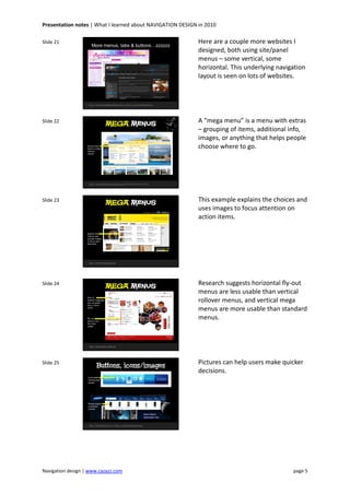
Here are a couple more websites I
designed, both using site/panel
menus – some vertical, some
horizontal. This underlying navigation
layout is seen on lots of websites.
Slide 22
MEGA Menus
http://www.frenchconnections.co.uk (this design not live yet)
Group menu
items to make
choices
clearer
A “mega menu” is a menu with extras
– grouping of items, additional info,
images, or anything that helps people
choose where to go.
Slide 23
MEGA Menus
http://www.amnesty.org.au
Explain the
choices and
include images
to focus your
attention
This example explains the choices and
uses images to focus attention on
action items.
Slide 24
http://www.yubin-nenga.jp
Fly-out
menu is not
the most
usable
MEGA Menus
Even in
another language
you can guess
how a menu
works
Research suggests horizontal fly-out
menus are less usable than vertical
rollover menus, and vertical mega
menus are more usable than standard
menus.
Slide 25
Buttons, icons/images
http://www.telstra.com | http://www.samsung.com.au
Photos double
as product
promos
Icons make
choices look
simple
Pictures can help users make quicker
decisions.
Presentation notes | What I learned about NAVIGATION DESIGN in 2010
Navigation design | www.cazazz.com page 6
Slide 26
Multiple Menu Madness
http://www.bigpond.com
1
2
3
4 5
7
6
This site has so many layers of
navigation it can be hard to discern
which is which. Despite that, it is
surprisingly usable.
Slide 27
Typographic
& numeric
2
Typographic or numeric navigation is
closely related to menu navigation,
except it is often less rigid and more
lateral in approach. It is a way of
merging branding, content and
navigation, sometimes at the expense
of usability, but this depends on the
website’s purpose.
Slide 28
Totally typographic navigation
http://www.proa.org | http://www.ah-studio.com
Typographic approach makes a strong statement and forces you to make a choice
Slide 29
Navigation becomes the content
http://www.digitalmash.com
Hover over
text to
make
sense of it
The wordy approach of this
navigation arguably suits the content
very well. The navigation actually
becomes a key part of the content.
Slide 30
Navigation by Numbers
http://www.modulab.co.uk | http://www.modularlab.com
Do I care
enough to
click?
The esoteric approach of these
examples makes the user work hard.
You don’t know what you will see
until you mouse over or click, so you
may need more of an incentive to do
so.
Presentation notes | What I learned about NAVIGATION DESIGN in 2010
Navigation design | www.cazazz.com page 7
Slide 31
NinjaNumericNavigation
http://answer.nttdocomo.co.jp/t28/
Here, numbers are used partly as
decoration and partly as a
reinforcement of the user’s selection.
Slide 32
Real world metaphors3

Real world metaphors are one of the
oldest ways of helping people
understand how to do things. Think
back to the “office” metaphor of
folders, filing cabinets and files that
was introduced to help people
understand early computer software
but is still generally used today.
Slide 33
Literal navigation
(design mock-up for website under development)
Navigate the
human body
to find out
about specific
muscles
(not a metaphor, the real thing)
This is not a metaphor, just an
example of an image map being more
effective than a menu.
Slide 34
A self-contained world
http://www.idemitsu.co.jp/chienergy/special/
Click and
explore the
“world” (the
scene moves
with you)
Mixed
metaphors
– cars in
trees?
The problem with metaphors is they
reflect the real world – what if you
want to throw in something more
abstract?
Slide 35
A metaphor with boundaries
http://www.annielennox.com
Open “doors”
to explore
Navigate to
“rooms”
Another problem with metaphors is
their scope – what if you want to
build an extension?
Presentation notes | What I learned about NAVIGATION DESIGN in 2010
Navigation design | www.cazazz.com page 8
Slide 36
A “real” shop display
http://www.jamesjoyce.co.uk
Browse products arranged along the wall
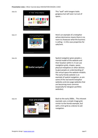
This “wall” with hangers looks
gorgeous but will soon run out of
space…
Slide 37
A virtual shopfront
http://www.daviddeane.com.au/
Showcases the
navigation, not
the products
or services
Here’s an example of a metaphor
whose dominence means there is no
room to showcase what the business
is selling – in this case properties for
sale/rent.
Slide 38
Spatial navigation4
Spatial navigation gives people a
mental model of the website and
their location within it. It can use
navigation grids, shapes, space,
physical metaphors or other devices
to give people an understanding of
the virtual space the website inhabits.
The early Honda website is an
example of spatial navigation, as are
some of the real world metaphor
websites and one-page websites that
are becoming more common
(especially for designer portfolio
websites).
Slide 39
Image grid navigator
Current
position is
highlightedSelect an
image
Back to the early 2000s… This intranet
example uses a simple image grid,
similar to the Honda example, but
with a mini-grid as a device to aid
navigation.
Presentation notes | What I learned about NAVIGATION DESIGN in 2010
Navigation design | www.cazazz.com page 9
Slide 40
Magical mystery tour
http://flywheeldesign.com/
Move over
shapes to make
the navigation
options appear
In this example you don’t know what
you will get until you mouse
over/click, although you may
remember what was where on
subsequent visits.
Slide 41
Holistic view
http://bucchake.com
Circle adjusts as you focus in on content
Here the circle device establishes the
brand and focuses the mind as you
make selections to get to lower level
content.
Slide 42
One page vertical glide
http://www.plinestudios.com/
Glide up/down smoothly
to explore vertical space
This beautifully smooth vertical scroll
gives a real sense of vertical space in
a one-page website.
Slide 43
One page decision path
http://www.komra.de
Follow the decision paths
according to what you
know or want to find
out. Stop and explore
when you want more.
Like the previous example, this is a
one-page website, but it works like a
decision tree (get it?)
Slide 44
One page multi-dimensional
http://www.visuall.be/
Move up/down/left/right/diagonally
using menu or arrows
This one page website glides in
different directions, but the
movement can be nauseating after a
while…
Presentation notes | What I learned about NAVIGATION DESIGN in 2010
Navigation design | www.cazazz.com page 10
Slide 45
No navigation
(or very minimal)
5
Sometimes you want to focus on the
content, without shoving navigation
under peoples’ noses.
Slide 46
NO site navigation
http://iconwerk.de/
Home icon is the only site navigation device.
It’s all about the content.
It’s all about the content. This
example has navigation to the
homepage only.
Slide 47
Minimal site navigation
http://relogik.com
No structure, just browse what’s on offer
Minimal navigation is especially
suited to portfolio sites.
Slide 48
Promotional one-pager
http://www.mailchimp.com/v5-3/
No choices are presented up-front.
You see welcoming content before
being expected to click anything.
For promotional websites you don’t
want people to get distracted, and
you want to warm them up before
sending them off in any direction.
This one-pager has minimal
navigation, all focused on getting the
user to do what’s wanted – sign up.
Slide 49
Navigation on demand
http://moonlinx.jp/special_issue/003/
Click to open out
navigation panel
Follow the arrows to explore
This example tucks away the
navigation at the right – it’s easy to
get to if you need it.
Presentation notes | What I learned about NAVIGATION DESIGN in 2010
Navigation design | www.cazazz.com page 11
Slide 50
A quick re-cap…
1. Menus/tabs/buttons
2. Typographic/numeric
3. Metaphoric
4. Spatial
5. Minimal or none
Types of navigation…
• Help users find what
they want/need
• Drive people to action
• Cross-promote content
• Show what is on offer
• Be found on Google
Role of navigation…
Here’s a summary of the navigation
types, and a reminder of what the
role of navigation is in the context of
the web design process.
Slide 51
Choosing a navigation style
• Why the navigation is there (its role)
• Who will be using it
• Where they want to go
• What YOU want them to do
• How you will manage it (CMS etc)
Navigation design decisions are just
like any other design decisions. They
start with an understanding of the
purpose of the communication.
Slide 52
My advice to web designers…
So what’s next? To find out more
about navigation designs, you have to
explore a little. My advice is the same
as I give myself when I visit a new
city…
Slide 53
My advice to web designers…
50’s style fonts & graphics from http://www.fontdiner.com/
Get lost.(it’s the only way you’ll find anything new)
It’s only by getting lost that you learn
ways to explore, put yourself in
others’ shoes, and discover what’s
out there. I wonder what website
navigation (if there is still such a
thing) will look like 13 years from
now?
Slide 54
Carolyn King | www.cazazz.com | twitter @cazazz
Thank you. I hope you enjoyed the
presentation! Follow me on twitter
@cazazz or see www.cazazz.com for
some of my design work.

Navigation design notes

  • 1.
    Presentation notes |What I learned about NAVIGATION DESIGN in 2010 Navigation design | www.cazazz.com page 1 Slide 1 What I learned about in 2010 NAVIGATION DESIGN www.cazazz.com A month or so I was archiving some old design work, and came across some website layouts from the 1990s that seemed to me quite different to most of today’s websites. And for good reason! Anyway, that’s what prompted me to do this presentation… Slide 2 What I didn’t know about in 1997 NAVIGATION DESIGN They say to understand the present you have to know where you’ve been, so here we go… Slide 3 Let’s check out the early days of web navigation A little nip back through time is in order. Btw I know the 50s/60s theme isn’t right for the 90’s, but I have just been designing a 50s theme website, and had a few 50s style fonts and graphics handy, so I figured it would be a shame to waste the opportunity! Slide 4 Back in 1997… www.honda.co.uk a simple corporate website This is a screenshot of a website designed for Honda Motor Europe (site launched in early 1997). Slide 5 Back in 1997… www.honda.co.uk basic menu matrix exploring brand values brand message guidance The site was based around a matrix of brand values – individuality, pleasure, etc. The user dips in to explore the site. Remember, this was done in the days when commercialism was still a relatively dirty word on the Internet, so websites weren’t overtly selling products and services.
  • 2.
    Presentation notes |What I learned about NAVIGATION DESIGN in 2010 Navigation design | www.cazazz.com page 2 Slide 6 Enigmatic navigation www.honda.co.uk Indicators show where you are Back to matrix Very basic menu The navigation relied on visual position markers to show people where they were – they could explore by clicking the dots, using the RH menu, or going back to the matrix home page. Slide 7 Lateral EXPLORATION www.honda.co.uk Brand values drive content and navigation The website content was focused around brand messages, relating these to the products. Slide 8 Inspired by… Battleships game 1 2 3 4 5 6 7 8 9 10 A B B B B S B C C D D C D E C F D D D G S D H S I S J C C C The grid idea for the Honda navigation was inspired by the pen- and-paper Battleships game, which uses a grid to position items. Slide 9 Why lateral navigation? • Encourage exploration and brand engagement • Appeal to women, who make purchase decisions • Refresh a brand perceived to be stuffy • Reach a younger demographic • Stand out from competitors • Support the message “first man then machine” • Why not? Few rules back then… Slide 10 Elsewhere on the web… Find more via the “Wayback machine” http://web.archive.org 1996 1998 1998 1995-7 In the 1990s there weren’t many rules about how websites should work – we made them up as we went along.
  • 3.
    Presentation notes |What I learned about NAVIGATION DESIGN in 2010 Navigation design | www.cazazz.com page 3 Slide 11 Meanwhile, back in 2010... So, back to the present… Slide 12 The same site in 2010 http://www.honda.co.uk/cars Action menu Product menu Topical features Feature buttons Footer links Service menu The Honda site is a typical corporate site, designed to promote products. It uses standard navigation menus, including deep footer links to help users find detailed content and boost SEO performance. Slide 13 So what’s changed? • Usability (research, best practice, awareness) • Accessibility (legal & ethical need for accessible websites) • Technology (Browsers, Javascript, Ajax, Mobile/Touch devices, etc) • Commercialism (need for measurable results, SEO performance) • Audience (numbers, demographics, sophistication, expectations) • Conventions (nav bars, tabs, breadcrumbs, links, standards) • Tools (CMS templates, menu systems, SEO analysis) Slide 14 What’s the role of website navigation? Q. Slide 15 What’s the role of website navigation? Q. Help people find their way around. A. Website navigation isn’t really about helping people find there way around. Who really wants to spend time exploring a website (apart from web designers)? It’s more about helping people find what they want – information, products, services, etc – as effectively as possible.
  • 4.
    Presentation notes |What I learned about NAVIGATION DESIGN in 2010 Navigation design | www.cazazz.com page 4 Slide 16 Role of navigation… 1. Find stuff they want 2. Get an overview of what’s on offer 3. See where they are 4. See where they can go For users… Slide 17 Role of navigation… 1. Find stuff they want 2. Get an overview of what’s on offer 3. See where they are 4. See where they can go For users… 1. Drive people to action points 2. Cross-sell services 3. Show what is/isn’t available 4. Be found on Google For site owners… Navigation has to work for the site owners as well as the site visitors. Slide 18 Styles of navigation in 2010 Slide 19 Menus, tabs & buttons 90% of websites? 1 Menus – rollover, flyout, expanding, heirarchical, mega menus – and simpler variants such as tabs, icons and buttons, are the most common form of website navigation. And for good reason – people know how to use them, they are usually easy to maintain, and they show exactly what is in the website. Slide 20 Menus, tabs & buttons http://www.ford.com/microsites/sustainability-report-2009-10 This is a website I designed in 2010 – it has the typical mix of tabs, menus and buttons to direct people to relevant content.
  • 5.
    Presentation notes |What I learned about NAVIGATION DESIGN in 2010 Navigation design | www.cazazz.com page 5 Slide 21 More menus, tabs & buttons…zzzzzz http://www.rosiesdollsclothes.com.au | http://www.arden.net.au Here are a couple more websites I designed, both using site/panel menus – some vertical, some horizontal. This underlying navigation layout is seen on lots of websites. Slide 22 MEGA Menus http://www.frenchconnections.co.uk (this design not live yet) Group menu items to make choices clearer A “mega menu” is a menu with extras – grouping of items, additional info, images, or anything that helps people choose where to go. Slide 23 MEGA Menus http://www.amnesty.org.au Explain the choices and include images to focus your attention This example explains the choices and uses images to focus attention on action items. Slide 24 http://www.yubin-nenga.jp Fly-out menu is not the most usable MEGA Menus Even in another language you can guess how a menu works Research suggests horizontal fly-out menus are less usable than vertical rollover menus, and vertical mega menus are more usable than standard menus. Slide 25 Buttons, icons/images http://www.telstra.com | http://www.samsung.com.au Photos double as product promos Icons make choices look simple Pictures can help users make quicker decisions.
  • 6.
    Presentation notes |What I learned about NAVIGATION DESIGN in 2010 Navigation design | www.cazazz.com page 6 Slide 26 Multiple Menu Madness http://www.bigpond.com 1 2 3 4 5 7 6 This site has so many layers of navigation it can be hard to discern which is which. Despite that, it is surprisingly usable. Slide 27 Typographic & numeric 2 Typographic or numeric navigation is closely related to menu navigation, except it is often less rigid and more lateral in approach. It is a way of merging branding, content and navigation, sometimes at the expense of usability, but this depends on the website’s purpose. Slide 28 Totally typographic navigation http://www.proa.org | http://www.ah-studio.com Typographic approach makes a strong statement and forces you to make a choice Slide 29 Navigation becomes the content http://www.digitalmash.com Hover over text to make sense of it The wordy approach of this navigation arguably suits the content very well. The navigation actually becomes a key part of the content. Slide 30 Navigation by Numbers http://www.modulab.co.uk | http://www.modularlab.com Do I care enough to click? The esoteric approach of these examples makes the user work hard. You don’t know what you will see until you mouse over or click, so you may need more of an incentive to do so.
  • 7.
    Presentation notes |What I learned about NAVIGATION DESIGN in 2010 Navigation design | www.cazazz.com page 7 Slide 31 NinjaNumericNavigation http://answer.nttdocomo.co.jp/t28/ Here, numbers are used partly as decoration and partly as a reinforcement of the user’s selection. Slide 32 Real world metaphors3  Real world metaphors are one of the oldest ways of helping people understand how to do things. Think back to the “office” metaphor of folders, filing cabinets and files that was introduced to help people understand early computer software but is still generally used today. Slide 33 Literal navigation (design mock-up for website under development) Navigate the human body to find out about specific muscles (not a metaphor, the real thing) This is not a metaphor, just an example of an image map being more effective than a menu. Slide 34 A self-contained world http://www.idemitsu.co.jp/chienergy/special/ Click and explore the “world” (the scene moves with you) Mixed metaphors – cars in trees? The problem with metaphors is they reflect the real world – what if you want to throw in something more abstract? Slide 35 A metaphor with boundaries http://www.annielennox.com Open “doors” to explore Navigate to “rooms” Another problem with metaphors is their scope – what if you want to build an extension?
  • 8.
    Presentation notes |What I learned about NAVIGATION DESIGN in 2010 Navigation design | www.cazazz.com page 8 Slide 36 A “real” shop display http://www.jamesjoyce.co.uk Browse products arranged along the wall This “wall” with hangers looks gorgeous but will soon run out of space… Slide 37 A virtual shopfront http://www.daviddeane.com.au/ Showcases the navigation, not the products or services Here’s an example of a metaphor whose dominence means there is no room to showcase what the business is selling – in this case properties for sale/rent. Slide 38 Spatial navigation4 Spatial navigation gives people a mental model of the website and their location within it. It can use navigation grids, shapes, space, physical metaphors or other devices to give people an understanding of the virtual space the website inhabits. The early Honda website is an example of spatial navigation, as are some of the real world metaphor websites and one-page websites that are becoming more common (especially for designer portfolio websites). Slide 39 Image grid navigator Current position is highlightedSelect an image Back to the early 2000s… This intranet example uses a simple image grid, similar to the Honda example, but with a mini-grid as a device to aid navigation.
  • 9.
    Presentation notes |What I learned about NAVIGATION DESIGN in 2010 Navigation design | www.cazazz.com page 9 Slide 40 Magical mystery tour http://flywheeldesign.com/ Move over shapes to make the navigation options appear In this example you don’t know what you will get until you mouse over/click, although you may remember what was where on subsequent visits. Slide 41 Holistic view http://bucchake.com Circle adjusts as you focus in on content Here the circle device establishes the brand and focuses the mind as you make selections to get to lower level content. Slide 42 One page vertical glide http://www.plinestudios.com/ Glide up/down smoothly to explore vertical space This beautifully smooth vertical scroll gives a real sense of vertical space in a one-page website. Slide 43 One page decision path http://www.komra.de Follow the decision paths according to what you know or want to find out. Stop and explore when you want more. Like the previous example, this is a one-page website, but it works like a decision tree (get it?) Slide 44 One page multi-dimensional http://www.visuall.be/ Move up/down/left/right/diagonally using menu or arrows This one page website glides in different directions, but the movement can be nauseating after a while…
  • 10.
    Presentation notes |What I learned about NAVIGATION DESIGN in 2010 Navigation design | www.cazazz.com page 10 Slide 45 No navigation (or very minimal) 5 Sometimes you want to focus on the content, without shoving navigation under peoples’ noses. Slide 46 NO site navigation http://iconwerk.de/ Home icon is the only site navigation device. It’s all about the content. It’s all about the content. This example has navigation to the homepage only. Slide 47 Minimal site navigation http://relogik.com No structure, just browse what’s on offer Minimal navigation is especially suited to portfolio sites. Slide 48 Promotional one-pager http://www.mailchimp.com/v5-3/ No choices are presented up-front. You see welcoming content before being expected to click anything. For promotional websites you don’t want people to get distracted, and you want to warm them up before sending them off in any direction. This one-pager has minimal navigation, all focused on getting the user to do what’s wanted – sign up. Slide 49 Navigation on demand http://moonlinx.jp/special_issue/003/ Click to open out navigation panel Follow the arrows to explore This example tucks away the navigation at the right – it’s easy to get to if you need it.
  • 11.
    Presentation notes |What I learned about NAVIGATION DESIGN in 2010 Navigation design | www.cazazz.com page 11 Slide 50 A quick re-cap… 1. Menus/tabs/buttons 2. Typographic/numeric 3. Metaphoric 4. Spatial 5. Minimal or none Types of navigation… • Help users find what they want/need • Drive people to action • Cross-promote content • Show what is on offer • Be found on Google Role of navigation… Here’s a summary of the navigation types, and a reminder of what the role of navigation is in the context of the web design process. Slide 51 Choosing a navigation style • Why the navigation is there (its role) • Who will be using it • Where they want to go • What YOU want them to do • How you will manage it (CMS etc) Navigation design decisions are just like any other design decisions. They start with an understanding of the purpose of the communication. Slide 52 My advice to web designers… So what’s next? To find out more about navigation designs, you have to explore a little. My advice is the same as I give myself when I visit a new city… Slide 53 My advice to web designers… 50’s style fonts & graphics from http://www.fontdiner.com/ Get lost.(it’s the only way you’ll find anything new) It’s only by getting lost that you learn ways to explore, put yourself in others’ shoes, and discover what’s out there. I wonder what website navigation (if there is still such a thing) will look like 13 years from now? Slide 54 Carolyn King | www.cazazz.com | twitter @cazazz Thank you. I hope you enjoyed the presentation! Follow me on twitter @cazazz or see www.cazazz.com for some of my design work.