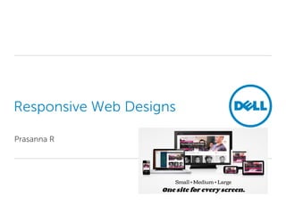
Responsive Web Designs
Responsive web design allows websites to adapt their layout depending on the screen size and orientation of the device used to view them. Websites using responsive design dynamically change the viewport, columns, images and more to provide the best possible viewing and interaction experience across all devices including desktops, tablets, and mobile phones. Key techniques for responsive design include using fluid grids that resize based on screen width and media queries that allow different CSS styles to be applied depending on screen size. Navigation, images, forms and other elements can be adapted to be responsive as well.
Presentation from Daniel Tome on Building Responsive Websites with Drupal presented at DrupalGov Canberra 2013
http://drupalact.org.au/events/drupalgov-canberra-2013/conference/schedule
In the 45 minutes of the session these will be the topics that will be covered:
10 minutes – Overview of responsive design and why it is important
20 minutes – Methods of implementing it with Drupal. Explaining modules, themes and challenges
10 minutes – Keeping it accessible in the government sector
5 minutes – What things can be optimised and the future of RWD with Drupal 8
Facebook Timeline for Brands - Banyan BranchBanyan Branch
Get the most out of Facebook Timeline for your brand. Here are the changes you need to know about, as well as a few tricks to get your content seen by more of your fans. From leading social media agency Banyan Branch.
As of March 10th, Facebook pages received an updated layout and several new features to help you engage with your fans. Here's some of the upgrades:
· Notifications when fans interact with your page or posts
· A place to showcase photos along the top of your page
· A news feed for your page
· The ability to Like and post on other pages as your pag
YouTube has completed beta testing of a new channel page now available to all users and brands. The new “One Channel” design puts featured content front and center and matches the aesthetic of Google+. YouTube has also announced several new features that aid in organizing and promoting videos on individual channels. This POV explains the news design and what to expect in the future.
AppSensor - Near Real Time Event Detection and Responsejtmelton
AppSensor is an OWASP project that defines a conceptual framework, methodology, guidance and reference implementation to design and deploy malicious behavior detection and automated responses directly within software applications.
There are many security protections available to applications today. AppSensor builds on these by providing a mechanism that allows architects and developers to build into their applications a way to detect events and attacks, then automatically respond to them. Not only can this stop and/or reduce the impact of an attack, it gives you incredibly valuable visibility and security intelligence about the operational state of your applications.
Building Drupal sites mobile first with lazy loading, responsive media and Varnish - without driving anyone insane.
A combined session, technical overview, and outlined solution.
Includes the notes from the workshop at the end.
Responsive Web Design - Advantages and Best Practice for Sports DirectCantarus
Using Europe’s largest sports retailer as a real-world case study, we discuss the pros and cons of responsive web design – particularly as regards SEO, costs and performance – versus dedicated mobile websites and then delve into the technology behind Sports Direct’s cutting-edge support for mobile devices.
Responsive Web Design: Advantages & Best Practice - Darrin Adams, CantarusInternet World
Mobile Theatre - June 19th, 15:00-15:30
We discuss the pros and cons of responsive web design – particularly with regards to SEO, costs and performance – versus dedicated mobile websites, and we then delve into the technology required to implement cutting-edge mobile device support for an enterprise-class website.
A review of the many opportunities available to search marketers in the native application ecosystem, presented by Rachel Pasqua, Co-Founder of Token, October 2013
Web UI Design Patterns and best-practices guide from http://www.uxpin.com -- the best online wireframing, UX & product management suite available anywhere.
Responsive web design (or RWD in short) is a relatively new and fast developing trend on the web. In these slides we will answer 2 questions:
1. What are the basics of responsive web design, without diving in the developer deep?
2. How will users benefit from responsive web design?
Responsive Web Design in Cascade Server, by Chris Cox of BarkleyREIhannonhill
This session will discuss the topic of Responsive Web Design (RWD) and go through a case study showing Chapman University's process in choosing and implementing RWD in their most recent redesign.
BarkleyREI & Hannon Hill Webinar - Responsive Web Designhannonhill
In this webinar, Hannon Hill partner BarkelyREI will show how Chapman University used Responsive Web Design for their website redesign this spring and how they used Cascade Server to accomplish this. Highlights will include a discussion of the advantages, considerations, and implications for the website redesign process if you choose to implement RWD.
Top 7 Ways To Improve Teams And SharePoint Navigation In Your Digital WorkplaceRichard Harbridge
70% of people start their journey by navigating. It is at the very heart of an effective digital workplace. Improving the navigation experience is Intranet's number one priority, and it often is not effectively designed or implemented. Navigation is also foundational for integration, automation, security, and many other essential areas of digital workplace investment. Poor navigation creates unnecessary inefficiencies and dependency on already overburdened resources to fill the navigation gaps with their time and effort directing requests, linking digital workspaces, essential applications, and more.
The good news is that organizations employ proven designs and best practices today to overcome these challenges. Join Richard Harbridge, a Microsoft MVP and internationally recognized expert on Microsoft 365 and the Digital Workplace, as he shares insight on how to better plan, design, personalize, configure, integrate, and enhance navigation for your Intranet and Digital Workplace. In the end, there will be a Q&A session.
Richard Harbridge is the Chief Technology Officer and owner of 2toLead and a Microsoft MVP. Richard works as a trusted advisor with hundreds of organizations, helping them understand their current needs, future needs, and what actions they should take to grow and achieve their bold ambitions.
Shamit Khemka describes Top 5 web designing trendsSynapseIndia
A lot has changed in Web designing arena, be it CSS3 style sheets or media query implementation, companies are now encompassing their web portals to look more appealing to the online visitors. SynapseIndia owner Shamit Khemka describes Changes and trends of web designing
Ryan Horner, One North Managing Director of Technology, shares his insight into the importance of retooling digital experiences for mobile devices, rich media and user experiences.
From the 2014 Experience Lab: Reimagine Marketing. To watch a video of this presentation, visit http://bit.ly/11VvGLF.
2. Responsive Web Design – Overview
Websites that adapts its layout and design to fit any device that chooses to
display it.
• Multiple devices with access to web browsers – Demo Prototying
– Smartphones; Tablets; Phablets; Netbooks; Monitors; Laptops; TV; Video game
consoles
• Two Options for maintain presence – Adaptive (Multiple Fixed Width Layouts
– Mobile site, Phablet site, tablet site) vs Responsive (Fluid Grid Layouts)
• RWD - Key Characteristics
o Mobile first approach
o Web development Follows Progressive
Enhancement
o Works well for Screen readers (irrespective of JS
enabled/disabled)
o Users can access the same content across devices
• What does RWD solve for? – Spectrum of Screen Sizes & Resolutions.
2
3. Responsive Web Design – Key Concepts
Fluid Grid + Media Queries = Responsive site
• Fluid Grid
– Site is designed based on arbitrary percentage values instead
of rigid pixels
– Layout is squeezed onto a tiny mobile device or stretched
All elements resize
– Ex: Fluid Grid site
• Media Queries
• CSS styles are conditionally applied based on the size of the
displaying browser using the Min-width feature
• Entirely redesign the layout for smaller devices
• Ex: Responsive site
3
4. Responsive Web Design – Key Concepts
Fluid Grid + Media Queries = Responsive site
Using Media Queries re-organize the
Modules
4
5. Challenges
It is a fundamental shift.
• Lack of static design Phase
– Modular Approach
– Navigation
– Tables
– Images – Adaptive Images or Content aware image sizing
• Converting old fixed sites
• Old browser versions
• Testing Time & Cost
• Exit Photoshop, Enter browser (Ex: Storm Franchise pages)
• Question Earlier Design Assumptions
“Stop Thinking in Pages. Start Thinking in Systems” – Jeremy Keith (Web
developer and Author, HTML5 for Web Designers)
5
6. Approaches to Navigation/Tables
Navigation
1. Top Nav or Do Nothing (Demo: Timkadlec, Confab2012)
2. Footer Anchor (Demo: Greygoose, Obama’s Campaign)
3. Select Menu (Demo: Viljamis)
4. Toggle (Demo: Starbucks, Macdonald)
5. Left Nav Flyout (Similar to FB app)
6. Hide and Cry (Demo: Authentic Jobs)
Tables
1. Converting each cell into its own line (Demo)
2. Replace it with small mock up table with link to large table (Demo)
3. Hiding less important columns with drop down menu to enable them
(Demo)
4. Fix the left most column and others can be scrolled horizontally (Demo)
6
7. Approaches to Navigation
Top Nav, Footer Anchor, Drop Down, Toggle, Left Nav flyout (FB App & Google)
Top Nav Approach
Link
Footer
Approach
Link
7
8. Approaches to Navigation
Top Nav, Footer Anchor, Drop Down, Toggle, Left Nav flyout (FB App & Google)
Drop Down
Approach
Link
Toggle
Approach
Link
8
9. Approaches to Navigation
Top Nav, Footer Anchor, Drop Down, Toggle, Left Nav flyout (FB App & Google)
Filter
Link
Toggle (Layered
Masthead)
Link
9
10. Approaches to Table
Each cell into its own line; replace with small mock table with link to view larger
one; display drop down to show other columns, horizontal scroll
Convert each cell into its own line
Replace it with small Mock up table
10
11. Approaches to Table
Each cell into its own line; replace with small mock table with link to view larger
one; display drop down to show other columns, horizontal scroll
Display drop down to show other columns
Horizontal Scroll
11
13. More elements
Most of the elements Carousel, Breadcrumb, Forms, Search box, Video, Maps,
Notification bars & Tabs can be designed to be responsive.
Responsive Tabs + Accordion
Fluid Search
More Responsive Patterns
Codes & modern patterns
can be found in Github
(Social Coding Platform)
Link
13
14. Advantages & Disadvantages
RWD is the way forward for presence across devices. Responsive Web design is
Google’s recommended configuration
Advantages
• Solving User Experience for the Long Term
• Analytics: One complete view of all traffic
• Sharing/Linking: One URL per content
• SEO: One URL accumulates Page Rank, Page Authority and hence Search engine
favour them
• Low Maintenance
• High Familiarity/Low learning curve for users: Same information is available in mobile
& desktop site.
Disadvantages
• SEO: Difficulty in adjusting Titles, Description & Content by devices as users might
use voice search – different keywords in mobile
• Resource intensive development. Green field projects cost much lesser than site
upgradation projects
14