Downloaded 30 times


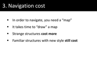

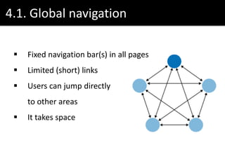
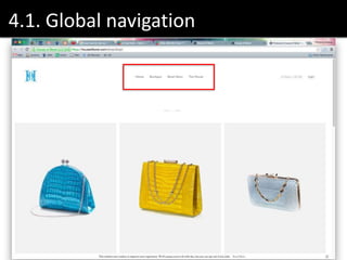
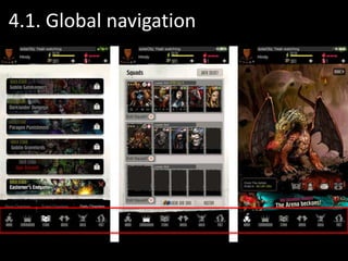
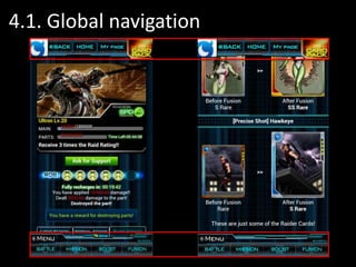


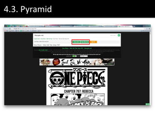


The document discusses various navigation patterns and their efficiencies, emphasizing concepts like global navigation, hub and spoke, and pyramid structures. It highlights the importance of signposts for user orientation and the concept of navigation cost, where users require a 'map' to navigate effectively within a product. Additionally, it suggests combining different navigation models to enhance user experience and references several design resources.

![[UX Series] 1b - 12 standard screen layouts](https://cdn.slidesharecdn.com/ss_thumbnails/enrwwps7midupojbmwj1-signature-085edba094deb1097db5eeb63e43eae4848440a0bb65a4aa426f2323e93c2199-poli-150828120514-lva1-app6891-thumbnail.jpg?width=640&height=640&fit=bounds)
![[UX Series] 2 - Clean design. Less is more](https://cdn.slidesharecdn.com/ss_thumbnails/ak7pcxfzs9q3y6ywjy24-signature-085edba094deb1097db5eeb63e43eae4848440a0bb65a4aa426f2323e93c2199-poli-150828120514-lva1-app6891-thumbnail.jpg?width=640&height=640&fit=bounds)
![[UX Series] 3 - User behavior patterns and design principles](https://cdn.slidesharecdn.com/ss_thumbnails/vmm42awvqzihoupsjjkf-signature-085edba094deb1097db5eeb63e43eae4848440a0bb65a4aa426f2323e93c2199-poli-150828120514-lva1-app6892-thumbnail.jpg?width=640&height=640&fit=bounds)
![[UX Series] 1 - UX Introduction](https://cdn.slidesharecdn.com/ss_thumbnails/uxintroduction-150804131237-lva1-app6891-thumbnail.jpg?width=640&height=640&fit=bounds)
![[UX Series] 4 - Contrast in design](https://cdn.slidesharecdn.com/ss_thumbnails/contrastindesign-150911111617-lva1-app6892-thumbnail.jpg?width=640&height=640&fit=bounds)
![[UX Series] 6 - Animation principles](https://cdn.slidesharecdn.com/ss_thumbnails/uxseries6-animationprinciples-150918113253-lva1-app6891-thumbnail.jpg?width=640&height=640&fit=bounds)


