Download to read offline
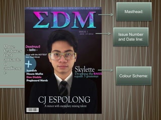
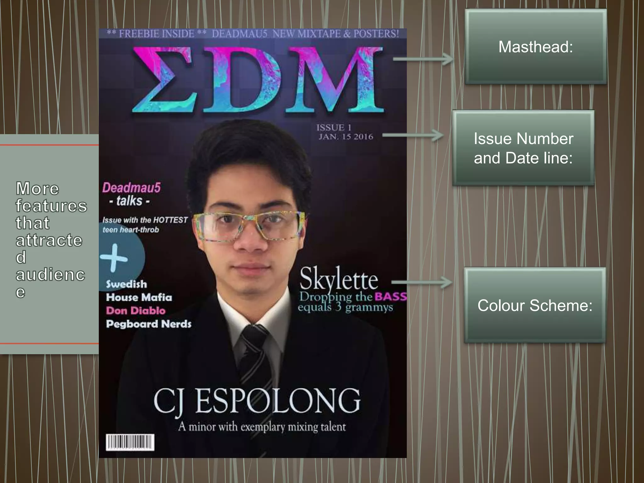
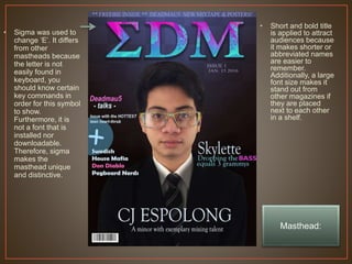
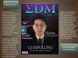

The document discusses design choices for the magazine masthead and colour scheme. It states that the masthead uses the Greek letter sigma to make it unique, and that a short, bold title is used to attract audiences. It also notes that a neon pink and light blue colour scheme is used because those colours are associated with EDM concerts, to involve the target audience and give a sense of belonging. The issue number and date are included to let readers know if the magazine is current and on trend.


![[Done] music video survey analysis](https://cdn.slidesharecdn.com/ss_thumbnails/donemusicvideosurveyanalysis-170120134626-thumbnail.jpg?width=640&height=640&fit=bounds)
![[Done] star theory..](https://cdn.slidesharecdn.com/ss_thumbnails/donestartheory-161208093738-thumbnail.jpg?width=640&height=640&fit=bounds)
![[Done] star theory](https://cdn.slidesharecdn.com/ss_thumbnails/donestartheory-161206123352-thumbnail.jpg?width=640&height=640&fit=bounds)
![[Done]mood board](https://cdn.slidesharecdn.com/ss_thumbnails/donemoodboard-161201082408-thumbnail.jpg?width=640&height=640&fit=bounds)
![[Done] bio](https://cdn.slidesharecdn.com/ss_thumbnails/donebio-161201081836-thumbnail.jpg?width=640&height=640&fit=bounds)


