Download to read offline

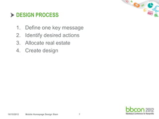
![DEFINE ONE KEY MESSAGE
• This is not your mission statement
• Must be succinct, understandable and repeatable
"At [org name] we [verb phrase] so that [constituent
group] can [verb phrase].”
10/15/2012 Mobile Homepage Design Slam 8](https://image.slidesharecdn.com/mobilehomepagedesignslam-llkmc-121015100005-phpapp02/85/Mobile-Homepage-Design-Slam-8-320.jpg)
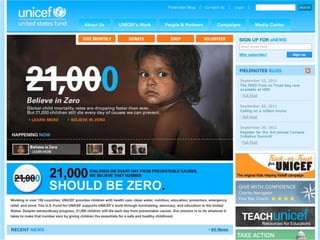
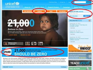
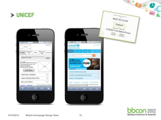
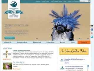
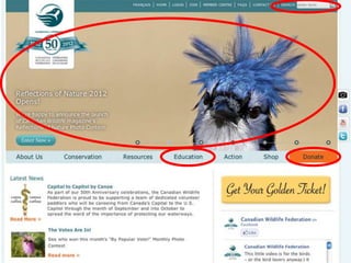
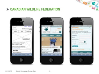
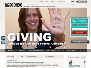
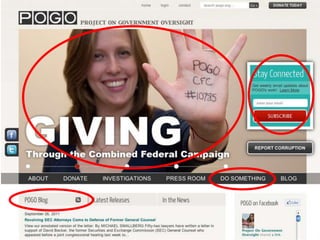
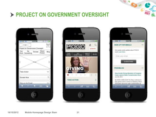
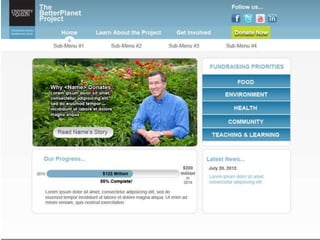
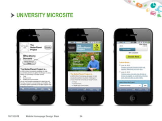
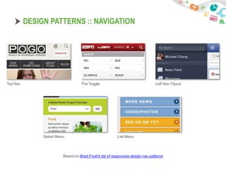

The document outlines a presentation on mobile homepage design. It discusses the importance of having a mobile presence, focusing on mobile-optimized websites as a first step. It provides guidance on defining a key message and desired actions, allocating screen space, and creating simple designs for touchscreens. Examples of effective nonprofit mobile homepages are shown and design patterns for navigation are presented. Attendees are invited to volunteer for a design slam.


