Download to read offline


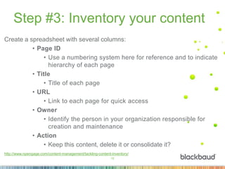
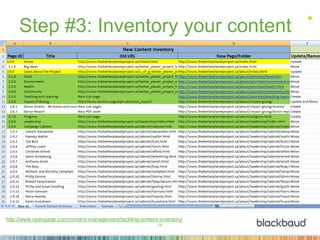


The document outlines essential strategies for enhancing online engagement, particularly emphasizing mobile responsiveness in nonprofit websites. Key steps include ensuring landing pages and emails are mobile-friendly, conducting a content inventory, adopting a 'content sea change' approach, and implementing responsive redesigns. The session concludes with an invitation to a follow-up event focused on emergency response preparedness.