Download as PDF, PPTX


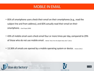
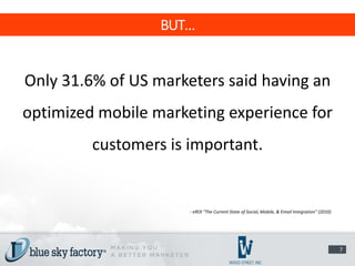
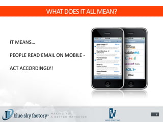
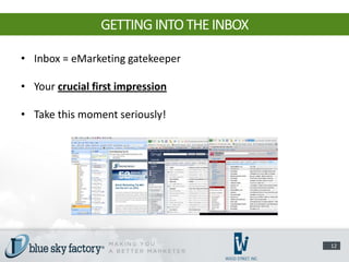

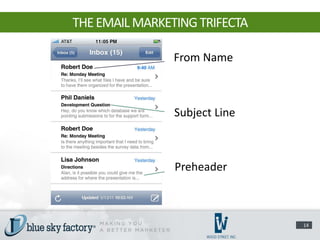
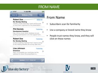
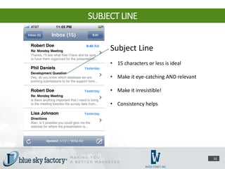
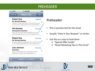
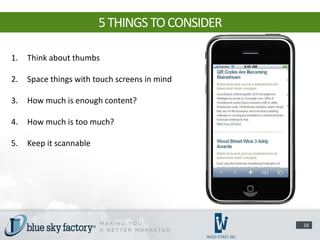
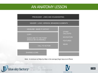

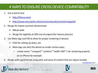
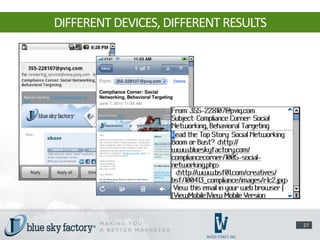

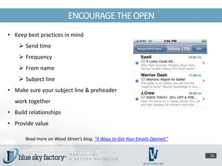

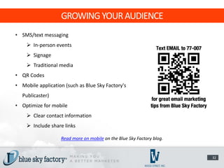


Mobile email marketing is growing in importance as smartphone usage increases. While over 80% of smartphone users check their email on their devices, only about 30% of marketers see mobile optimization as important. To succeed at mobile email marketing, marketers must design emails that are readable on various small screens through careful use of formatting, images, and content prioritization. They should also encourage opens and clicks through best practices for subject lines, preheaders, and calls to action tailored for mobile. Growing a mobile audience requires SMS/text and QR codes along with a fully optimized website and applications.


