Download to read offline

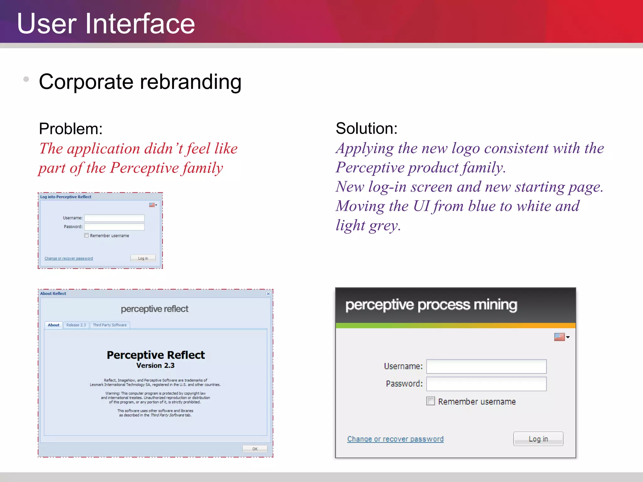
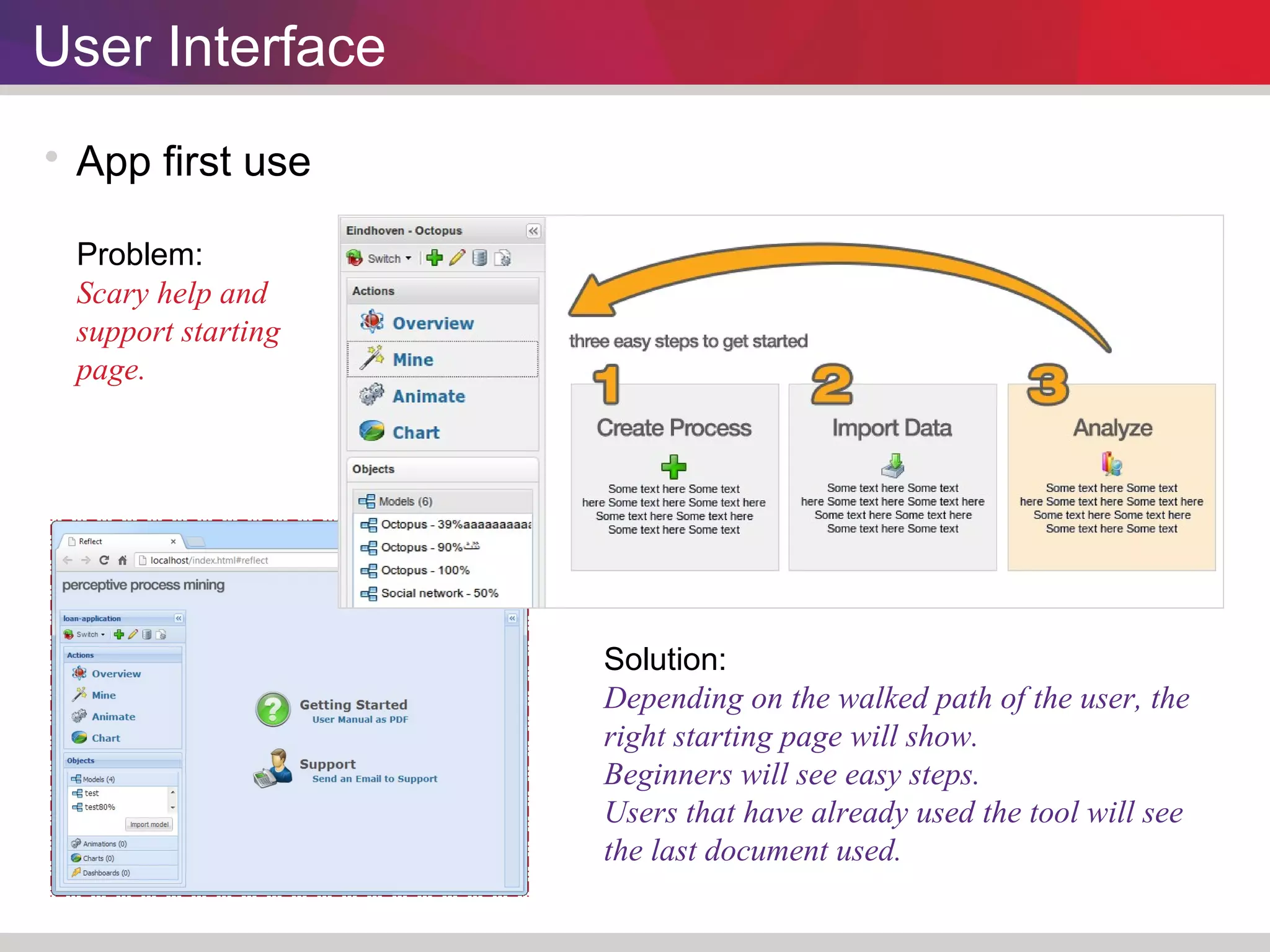
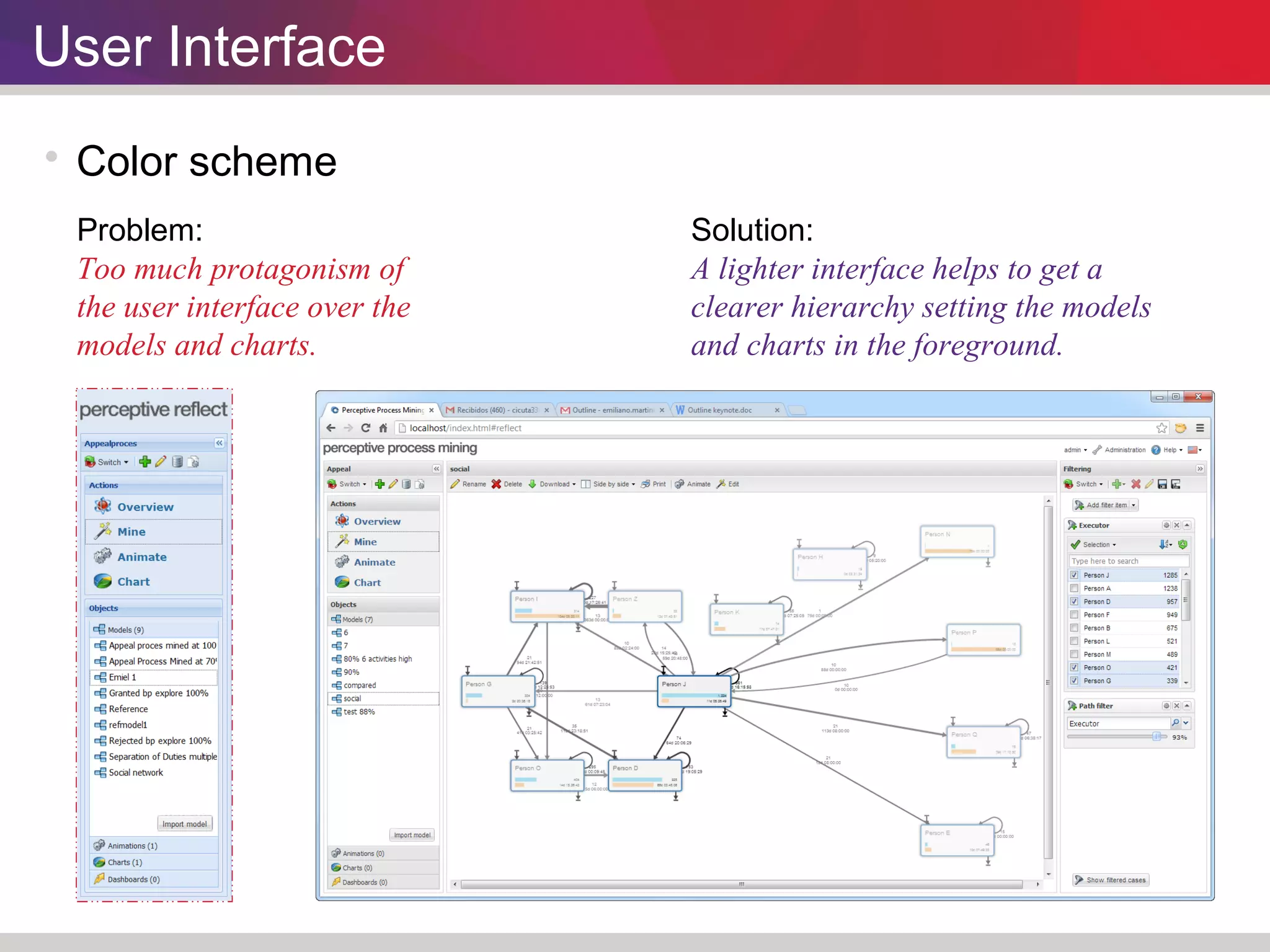
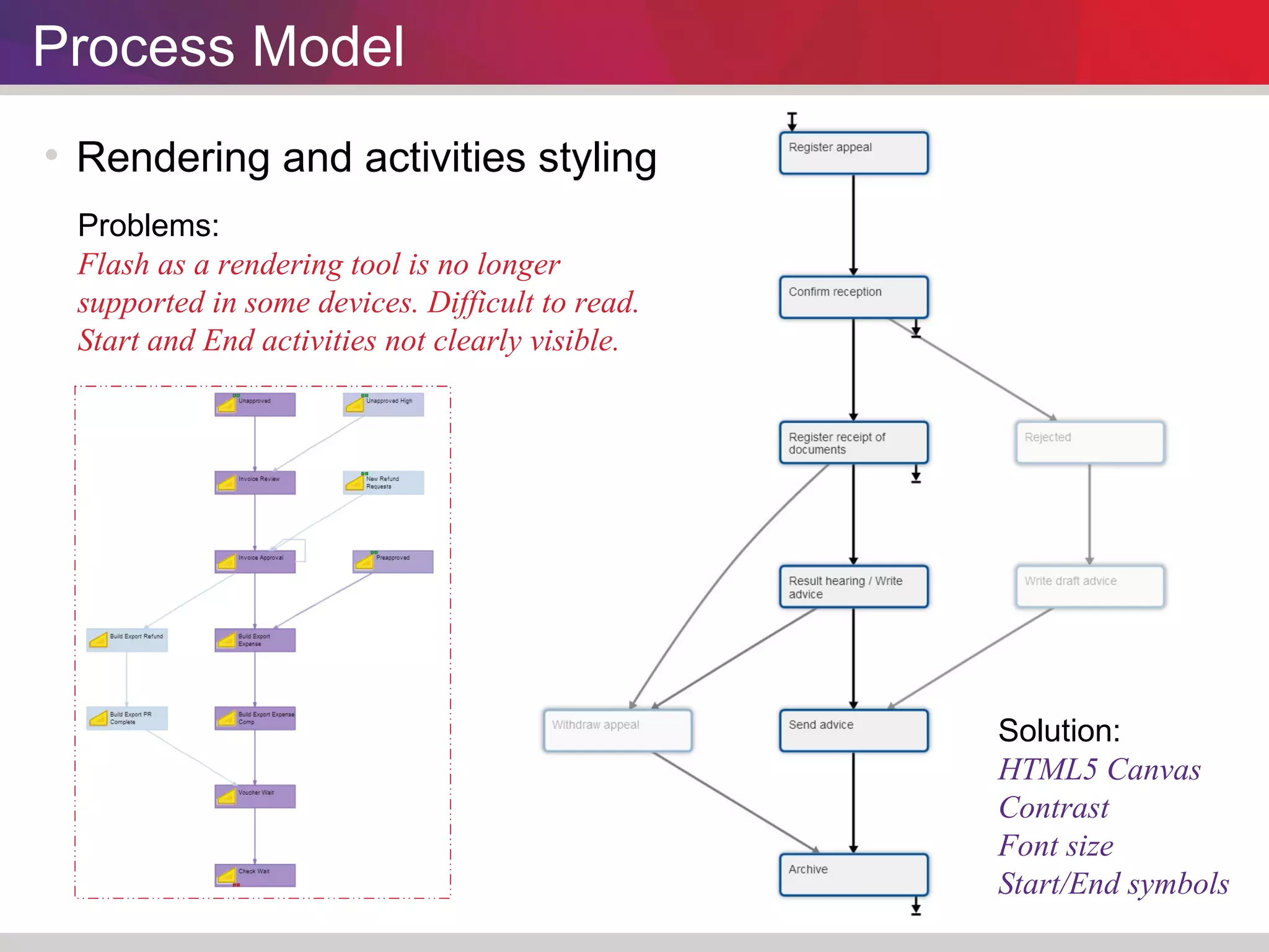
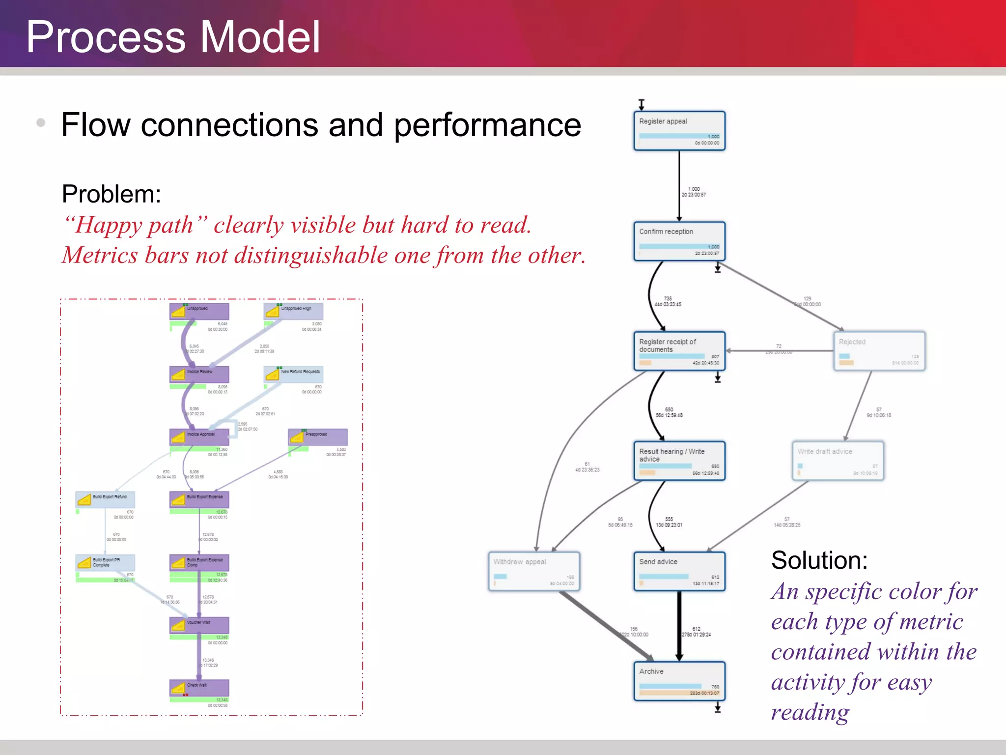
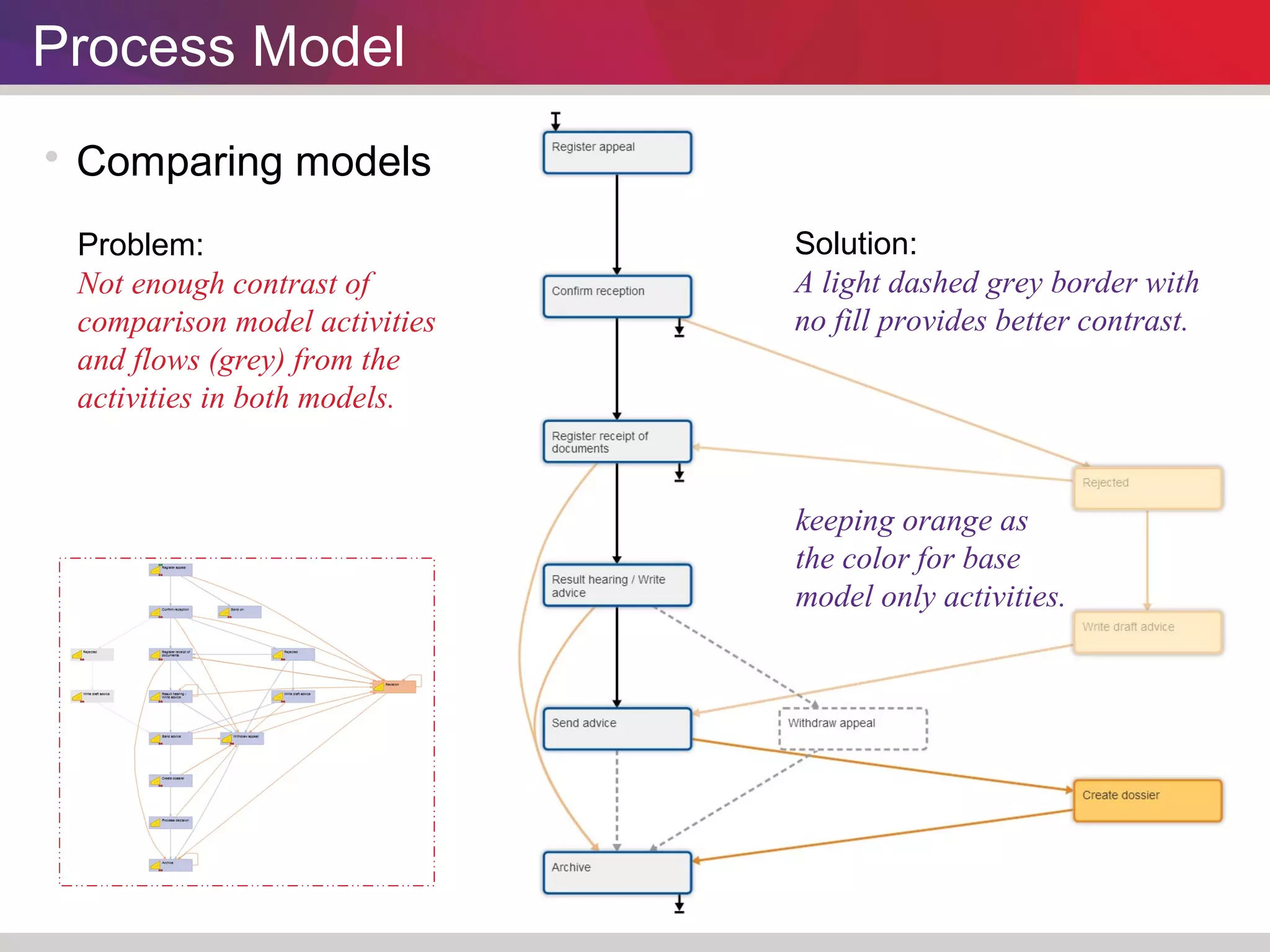
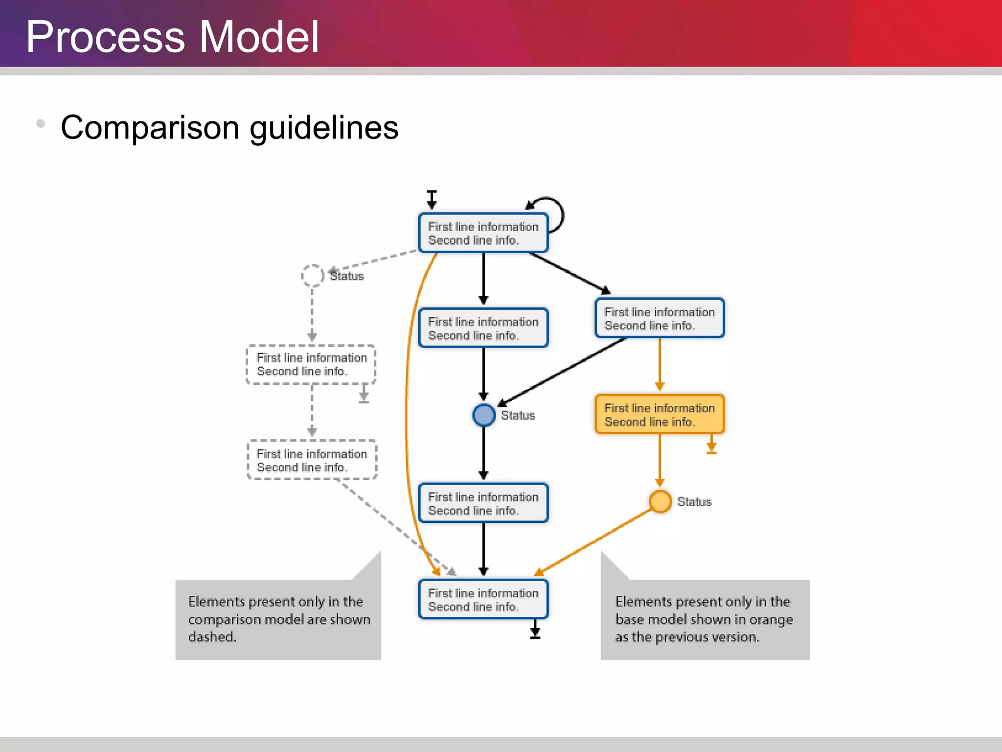
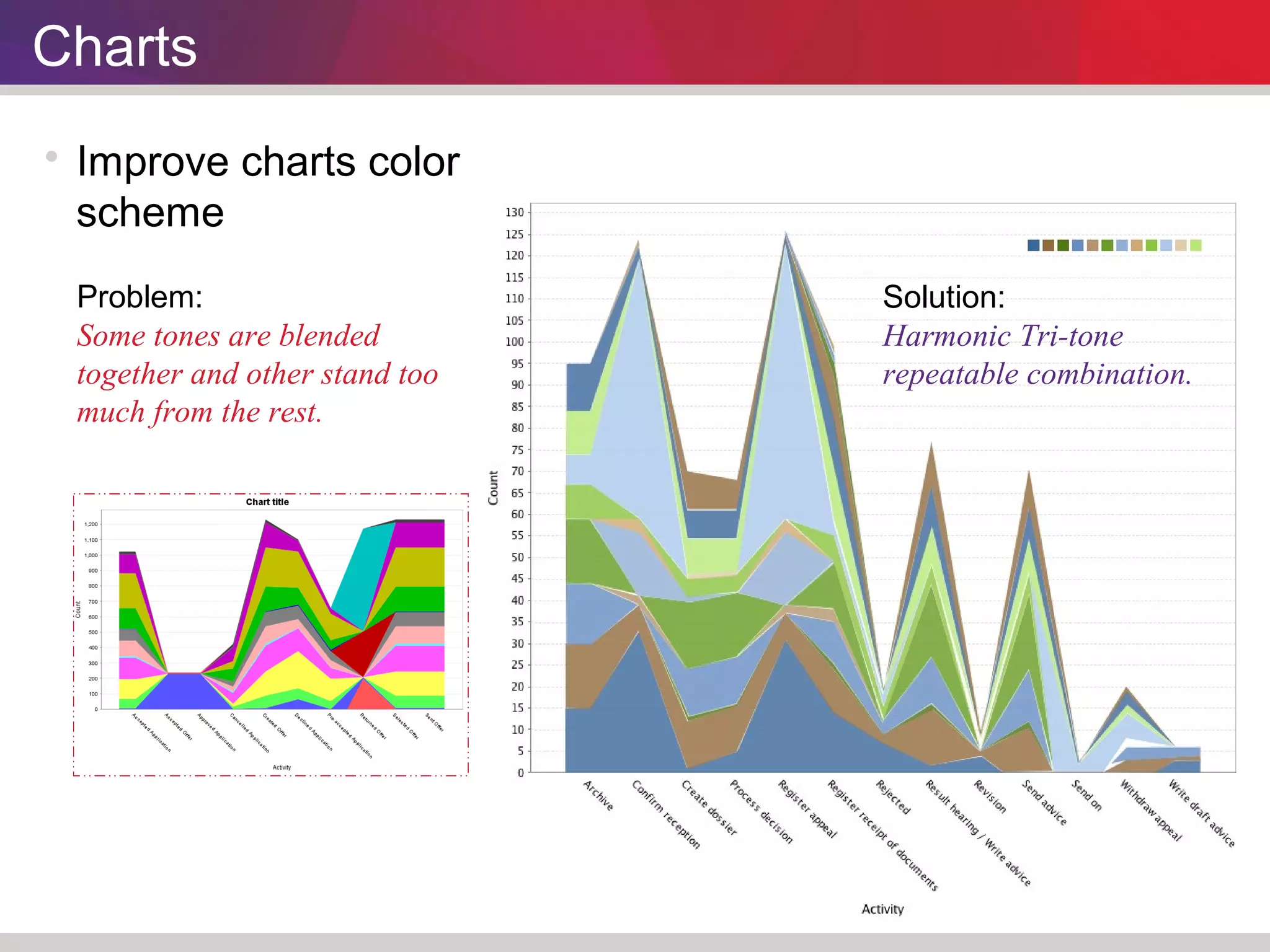
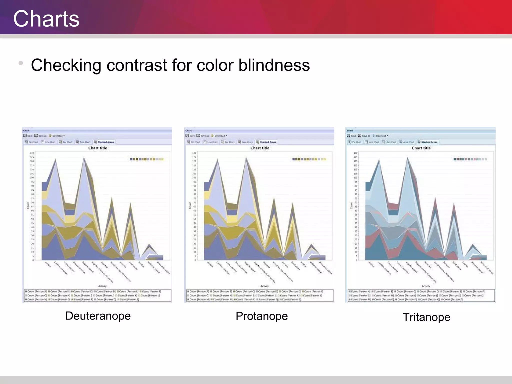
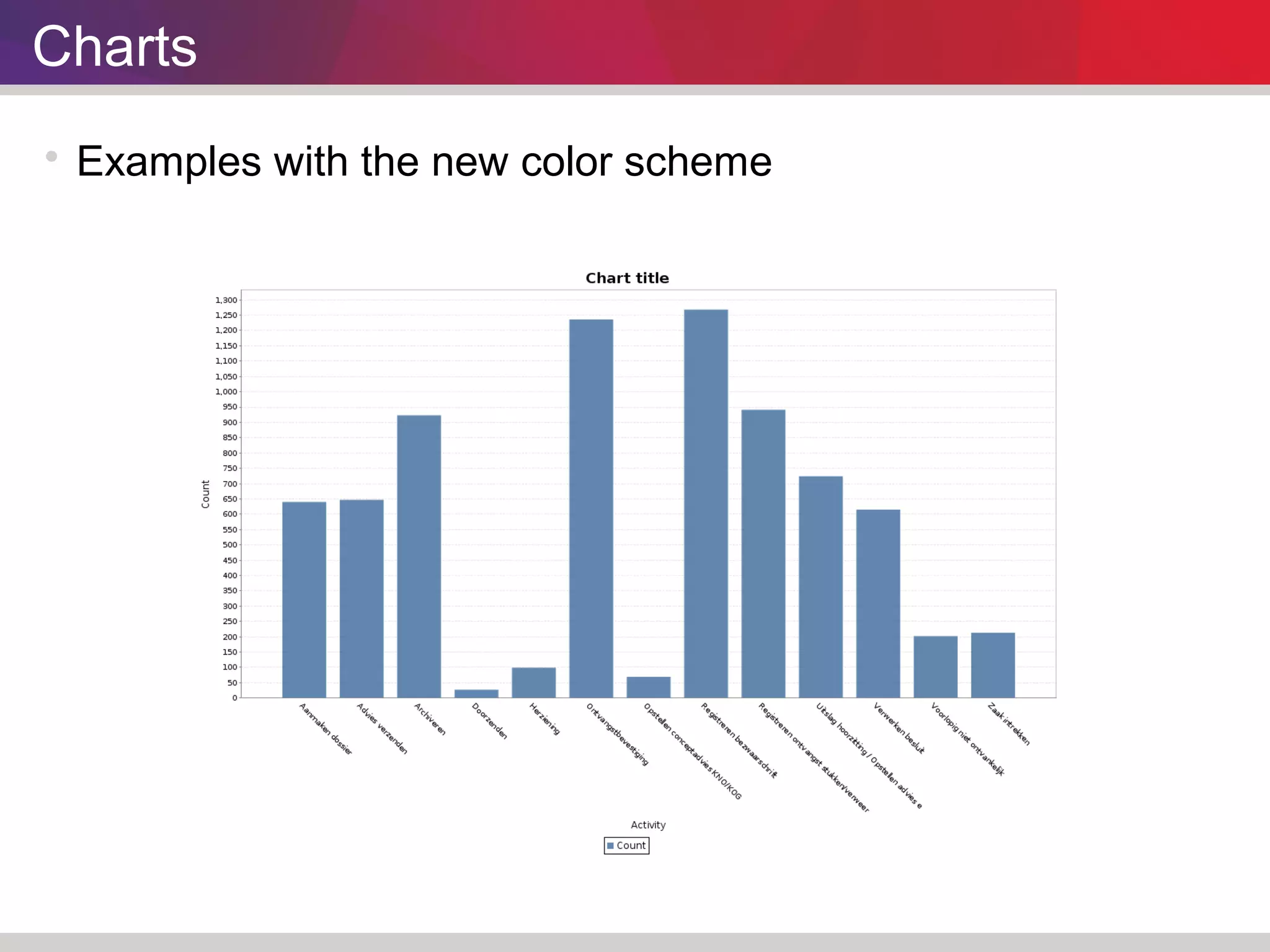
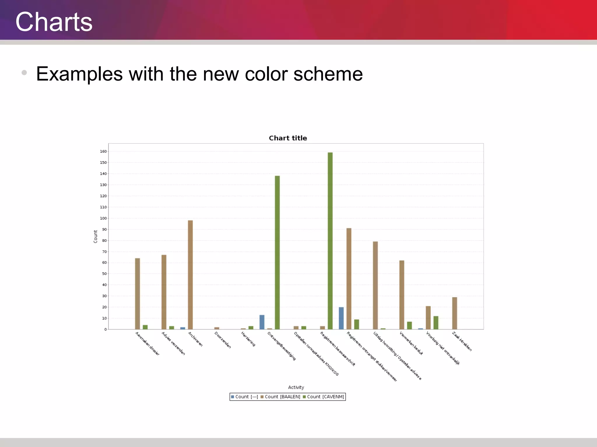
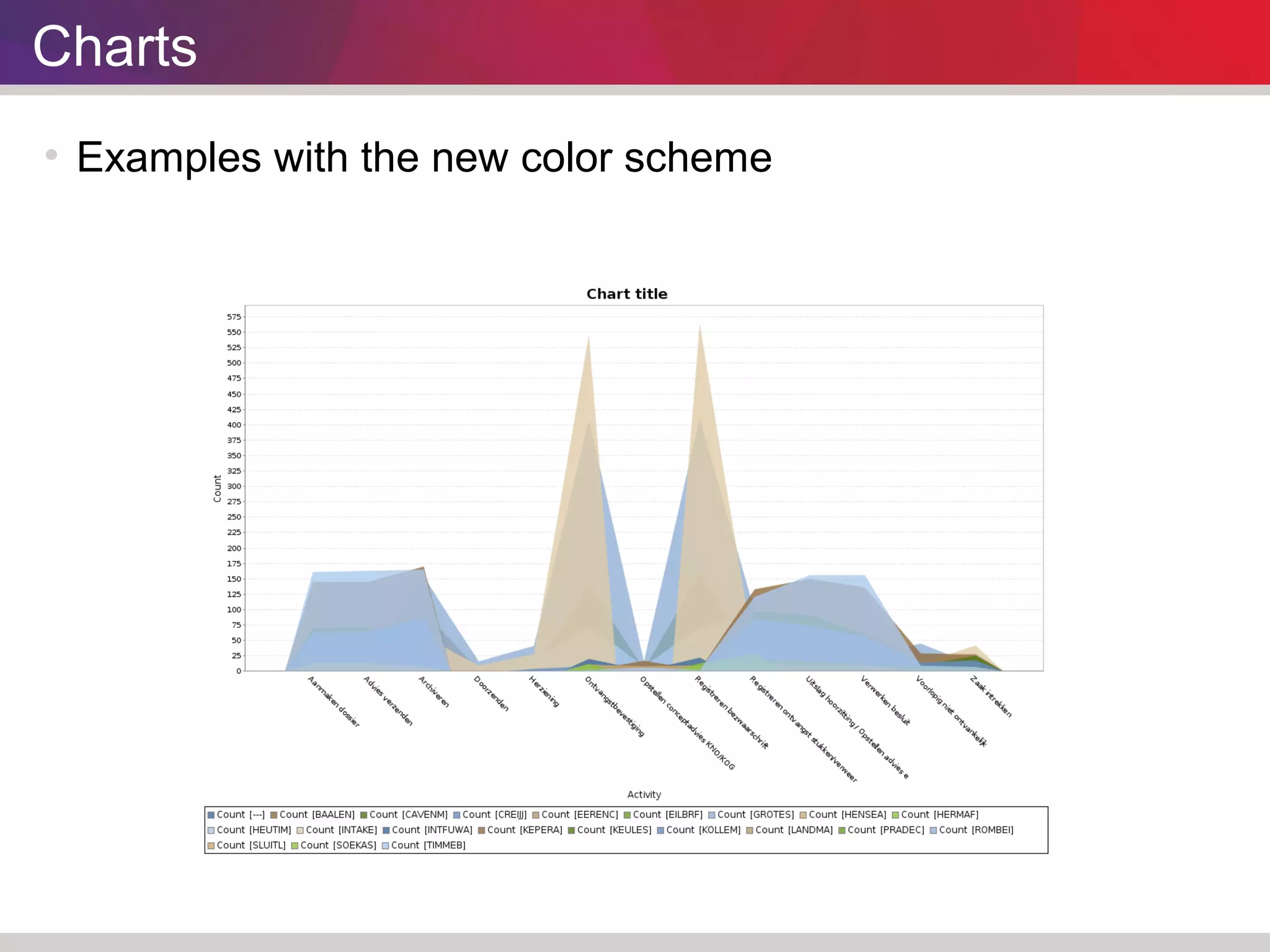
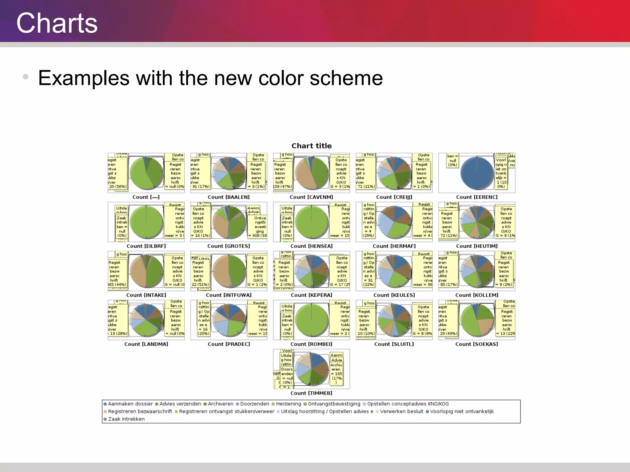
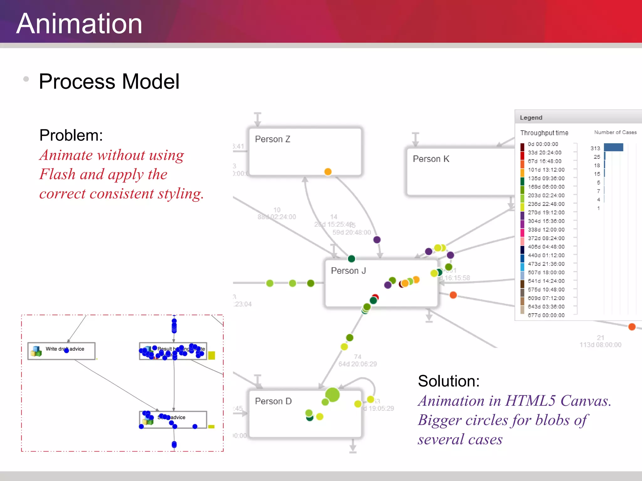
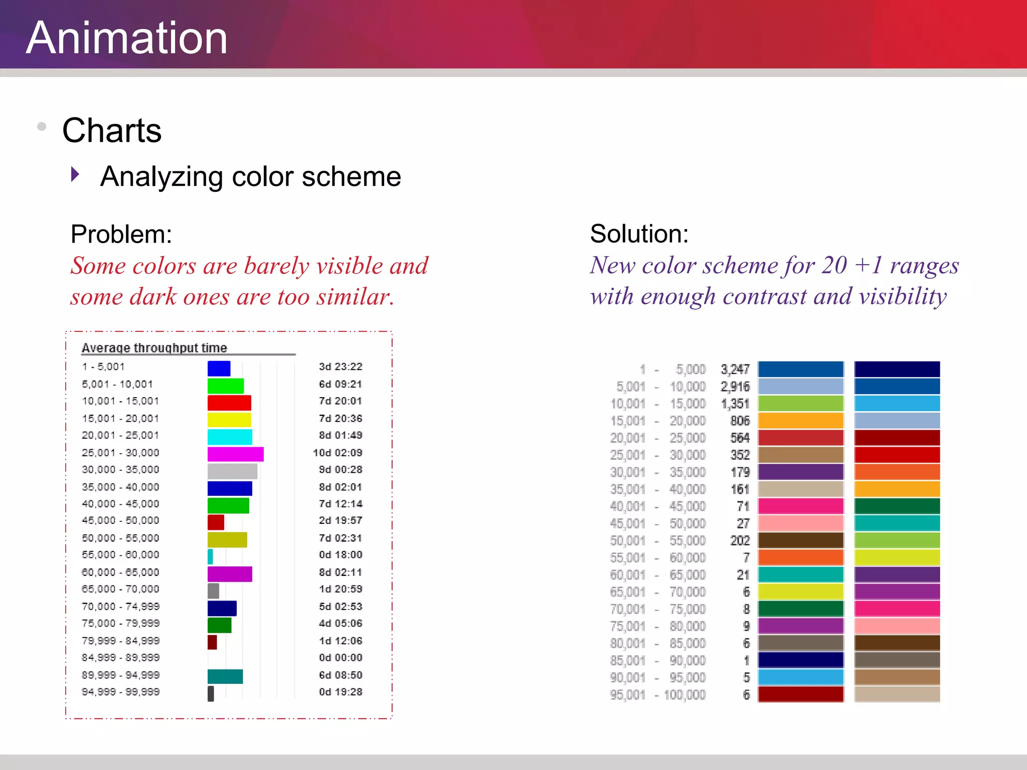
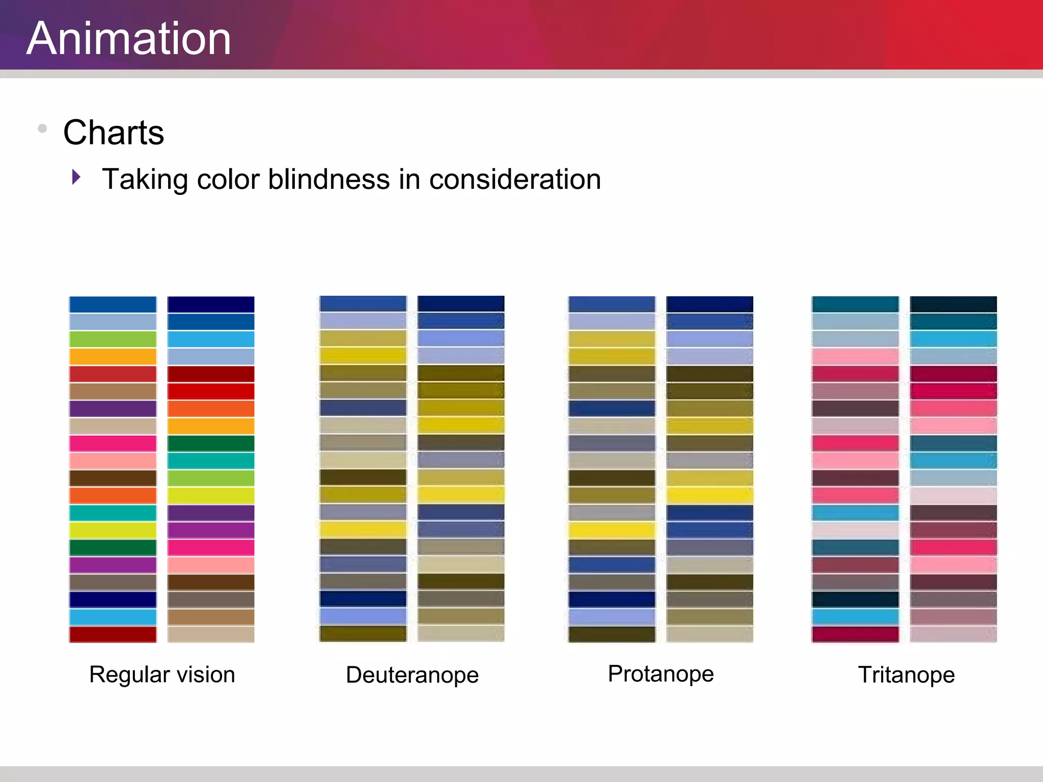
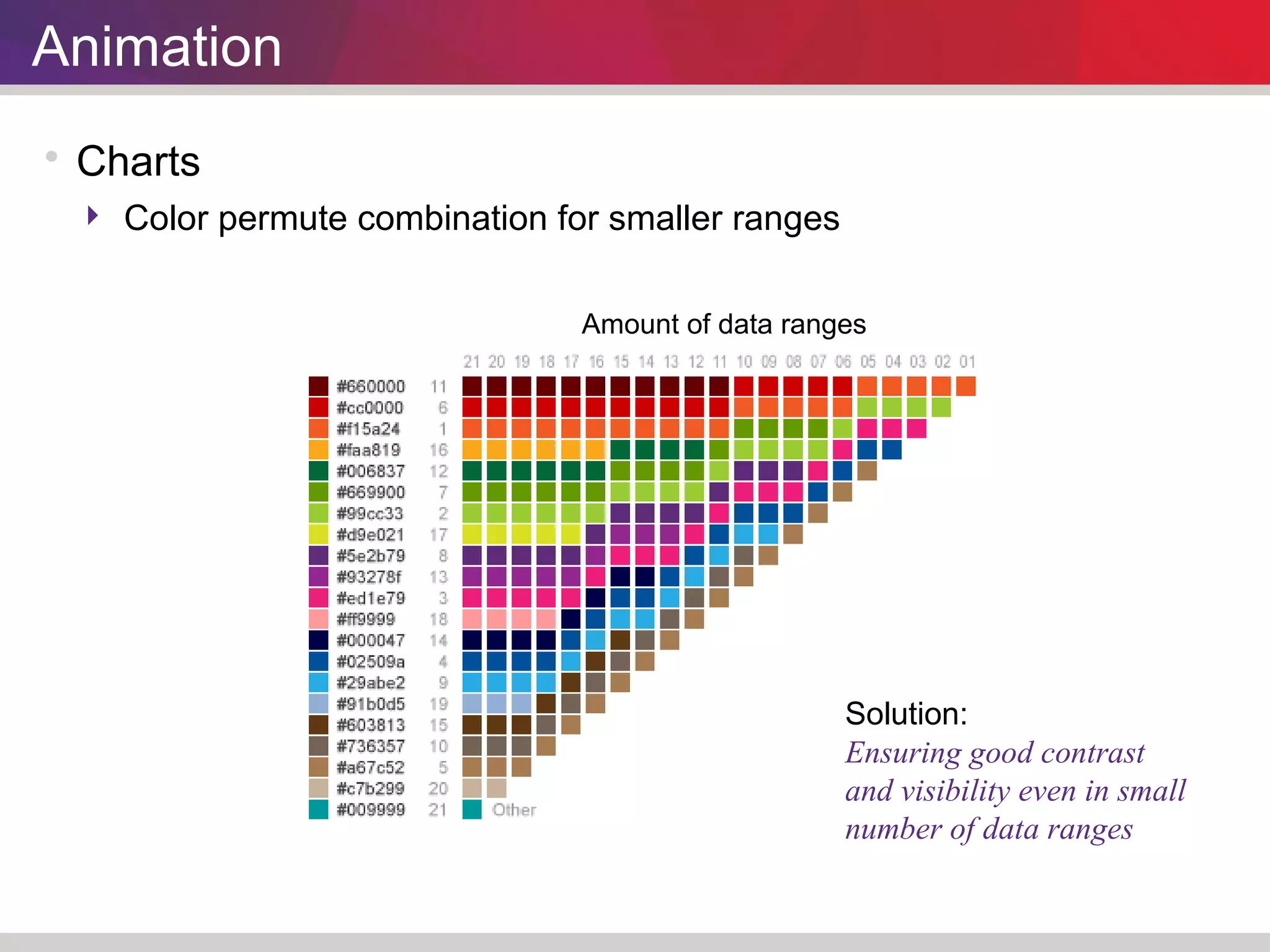
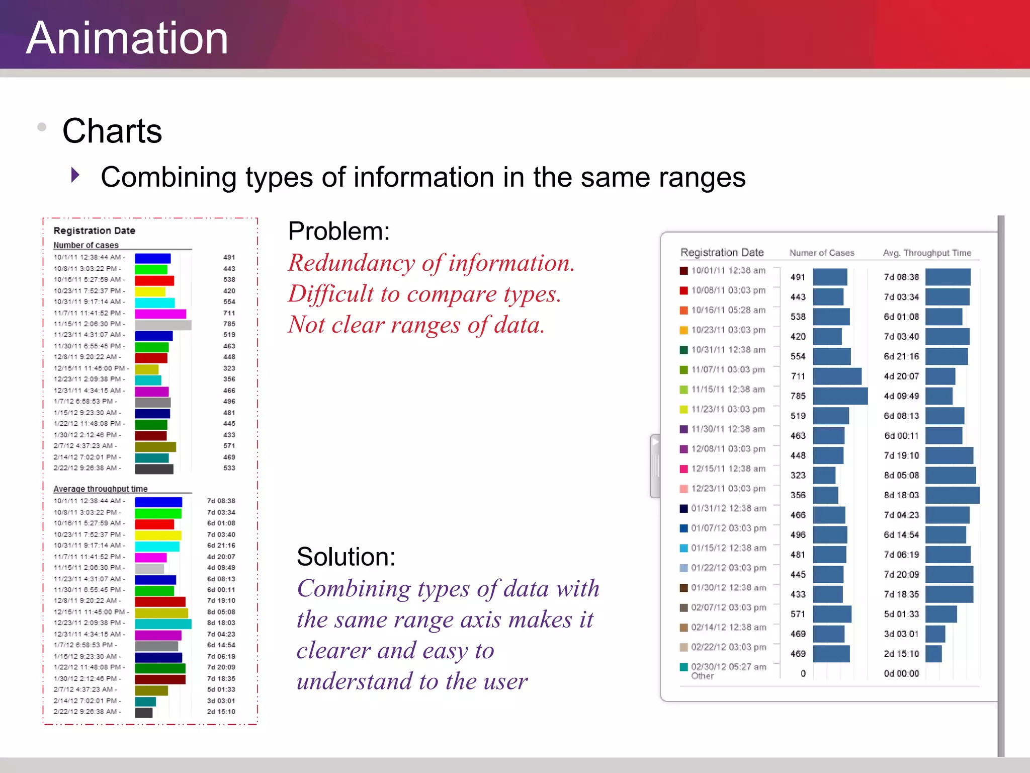

This document discusses improvements made to the user interface, process model, charts, and animations of a process mining application. The updates were aimed at addressing issues related to corporate rebranding, updating outdated technology, and incorporating user experience research findings. Changes included applying a new color scheme and logo aligned with the company's products, improving navigation for first-time and returning users, enhancing readability of the process model, standardizing charts' color schemes, and animating elements without Flash for broader device compatibility. User testing validated that the updates better supported user needs and understanding of the application.