
Recommended
More Related Content
What's hot
What's hot (20)
Similar to Miley Cyrus Bangerz digipack analysis
Similar to Miley Cyrus Bangerz digipack analysis (20)
Recently uploaded
Recently uploaded (20)
Miley Cyrus Bangerz digipack analysis
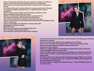
- 1. - Name of artist at top and bottom of cover in spaced out writing so it stands out - Colours are pink and purple connoting the fact she is a female singer - Palm trees and neon sign imply that the album might be summer themed/club themed - Can clearly tell the genre is pop by what she is wearing and the name “Bangerz” - The spelling of bangers being spelt with a ‘z’ implies its aimed at young people/teens - Artist is wearing a black outfit so that the background stands out more - Being sexualised through outfit and makeup - Red lips connote power (independent woman), passion and love - This means some songs could be about love and breakups - Title of album almost looks as though it is lit up like a neon sign - Pictures of palm trees have a green/pink effect making it look fun/striking to the eye - Artist is central focus - Image is recognisable, short blonde hair, red lips, black outfit - Stereotyped as reckless and lively - Mainstream artist - Miley has been cropped out and edited onto the cover - Eye contact with camera draws people in - Cover looks 80’s club themed so teens will be intrigued - On this cover she has back facing the camera however still making eye contact by looking over shoulder - Hand on lip with mouth slightly open suggests she is secretive - On this cover she looks more mysterious as if she has something to hide - Both covers look similar but different pictures of the artist (original and deluxe album) - Photos are angled slightly in the background making them look as if they are actual photographs that have been taken - Colours of album almost represent a sunset/holiday connoting the fact that the songs within the album are about Miley making memories and just having fun being young - This album gives off a mature but still entertaining image of Miley as she wants the audience to recognise that she is no longer the old Miley, she has grown up and her style/music shows this - Overall, the album is bright and striking to the eye, it would definitely stand out in a music store
- 2. - Names of the songs are placed unusually, they seem to go round her body - Picture is cut out - Pink, clear text, all upper case - On the back cover it follows the same colour scheme - Still an ombre effect background resembling a sunset which is possibly what inspired the fun summer theme of the album - Side portrait of the artist in same outfit sitting on a chair - Looking away from camera as this is the back of the cover which will not be the main focus - Institutional details - Sony music logo in the bottom right corner which is her record label
- 3. - CD is simplistic compared to the album cover - Pink writing against the white background so that it stands out - Pink also connotes fact she is a female - Producers etc written in smaller, black writing - Spaced out writing and same font that is featured on the CD cover - Name of artist at top because its important to remember her name - Name of album underneath - Plain CD helps the actual cover of the album stand out more - This is a page of the inside booklet and a sticker booklet you also receive with the CD - The stickers are colourful and seem to be aimed at teenagers as there are emojis used and some things that only teenagers would understand - In most of the pictures in the booklet Miley is wearing revealing clothing to attract the audience and show her careless attitude - Again, the writing has been placed diagonally and rounded which emphasises the party theme of the album - Holding balloons also represents this - Red writing matches her red clothing and connotes her sexual, feisty nature