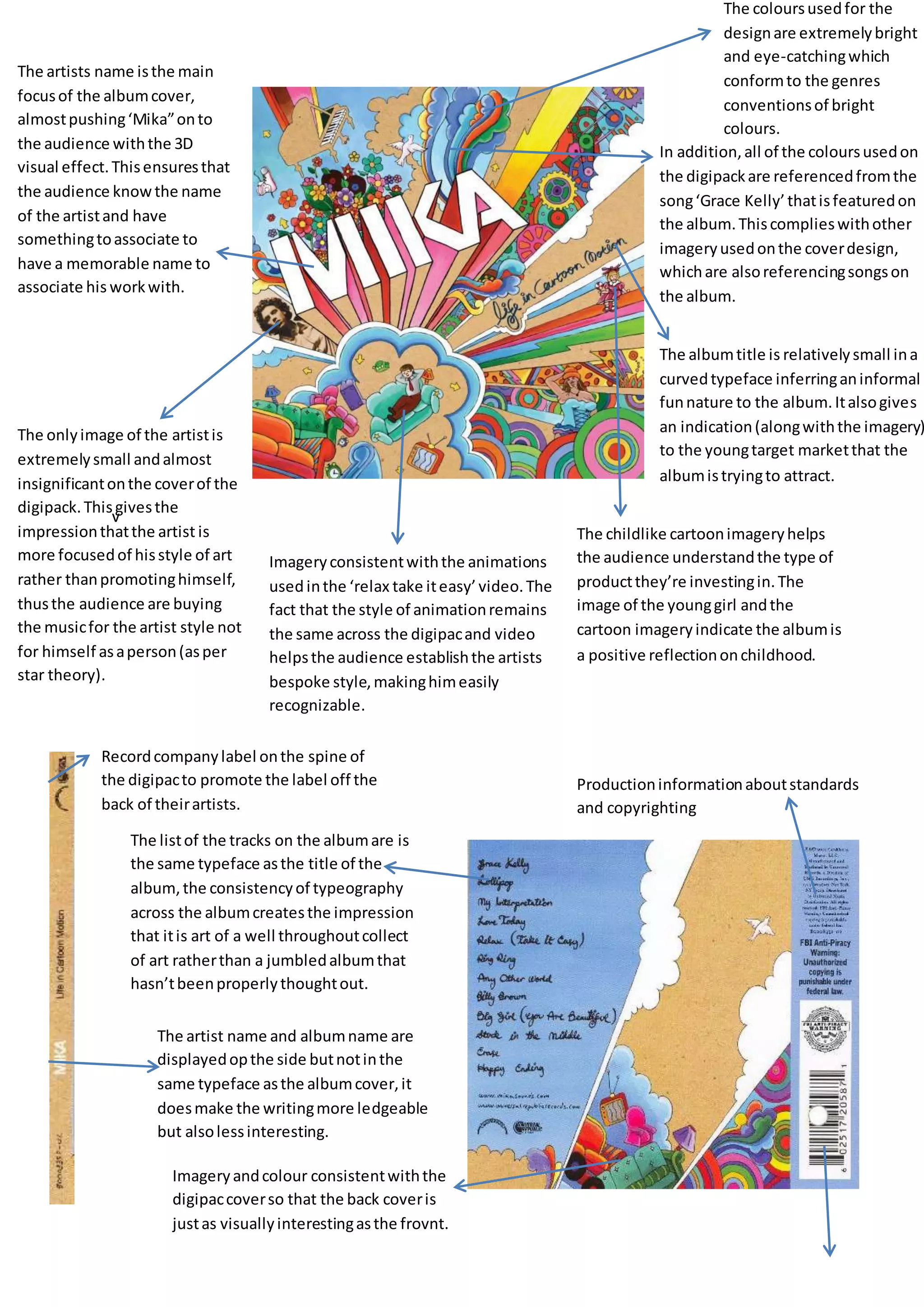
v
The coloursusedfor the
designare extremelybright
and eye-catchingwhich
conformto the genres
conventionsof bright
colours.
In addition,all of the coloursusedon
the digipackare referencedfromthe
song‘Grace Kelly’thatisfeaturedon
the album.Thiscomplieswithother
imageryusedonthe coverdesign,
whichare alsoreferencingsongson
the album.
The albumtitle is relativelysmall ina
curvedtypeface inferringaninformal
funnature to the album.Italsogives
an indication(alongwiththe imagery)
to the youngtarget marketthat the
albumistryingto attract.
The childlike cartoonimageryhelps
the audience understandthe type of
productthey’re investingin.The
image of the younggirl andthe
cartoon imageryindicate the albumis
a positive reflectiononchildhood.
Imageryconsistentwiththe animations
usedinthe ‘relax take iteasy’video.The
fact that the style of animationremains
the same across the digipacand video
helpsthe audience establishthe artists
bespoke style,makinghimeasily
recognizable.
The onlyimage of the artistis
extremelysmall andalmost
insignificantonthe coverof the
digipack.Thisgivesthe
impressionthatthe artist is
more focusedof hisstyle of art
rather thanpromotinghimself,
thusthe audience are buying
the musicfor the artist style not
for himself asaperson(asper
star theory).
The artists name isthe main
focusof the albumcover,
almostpushing‘Mika”onto
the audience withthe 3D
visual effect.Thisensuresthat
the audience knowthe name
of the artistand have
somethingtoassociate to
have a memorable name to
associate his workwith.
Recordcompanylabel onthe spine of
the digipacto promote the label off the
back of theirartists.
The listof the tracks on the albumare is
the same typeface asthe title of the
album,the consistencyof typeography
across the albumcreatesthe impression
that itis art of a well throughoutcollect
of art ratherthan a jumbledalbumthat
hasn’tbeenproperlythoughtout.
Imageryandcolour consistentwiththe
digipaccoverso that the back coveris
justas visuallyinterestingasthe frovnt.
The artist name and albumname are
displayedopthe side butnotinthe
same typeface asthe albumcover,it
doesmake the writingmore ledgeable
but alsolessinteresting.
Productioninformationaboutstandards
and copyrighting

Mika digi

  • 1.
    v The coloursusedfor the designareextremelybright and eye-catchingwhich conformto the genres conventionsof bright colours. In addition,all of the coloursusedon the digipackare referencedfromthe song‘Grace Kelly’thatisfeaturedon the album.Thiscomplieswithother imageryusedonthe coverdesign, whichare alsoreferencingsongson the album. The albumtitle is relativelysmall ina curvedtypeface inferringaninformal funnature to the album.Italsogives an indication(alongwiththe imagery) to the youngtarget marketthat the albumistryingto attract. The childlike cartoonimageryhelps the audience understandthe type of productthey’re investingin.The image of the younggirl andthe cartoon imageryindicate the albumis a positive reflectiononchildhood. Imageryconsistentwiththe animations usedinthe ‘relax take iteasy’video.The fact that the style of animationremains the same across the digipacand video helpsthe audience establishthe artists bespoke style,makinghimeasily recognizable. The onlyimage of the artistis extremelysmall andalmost insignificantonthe coverof the digipack.Thisgivesthe impressionthatthe artist is more focusedof hisstyle of art rather thanpromotinghimself, thusthe audience are buying the musicfor the artist style not for himself asaperson(asper star theory). The artists name isthe main focusof the albumcover, almostpushing‘Mika”onto the audience withthe 3D visual effect.Thisensuresthat the audience knowthe name of the artistand have somethingtoassociate to have a memorable name to associate his workwith. Recordcompanylabel onthe spine of the digipacto promote the label off the back of theirartists. The listof the tracks on the albumare is the same typeface asthe title of the album,the consistencyof typeography across the albumcreatesthe impression that itis art of a well throughoutcollect of art ratherthan a jumbledalbumthat hasn’tbeenproperlythoughtout. Imageryandcolour consistentwiththe digipaccoverso that the back coveris justas visuallyinterestingasthe frovnt. The artist name and albumname are displayedopthe side butnotinthe same typeface asthe albumcover,it doesmake the writingmore ledgeable but alsolessinteresting. Productioninformationaboutstandards and copyrighting