10 Commandments PowerPoint Guide
•Download as PPTX, PDF•
5 likes•1,221 views

Guidelines for ppt ten commandments

Recommended
More Related Content
Similar to 10 Commandments PowerPoint Guide
Similar to 10 Commandments PowerPoint Guide (20)
More from Devan Pannen
More from Devan Pannen (17)
Recently uploaded
Recently uploaded (20)
10 Commandments PowerPoint Guide
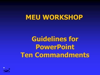
- 1. MEU WORKSHOP Guidelines for PowerPoint Ten Commandments
- 2. PowerPoint
- 3. The Ten Commandments I. Size really does matter II. Use “sans serif” typeface III. Do not overload slides IV.Use bullets , not numbers V. Allow plenty of room around VI. Follow “6 x 6 x 6” rule VII. Choose color carefully VIII.Graphs / charts IX. Pictures & clip arts X. Be consistent
- 4. Size really does matter!I.
- 5. Minimum 36 point for titles 24 point for body text This is 32 point Title at least 1.5 times larger 45 point 40 point 35 point 30 point 25 point 20 point 15 point 10 point Select Readable Type Size This is 44 point
- 6. Use a Readable Font Arial Verdana Times New Roman Garamond Sans serif Serif (no curly feet) II.
- 7. No More than One Topic per Slide III.
- 8. Do not overload slides Do not use Unnecessary slides
- 9. The Medlite™ C6 Laser The all new Medlite™ C Series laser design features a calibration port, a counter-balanced articulated arm, no need for user adjustments of 532 nm energy levels, new compact industrial design and the fully integrated optional Multilite™ Dye Laser handpieces. The new Medlite™ C6 truly holds up the Medlite’s reputation for versatility that has earned it the name “workhorse of the medical office environment”.
- 10. The Medlite™ C6 Laser Features Articulated arm Calibration port No need for user adjustments Compact
- 11. Bullets Use Bullets, Not numbers Bullets imply no significant order Use numbers only to show rank or sequence Use the same color for all IV.
- 12. Bullets Use Bullets, Not numbers Bullets imply no significant order Use numbers only to show rank or sequence Use the same color for all
- 13. Bullets Use Bullets, Not numbers Bullets imply no significant order Use numbers only to show rank or sequence Use the same color for all
- 14. Bullet lists - adding colour Building bullet lists places more emphasis on each point Previous points can be dimmed to a lower tone colour to carry audience attention Make sure all colours used remain visible
- 15. Allow plenty of room around borders and illustrations Keep all objects atleast a mouse pointer away from the edge V.
- 16. Use the 6-6-6 rule: 6 lines of text 6 words per line 6 text pages in a row VI.
- 17. Choose Color Carefully Use the same color consistently throughout the presentation Use light letters on a dark background Or dark letters on a light background VII.
- 18. Other Etiological Factors Stress, Anxiety Hair sprays, gels Hair coloring products Hot hair curlers Dry indoor heating
- 19. Other Etiological Factors Stress, Anxiety Hair sprays, gels Hair coloring products Hot hair curlers Dry indoor heating
- 20. Graphs / Charts Avoid importing Excel Graphs / Charts VIII.
- 21. Use Solid Colors instead of fill Patterns on Charts Patterns on bars or pie slices cause confusion. Solid colors convey a clear bold message 0 20 40 1st Qtr 2nd Qtr 3rd Qtr 4th Qtr Blue Red Hatch
- 22. Use Solid Colors instead of fill Patterns on Charts 0 20 40 1st Qtr 2nd Qtr 3rd Qtr 4th Qtr Blue Red Hatch Patterns on bars or pie slices cause confusion. Solid colors convey a clear bold message
- 23. Tables Use simple tables Limit rows / columns Round off %
- 24. Hair Depth and Hair Cycle Body Area % Anagen Hair Telogen Duration Follicles Density (1/cm2 ) Depth of Follicle Chin 70.8 10 weeks 500 2 - 4mm Upper lip 65.3 6 weeks 500 1 - 2.5mm Axillae 30 3 months 65 3.5 - 4.5mm Pubic Area 30 12 weeks 70 3.5 - 4.5mm Arms 20.7 18 weeks 80 Legs 20 24 weeks 60 2.5 - 4mm 3.5 - 4.5mm
- 25. Hair Depth and Hair Cycle Body Area % Anagen Hair Telogen Duration Follicles Density (1/cm2 ) Depth of Follicle Chin 70 10 weeks 500 2 - 4mm Upper lip 65 6 weeks 500 1 - 2.5mm Axillae 30 3 months 65 3.5 - 4.5mm Pubic Area 30 12 weeks 70 3.5 - 4.5mm Arms 20 18 weeks 80 Legs 20 24 weeks 60 2.5 - 4mm 3.5 - 4.5mm
- 26. Hair Depth and Hair Cycle Body Area % Anagen Hair Telogen Duration Follicles Density (1/cm2 ) Depth of Follicle Chin 70 10 weeks 500 2 - 4mm Upper lip 65 6 weeks 500 1 - 2.5mm Axillae 30 3 months 65 3.5 - 4.5mm Pubic Area 30 12 weeks 70 3.5 - 4.5mm Arms 20 18 weeks 80 Legs 20 24 weeks 60 2.5 - 4mm 3.5 - 4.5mm
- 27. A picture is worth a thousand words Actinic reticuloid Lepromatous leprosy
- 28. Periorbital Erbium Resurfacing Before After 6 weeks
- 29. Scanning Pictures Size Color - 256colors Resolution - 800 X 600 BMP < GIF < JPEG
- 31. 196 KB A picture is worth a thousand words, but it uses up three thousand times the memory
- 32. Keep slides simple Information layout Style and size of font Use of colours Style of graphics Build effects and transitions Be consistent with: X.
- 33. The Seven Deadly Sins Slide Transitions And Sound Effects Standard Clipart Presentation Templates Text-Heavy Slides The “Me” Paradigm Reading Faith in Technology
- 34. Slide effects - Transition SLIDE effects are like SIDE effects The less the better
- 35. Slide Animation Don’t do it because you know how to do it !
- 36. B Cell T Cell Immunity
- 37. B Cell T Cell Immunity
- 38. B Cell T Cell Immunity
- 39. B Cell T Cell Immunity
- 40. B Cell T Cell Immunity
- 41. B Cell T Cell Immunity
- 42. B Cell T Cell Immunity
- 43. B Cell T Cell Immunity
- 44. B Cell T Cell Immunity
- 45. B Cell T Cell Immunity
- 46. B Cell T Cell Antibody Antigen Immunity
- 47. Clip Art Friend or foe ?!
- 48. Stage Fear ? It is perfectly normal to feel nervous Just don't show it !
- 49. Should be a visual aid and not a visual distraction
- 50. Try not to use the “same old templates” Innovate!
- 51. The key to preparing effective audiovisual aids is to remember that they are only aids. Their role is to add a visual dimension to the points that you made orally. They cannot make those points for you; they can only reinforce them. When you plan for audiovisual aids, follow these simple guidelines: One research finding says that if you use a visual aid to make your first point, you'll increase retention rate from 15 to 40 per cent. But with each additional visual aid that rate will decrease…. Text heavy slides
- 54. You can’t stop talking Recall: You cannot start talking until the audience has finished reading But: You can’t stop talking So: You end up reading your slide to the audience. Which is: Really annoying
- 55. Don’t turn your back to the audience
- 56. Have a back up
- 58. He who fails to prepare Prepares to fail
- 59. Check the room layout and locate light switches
- 61. Dress appropriately Use clothes in which you are comfortable
- 62. The audience will judge you in the first 30 seconds they see you
- 65. Work the whole room Rule of thumb: not > 3sec on each member of the audience
- 67. Pauses are vital !
- 68. Don’t allow the PowerPoint to take over the presentation
- 69. What do I want them to learn from me? It really begins in your mind!
- 70. Make enough slides so that you don't have to keep going back and forth in the presentation.
- 71. Did you know you can spell-check in Powerpoint?
- 72. May the best presentation of you past be the worst presentation of your future Thank you