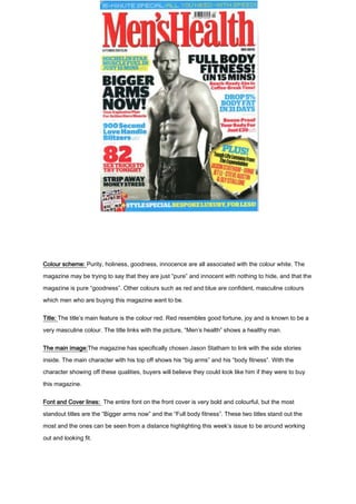
1. Colour scheme: Purity, holiness, goodness, innocence are all associated with the colour white. The
magazine may be trying to say that they are just “pure” and innocent with nothing to hide, and that the
magazine is pure “goodness”. Other colours such as red and blue are confident, masculine colours
which men who are buying this magazine want to be.
Title: The title’s main feature is the colour red. Red resembles good fortune, joy and is known to be a
very masculine colour. The title links with the picture, “Men’s health” shows a healthy man.
The main image:The magazine has specifically chosen Jason Statham to link with the side stories
inside. The main character with his top off shows his “big arms” and his “body fitness”. With the
character showing off these qualities, buyers will believe they could look like him if they were to buy
this magazine.
Font and Cover lines: The entire font on the front cover is very bold and colourful, but the most
standout titles are the “Bigger arms now” and the “Full body fitness”. These two titles stand out the
most and the ones can be seen from a distance highlighting this week’s issue to be around working
out and looking fit.
2. Audience: The audience is specifically aimed at men as it features the masculine colours, images
and cover lines. The magazine highlights manly activities like “bigger arms” “sex tricks”. This
magazine is perhaps aimed at younger men who are at the peak of their fitness looking to build up.