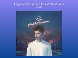
2. Base template - designed by Bianca
Simplistic font.
Record label - Fueled By Ramen Track list. No numbers in order
to continue the simplistic,
dreamy aesthetic
Name is smaller than album
name. Reflects his humble
star image
3. The CD itself has a few possible unique designs that could
be used. The first is a messy, scattered design that catches
the eye instantly. The second is a darker. more serious but
normative choice. The third is the most simplistic and
reflective of Andrew’s music. All three use pastel colours.
4. This is a digipak sketch I came up with. Three different styles of abstract are apparent.
1. Triangle style - more aggressive, not really Andrew’s style, who is more of a feminine, passive artist.
2. Circular style - more docile, bubbly and curious.
3. Oblong style - closer to his logo of AH, so synergy flows well.
5. Another digipak template I sketched. More intense, less simple, but follows more of a pattern. Would
involve pastel colours. Title would have few triangles to create a contrast, bringing attention to the title and
artist. Physical CD wouldn't follow the same pattern, but have his logo with a simplistic design or just a
straight colour.