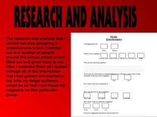
The research and analysis that I
carried out was designing a
questionnaire which I handed
out to a number of people
around the school which where
filled out and given back to me.
After I collected them all I looked
through all of the information
that I had gained and started to
see who my target audience
would be so that I can focus my
magazine on that particular
group.
The information that I gained from these questionnaires where that the main
audience that I have is male and in the actual school, from this I now know
not to waist time aiming it at people in the sixth form because it wouldn’t be
as successful and also I have to aim it at boys mainly because more boys
said they would buy it than girls. Another thing that I learnt from this
questionnaire is that the main thing that they want the magazine to be
focused on is things that are happening around the school such as sports
teams etc… this means that my magazine will have to include all of this
information so that the customers/target audience will be drawn to it and
they will enjoy reading it.
This means that if we get the target audience interested and they enjoy
reading the magazine then this means that they will buy the next weeks
issue and that they will spread the word around that the magazine is good
so more people will buy it. Also I found out that I should bring a new issue
out every month because of the fact that this is what the target audience
want so that what they are going to get. Also I found out what price I
should have it at because at the bottom of this questionnaire I asked the
question how much would they spend on my magazine which is £1
because that’s around the price most people would spend so that's the
price I have to aim it at.
A clear heading in the top right
                                      hand corner shows the school
                                      name and the use of the red on
This picture could be                 white makes it eye catching and
representing a recent                 stand out.
school event (sports
day) It could also be
advertising to people to
join the team.

The cover line says
congratulations
students this gives
the idea that this
article relates to a
success in sports

The main thing
that I have
noticed is that
there's no school
logo or badge                                                            This subheading says
which is the only                                                        what could be seen as
negative about                                                           the school slogan.
this design.                                                             Also its colour
                                                                         coordinated with the
                                                                         rest of the magazine


This little bubble at the bottom is
the easiest thing to read on the
hole which means that this must
be what the designer wants you
                                             The red used in the banner and the text is the same
to focus on the most.
                                             colour text that the students are wearing so this must
                                             mean that this is the colour of there school uniform too
As you can see the same
This picture could be                         colours in the magazine above
representing a recent                         are used so this defiantly
school event (sports                          means that these must be the
day) It could also be                         school uniform colours.
advertising to people to
join the team.


                                        We see that again the focus of the
                                        magazine is sports this would
                                        mean that the magazines main
A clear heading in the top              focus is sports through out the
right hand corner shows                 school.
the school name and the
use of the red on white
makes it eye catching and
stand out.


                                      ON THE GO! Is shown in a
                                      bigger text and more unique text
                                      to the rest of the magazine so
                                      this is trying to get you attention.
                                      Also the use of the green
                                      background makes it stand out
                                      more. We defiantly know that the
                                      main focus of the magazine is
                                      sports by the title on the right
This little bubble at the bottom is   saying JUNIOR ATHLETICS.
the easiest thing to read on the
hole which means that this must
be what the designer wants you
to focus on the most.
The ways that my media product uses changes and develops current ideas is firstly by the way that I
have looked through other school magazines. I have been able to get my ideas from them and apply
them to my magazine design. For example, the colour scheme that I have used and the fonts that I
used are related and appropriate to the school setting. This is a developed idea because of the fact
that I have looked at other magazines and developed and made changes from what I have seen
through my research. Another development was with the colours; I have made sure that the colours
are all associated with school and also, where I want the audience to focus particularly, I have used a
brighter, more eye catching colour so that the reader sees that and is drawn to it.
I feel that my magazine represents the sixth
form in a very positive way firstly because
of the fact that the pictures and images of
the students I have used are all smiling or
are looking at work which shows the sixth
form in a very positive way. Also, the use
of text and the information that I am
including in the text boxes are again all
positive and are about what is happening in
the school.
The place that will distribute my magazine
would be the school its self that it’s about
and they will be for sale in the common
room so that they are easily seen by the
target audience and so that it will attract
more and more people
The audience for my media product as I found out in
my research would be the students in sixth form so
I focused my magazine mainly on them and on what
kind of thing happen in the sixth form. My second
reason for this is so that the students will see what
kind of things are happening through out the sixth
form so they will get all of the latest updates and
news.
I would attract my audience by having things like
Sixth form written on the front of it and then having
pictures of people in the sixth form which means that
they will know exactly what’s going on in the school
and what the latest news is on certain things that
they might want to know about. Also the fact that it is
being sold in the common room would mean that the
sixth form students would have easy access to
buying it and will be right in front of them instead
them having to look all over the place and thinking
that they cant be bothered to look for it.
I have learnt that the use of technology helps towards the
finding of already existing magazines so that you can get
ideas from them and find out the way that I will have to
design my magazine. Also it’s a good way to make the
product and design it because it’s quicker and faster and
also can be saved in an easily accessible place.
Looking back at my preliminary task I have learnt that
the way that I have to design my magazine is by the
use of colours and text and also the use of images.
Then I would have to focus on the layout and how the
whole page is set up so that it will be eye catching
and unique instead of being plain and boring which it
would be if changes aren’t made.

Media Research and Analysis

  • 1.
    The research andanalysis that I carried out was designing a questionnaire which I handed out to a number of people around the school which where filled out and given back to me. After I collected them all I looked through all of the information that I had gained and started to see who my target audience would be so that I can focus my magazine on that particular group.
  • 2.
    The information thatI gained from these questionnaires where that the main audience that I have is male and in the actual school, from this I now know not to waist time aiming it at people in the sixth form because it wouldn’t be as successful and also I have to aim it at boys mainly because more boys said they would buy it than girls. Another thing that I learnt from this questionnaire is that the main thing that they want the magazine to be focused on is things that are happening around the school such as sports teams etc… this means that my magazine will have to include all of this information so that the customers/target audience will be drawn to it and they will enjoy reading it.
  • 3.
    This means thatif we get the target audience interested and they enjoy reading the magazine then this means that they will buy the next weeks issue and that they will spread the word around that the magazine is good so more people will buy it. Also I found out that I should bring a new issue out every month because of the fact that this is what the target audience want so that what they are going to get. Also I found out what price I should have it at because at the bottom of this questionnaire I asked the question how much would they spend on my magazine which is £1 because that’s around the price most people would spend so that's the price I have to aim it at.
  • 4.
    A clear headingin the top right hand corner shows the school name and the use of the red on This picture could be white makes it eye catching and representing a recent stand out. school event (sports day) It could also be advertising to people to join the team. The cover line says congratulations students this gives the idea that this article relates to a success in sports The main thing that I have noticed is that there's no school logo or badge This subheading says which is the only what could be seen as negative about the school slogan. this design. Also its colour coordinated with the rest of the magazine This little bubble at the bottom is the easiest thing to read on the hole which means that this must be what the designer wants you The red used in the banner and the text is the same to focus on the most. colour text that the students are wearing so this must mean that this is the colour of there school uniform too
  • 5.
    As you cansee the same This picture could be colours in the magazine above representing a recent are used so this defiantly school event (sports means that these must be the day) It could also be school uniform colours. advertising to people to join the team. We see that again the focus of the magazine is sports this would mean that the magazines main A clear heading in the top focus is sports through out the right hand corner shows school. the school name and the use of the red on white makes it eye catching and stand out. ON THE GO! Is shown in a bigger text and more unique text to the rest of the magazine so this is trying to get you attention. Also the use of the green background makes it stand out more. We defiantly know that the main focus of the magazine is sports by the title on the right This little bubble at the bottom is saying JUNIOR ATHLETICS. the easiest thing to read on the hole which means that this must be what the designer wants you to focus on the most.
  • 6.
    The ways thatmy media product uses changes and develops current ideas is firstly by the way that I have looked through other school magazines. I have been able to get my ideas from them and apply them to my magazine design. For example, the colour scheme that I have used and the fonts that I used are related and appropriate to the school setting. This is a developed idea because of the fact that I have looked at other magazines and developed and made changes from what I have seen through my research. Another development was with the colours; I have made sure that the colours are all associated with school and also, where I want the audience to focus particularly, I have used a brighter, more eye catching colour so that the reader sees that and is drawn to it.
  • 7.
    I feel thatmy magazine represents the sixth form in a very positive way firstly because of the fact that the pictures and images of the students I have used are all smiling or are looking at work which shows the sixth form in a very positive way. Also, the use of text and the information that I am including in the text boxes are again all positive and are about what is happening in the school.
  • 8.
    The place thatwill distribute my magazine would be the school its self that it’s about and they will be for sale in the common room so that they are easily seen by the target audience and so that it will attract more and more people
  • 9.
    The audience formy media product as I found out in my research would be the students in sixth form so I focused my magazine mainly on them and on what kind of thing happen in the sixth form. My second reason for this is so that the students will see what kind of things are happening through out the sixth form so they will get all of the latest updates and news.
  • 10.
    I would attractmy audience by having things like Sixth form written on the front of it and then having pictures of people in the sixth form which means that they will know exactly what’s going on in the school and what the latest news is on certain things that they might want to know about. Also the fact that it is being sold in the common room would mean that the sixth form students would have easy access to buying it and will be right in front of them instead them having to look all over the place and thinking that they cant be bothered to look for it.
  • 11.
    I have learntthat the use of technology helps towards the finding of already existing magazines so that you can get ideas from them and find out the way that I will have to design my magazine. Also it’s a good way to make the product and design it because it’s quicker and faster and also can be saved in an easily accessible place.
  • 12.
    Looking back atmy preliminary task I have learnt that the way that I have to design my magazine is by the use of colours and text and also the use of images. Then I would have to focus on the layout and how the whole page is set up so that it will be eye catching and unique instead of being plain and boring which it would be if changes aren’t made.