
Recommended
More Related Content
What's hot
What's hot (14)
Viewers also liked
Similar to Media Evaluation
Similar to Media Evaluation (20)
Recently uploaded
Recently uploaded (20)
Media Evaluation
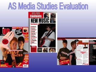
- 1. AS Media Studies Evaluation
- 2. In what ways does your media product use, develope or challenge forms and conventions of real media products? FRONT COVER For my music magazine’s front cover I have used, developed and challenged forms of conventions of real music magazines. A conventional music magazine’s front cover has a large picture of a music artist or band that fills the whole page, then text and other pictures overlap this. My magazine follows this convention. I also followed the conventional positioning of text and pictures. I decided to challenge some of the conventional forms for a front cover with help from my questionnaire. I discovered from my analysis of music magazine front covers that magazines often offer a free gift, usually a free CD, I challenged this convention by offering a free iTunes Redeem code. This code is typed into the redeem section on iTunes and free songs are downloaded onto your account. I chose to do this as my questionnaire showed that my target audience usually listen to music via an iPod. Another magazine front cover convention is the use of pullout quotes, I developed this convention as I used more than just one pullout quote. Again I chose to do this because my questionnaire revealed that my target audience would be attracted to a music magazine that had pullout quotes.
- 3. CONTENTS PAGE I also used and challenged conventions of a music magazine’s contents page. I followed the conventional way of presenting what is inside the music magazine by having the name of the article written in larger bold font and then an explanation of that article in a smaller font. Also the contents page has pictures with page numbers in the top left corners giving a visual explanation of what will be on that page, this is another magazine convention that I followed. I tried to challenge what the actual contents of the magazine was therefore I used a convergence of themes and I wrote that on one of the pages there will be a review of a new singing interactive video game. Some magazines do already converge games and films in a music based magazine but only some therefore I though an inclusion of this would make my magazine more unique but also able to follow conventions.
- 4. DOUBLE PAGE SPREAD My double page spread uses, challenges and develops conventions of a real music magazines. I originally wanted to do an interview written in the style of question then answer but I then found that it was more conventional to do it in an indirect way. I also followed the convention of having a line at the top spreading across the two pages and including the page number, date of issue and magazine name. And I also followed the convention of putting a caption in a picture that describes the goings on, possibly in a comical way. I tried to develop the conventional style of writing. I wrote in an informative way but I also tried to make the piece quite comical. I felt that this would work with my target audience and the style of my magazine.
- 5. How does your media product represent particular social groups? My magazine represents teenagers and young adults that listen to Indie and rock music. The language I used has a colloquial style making it more relevant to younger people and also making it more personal and entertaining. Also the use of pictures and how they were presented was used to represent teenage indie rockers. Most of the small insert pictures are presented at an angle this gives a rebellious look to the pictures. The people in all of my pictures are within the target age group for my magazine allowing me to represent that age group. I tried to represent the social group of teenage Indie rockers also by the style of clothing that people in the pictures are wearing I did this by researching Indie bands on the internet and seeing what they were wearing and then replicated this in my work. I also discovered from research that Indie rockers are known to be rebellious and I tried to achieve this representation through my pullout quotes from my featuring band.
- 7. Who would be the audience for your media product? I set my age group prior to the construction of my magazine as 15 to 20 year olds and for my questionnaire I asked mostly that age group therefore the results I got from the questionnaire were just specific to that age group and a few from the surrounding age groups. So the target audience for my magazine would be Teenagers and Young adults. In my questionnaire I also asked people what their favourite genre’s where and as you can see the top one was Indie but close following was Rock therefore I decided to do a magazine focusing on both of these. This worked well because the two genres are not too dissimilar. Using these too bits of information I decided to make my magazine considering the audience to be Teenagers and young adults who listen to Indie/Rock music.
- 8. How did you attract/address your audience? Before the construction of my magazine I made a questionnaire which consisted of questions about what they would like to see on a magazine. These questions were on colour, genre and features. The questionnaire gave me a clear insight into what my target audience would be mostly attracted to. The questionnaire also questioned my audience about how much they would be willing to pay and this helped me create a realistic but reasonable price for my magazine. I also used a number of conventions used on Indie/Rock magazines to create something that would appeal to my target audience I did this through research of existing products. By use of large, bold fonts and the use of reversed out text I have made the text more interesting and I have made it stand out more. My pictures and my text are sometimes presented at an angle which I believe makes the reader become more drawn in.
- 9. What have you learnt about technologies from the process of constructing this product? At the begging of my coursework construction I did not know anything about adobe Photoshop but now after creating my magazine I have learnt so much about how to use all the different tools and settings within the programme. I have also learnt lots about using a digital camera and how to create the best lighting in a photography studio. My knowledge of printing my product to the best quality has expanded. For the printing we used a high quality A3 and A4 printer which was ideal for the double page spread.
- 10. Looking back at your preliminary task, what do you feel you have learnt in the progression from it to the full product? Since doing the Preliminary task I have learnt much more about the way magazines are made and presented. I learnt lots about the conventions of music magazines and what people who read a music magazine expect to see inside and on the front cover. I have also learnt a lot about the media technologies which I elaborated on in the previous slide I have learnt more about the effective ways to layout a front cover, contens page and double page spread. I have learnt, though research about the rule of thirds and this helped me when trying to find the best place to insert pictures My knowledge of conventional language use in music magazines has grown substantially and also I have learnt that using a variety of font style the reader in more drawn in.