The document analyzes front covers, double pages, and contents pages of hip hop magazines. Some key findings include:
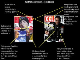
1) Front covers commonly use black, red, and bold fonts to convey masculinity and prominently display the magazine name.
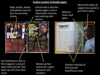
2) Double page spreads contain rich visuals and eye-catching colors to engage readers. Medium shots of rappers are often used to give them status.
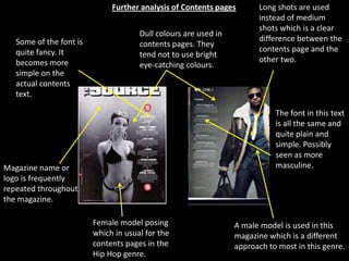
3) Contents pages tend to use duller colors and longer shots compared to other pages. Fonts are plainer to appear more masculine.