Extreme Makeover: Enterprise Website Edition
•Download as PPTX, PDF•
0 likes•687 views

The document compares the before and after redesigns of the home and product pages for the websites Birst.com and Appthority.com. The before versions are described as having confusing pathways, unclear messaging hierarchies, and underwhelming designs that did not effectively highlight products or generate leads. The after redesigns implemented focused hero sections, clear messaging, product-centric designs with screenshots, persona-based solution pathways, and clean organized layouts to better emphasize key information and calls to action.
Report
Share
Report
Share

Recommended
Ppt ch02
The document discusses principles for designing accessible and user-friendly websites, including understanding different design environments and user needs. Key recommendations are to create a unified design with consistent navigation, use a grid structure and active white space, design pages for different screen sizes and devices, and ensure content is easily readable and accessible across different technologies. Accessibility and usability should be priorities from the start of design.
Ppt ch02
The document discusses principles for designing accessible and user-friendly websites, including understanding different design environments and user needs. Key recommendations are to create a unified design with consistent navigation, use active white space to guide users, design content specifically for online reading, and thoroughly test pages across browsers and devices to ensure compatibility and accessibility. The goal is to effectively present information through a simple and intuitive interface tailored to users.
Ppt ch03
The document outlines the process for planning and developing a website, including creating a site specification, identifying the content goal and target audience, choosing a hosting provider, and testing the site. Key steps are understanding the development process, building a team, specifying requirements, designing information architecture and page templates, development, quality assurance testing, and ongoing site maintenance.
Ppt ch11
This chapter discusses how to create user input forms on web pages. It covers using the <form> element to contain forms and attributes like method and action. It also covers various input elements like text boxes, checkboxes, radio buttons, and file uploads. Grouping elements like <fieldset> and <legend> are described as well as styling forms with CSS. The overall objectives are to understand how forms work and how to create different types of input objects and style forms.
Ppt ch07
This chapter discusses page layout design principles. It covers the normal flow of elements, using divisions to create containers, floating layouts, and building flexible and fixed page layouts. The key points are that the normal flow determines how elements are displayed, divisions are used to segment content, floats remove elements from the flow and require widths, and flexible layouts adapt while fixed layouts maintain consistent widths using wrappers.
Ppt ch09
This document discusses principles for planning effective website navigation. It covers creating navigation that answers common user questions about location and direction. Various navigation structures are examined, including text-based, graphic, and list-based options. Guidelines for horizontal and vertical navigation bars are provided. Background colors, graphics and hover effects are also described as ways to enhance navigation usability.
Building A Business Directory Using WordPress
Originally presented to the Vancouver WordPress Meetup Group, this presentation covers some of the themes & plugins available to build different kinds of business directories.
Ppt ch06
This chapter discusses the CSS box model and how it allows control over margins, padding, borders, and dimensions of content boxes. Key concepts covered include using the box model to lay out pages, applying various margin, padding and border properties, floating elements, and controlling overflow. The goal is to understand how to use CSS to enhance readability and create flexible or fixed page layouts.
Green Hectares Rural Tech Workshop - Adding Content
A basic overview of how to add content to a basic website. For more information on Green Hectares or the Rural Tech program, go to www.greenhectaresonline.com
Ppt ch08
The chapter discusses incorporating graphics and color into web design. It covers graphic file formats like GIF, JPG, and PNG and how to use them properly. It also explains how computers display color and how to control color properties with CSS, including specifying background images and colors.
Airbnb share your style program
The "Share Your Style" program aims to incentivize more hosting on Airbnb by allowing hosts to easily catalog distinctive products in their home. Guests can then favorite items and link to purchase them online or locally. This benefits hosts by improving ratings, brands through awareness and data on influencers, and guests through discovery and purchases. Next steps include validating demand, designing the product tagging feature, testing it in Australia, and ramping up partnerships with brands.
Good bad ugly_presentation
The document summarizes key considerations for customizing SharePoint sites, including:
- Classic SharePoint offered more customization options like custom master pages and page layouts while modern is more limited but mobile friendly.
- Themes, colors, fonts, and page layouts are important design elements that impact the user experience and should be chosen carefully based on the audience and content.
- Display templates, search-based experiences, and understanding the audience are important for organizing and presenting information effectively to users.
Sitecore Experience Accelerator (SxA)
SXA (Sitecore Experience Accelerator) is an out-of-the-box component library and architecture that allows for increased productivity and parallel work. It includes pre-built components, local datasources, and an extended Experience Editor that allows for drag-and-drop page building. SXA uses a Helix architecture and allows for creative exchange where front-end developers can style themes without Sitecore knowledge. It provides conventions for page designs, partial designs, and HTML structure.
SXA in action
SXA is just not a toolbox. SXA is a complete package of design, structure, data and all these with Helix principles. It covers what all comes in boundary of SXA. How development can be accelerated in real world.
pres-irsurf2013-v11
Crocs redesigned its ecommerce website to better support branding, drive increased sales, and empower regional teams. The redesign provided a cleaner look across pages with bigger images and consistent calls to action. It launched smoothly across 18 countries over 16 months. Lessons included setting milestones with vendors, separating design and functionality testing, and extensively pilot testing changes. The redesign resulted in improved customer satisfaction, engagement, and sales.
Implementing SharePoint: Site Customization and Branding
This document discusses site customization and branding in SharePoint. There are two types of building blocks for customizing sites: site definitions and custom site templates. Site definitions consist of XML and ASPX files stored on web servers, while custom site templates are stored in the database and are created from an existing site. The document outlines pros and cons of each approach and considerations for when to use site definitions versus custom site templates for site customization and branding in SharePoint.
Inside eCommerce - Design for Success - Micksgarage.com- Brendan McMahon
Micksgarage CMO Brendan McMahon on the fundamentals of designing for conversion rate optimisation, as practiced at Micksgarage.com
Web design
An overview of the differences between Theme based web design and Bespoke web design services.
More information is on our website:
http://oima.co.uk/services/web-design/
Online Internet Marketing Advisers Ltd.
Multimedia Development Lifecycle
Week 2 Lecturing
P420 - 1 CMLA
Multimedia Presentation for Public Relations
Swiss German University Indonesia
(13 September 2011)
How To Solve The E-Commerce SEO Puzzle
How to untangle the puzzle that is ecommerce SEO
There is little doubt that competition within the online marketplace is fierce, performing SEO on any ecommerce site is not desirable, it now an essential ingredient for any business selling online.
Not only is it extremely difficult to compete against the ecommerce giants that are currently dominating the landscape, but most ecommerce sites by their very nature go against good SEO.
Suso digital sem rush e commerce webinar
The document discusses common issues in eCommerce SEO and provides recommendations to address them. It covers topics like site design and usability, including site architecture, on-page SEO, duplicate content, mobile search, and schema. It also discusses content creation strategies like developing guides and blogs to solve customer problems. Finally, it provides link building tips such as developing relationships, public relations, and creating cornerstone content. The overall document aims to help eCommerce sites improve their SEO.
[Pubcon Austin 2010] eCommerce Site Optimization
The document provides tips for optimizing an eCommerce site for search engines. It discusses focusing on key search terms and unique product descriptions. It also recommends dynamic page titles and meta tags, following web standards, and having descriptive internal linking. Additionally, it mentions strategies like XML sitemaps, external linking, and using robots.txt files properly to manage spiders. The overall goal is to design a site that is optimized for both search engines and user conversion.
SRC 204 - Build a SharePoint 2013 Search Driven Application!
SharePoint 2013 has FAST search built into its core fabric. New site templates and web parts have been added to allow you to build search driven applications. Through these search web parts, we can cross site collection boundaries to surface information, improve navigation and create a seamless experience across the different sites, site collection and web application. We will also demonstrate how to use cross site publishing to leverage multiple content sources. We also discuss several approaches for publishing internet sites.
SharePoint 2013 Branding
This document discusses SharePoint 2013 branding and design. It covers using composed looks for low effort branding, customizing out of the box master pages for medium effort branding, and creating custom master pages and page layouts for complex designs. It also discusses the Design Manager tool for converting HTML designs to SharePoint master pages, device channels for responsive designs across devices, and resources for further learning.
Click here to download my CV in Word format.doc
This document contains personal and professional details of Nicole Lambon, a South African graphic designer and web developer currently earning R9000 gross per month. It outlines her proficiencies including various design, development and CMS skills. Her experience includes over 10 years of web design, development and frontend work for various clients. She holds a diploma in information technology from Tygerberg College with 13 distinctions.
Understanding and Customizing the Modern SharePoint Experience
The document discusses modern SharePoint sites and how they differ from classic sites. It provides an overview of key aspects of modern sites including Office 365 groups, hub sites, differences between modern and classic sites and pages. It also covers options for customizing the user interface of modern sites such as site designs, themes, and SharePoint Framework extensions and web parts.
SEO Design Basics
Search engine optimization – creating your site so that its content is easily found and indexed by search engines and ranks high in search results – is a challenge even for the experienced e-retailer. It starts with an understanding of the basic activities that constitute SEO and how you can push those levers though your design choices to draw more traffic from natural search to your site. This session will cover the ground floor of SEO to get you on the right track and prepare you for the next level. It will also provide real life examples as a way to help retailers understand how to work great SEO into a design — and what to avoid to prevent being penalized by Google.
Wp nhcc portfolio
This document provides information on how to showcase work using WordPress. It discusses what WordPress is, how it can be used to create blogs, websites, and online stores. It also covers plugins, themes, organizing content with categories and tags, and setting up portfolios or galleries. Common plugins, themes, and portfolio plugins are recommended, such as NexGEN Gallery, Awesome Flickr Gallery, and Portfolio Post Type. Resources for learning more about WordPress like meetups and WordCamps are also included.
CMS Design & Layout Best Practices
Learn how to create more dynamic pages using NYU's central CMS with these design and layout best practices.
Note: these are shared slides from an in-person training delivered by Katie Santo and Logan Johnson of NYU's Digital Communications Group and are meant to be an aid for CMS users at NYU.
Wcm4
This document provides guidance on customizing a website created with WCM and iParts. It discusses how to create a new website by copying an existing sample site and then customizing various aspects like themes, logos, banners, icons, colors, and content layout. It provides steps for customizing header elements, social media images, the welcome banner, favicon, and copyright statement. It also covers changing theme colors by modifying sprite images and CSS styles.
More Related Content
What's hot
Green Hectares Rural Tech Workshop - Adding Content
A basic overview of how to add content to a basic website. For more information on Green Hectares or the Rural Tech program, go to www.greenhectaresonline.com
Ppt ch08
The chapter discusses incorporating graphics and color into web design. It covers graphic file formats like GIF, JPG, and PNG and how to use them properly. It also explains how computers display color and how to control color properties with CSS, including specifying background images and colors.
Airbnb share your style program
The "Share Your Style" program aims to incentivize more hosting on Airbnb by allowing hosts to easily catalog distinctive products in their home. Guests can then favorite items and link to purchase them online or locally. This benefits hosts by improving ratings, brands through awareness and data on influencers, and guests through discovery and purchases. Next steps include validating demand, designing the product tagging feature, testing it in Australia, and ramping up partnerships with brands.
Good bad ugly_presentation
The document summarizes key considerations for customizing SharePoint sites, including:
- Classic SharePoint offered more customization options like custom master pages and page layouts while modern is more limited but mobile friendly.
- Themes, colors, fonts, and page layouts are important design elements that impact the user experience and should be chosen carefully based on the audience and content.
- Display templates, search-based experiences, and understanding the audience are important for organizing and presenting information effectively to users.
Sitecore Experience Accelerator (SxA)
SXA (Sitecore Experience Accelerator) is an out-of-the-box component library and architecture that allows for increased productivity and parallel work. It includes pre-built components, local datasources, and an extended Experience Editor that allows for drag-and-drop page building. SXA uses a Helix architecture and allows for creative exchange where front-end developers can style themes without Sitecore knowledge. It provides conventions for page designs, partial designs, and HTML structure.
SXA in action
SXA is just not a toolbox. SXA is a complete package of design, structure, data and all these with Helix principles. It covers what all comes in boundary of SXA. How development can be accelerated in real world.
pres-irsurf2013-v11
Crocs redesigned its ecommerce website to better support branding, drive increased sales, and empower regional teams. The redesign provided a cleaner look across pages with bigger images and consistent calls to action. It launched smoothly across 18 countries over 16 months. Lessons included setting milestones with vendors, separating design and functionality testing, and extensively pilot testing changes. The redesign resulted in improved customer satisfaction, engagement, and sales.
Implementing SharePoint: Site Customization and Branding
This document discusses site customization and branding in SharePoint. There are two types of building blocks for customizing sites: site definitions and custom site templates. Site definitions consist of XML and ASPX files stored on web servers, while custom site templates are stored in the database and are created from an existing site. The document outlines pros and cons of each approach and considerations for when to use site definitions versus custom site templates for site customization and branding in SharePoint.
Inside eCommerce - Design for Success - Micksgarage.com- Brendan McMahon
Micksgarage CMO Brendan McMahon on the fundamentals of designing for conversion rate optimisation, as practiced at Micksgarage.com
What's hot (9)
Green Hectares Rural Tech Workshop - Adding Content
Green Hectares Rural Tech Workshop - Adding Content
Implementing SharePoint: Site Customization and Branding
Implementing SharePoint: Site Customization and Branding
Inside eCommerce - Design for Success - Micksgarage.com- Brendan McMahon
Inside eCommerce - Design for Success - Micksgarage.com- Brendan McMahon
Similar to Extreme Makeover: Enterprise Website Edition
Web design
An overview of the differences between Theme based web design and Bespoke web design services.
More information is on our website:
http://oima.co.uk/services/web-design/
Online Internet Marketing Advisers Ltd.
Multimedia Development Lifecycle
Week 2 Lecturing
P420 - 1 CMLA
Multimedia Presentation for Public Relations
Swiss German University Indonesia
(13 September 2011)
How To Solve The E-Commerce SEO Puzzle
How to untangle the puzzle that is ecommerce SEO
There is little doubt that competition within the online marketplace is fierce, performing SEO on any ecommerce site is not desirable, it now an essential ingredient for any business selling online.
Not only is it extremely difficult to compete against the ecommerce giants that are currently dominating the landscape, but most ecommerce sites by their very nature go against good SEO.
Suso digital sem rush e commerce webinar
The document discusses common issues in eCommerce SEO and provides recommendations to address them. It covers topics like site design and usability, including site architecture, on-page SEO, duplicate content, mobile search, and schema. It also discusses content creation strategies like developing guides and blogs to solve customer problems. Finally, it provides link building tips such as developing relationships, public relations, and creating cornerstone content. The overall document aims to help eCommerce sites improve their SEO.
[Pubcon Austin 2010] eCommerce Site Optimization
The document provides tips for optimizing an eCommerce site for search engines. It discusses focusing on key search terms and unique product descriptions. It also recommends dynamic page titles and meta tags, following web standards, and having descriptive internal linking. Additionally, it mentions strategies like XML sitemaps, external linking, and using robots.txt files properly to manage spiders. The overall goal is to design a site that is optimized for both search engines and user conversion.
SRC 204 - Build a SharePoint 2013 Search Driven Application!
SharePoint 2013 has FAST search built into its core fabric. New site templates and web parts have been added to allow you to build search driven applications. Through these search web parts, we can cross site collection boundaries to surface information, improve navigation and create a seamless experience across the different sites, site collection and web application. We will also demonstrate how to use cross site publishing to leverage multiple content sources. We also discuss several approaches for publishing internet sites.
SharePoint 2013 Branding
This document discusses SharePoint 2013 branding and design. It covers using composed looks for low effort branding, customizing out of the box master pages for medium effort branding, and creating custom master pages and page layouts for complex designs. It also discusses the Design Manager tool for converting HTML designs to SharePoint master pages, device channels for responsive designs across devices, and resources for further learning.
Click here to download my CV in Word format.doc
This document contains personal and professional details of Nicole Lambon, a South African graphic designer and web developer currently earning R9000 gross per month. It outlines her proficiencies including various design, development and CMS skills. Her experience includes over 10 years of web design, development and frontend work for various clients. She holds a diploma in information technology from Tygerberg College with 13 distinctions.
Understanding and Customizing the Modern SharePoint Experience
The document discusses modern SharePoint sites and how they differ from classic sites. It provides an overview of key aspects of modern sites including Office 365 groups, hub sites, differences between modern and classic sites and pages. It also covers options for customizing the user interface of modern sites such as site designs, themes, and SharePoint Framework extensions and web parts.
SEO Design Basics
Search engine optimization – creating your site so that its content is easily found and indexed by search engines and ranks high in search results – is a challenge even for the experienced e-retailer. It starts with an understanding of the basic activities that constitute SEO and how you can push those levers though your design choices to draw more traffic from natural search to your site. This session will cover the ground floor of SEO to get you on the right track and prepare you for the next level. It will also provide real life examples as a way to help retailers understand how to work great SEO into a design — and what to avoid to prevent being penalized by Google.
Wp nhcc portfolio
This document provides information on how to showcase work using WordPress. It discusses what WordPress is, how it can be used to create blogs, websites, and online stores. It also covers plugins, themes, organizing content with categories and tags, and setting up portfolios or galleries. Common plugins, themes, and portfolio plugins are recommended, such as NexGEN Gallery, Awesome Flickr Gallery, and Portfolio Post Type. Resources for learning more about WordPress like meetups and WordCamps are also included.
CMS Design & Layout Best Practices
Learn how to create more dynamic pages using NYU's central CMS with these design and layout best practices.
Note: these are shared slides from an in-person training delivered by Katie Santo and Logan Johnson of NYU's Digital Communications Group and are meant to be an aid for CMS users at NYU.
Wcm4
This document provides guidance on customizing a website created with WCM and iParts. It discusses how to create a new website by copying an existing sample site and then customizing various aspects like themes, logos, banners, icons, colors, and content layout. It provides steps for customizing header elements, social media images, the welcome banner, favicon, and copyright statement. It also covers changing theme colors by modifying sprite images and CSS styles.
Seo service
This document discusses search engine optimization (SEO) and provides information on several key topics related to SEO. It covers why SEO is important, noting that most users click on organic search results rather than paid links. It also discusses keyword research, on-page optimization, using Business Catalyst features to optimize a website, Google's ranking algorithm and other ranking factors. The document is presented in multiple sections that each provide details on individual SEO topics.
Zoocha
We are Zoocha, an innovative creative digital agency, based in Hertford, UK. We are experts in delivering website design, search engine optimisation, ecommerce, content management and marketing services.
Developing an effective website captovate 2012_hs_v8
The document provides an overview of developing an effective website. It discusses planning for success by determining if a website is needed, defining its purpose, researching target audiences, and setting goals. It also covers getting started by determining resources needed and how to work with an agency. The document outlines key elements of an effective website, including having a solid foundation through proper information architecture and usability. It emphasizes the importance of content, design, functionality, search engine optimization, and social media integration.
Business 2.0 with WordPress
Business 2.0 with WordPress reveals the secrets of making a profit with WordPress. It's target auditory is: entrepreneurs, small business owners, designers and developers. Different approaches for business based on the platform circles - quick, cheap and powerful WP-based website setup or consulting and products for designers and developers.
Avada kedavra!
Avada is a responsive design theme for WordPress that provides a flexible and customizable framework. It has many features like premade page templates, one page scrolling, parallax effects, ecommerce functionality, and shortcodes. Both coders and non-coders can use Avada due to its simple menus, layout options, and built-in plugins. The theme also offers robust support through its documentation, forums, and quick ticket responses.
Must Have Small Business Website Features
Nicole Roach from BizCentral USA gave a presentation on developing an effective business website. She discussed the basics of web development and design, key elements every business website should have, and a 5 step process for website development. The presentation provided an overview of website design and structure, and concluded with a question and answer session.
WordPress Websites for Engineers: Elevate Your Brand
Presentation: Are you an engineer looking to enhance your professional brand? Join our insightful webinar where Gary Vaughan, a seasoned IT professional and WordPress expert, will unveil the power of WordPress websites in boosting your career and professional profile. Whether you're a consultant, volunteer, or aspiring employee, a well-crafted website can be a game-changer in showcasing your expertise.
Speaker Bio: Gary's long career spans from Project Manager and Foreign Service Officer to IT Contractor at the State Department's Office of eDiplomacy. With a profound focus on WordPress software support, he now dedicates his expertise to pro bono website design for DC area non-profits and offers web design resources at dcwebrevolution.com. Gary specializes in WordPress web consulting, business planning, website design, and social media management.
Similar to Extreme Makeover: Enterprise Website Edition (20)
SRC 204 - Build a SharePoint 2013 Search Driven Application!
SRC 204 - Build a SharePoint 2013 Search Driven Application!
Understanding and Customizing the Modern SharePoint Experience
Understanding and Customizing the Modern SharePoint Experience
Developing an effective website captovate 2012_hs_v8
Developing an effective website captovate 2012_hs_v8
WordPress Websites for Engineers: Elevate Your Brand
WordPress Websites for Engineers: Elevate Your Brand
Recently uploaded
Goodbye Windows 11: Make Way for Nitrux Linux 3.5.0!
As the digital landscape continually evolves, operating systems play a critical role in shaping user experiences and productivity. The launch of Nitrux Linux 3.5.0 marks a significant milestone, offering a robust alternative to traditional systems such as Windows 11. This article delves into the essence of Nitrux Linux 3.5.0, exploring its unique features, advantages, and how it stands as a compelling choice for both casual users and tech enthusiasts.
Let's Integrate MuleSoft RPA, COMPOSER, APM with AWS IDP along with Slack
Discover the seamless integration of RPA (Robotic Process Automation), COMPOSER, and APM with AWS IDP enhanced with Slack notifications. Explore how these technologies converge to streamline workflows, optimize performance, and ensure secure access, all while leveraging the power of AWS IDP and real-time communication via Slack notifications.
Observability Concepts EVERY Developer Should Know -- DeveloperWeek Europe.pdf
Monitoring and observability aren’t traditionally found in software curriculums and many of us cobble this knowledge together from whatever vendor or ecosystem we were first introduced to and whatever is a part of your current company’s observability stack.
While the dev and ops silo continues to crumble….many organizations still relegate monitoring & observability as the purview of ops, infra and SRE teams. This is a mistake - achieving a highly observable system requires collaboration up and down the stack.
I, a former op, would like to extend an invitation to all application developers to join the observability party will share these foundational concepts to build on:
Presentation of the OECD Artificial Intelligence Review of Germany
Consult the full report at https://www.oecd.org/digital/oecd-artificial-intelligence-review-of-germany-609808d6-en.htm
“Building and Scaling AI Applications with the Nx AI Manager,” a Presentation...
“Building and Scaling AI Applications with the Nx AI Manager,” a Presentation...Edge AI and Vision Alliance
For the full video of this presentation, please visit: https://www.edge-ai-vision.com/2024/06/building-and-scaling-ai-applications-with-the-nx-ai-manager-a-presentation-from-network-optix/
Robin van Emden, Senior Director of Data Science at Network Optix, presents the “Building and Scaling AI Applications with the Nx AI Manager,” tutorial at the May 2024 Embedded Vision Summit.
In this presentation, van Emden covers the basics of scaling edge AI solutions using the Nx tool kit. He emphasizes the process of developing AI models and deploying them globally. He also showcases the conversion of AI models and the creation of effective edge AI pipelines, with a focus on pre-processing, model conversion, selecting the appropriate inference engine for the target hardware and post-processing.
van Emden shows how Nx can simplify the developer’s life and facilitate a rapid transition from concept to production-ready applications.He provides valuable insights into developing scalable and efficient edge AI solutions, with a strong focus on practical implementation.Climate Impact of Software Testing at Nordic Testing Days
My slides at Nordic Testing Days 6.6.2024
Climate impact / sustainability of software testing discussed on the talk. ICT and testing must carry their part of global responsibility to help with the climat warming. We can minimize the carbon footprint but we can also have a carbon handprint, a positive impact on the climate. Quality characteristics can be added with sustainability, and then measured continuously. Test environments can be used less, and in smaller scale and on demand. Test techniques can be used in optimizing or minimizing number of tests. Test automation can be used to speed up testing.
GraphRAG for Life Science to increase LLM accuracy
GraphRAG for life science domain, where you retriever information from biomedical knowledge graphs using LLMs to increase the accuracy and performance of generated answers
Removing Uninteresting Bytes in Software Fuzzing
Imagine a world where software fuzzing, the process of mutating bytes in test seeds to uncover hidden and erroneous program behaviors, becomes faster and more effective. A lot depends on the initial seeds, which can significantly dictate the trajectory of a fuzzing campaign, particularly in terms of how long it takes to uncover interesting behaviour in your code. We introduce DIAR, a technique designed to speedup fuzzing campaigns by pinpointing and eliminating those uninteresting bytes in the seeds. Picture this: instead of wasting valuable resources on meaningless mutations in large, bloated seeds, DIAR removes the unnecessary bytes, streamlining the entire process.
In this work, we equipped AFL, a popular fuzzer, with DIAR and examined two critical Linux libraries -- Libxml's xmllint, a tool for parsing xml documents, and Binutil's readelf, an essential debugging and security analysis command-line tool used to display detailed information about ELF (Executable and Linkable Format). Our preliminary results show that AFL+DIAR does not only discover new paths more quickly but also achieves higher coverage overall. This work thus showcases how starting with lean and optimized seeds can lead to faster, more comprehensive fuzzing campaigns -- and DIAR helps you find such seeds.
- These are slides of the talk given at IEEE International Conference on Software Testing Verification and Validation Workshop, ICSTW 2022.
GraphSummit Singapore | Neo4j Product Vision & Roadmap - Q2 2024
Maruthi Prithivirajan, Head of ASEAN & IN Solution Architecture, Neo4j
Get an inside look at the latest Neo4j innovations that enable relationship-driven intelligence at scale. Learn more about the newest cloud integrations and product enhancements that make Neo4j an essential choice for developers building apps with interconnected data and generative AI.
Artificial Intelligence for XMLDevelopment
In the rapidly evolving landscape of technologies, XML continues to play a vital role in structuring, storing, and transporting data across diverse systems. The recent advancements in artificial intelligence (AI) present new methodologies for enhancing XML development workflows, introducing efficiency, automation, and intelligent capabilities. This presentation will outline the scope and perspective of utilizing AI in XML development. The potential benefits and the possible pitfalls will be highlighted, providing a balanced view of the subject.
We will explore the capabilities of AI in understanding XML markup languages and autonomously creating structured XML content. Additionally, we will examine the capacity of AI to enrich plain text with appropriate XML markup. Practical examples and methodological guidelines will be provided to elucidate how AI can be effectively prompted to interpret and generate accurate XML markup.
Further emphasis will be placed on the role of AI in developing XSLT, or schemas such as XSD and Schematron. We will address the techniques and strategies adopted to create prompts for generating code, explaining code, or refactoring the code, and the results achieved.
The discussion will extend to how AI can be used to transform XML content. In particular, the focus will be on the use of AI XPath extension functions in XSLT, Schematron, Schematron Quick Fixes, or for XML content refactoring.
The presentation aims to deliver a comprehensive overview of AI usage in XML development, providing attendees with the necessary knowledge to make informed decisions. Whether you’re at the early stages of adopting AI or considering integrating it in advanced XML development, this presentation will cover all levels of expertise.
By highlighting the potential advantages and challenges of integrating AI with XML development tools and languages, the presentation seeks to inspire thoughtful conversation around the future of XML development. We’ll not only delve into the technical aspects of AI-powered XML development but also discuss practical implications and possible future directions.
National Security Agency - NSA mobile device best practices
Threats to mobile devices are more prevalent and increasing in scope and complexity. Users of mobile devices desire to take full advantage of the features
available on those devices, but many of the features provide convenience and capability but sacrifice security. This best practices guide outlines steps the users can take to better protect personal devices and information.
TrustArc Webinar - 2024 Global Privacy Survey
How does your privacy program stack up against your peers? What challenges are privacy teams tackling and prioritizing in 2024?
In the fifth annual Global Privacy Benchmarks Survey, we asked over 1,800 global privacy professionals and business executives to share their perspectives on the current state of privacy inside and outside of their organizations. This year’s report focused on emerging areas of importance for privacy and compliance professionals, including considerations and implications of Artificial Intelligence (AI) technologies, building brand trust, and different approaches for achieving higher privacy competence scores.
See how organizational priorities and strategic approaches to data security and privacy are evolving around the globe.
This webinar will review:
- The top 10 privacy insights from the fifth annual Global Privacy Benchmarks Survey
- The top challenges for privacy leaders, practitioners, and organizations in 2024
- Key themes to consider in developing and maintaining your privacy program
How to Get CNIC Information System with Paksim Ga.pptx
Pakdata Cf is a groundbreaking system designed to streamline and facilitate access to CNIC information. This innovative platform leverages advanced technology to provide users with efficient and secure access to their CNIC details.
HCL Notes und Domino Lizenzkostenreduzierung in der Welt von DLAU
Webinar Recording: https://www.panagenda.com/webinars/hcl-notes-und-domino-lizenzkostenreduzierung-in-der-welt-von-dlau/
DLAU und die Lizenzen nach dem CCB- und CCX-Modell sind für viele in der HCL-Community seit letztem Jahr ein heißes Thema. Als Notes- oder Domino-Kunde haben Sie vielleicht mit unerwartet hohen Benutzerzahlen und Lizenzgebühren zu kämpfen. Sie fragen sich vielleicht, wie diese neue Art der Lizenzierung funktioniert und welchen Nutzen sie Ihnen bringt. Vor allem wollen Sie sicherlich Ihr Budget einhalten und Kosten sparen, wo immer möglich. Das verstehen wir und wir möchten Ihnen dabei helfen!
Wir erklären Ihnen, wie Sie häufige Konfigurationsprobleme lösen können, die dazu führen können, dass mehr Benutzer gezählt werden als nötig, und wie Sie überflüssige oder ungenutzte Konten identifizieren und entfernen können, um Geld zu sparen. Es gibt auch einige Ansätze, die zu unnötigen Ausgaben führen können, z. B. wenn ein Personendokument anstelle eines Mail-Ins für geteilte Mailboxen verwendet wird. Wir zeigen Ihnen solche Fälle und deren Lösungen. Und natürlich erklären wir Ihnen das neue Lizenzmodell.
Nehmen Sie an diesem Webinar teil, bei dem HCL-Ambassador Marc Thomas und Gastredner Franz Walder Ihnen diese neue Welt näherbringen. Es vermittelt Ihnen die Tools und das Know-how, um den Überblick zu bewahren. Sie werden in der Lage sein, Ihre Kosten durch eine optimierte Domino-Konfiguration zu reduzieren und auch in Zukunft gering zu halten.
Diese Themen werden behandelt
- Reduzierung der Lizenzkosten durch Auffinden und Beheben von Fehlkonfigurationen und überflüssigen Konten
- Wie funktionieren CCB- und CCX-Lizenzen wirklich?
- Verstehen des DLAU-Tools und wie man es am besten nutzt
- Tipps für häufige Problembereiche, wie z. B. Team-Postfächer, Funktions-/Testbenutzer usw.
- Praxisbeispiele und Best Practices zum sofortigen Umsetzen
GraphSummit Singapore | The Future of Agility: Supercharging Digital Transfor...
Leonard Jayamohan, Partner & Generative AI Lead, Deloitte
This keynote will reveal how Deloitte leverages Neo4j’s graph power for groundbreaking digital twin solutions, achieving a staggering 100x performance boost. Discover the essential role knowledge graphs play in successful generative AI implementations. Plus, get an exclusive look at an innovative Neo4j + Generative AI solution Deloitte is developing in-house.
GraphSummit Singapore | Enhancing Changi Airport Group's Passenger Experience...
Dr. Sean Tan, Head of Data Science, Changi Airport Group
Discover how Changi Airport Group (CAG) leverages graph technologies and generative AI to revolutionize their search capabilities. This session delves into the unique search needs of CAG’s diverse passengers and customers, showcasing how graph data structures enhance the accuracy and relevance of AI-generated search results, mitigating the risk of “hallucinations” and improving the overall customer journey.
Recently uploaded (20)
Goodbye Windows 11: Make Way for Nitrux Linux 3.5.0!
Goodbye Windows 11: Make Way for Nitrux Linux 3.5.0!
Let's Integrate MuleSoft RPA, COMPOSER, APM with AWS IDP along with Slack
Let's Integrate MuleSoft RPA, COMPOSER, APM with AWS IDP along with Slack
Observability Concepts EVERY Developer Should Know -- DeveloperWeek Europe.pdf
Observability Concepts EVERY Developer Should Know -- DeveloperWeek Europe.pdf
Presentation of the OECD Artificial Intelligence Review of Germany
Presentation of the OECD Artificial Intelligence Review of Germany
“Building and Scaling AI Applications with the Nx AI Manager,” a Presentation...
“Building and Scaling AI Applications with the Nx AI Manager,” a Presentation...
Climate Impact of Software Testing at Nordic Testing Days
Climate Impact of Software Testing at Nordic Testing Days
GraphRAG for Life Science to increase LLM accuracy
GraphRAG for Life Science to increase LLM accuracy
GraphSummit Singapore | Neo4j Product Vision & Roadmap - Q2 2024
GraphSummit Singapore | Neo4j Product Vision & Roadmap - Q2 2024
National Security Agency - NSA mobile device best practices
National Security Agency - NSA mobile device best practices
How to Get CNIC Information System with Paksim Ga.pptx
How to Get CNIC Information System with Paksim Ga.pptx
HCL Notes und Domino Lizenzkostenreduzierung in der Welt von DLAU
HCL Notes und Domino Lizenzkostenreduzierung in der Welt von DLAU
GraphSummit Singapore | The Future of Agility: Supercharging Digital Transfor...
GraphSummit Singapore | The Future of Agility: Supercharging Digital Transfor...
GraphSummit Singapore | Enhancing Changi Airport Group's Passenger Experience...
GraphSummit Singapore | Enhancing Changi Airport Group's Passenger Experience...
Extreme Makeover: Enterprise Website Edition
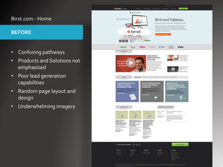
- 1. Birst.com - Home • Confusing pathways • Products and Solutions not emphasized • Poor lead generation capabilities • Random page layout and design • Underwhelming imagery BEFORE
- 2. Birst.com - Home • Focused hero highlights key messages • Clear messaging hierarchy • Product-centric design featuring screenshots • Persona-based solution pathways • Clean, organized design AFTER
- 3. Birst.com - Product • Confusing pathways • Products and Solutions not emphasized • Poor lead generation capabilities • Random page layout and design • Underwhelming imagery BEFORE
- 4. Birst.com - Product • Focused hero highlights key messages • Clear messaging hierarchy • Product-centric design featuring screenshots • Persona-based solution pathways • Clean, organized design AFTER
- 5. Appthority.com - Home • Constrained, three-column layout • Flat content presentation and hierarchy • Confusing navigation labels, and no obvious next steps • Simple design projected an underwhelming company image BEFORE
- 6. Appthority.com - Home • Modern, scrolling homepage • Sophisticated, upscale design elevates company stature • Much higher brand visibility • Key product features highlighted • Topical layers featuring pathways to in-depth information AFTER
- 7. Appthority.com - Product • Constrained, three-column layout • Flat content presentation and hierarchy • Confusing navigation labels, and no obvious next steps • Simple design projected an underwhelming company image BEFORE
- 8. Appthority.com - Product • Bold hear messaging • Interactive, explorable layer presenting product value propositions • Interactive Explore Features layer to guide user deeper into relevant product information • Clear and compelling service offerings with prominent call to action AFTER