Download to read offline


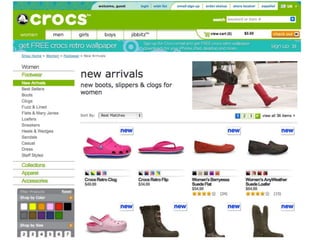

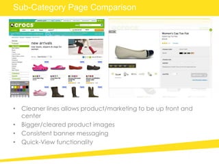


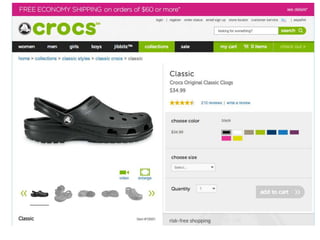

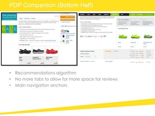

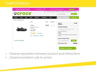
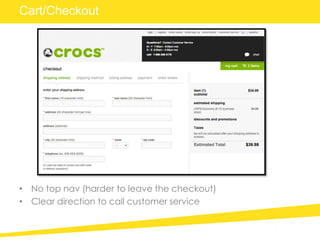


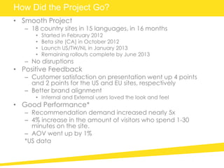


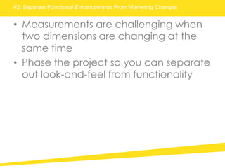


Crocs redesigned its ecommerce website to better support branding, drive increased sales, and empower regional teams. The redesign provided a cleaner look across pages with bigger images and consistent calls to action. It launched smoothly across 18 countries over 16 months. Lessons included setting milestones with vendors, separating design and functionality testing, and extensively pilot testing changes. The redesign resulted in improved customer satisfaction, engagement, and sales.


