Download as PDF, PPTX


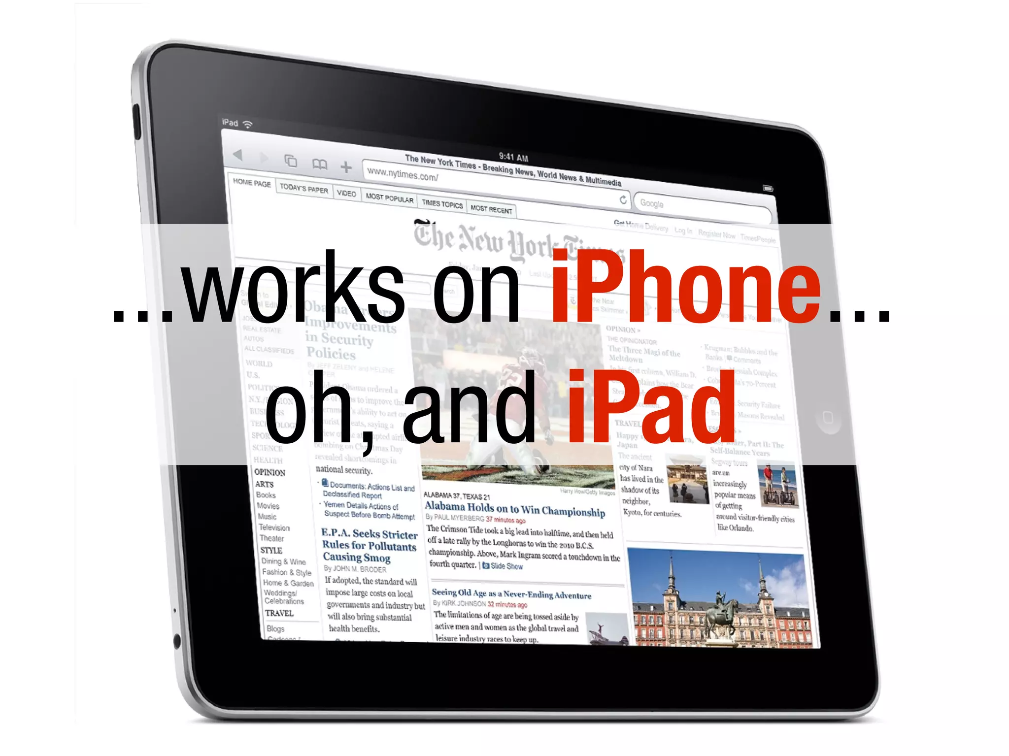


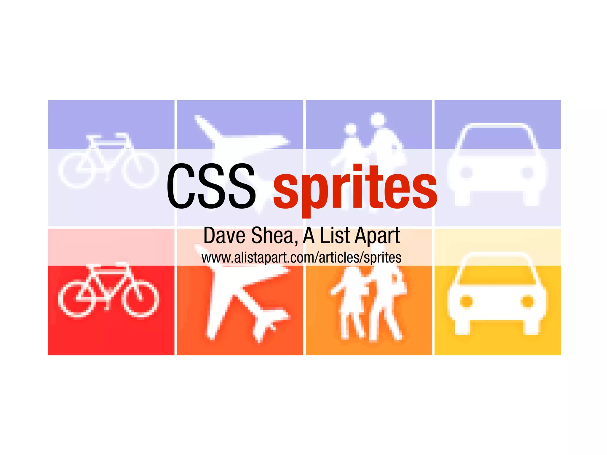


The document discusses making websites mobile-friendly by either creating a separate mobile site with a different domain (like m.example.com) or using a single adaptive site with fluid layouts, viewport meta tags, and CSS media queries to dynamically adjust the layout for different screen sizes. It recommends minimizing requests through techniques like CSS sprites and combining files to optimize performance on mobile networks.


![Coded Agents – with UiPath SDK + LangGraph [Virtual Hands-on Workshop]](https://cdn.slidesharecdn.com/ss_thumbnails/codedagentsdeck-251215155422-5497c599-thumbnail.jpg?width=640&height=640&fit=bounds)


