Making your site mobile-friendly
 Patrick H. Lauke / Opera Software


Patrick H. Lauke /Standards-Next / London / 12 June 2010
mobile web is
increasingly important
we need a site that
 works on iPhone
...works on iPhone...
    oh, and iPad
“remove iPhone from ass”
  Peter-Paul Koch, The iPhone obsession
        www.quirksmode.org/blog/archives/2010/02/the_iphone_obse.html
make your site work on
all (most) mobile devices
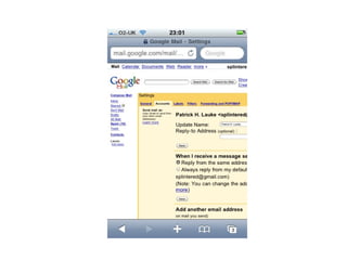
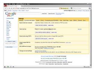
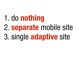
1. do nothing
not WAP or text anymore...
mobile browsers
will work ok-ish
“But the mobile context...”
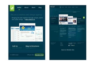
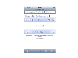
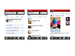
2. separate mobile site
  (m.flickr.com, mobile.mysite.com, ...)
beware browser sniffing
     photo: http://www.flickr.com/photos/timdorr/2096272747/
offer users choice:
desktop or mobile?
refactored for small screen,
not dumbed down for mobile
3. single adaptive site
nothing new...
fluid layout, progressive enhancement, graceful degradation
CSS 2 Media Types
   (screen, print, handheld)
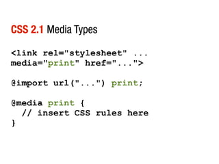
CSS 2.1 Media Types

<link rel="stylesheet" ...
media="print" href="...">

@import url("...") print;

@media print {
  // insert CSS rules here
}
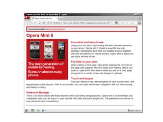
CSS 3 Media Queries
  “...the new hotness” Jeffrey Zeldman
    http://www.zeldman.com/2010/04/08/best-aea-yet/
CSS 3 Media Queries

● build and extend CSS 2.1 Media Types
● more granular control of capabilities

● width, height, orientation, color, resolution, …


http://www.w3.org/TR/css3-mediaqueries/
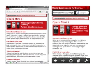
CSS 3 Media Queries
<link rel="stylesheet" ...
media="screen and (max-width:480px)" href="...">

@import url("...") screen and (max-width:480px);

@media screen and (max-width:480px) {
  // insert CSS rules here
}
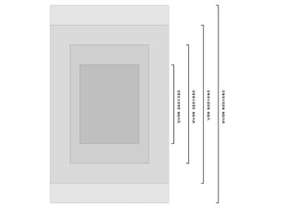
viewport meta
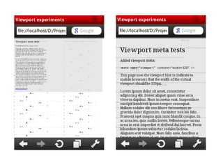
viewport meta

● on desktop viewport = visible area of browser
● mobile browsers have “virtual viewport”

● viewport meta gives hints


http://developer.apple.com/safari/library/documentation/AppleApplications/Reference/SafariWeb
Content/UsingtheViewport/UsingtheViewport.html
viewport meta

<meta name="viewport"
content="width=device-width">

<meta name="viewport"
content="width=320, initial-
scale=2.3,user-scalable=no">
minimise data
 and server requests
(minify JavaScript, combine CSS, …)
minimise data

● data transfer over network can be slow
● compress images (PNGCrush)

● optimise your HTML (death to div-itis)

● minify JavaScript

● combine CSS
minimise server requests

● each request has overhead
● limit to concurrent requests

● caching not reliable (e.g. iPhone > 25Kb)
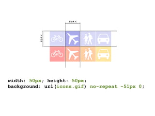
CSS sprites
 Dave Shea, A List Apart
 www.alistapart.com/articles/sprites
width: 50px; height: 50px;
background: url(icons.gif) no-repeat -51px 0;
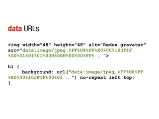
data URLs
http://software.hixie.ch/utilities/cgi/data/data
data URLs
<img width="48" height="48" alt="Redux gravatar"
src="data:image/jpeg,%FF%D8%FF%E0%00%10JFIF
%00%01%01%01%00H%00H%00%00%FF% … ">

h1 {
     background: url("data:image/jpeg,%FF%D8%FF
%E0%00%10JFIF%00%01 … ") no-repeat left top;
}
1. do nothing
2. separate mobile site
3. single adaptive site
www.opera.com/developer
                         patrick.lauke@opera.com
people.opera.com/patrickl/presentations/standards-next_12.06.2010/standards-next_12.06.2010.pdf