Download to read offline


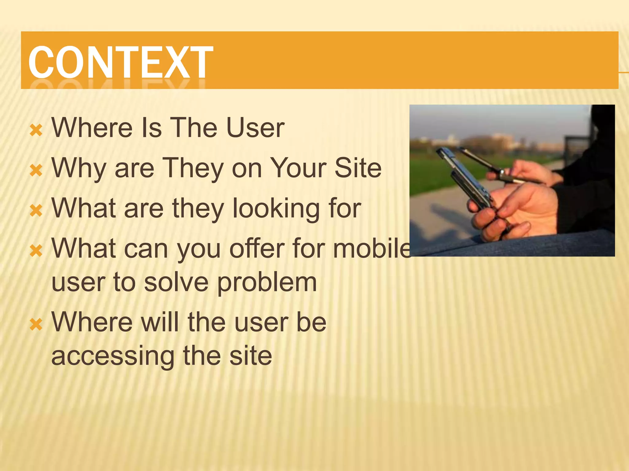
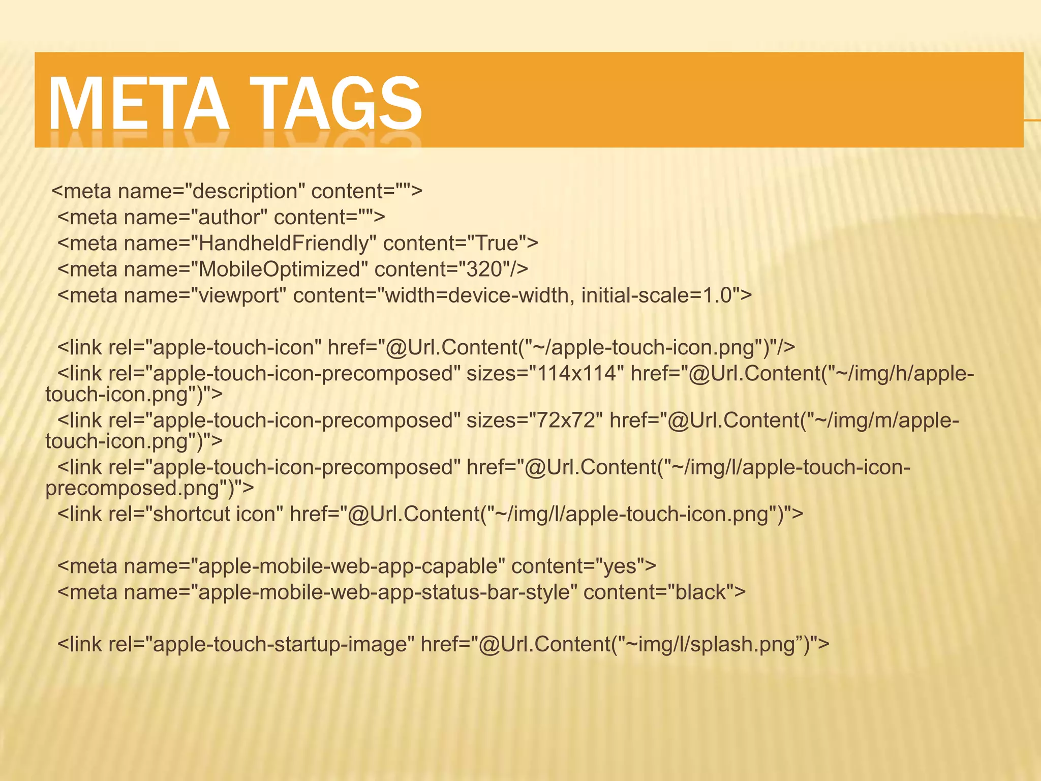
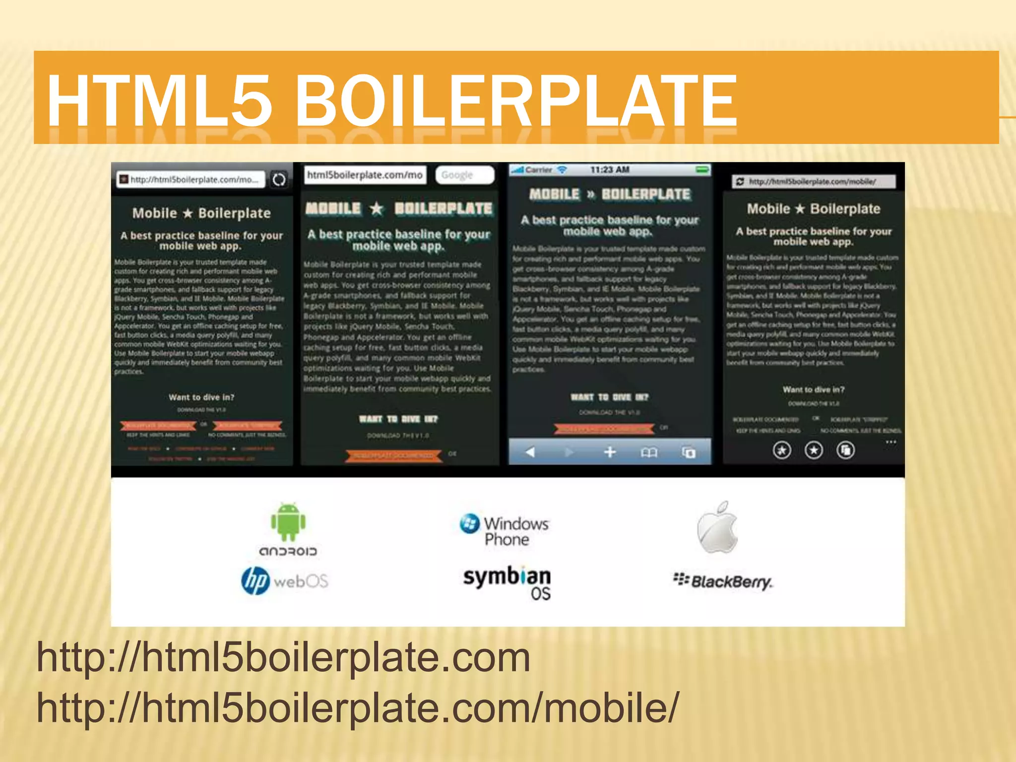
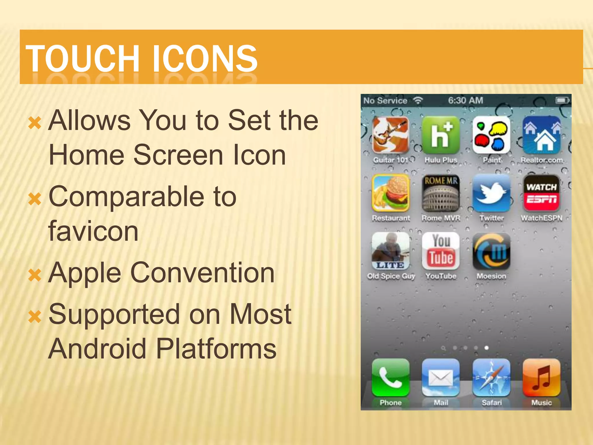
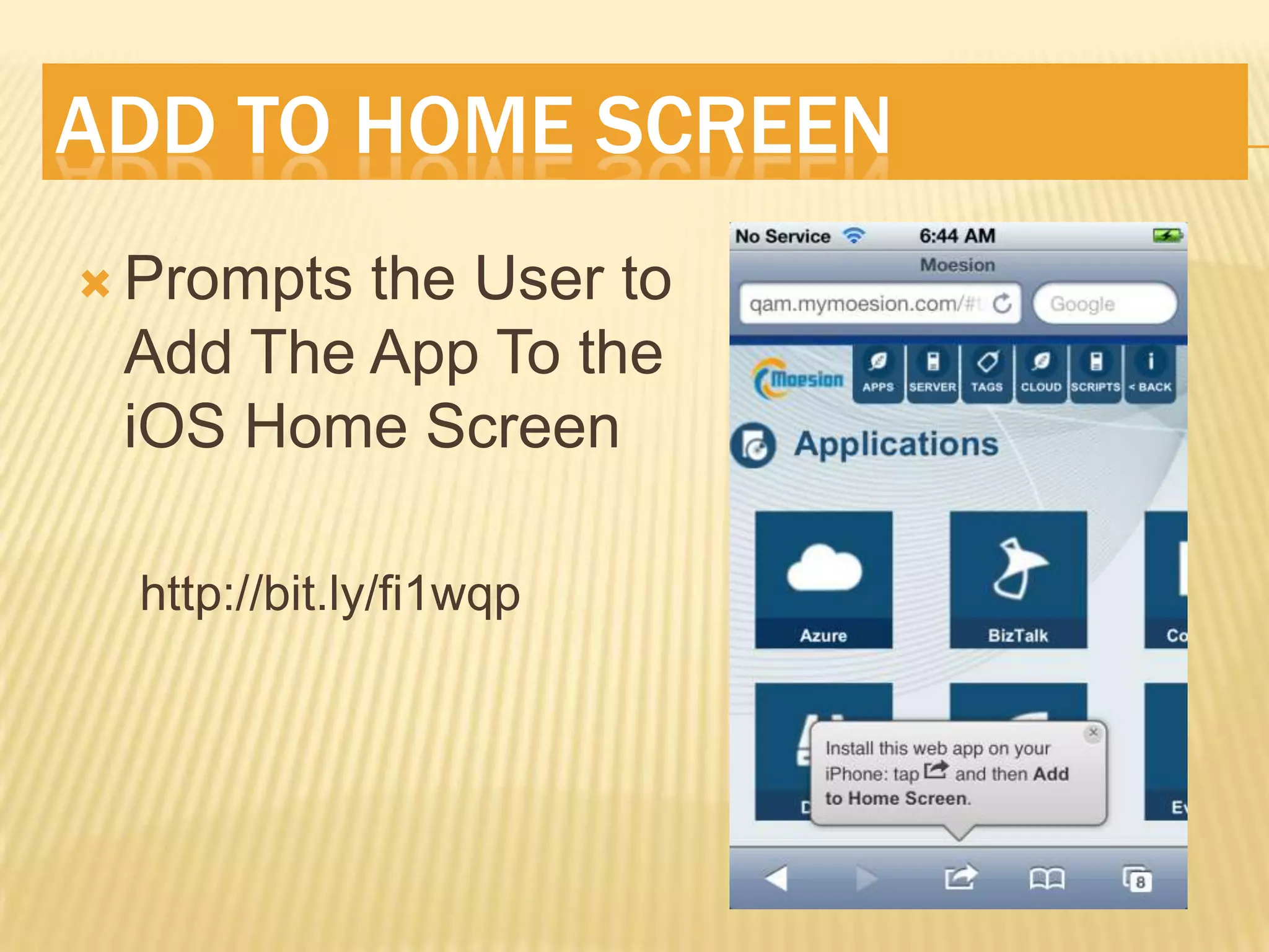

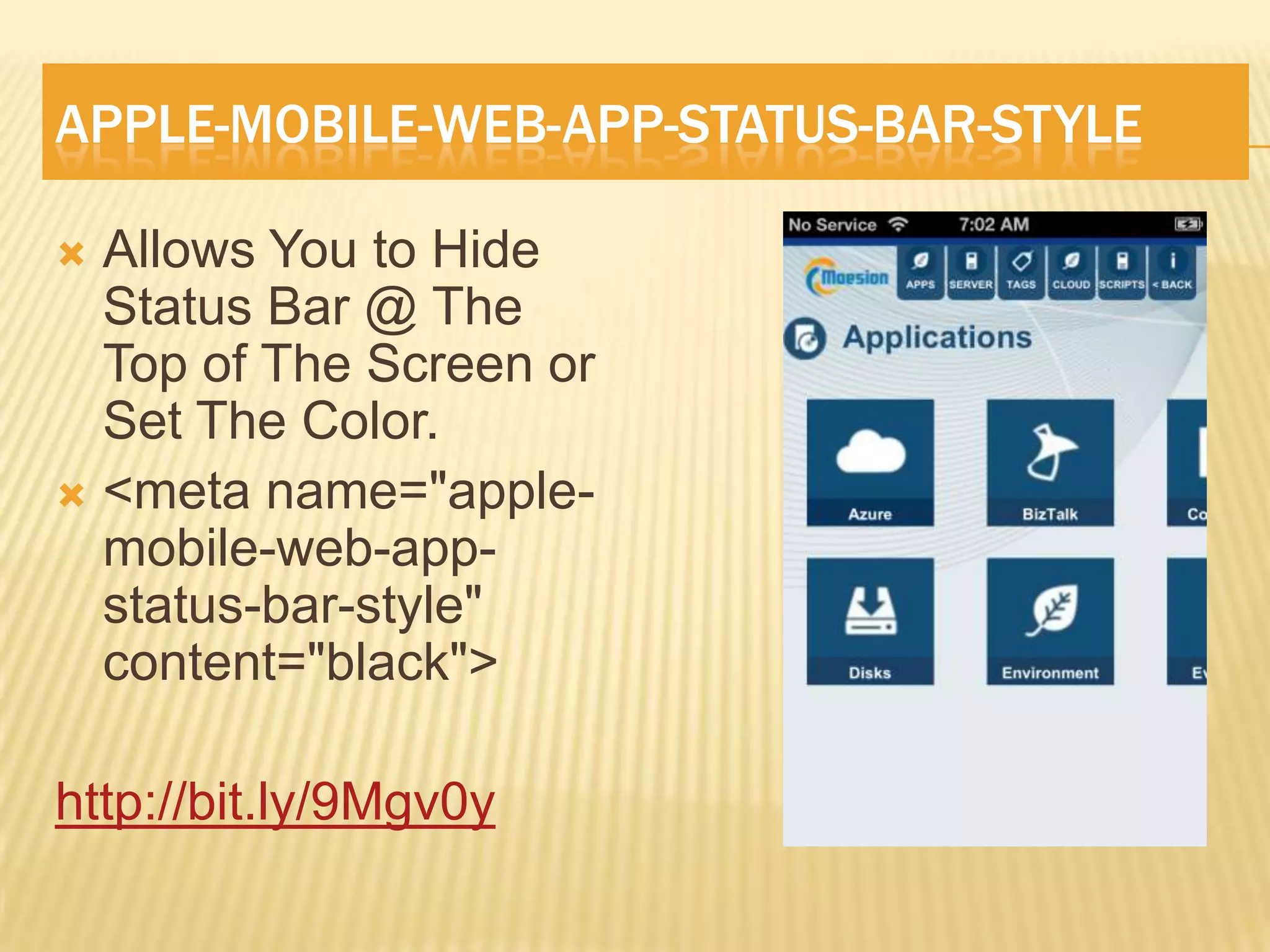

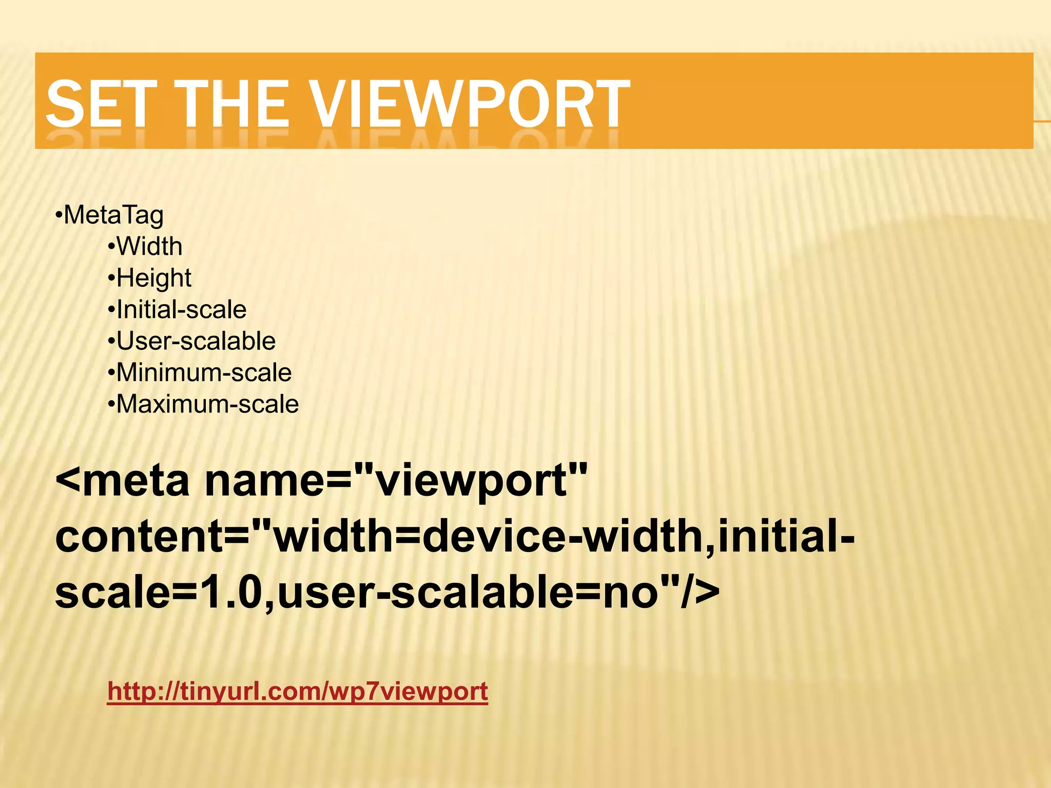
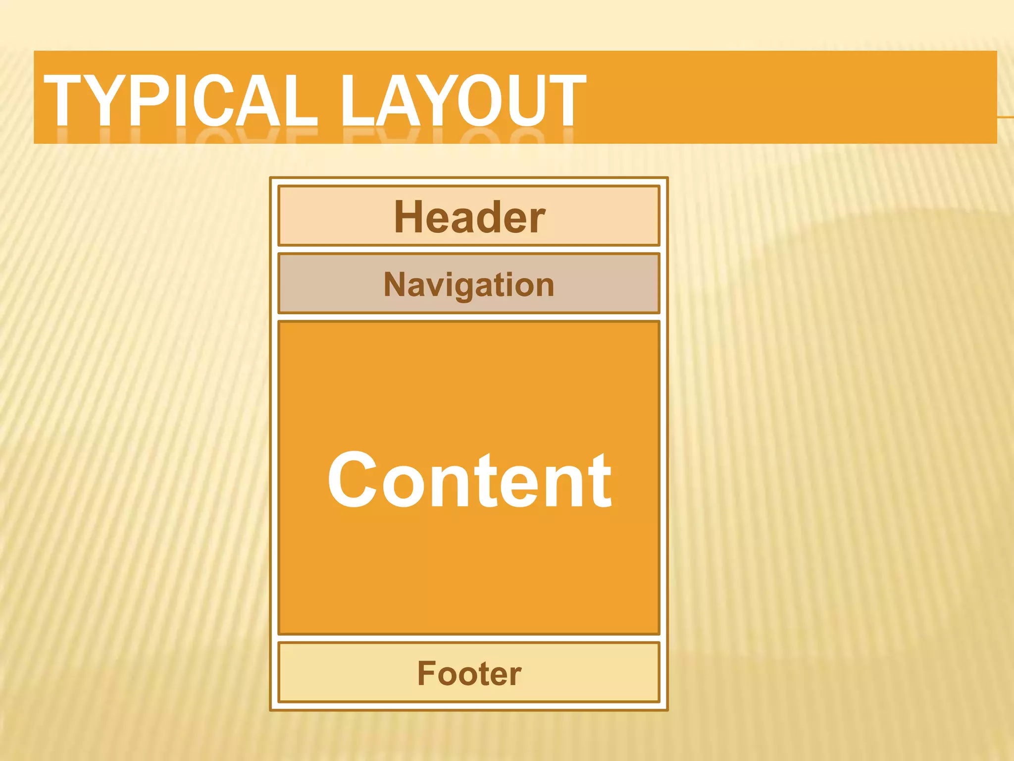
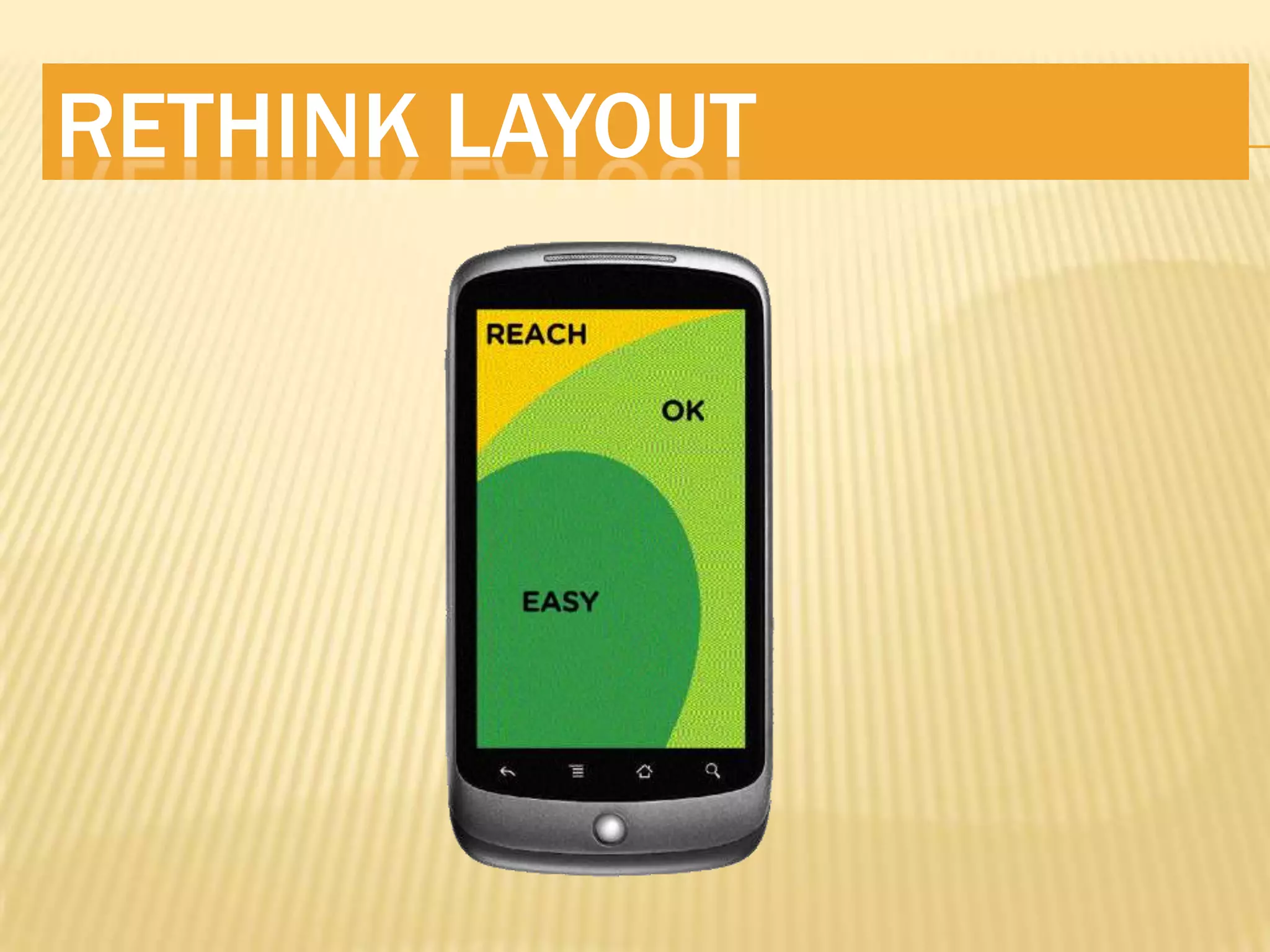
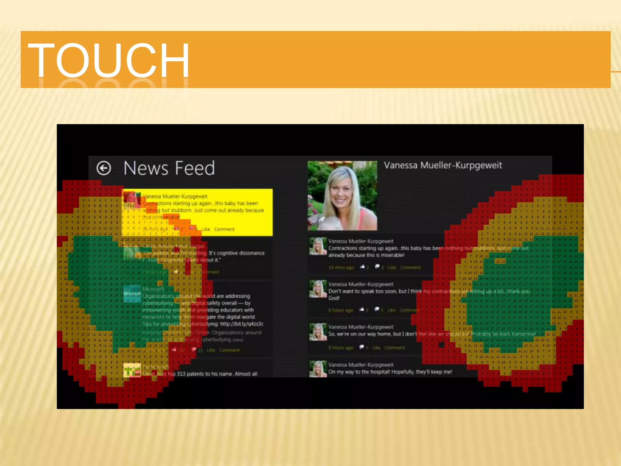
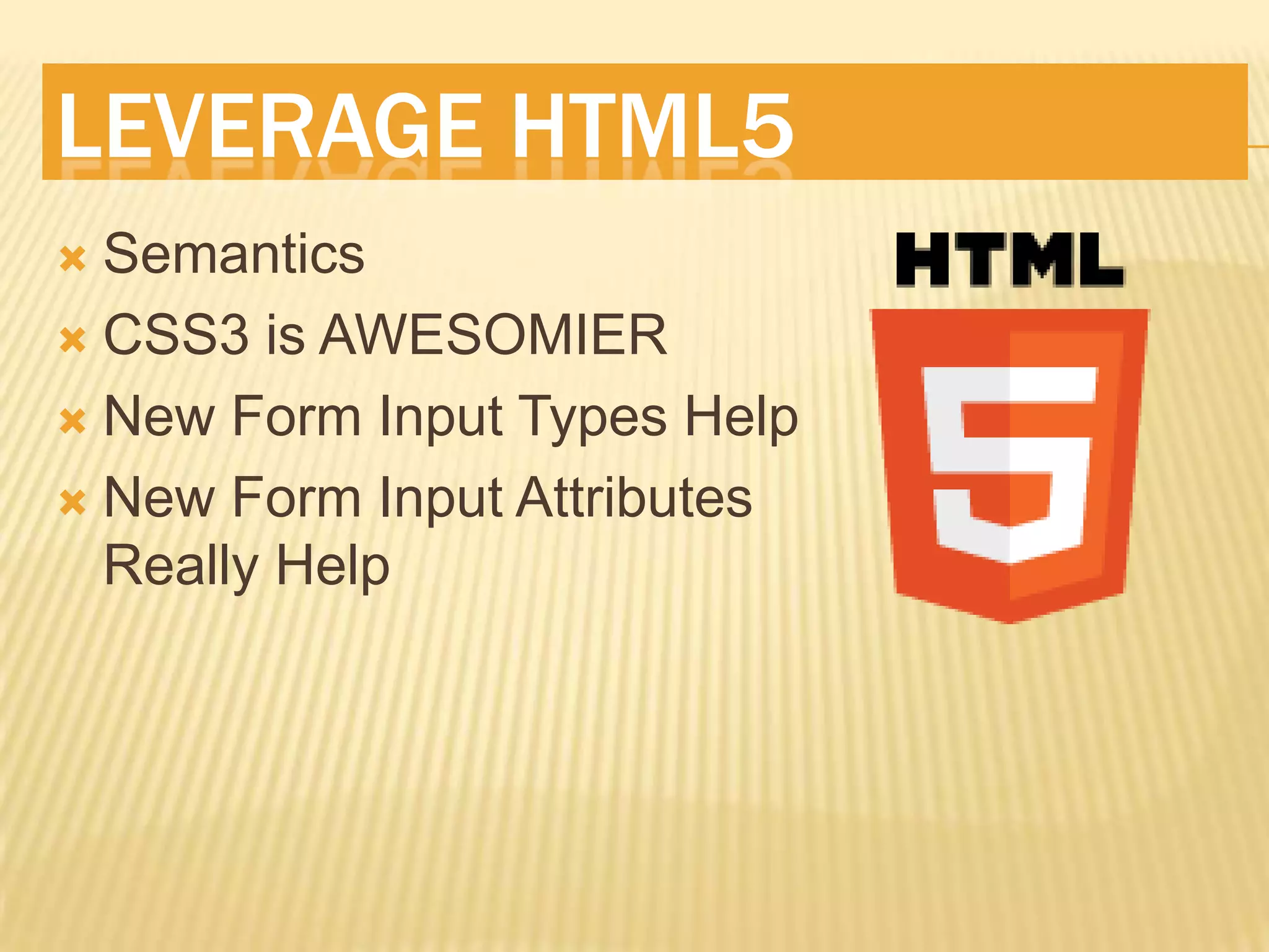

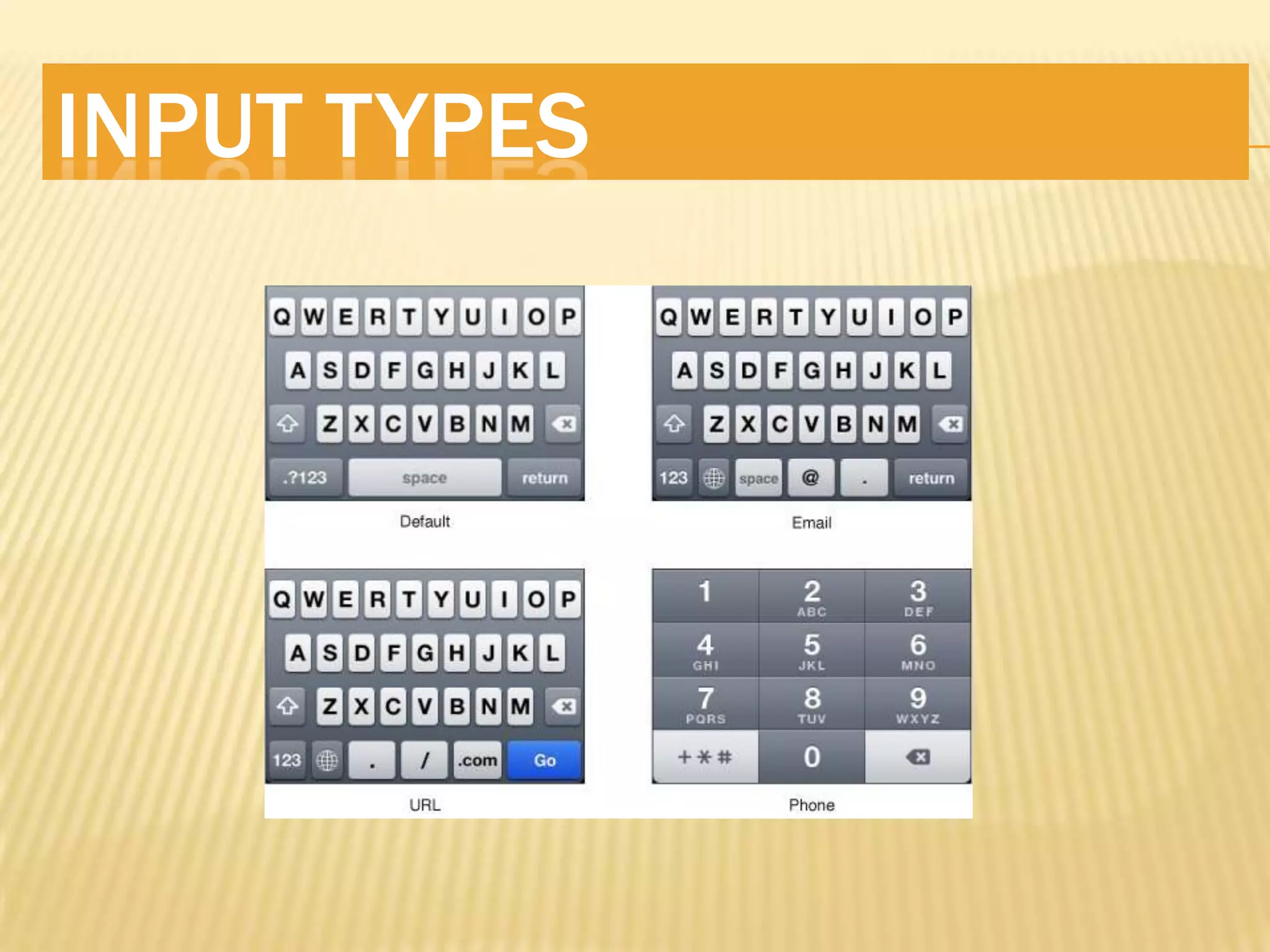

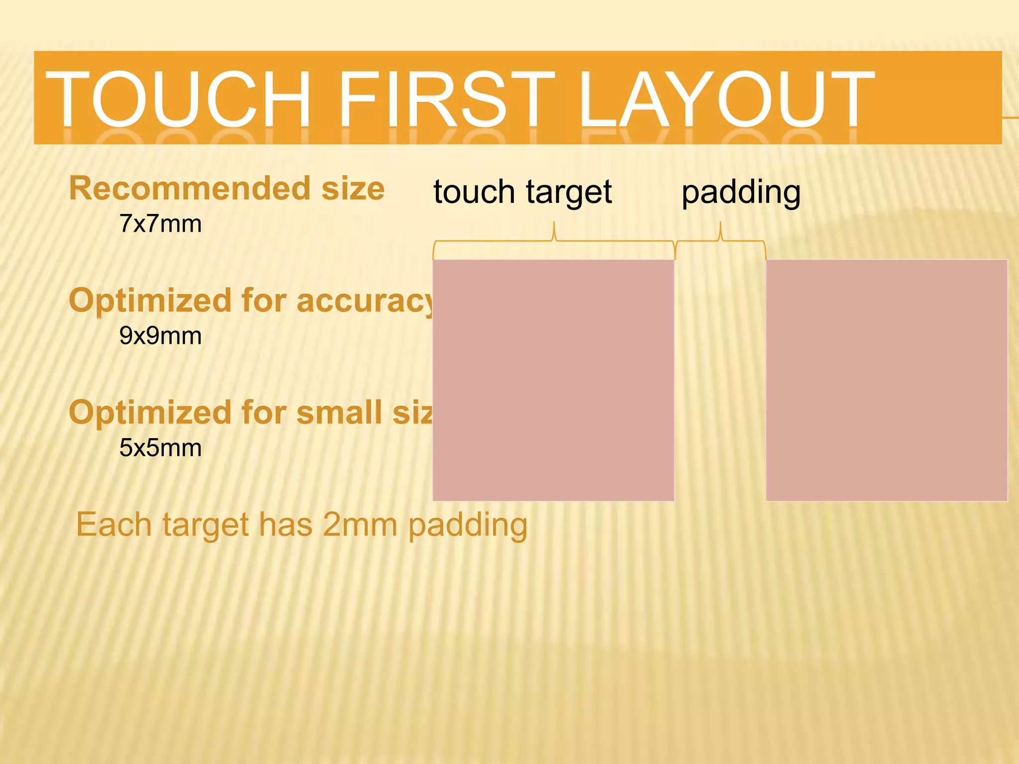


This document provides guidance on how to build effective mobile web apps. It discusses understanding the mobile landscape and user needs, designing for a mobile-first approach, leveraging HTML5 features, optimizing for touch interfaces, and using technologies like CSS3, JavaScript, and device APIs. The key recommendations are to focus on the most common user tasks, reduce content, and make all functionality accessible within 3 taps or clicks.