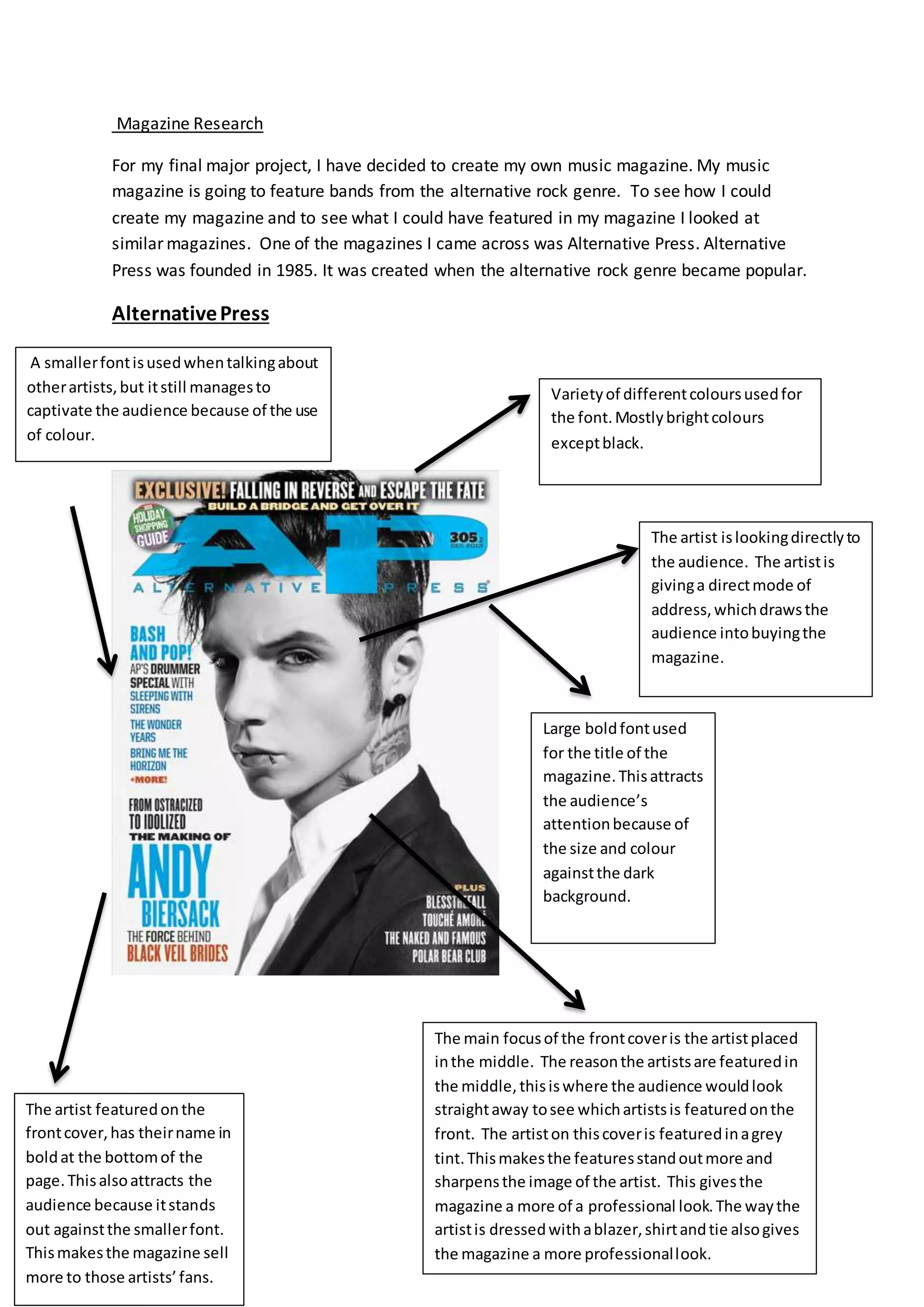
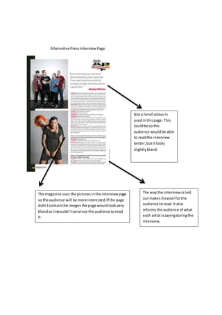
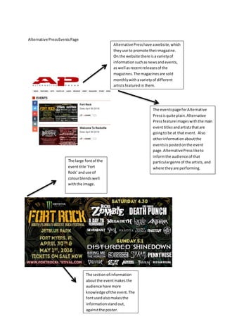
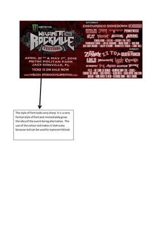
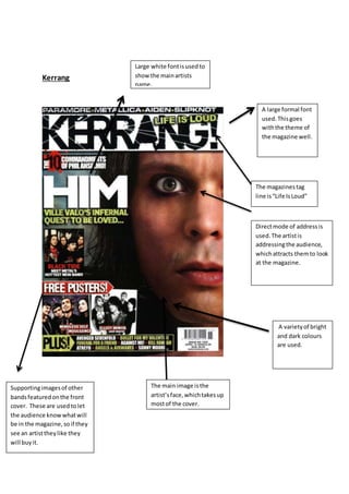
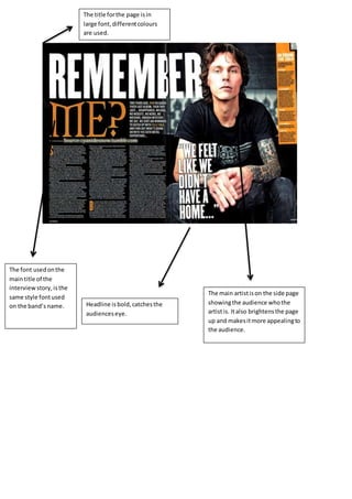
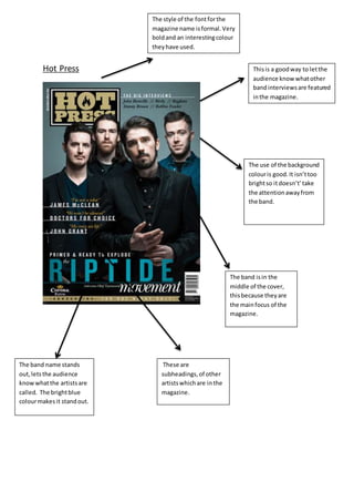
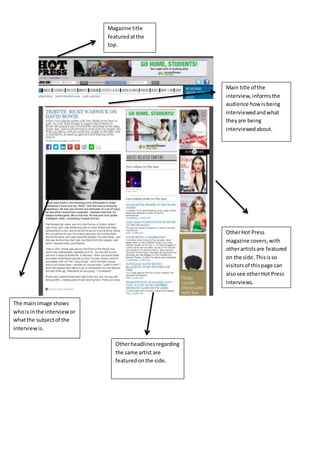
Magazine Research
For my final major project, I have decided to create my own music magazine. My music
magazine is going to feature bands from the alternative rock genre. To see how I could
create my magazine and to see what I could have featured in my magazine I looked at
similar magazines. One of the magazines I came across was Alternative Press. Alternative
Press was founded in 1985. It was created when the alternative rock genre became popular.
AlternativePress
Large boldfontused
for the title of the
magazine.Thisattracts
the audience’s
attentionbecause of
the size and colour
againstthe dark
background.
The artist featuredonthe
frontcover,has theirname in
boldat the bottomof the
page.Thisalsoattracts the
audience because itstands
out againstthe smallerfont.
Thismakesthe magazine sell
more to those artists’fans.
The main focusof the frontcoveris the artistplaced
inthe middle. The reasonthe artistsare featuredin
the middle,thisiswhere the audience wouldlook
straightaway tosee whichartistsis featuredonthe
front. The artiston thiscoveris featuredinagrey
tint.Thismakesthe featuresstandoutmore and
sharpensthe image of the artist. This givesthe
magazine a more of a professional look.The waythe
artistis dressedwithablazer,shirtandtie alsogives
the magazine a more professionallook.
The artist islookingdirectlyto
the audience. The artistis
givinga directmode of
address,whichdrawsthe
audience intobuyingthe
magazine.
A smallerfontisusedwhentalkingabout
otherartists,but itstill managesto
captivate the audience because of the use
of colour.
Varietyof differentcoloursusedfor
the font.Mostlybrightcolours
exceptblack.
AlternativePressInterview Page
The magazine usesthe picturesinthe interview page
so the audience will be more interested.If the page
didn’tcontainthe imagesthe page wouldlookvery
blandso itwouldn’tconvince the audience toread
it.
Nota lotof colouris
usedinthispage.This
couldbe so the
audience wouldbe able
to readthe interview
better,butitlooks
slightlybland.
The way the interview islaid
out makesiteasierforthe
audience toread.It also
informsthe audience of what
each artistissayingduringthe
interview.
Alternative PressEventsPage
The eventspage forAlternative
Pressisquite plain.Alternative
Pressfeature imageswiththe main
eventtitlesandartiststhatare
goingto be at thatevent. Also
otherinformationabout the
eventsispostedonthe event
page.AlternativePressliketo
informthe audience of that
particulargenre of the artists,and
where theyare performing.
The sectionof information
aboutthe eventmakesthe
audience have more
knowledge of the event.The
fontusedalsomakesthe
informationstand out,
againstthe poster.
The large fontof the
eventtitle ‘Fort
Rock’ anduse of
colourblendswell
withthe image.
AlternativePresshave awebsite,which
theyuse to promote theirmagazine.
On the website there isavarietyof
informationsuchasnewsandevents,
as well asrecentreleasesof the
magazines.The magazinesare sold
monthlywithavarietyof different
artistsfeaturedinthem.
The style of fontlooksverysharp.It is a very
formal style of fontand immediatelygives
the ideaof the eventbeingalternative. The
use of the colourredmakesit lookscary
because redcan be usedto representblood.
Kerrang
A large formal font
used.Thisgoes
withthe theme of
the magazine well.
A varietyof bright
and dark colours
are used.
Directmode of addressis
used.The artistis
addressingthe audience,
whichattracts themto look
at the magazine.
The magazinestag
line is“Life IsLoud”
The main image isthe
artist’sface,whichtakesup
mostof the cover.
Supportingimagesof other
bandsfeaturedonthe front
cover. These are used tolet
the audience knowwhatwill
be in the magazine,soif they
see an artisttheylike they
will buyit.
Large white fontisused to
show the mainartists
name.
The main artistison the side page
showingthe audience whothe
artistis. Italso brightensthe page
up and makesitmore appealingto
the audience.
Headline isbold,catchesthe
audienceseye.
The font usedonthe
maintitle of the
interview story, isthe
same style fontused
on the band’s name.
The title forthe page isin
large font,differentcolours
are used.
Hot Press
The style of the fontforthe
magazine name isformal.Very
boldand an interestingcolour
theyhave used.
The use of the background
colouris good.It isn’ttoo
brightso itdoesn’t’take
the attentionawayfrom
the band.
The band isin the
middle of the cover,
thisbecause theyare
the mainfocus of the
magazine.
The band name stands
out,letsthe audience
knowwhatthe artistsare
called. The brightblue
colourmakes it standout.
Thisis a goodway to letthe
audience know whatother
bandinterviewsare featured
inthe magazine.
These are
subheadings,of other
artistswhichare inthe
magazine.
Main title of the
interview,informsthe
audience how isbeing
interviewedandwhat
theyare being
interviewedabout.
The main image shows
whois inthe interviewor
whatthe subjectof the
interview is.
OtherHot Press
magazine covers,with
otherartistsare featured
on the side.Thisisso
visitorsof thispage can
alsosee otherHot Press
interviews.
Otherheadlinesregarding
the same artist are
featuredonthe side.
Magazine title
featuredatthe
top.
Now I have analysed a few music magazines I know what I would like to add to my
magazine, and the general structure of a magazine. I now also have an idea of what I would
to have on the front cover of my magazine. When analysing the magazine covers I know why
particular things are featured on the front cover. When customers look at the cover they are
drawn to buying the magazine. Analysing the magazines gives me a better understanding of
how magazines are created the way they are. The creators of magazines look mainly at the
target audience of their product, which is what I am going to do when creating my
magazine. Every detail on the magazines is put on there to meet the audience’s needs and
desires, from details such as the colours , font styles and artists featured in the magazines.

Magazine research

  • 1.
    Magazine Research For myfinal major project, I have decided to create my own music magazine. My music magazine is going to feature bands from the alternative rock genre. To see how I could create my magazine and to see what I could have featured in my magazine I looked at similar magazines. One of the magazines I came across was Alternative Press. Alternative Press was founded in 1985. It was created when the alternative rock genre became popular. AlternativePress Large boldfontused for the title of the magazine.Thisattracts the audience’s attentionbecause of the size and colour againstthe dark background. The artist featuredonthe frontcover,has theirname in boldat the bottomof the page.Thisalsoattracts the audience because itstands out againstthe smallerfont. Thismakesthe magazine sell more to those artists’fans. The main focusof the frontcoveris the artistplaced inthe middle. The reasonthe artistsare featuredin the middle,thisiswhere the audience wouldlook straightaway tosee whichartistsis featuredonthe front. The artiston thiscoveris featuredinagrey tint.Thismakesthe featuresstandoutmore and sharpensthe image of the artist. This givesthe magazine a more of a professional look.The waythe artistis dressedwithablazer,shirtandtie alsogives the magazine a more professionallook. The artist islookingdirectlyto the audience. The artistis givinga directmode of address,whichdrawsthe audience intobuyingthe magazine. A smallerfontisusedwhentalkingabout otherartists,but itstill managesto captivate the audience because of the use of colour. Varietyof differentcoloursusedfor the font.Mostlybrightcolours exceptblack.
  • 2.
    AlternativePressInterview Page The magazineusesthe picturesinthe interview page so the audience will be more interested.If the page didn’tcontainthe imagesthe page wouldlookvery blandso itwouldn’tconvince the audience toread it. Nota lotof colouris usedinthispage.This couldbe so the audience wouldbe able to readthe interview better,butitlooks slightlybland. The way the interview islaid out makesiteasierforthe audience toread.It also informsthe audience of what each artistissayingduringthe interview.
  • 3.
    Alternative PressEventsPage The eventspageforAlternative Pressisquite plain.Alternative Pressfeature imageswiththe main eventtitlesandartiststhatare goingto be at thatevent. Also otherinformationabout the eventsispostedonthe event page.AlternativePressliketo informthe audience of that particulargenre of the artists,and where theyare performing. The sectionof information aboutthe eventmakesthe audience have more knowledge of the event.The fontusedalsomakesthe informationstand out, againstthe poster. The large fontof the eventtitle ‘Fort Rock’ anduse of colourblendswell withthe image. AlternativePresshave awebsite,which theyuse to promote theirmagazine. On the website there isavarietyof informationsuchasnewsandevents, as well asrecentreleasesof the magazines.The magazinesare sold monthlywithavarietyof different artistsfeaturedinthem.
  • 4.
    The style offontlooksverysharp.It is a very formal style of fontand immediatelygives the ideaof the eventbeingalternative. The use of the colourredmakesit lookscary because redcan be usedto representblood.
  • 5.
    Kerrang A large formalfont used.Thisgoes withthe theme of the magazine well. A varietyof bright and dark colours are used. Directmode of addressis used.The artistis addressingthe audience, whichattracts themto look at the magazine. The magazinestag line is“Life IsLoud” The main image isthe artist’sface,whichtakesup mostof the cover. Supportingimagesof other bandsfeaturedonthe front cover. These are used tolet the audience knowwhatwill be in the magazine,soif they see an artisttheylike they will buyit. Large white fontisused to show the mainartists name.
  • 6.
    The main artistisonthe side page showingthe audience whothe artistis. Italso brightensthe page up and makesitmore appealingto the audience. Headline isbold,catchesthe audienceseye. The font usedonthe maintitle of the interview story, isthe same style fontused on the band’s name. The title forthe page isin large font,differentcolours are used.
  • 7.
    Hot Press The styleof the fontforthe magazine name isformal.Very boldand an interestingcolour theyhave used. The use of the background colouris good.It isn’ttoo brightso itdoesn’t’take the attentionawayfrom the band. The band isin the middle of the cover, thisbecause theyare the mainfocus of the magazine. The band name stands out,letsthe audience knowwhatthe artistsare called. The brightblue colourmakes it standout. Thisis a goodway to letthe audience know whatother bandinterviewsare featured inthe magazine. These are subheadings,of other artistswhichare inthe magazine.
  • 8.
    Main title ofthe interview,informsthe audience how isbeing interviewedandwhat theyare being interviewedabout. The main image shows whois inthe interviewor whatthe subjectof the interview is. OtherHot Press magazine covers,with otherartistsare featured on the side.Thisisso visitorsof thispage can alsosee otherHot Press interviews. Otherheadlinesregarding the same artist are featuredonthe side. Magazine title featuredatthe top.
  • 9.
    Now I haveanalysed a few music magazines I know what I would like to add to my magazine, and the general structure of a magazine. I now also have an idea of what I would to have on the front cover of my magazine. When analysing the magazine covers I know why particular things are featured on the front cover. When customers look at the cover they are drawn to buying the magazine. Analysing the magazines gives me a better understanding of how magazines are created the way they are. The creators of magazines look mainly at the target audience of their product, which is what I am going to do when creating my magazine. Every detail on the magazines is put on there to meet the audience’s needs and desires, from details such as the colours , font styles and artists featured in the magazines.