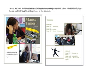
1. This is my final outcome of the Plumstead Manor Magazine front cover and contents page
based on the thoughts and opinions of the student.
2. ‘Manor Times’ Magazine Overall.
Out of the 25 people surveyed, ‘Manor Times’ proved to be
the most popular amongst the other names proposed. Most
people agreed that they’d prefer to see a basic font
therefore I used ‘Adobe Gothic std B’ as it is the most legible
and the most clear. The colour scheme, an aspect which i
also surveyed ended up being a contrast between Light &
dark greens so as not to distract from the quality of the
images, whose composition are placed in both the top and
bottom halves of the cover. In addition, my survey results
revealed that people would prefer to see more images over
text, an Idea which I have incorporated onto my front cover. I
ensured that the cover lines would stand out by placing
them onto a yellow background and using a red coloured
font in order to attract the reader’s attention.
Overall, I am content with the final outcome of the front
cover of ‘Manor Times’ due to the fact that the image and
background theme complement each other well, also I like
the contents of my images as they truly represent the
academic lifestyle. In addition, the fact that it is based on
student opinion makes the magazine credible as it voices the
student’s point of view as they’re the target audience.
However, a point for improvement would be to rearrange
the positioning and sizes of the small images underneath the
cover line so that it creates a neater aesthetic.
3. ‘Manor Times’ Magazine Overall.
I have used the same colour scheme on the contents
page with a different font. This creates the effect of it
looking a lot clearer as considering it it’s a contents page
the purpose is to allow readers to navigate through the
magazine. In my opinion, the picture composition has a
neater layout (horizontal) and looks more appealing to
the eye and does not look overcrowded. The pictures
are larger in size and I have used a picture of a dancer’s
silhouette which represents the schools status as a
performing arts school. However, I also feel like the
design looks too plain and that more could have been
done in order to attract the target audience (secondary
school teenagers) and that more colour could have been
used.