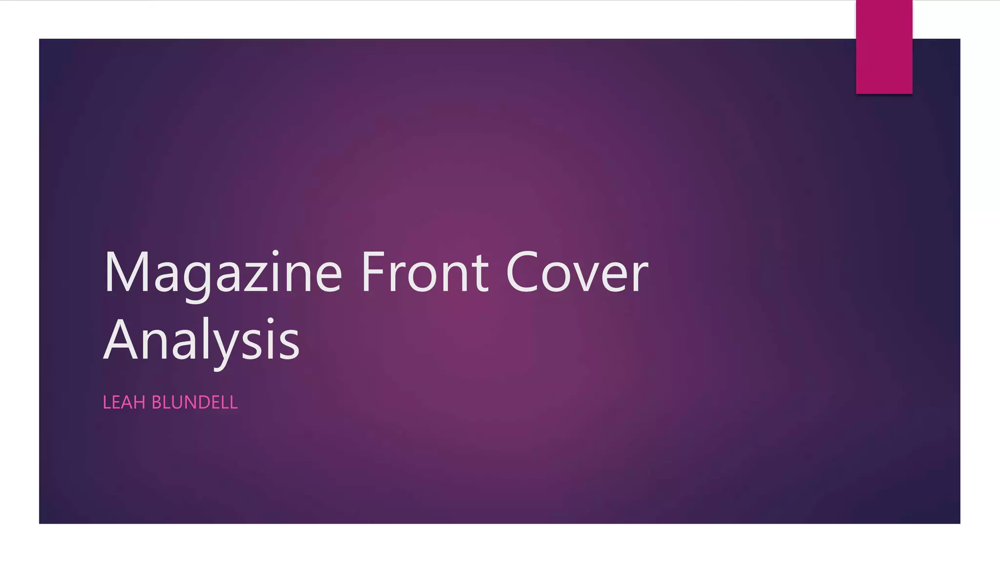
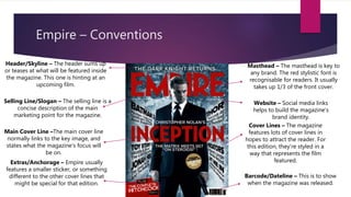
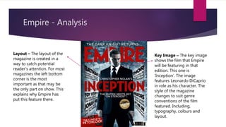
Magazine Front Cover
Analysis
LEAH BLUNDELL
Empire – Conventions
Masthead – The masthead is key to
any brand. The red stylistic font is
recognisable for readers. It usually
takes up 1/3 of the front cover.
Header/Skyline – The header sums up
or teases at what will be featured inside
the magazine. This one is hinting at an
upcoming film.
Main Cover Line –The main cover line
normally links to the key image, and
states what the magazine’s focus will
be on.
Cover Lines – The magazine
features lots of cover lines in
hopes to attract the reader. For
this edition, they’re styled in a
way that represents the film
featured.
Selling Line/Slogan – The selling line is a
concise description of the main
marketing point for the magazine.
Website – Social media links
helps to build the magazine’s
brand identity.
Extras/Anchorage – Empire usually
features a smaller sticker, or something
different to the other cover lines that
might be special for that edition.
Barcode/Dateline – This is to show
when the magazine was released.
Empire - Analysis
Key Image – The key image
shows the film that Empire
will be featuring in that
edition. This one is
‘Inception’. The image
features Leonardo DiCaprio
in role as his character. The
style of the magazine
changes to suit genre
conventions of the film
featured. Including,
typography, colours and
layout.
Layout – The layout of the
magazine is created in a
way to catch potential
reader’s attention. For most
magazines the left bottom
corner is the most
important as that may be
the only part on show. This
explains why Empire has
put this feature there.
Empire Covers
From the covers above it is clear that there are shared conventions between all the Empire covers.
The key image is centred, the general house style is used with slight changes depending on the
film that is featured. There appears to be cover lines on the majority of the magazines, apart from
the ‘Suicide Squad’ one as there seems to be just a focus on the Oscars.

Magazine front cover analysis

  • 1.
  • 2.
    Empire – Conventions Masthead– The masthead is key to any brand. The red stylistic font is recognisable for readers. It usually takes up 1/3 of the front cover. Header/Skyline – The header sums up or teases at what will be featured inside the magazine. This one is hinting at an upcoming film. Main Cover Line –The main cover line normally links to the key image, and states what the magazine’s focus will be on. Cover Lines – The magazine features lots of cover lines in hopes to attract the reader. For this edition, they’re styled in a way that represents the film featured. Selling Line/Slogan – The selling line is a concise description of the main marketing point for the magazine. Website – Social media links helps to build the magazine’s brand identity. Extras/Anchorage – Empire usually features a smaller sticker, or something different to the other cover lines that might be special for that edition. Barcode/Dateline – This is to show when the magazine was released.
  • 3.
    Empire - Analysis KeyImage – The key image shows the film that Empire will be featuring in that edition. This one is ‘Inception’. The image features Leonardo DiCaprio in role as his character. The style of the magazine changes to suit genre conventions of the film featured. Including, typography, colours and layout. Layout – The layout of the magazine is created in a way to catch potential reader’s attention. For most magazines the left bottom corner is the most important as that may be the only part on show. This explains why Empire has put this feature there.
  • 4.
    Empire Covers From thecovers above it is clear that there are shared conventions between all the Empire covers. The key image is centred, the general house style is used with slight changes depending on the film that is featured. There appears to be cover lines on the majority of the magazines, apart from the ‘Suicide Squad’ one as there seems to be just a focus on the Oscars.