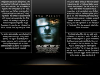
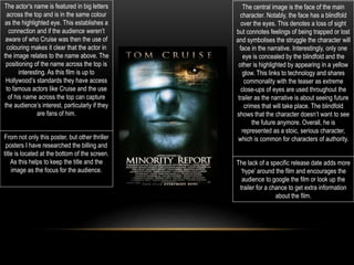
Minority Report (2002)
Leah Blundell
TEXTUAL ANALYSIS OF A POSTER
The poster uses a dark background. This
denotes that the film will be focused on a
dark, serious subject and is shrouded in
mystery. The connotations of this black
background and the face emerging from it
is that perhaps the character (Cruise)
depicted in the centre will be confronted
with his own darkness in the film. This
reveals that although the genre is a
thriller, the positioning of the image
focuses on the psyche and indicates that
this is a poster for a psychological thriller.
The use of a blue tone over the whole poster
is a common link to the teaser trailer where
blue is also prevalent. The use of blue is in
many other thriller movies that I have
researched so far, particularly crime thrillers
as an obvious link is the flashing blue light of
police and other emergency services putting
the audience on edge as it evokes a sense of
danger. However, blue can also represent
stability and self-expression as it is the colour
of the sky etc. This also suggests links to the
focus of the mind.
The tagline also uses the same font as the
whole poster creating a strong brand
identity. The tagline ‘Everybody runs’
creates suspense and in combination with
the highlighted eye it acts as direct
address and the audience feel personally
targeted and directly included.
The typography of the title is a bold, white
capitalised font with use of serifs. This adds a
formal sense compared to typical thriller films
that have more modernised fonts. However,
the formality of the font denotes that there
may be authority figures like the police
featured in the film. The font style also links in
with the ‘report’ aspect of the title. The size of
the title is obviously bigger than the other text
on the poster to draw attention to it.
The actor’s name is featured in big letters
across the top and is in the same colour
as the highlighted eye. This establishes a
connection and if the audience weren’t
aware of who Cruise was then the use of
colouring makes it clear that the actor in
the image relates to the name above. The
positioning of the name across the top is
interesting. As this film is up to
Hollywood’s standards they have access
to famous actors like Cruise and the use
of his name across the top can capture
the audience’s interest, particularly if they
are fans of him.
The central image is the face of the main
character. Notably, the face has a blindfold
over the eyes. This denotes a loss of sight
but connotes feelings of being trapped or lost
and symbolises the struggle the character will
face in the narrative. Interestingly, only one
eye is concealed by the blindfold and the
other is highlighted by appearing in a yellow
glow. This links to technology and shares
commonality with the teaser as extreme
close-ups of eyes are used throughout the
trailer as the narrative is about seeing future
crimes that will take place. The blindfold
shows that the character doesn’t want to see
the future anymore. Overall, he is
represented as a stoic, serious character,
which is common for characters of authority.From not only this poster, but other thriller
posters I have researched the billing and
title is located at the bottom of the screen.
As this helps to keep the title and the
image as the focus for the audience.
The lack of a specific release date adds more
‘hype’ around the film and encourages the
audience to google the film or look up the
trailer for a chance to get extra information
about the film.
COMMENTS
• The USP of this poster is evidently the intense blue colour and the blindfold/use of eye
imagery to spark interest as to why the man is blindfolded or what the use of eyes have to
do with the narrative.
• From analysing this film poster, I find the use of one central image an effective idea as the
audiences attention is directed to the image. The use of the blindfold ignites questions
and along with the lack of a specific release date the audience is overwhelmed with the
desire to find out more about the film. I think this would be a very useful idea to adopt for
our promotional campaign, as combined with the use of social media, we could create a
viral campaign.
• Additionally, the use of the blue tone is effective in establishing the genre and other hints
about the narrative when used in combination with other micro-elements like the mise-en-
scene. With the use of only one font being used I feel a very strong brand identity is
created from this and making use of a similar technique will help with recognition from the
audience.

Textual analysis of a poster

  • 1.
    Minority Report (2002) LeahBlundell TEXTUAL ANALYSIS OF A POSTER
  • 2.
    The poster usesa dark background. This denotes that the film will be focused on a dark, serious subject and is shrouded in mystery. The connotations of this black background and the face emerging from it is that perhaps the character (Cruise) depicted in the centre will be confronted with his own darkness in the film. This reveals that although the genre is a thriller, the positioning of the image focuses on the psyche and indicates that this is a poster for a psychological thriller. The use of a blue tone over the whole poster is a common link to the teaser trailer where blue is also prevalent. The use of blue is in many other thriller movies that I have researched so far, particularly crime thrillers as an obvious link is the flashing blue light of police and other emergency services putting the audience on edge as it evokes a sense of danger. However, blue can also represent stability and self-expression as it is the colour of the sky etc. This also suggests links to the focus of the mind. The tagline also uses the same font as the whole poster creating a strong brand identity. The tagline ‘Everybody runs’ creates suspense and in combination with the highlighted eye it acts as direct address and the audience feel personally targeted and directly included. The typography of the title is a bold, white capitalised font with use of serifs. This adds a formal sense compared to typical thriller films that have more modernised fonts. However, the formality of the font denotes that there may be authority figures like the police featured in the film. The font style also links in with the ‘report’ aspect of the title. The size of the title is obviously bigger than the other text on the poster to draw attention to it.
  • 3.
    The actor’s nameis featured in big letters across the top and is in the same colour as the highlighted eye. This establishes a connection and if the audience weren’t aware of who Cruise was then the use of colouring makes it clear that the actor in the image relates to the name above. The positioning of the name across the top is interesting. As this film is up to Hollywood’s standards they have access to famous actors like Cruise and the use of his name across the top can capture the audience’s interest, particularly if they are fans of him. The central image is the face of the main character. Notably, the face has a blindfold over the eyes. This denotes a loss of sight but connotes feelings of being trapped or lost and symbolises the struggle the character will face in the narrative. Interestingly, only one eye is concealed by the blindfold and the other is highlighted by appearing in a yellow glow. This links to technology and shares commonality with the teaser as extreme close-ups of eyes are used throughout the trailer as the narrative is about seeing future crimes that will take place. The blindfold shows that the character doesn’t want to see the future anymore. Overall, he is represented as a stoic, serious character, which is common for characters of authority.From not only this poster, but other thriller posters I have researched the billing and title is located at the bottom of the screen. As this helps to keep the title and the image as the focus for the audience. The lack of a specific release date adds more ‘hype’ around the film and encourages the audience to google the film or look up the trailer for a chance to get extra information about the film.
  • 4.
    COMMENTS • The USPof this poster is evidently the intense blue colour and the blindfold/use of eye imagery to spark interest as to why the man is blindfolded or what the use of eyes have to do with the narrative. • From analysing this film poster, I find the use of one central image an effective idea as the audiences attention is directed to the image. The use of the blindfold ignites questions and along with the lack of a specific release date the audience is overwhelmed with the desire to find out more about the film. I think this would be a very useful idea to adopt for our promotional campaign, as combined with the use of social media, we could create a viral campaign. • Additionally, the use of the blue tone is effective in establishing the genre and other hints about the narrative when used in combination with other micro-elements like the mise-en- scene. With the use of only one font being used I feel a very strong brand identity is created from this and making use of a similar technique will help with recognition from the audience.